Scifi Interior
Hello fellow Polycounters!
Good to see you again, and thanks for looking at this thread!
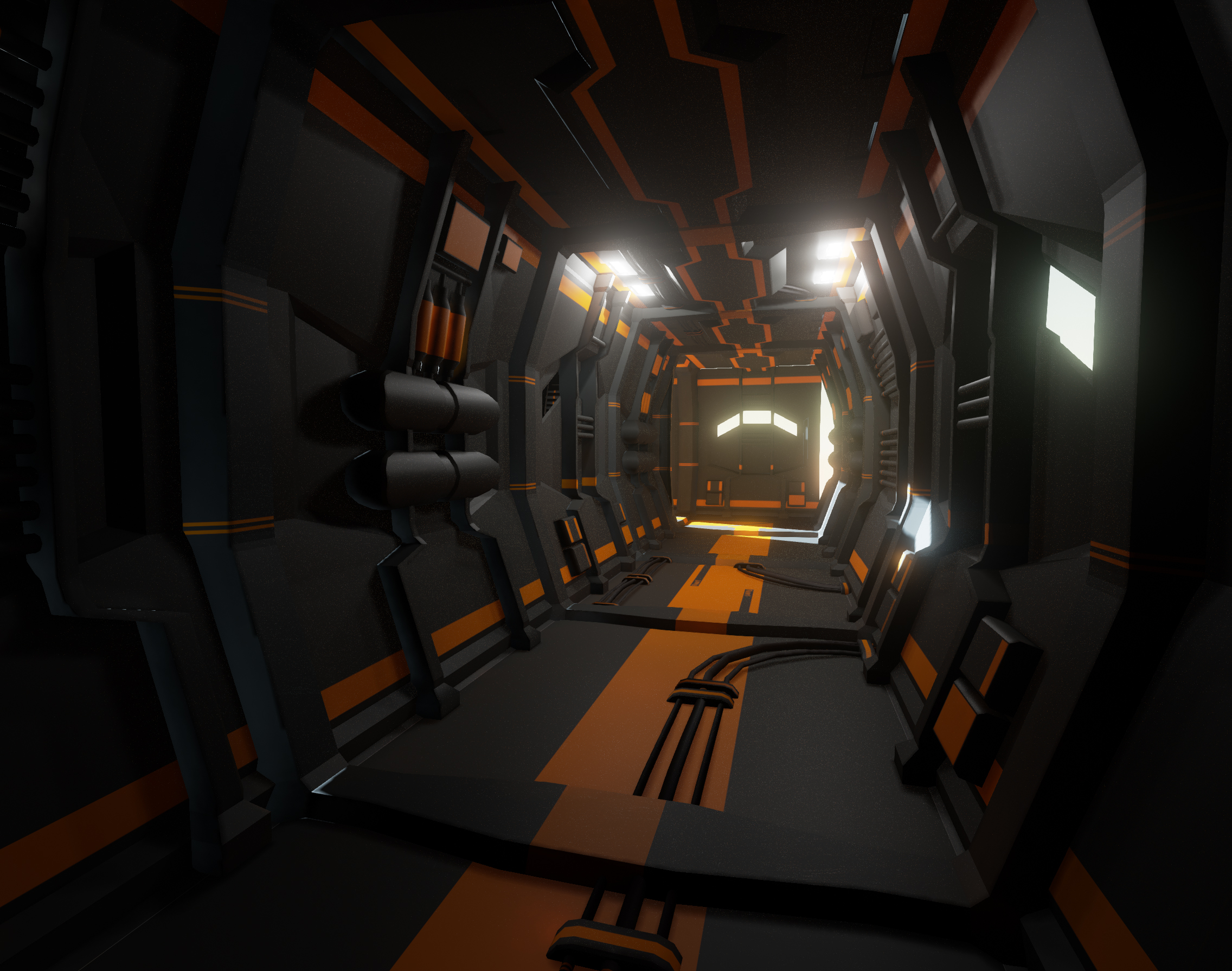
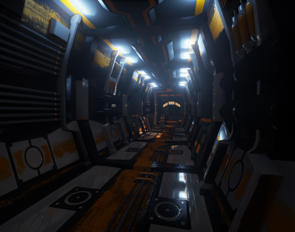
So I have been working on this environment for about 4 days now ( not non-stop ) and the main goal is to push myself in terms of Modular pieces for an environment and learning the PBR workflow, this is also the first time creating an evironment (in free time) wich I intend to finish!
So! some screenshots so far!
Some basic textures and the pieces of 3D

Created some corner geometry and worked on some of my textures to figure out the PBR workflow

I really love doing this, but dunno when I will be able to finish it due to an overflow of other stuff that I'm going to do
Updates coming soon and thanks for watching people!!
Good to see you again, and thanks for looking at this thread!
So I have been working on this environment for about 4 days now ( not non-stop ) and the main goal is to push myself in terms of Modular pieces for an environment and learning the PBR workflow, this is also the first time creating an evironment (in free time) wich I intend to finish!
So! some screenshots so far!
Some basic textures and the pieces of 3D

Created some corner geometry and worked on some of my textures to figure out the PBR workflow

I really love doing this, but dunno when I will be able to finish it due to an overflow of other stuff that I'm going to do
Updates coming soon and thanks for watching people!!

Replies
Keep it up, good luck!
its looking really good but why are you using scratched paint in the second image. I feel it doesnt fit right.
the first picture looks very interesting and could look even better if youd use the same specularity as in the second image on the black surfaces. But thats just my Opinion.
is the thing in the front a door? if you could make that more obvious, the things Kimon mentioned would fall away since the corridor would then have a reasonable spacing
With best regards Joel
I'm trying to create a more wheatered look for this scifi piece, so scratches and little damage everywhere, and the panel in the back is some kind of small window.
But going forth on what Kimon said I'm modeling a door and windows as we speak to make the scale reference clearer.
And as for the specularity/metalness/roughness ( still figuring out the details )that doesnt seem to work so great in terms of realism, When my door and windows are done I'll add them and upload another Picture!
But really apreciate the feedback, I'm going to try to push the colors and see what works best, even post some different color schemes maybe.
Thanks for posting and taking the time!
Here are some Screenshots
One for a room I created ( with more Props to come and fill the space ) and I think it gives more of a feeling of scale ( thanks for the tips and comments on that).
And one for the details on the floorpanel ( still A wip ) because I don't really like the shine and the texture of the white parts, also the scratches need more logic to placement and need to be much smaller.
And maybe make the paint a little more reflective.
All critique and comments are more than welcome people so don't hesitate to do so,
Thanks for looking!