WIP - Garden
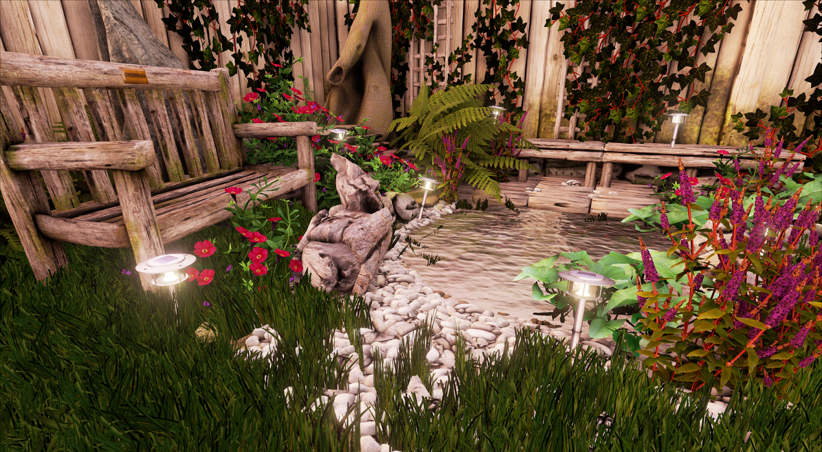
Been working on little garden, whilst learning unreal 4 (never used unreal before now).
Firstly, I don't like the water in the scene, I'll look into some water guides next. Also I forgot to turn the lights off as they've got emission from the texture, it was a night scene but I changed it to a dusk scene, figured Ill just sort that all out once I got some feedback in
Anyways slam away on it. I'm braced.


Replies
updated from feedback, gone over redone the lighting, got the SSS working, tweaked a bunch of the map values to even them out more. (mostly AO maps). Adjusted some diff brightness maps, and moved some of the props around. Also changed the water by taking it from one of the pre-made shaders in the cave scene. added in some post processing effects and linked up the lighting to the sky.
Some of the grass and leaves might be a bit too saturated but it could be the lighting, hard to say.
Otherwise, It's starting to look nice indeed.
ScottMichaelH right, the moss on the fence looks quite flat. You could try giving the fence a similar treatment as the bench, contain it around the base and behind the Ivy, but scale it back if you want a newer looking fence.
Thank you for the feedbacks eveyrone, I wanted to keep the lights in mostly to just have an excuse to splash blue across a predominately orange scene. I tried a night scene, but I have to go crazy with the lights to make it look correct (and there were still dark patches) and a day time scene gives even less reason to have multi colours going around, that's why I chose the sunset period.
Reduced the intensity of the blue lights and changed the shadow properties of the lights so they now look far softer. Also adjusted the instancing on the grass so the shadows work better in there. I could reduce the instancing, but that in turn kills my pc's frame rate.
Then added the same moss to the fence as for some reason or other I used a different one, but I didn't like how it looked against the niceness of the fence, so I plonked some wooden panels in front the largest patch to remove attention from it.
Feel this is getting there really. Might call it a day for now and return to it once I've learnt unreal better. (i say might, something probably will change when i go tweak more things) ^_^