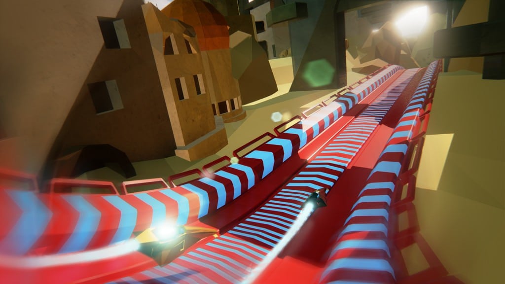
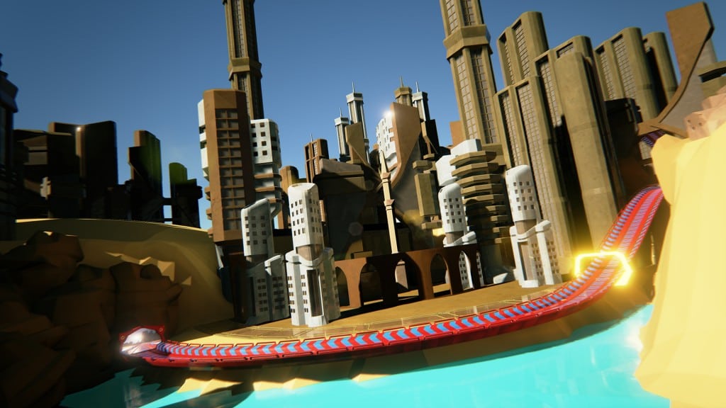
Red:Out - a futuristic racing game
Hello everyone! I'd like to share the brand new game we're developing at http://34bigthings.com/, a small indie studio located in Turin, Italy : if you think we love
Wipeout and we miss it a lot, well, you're right.
We're developing it with Unreal Engine 4, but I'm trying to have a retro look. Yes, no fancy-normals, almost everything low poly with hard edges where needed.
It will be a fast paced race game with a lot of WEAPONS, MAD TRACK PIECES, LONG HIGH-SPEED JUMPS and...
...
4 PLAYER SPLIT SCREEN WITH OCULUS SUPPORT! (if you've enough Oculus...)


It's the first time I'm fully in charge of the look and feel of an entire videogame, until now I've served as Tech Artist. I'd like to have some feedbacks on the Art Direction, cause we're still in pre-Alpha and some adjustments are due.
Hope you like it!
Peace,
Budello
Wipeout and we miss it a lot, well, you're right.
We're developing it with Unreal Engine 4, but I'm trying to have a retro look. Yes, no fancy-normals, almost everything low poly with hard edges where needed.
It will be a fast paced race game with a lot of WEAPONS, MAD TRACK PIECES, LONG HIGH-SPEED JUMPS and...
...
4 PLAYER SPLIT SCREEN WITH OCULUS SUPPORT! (if you've enough Oculus...)


It's the first time I'm fully in charge of the look and feel of an entire videogame, until now I've served as Tech Artist. I'd like to have some feedbacks on the Art Direction, cause we're still in pre-Alpha and some adjustments are due.
Hope you like it!
Peace,
Budello
Replies
As for critiques on art style and directions I'd say the slightly noisy textures on the building are kind of clashing with the style imho.
I'd expect something cleaner (more like the ground and the stones) and probably a bit more flashy/saturated or with just some hints of colors kind of like what mirror's edge does.
Anyway will keep an eye on this
Thanks man, I was already thinking about it!
However I feel your track color and textures are letting you down.
I had to look at the track shot three times until I saw the vehicles on it.
Change the color scheme of the track (something that contrasts with the vehicles and way less saturated) and bring your textures more in line with your environment and I believe you're good to go.
Ok, this may seems strange but we just changed the color scheme of the track to a light blue with yellow arrows and it's WAAAAAAAY better! Thanks man, your critique is really appreciated! :thumbup:
https://www.youtube.com/watch?v=F-4nNDRtkzI