Batman Bust
Heyo 
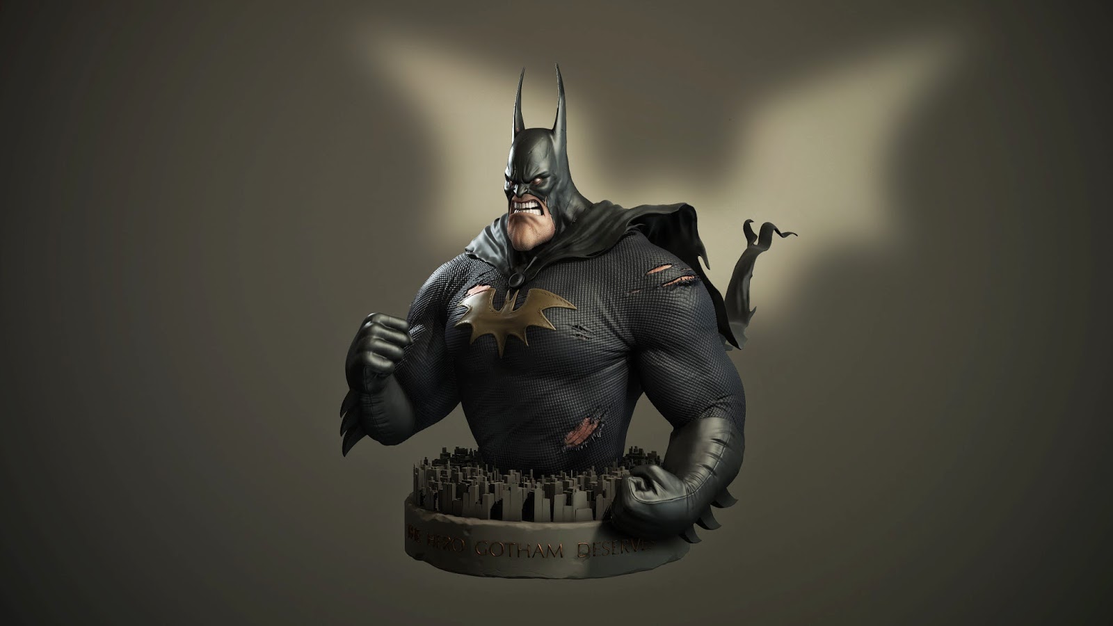
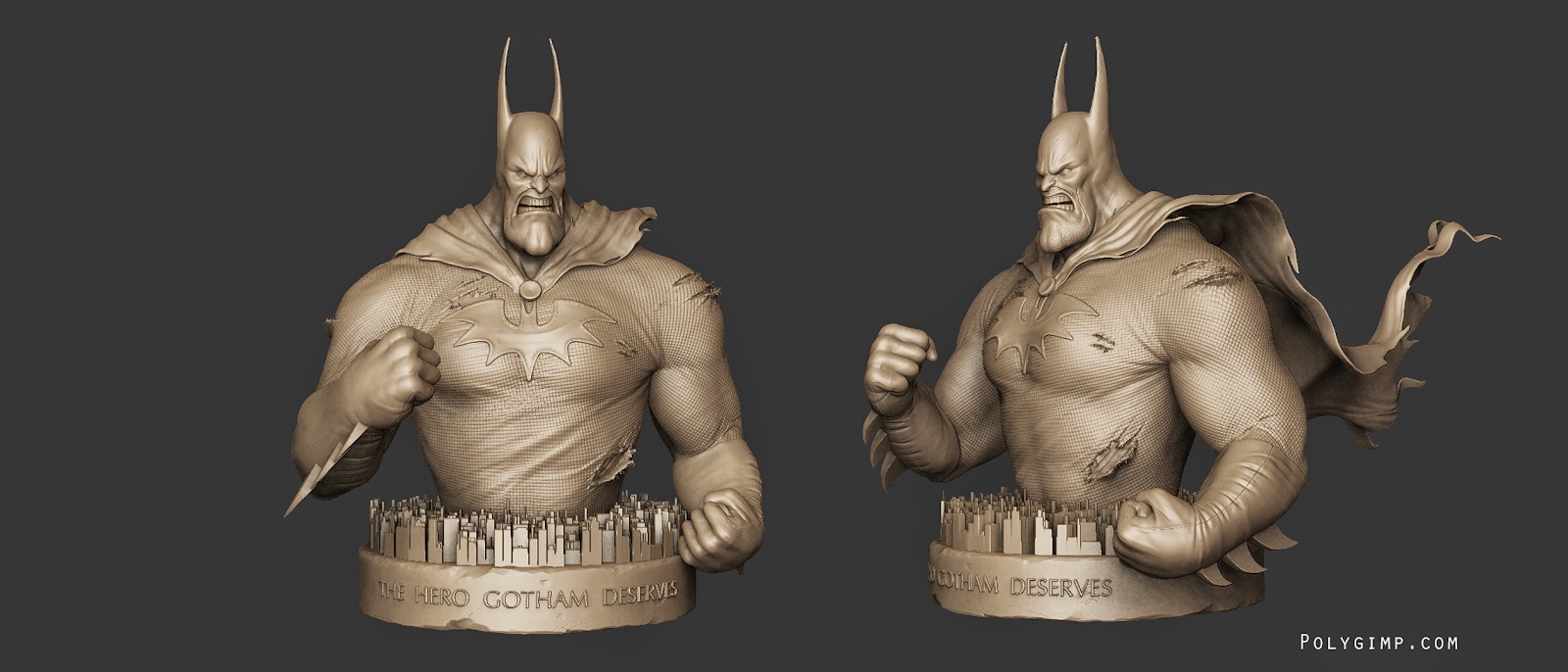
A while ago the legendary Serge Birault posted a sick batman sketch on facebook, so i used it as a practice sculpt. It turned out pretty well so i figured i'd share it Currently i'm working on practicing lighting...presentation is something i kinda suck at. A few guys in the google hangout have given me some pointers, which has been awesome. Would love to know how you'd approach lighting/presenting a bust like this..or any pointers you can throw at me.
The Sketch:

(Serge's blog here: sergebirault.blogspot.com.au/)


A while ago the legendary Serge Birault posted a sick batman sketch on facebook, so i used it as a practice sculpt. It turned out pretty well so i figured i'd share it
The Sketch:

(Serge's blog here: sergebirault.blogspot.com.au/)


Replies
Your main presentation shot may work better in a portrait layout. Great work!
@jStins - haha printing that cape might suck? :P
@Hard3d - there's nothing special about the texture, this is a polypainted sculpt rendered in marmoset.
The stone/city he's on feels off to me. it feels somewhat rushed. the entire sculpt looks baller, then the base looks meh. Perhaps its too greebleled. Which is good in the sense that it establishes scale, but bad in the sense that it isn't realistic or functional looking. More variation in the height and frequency of the building position might help. Having a few strays that stick up high near his body would be cool too.
http://www.raffaelphoto.com/wp-content/uploads/2013/01/new-york-city-at-night-skyline-panorama1.jpg
In any case, Awesome work!
@Slosh - Thanks, I'll fix it up
@s6. Yeah you caught me haha..definitely greebled. I didn't want to spend too much time on the base, so i was a bit lazy.
@Adam - Glad you think so, cheers.