Tormentum - indie game (2D game art)
Hello!
I wanted to show off some game-art I was created 1,5 years ago for an independent game called "Tormentum".
It's still in development mostly by our fellow programmer. We are small three-man team and our goal was to make 2D point and click adventure game. The action of the game is set in a dark world, veering between dreams and nightmare.
here is the trailer
Feel free to check out Tormentum's Indiegogo page where you can find all the details about the project. Also you can find us on Greenlight. Of course we would be greatful for any kind of help.
so let's begin..

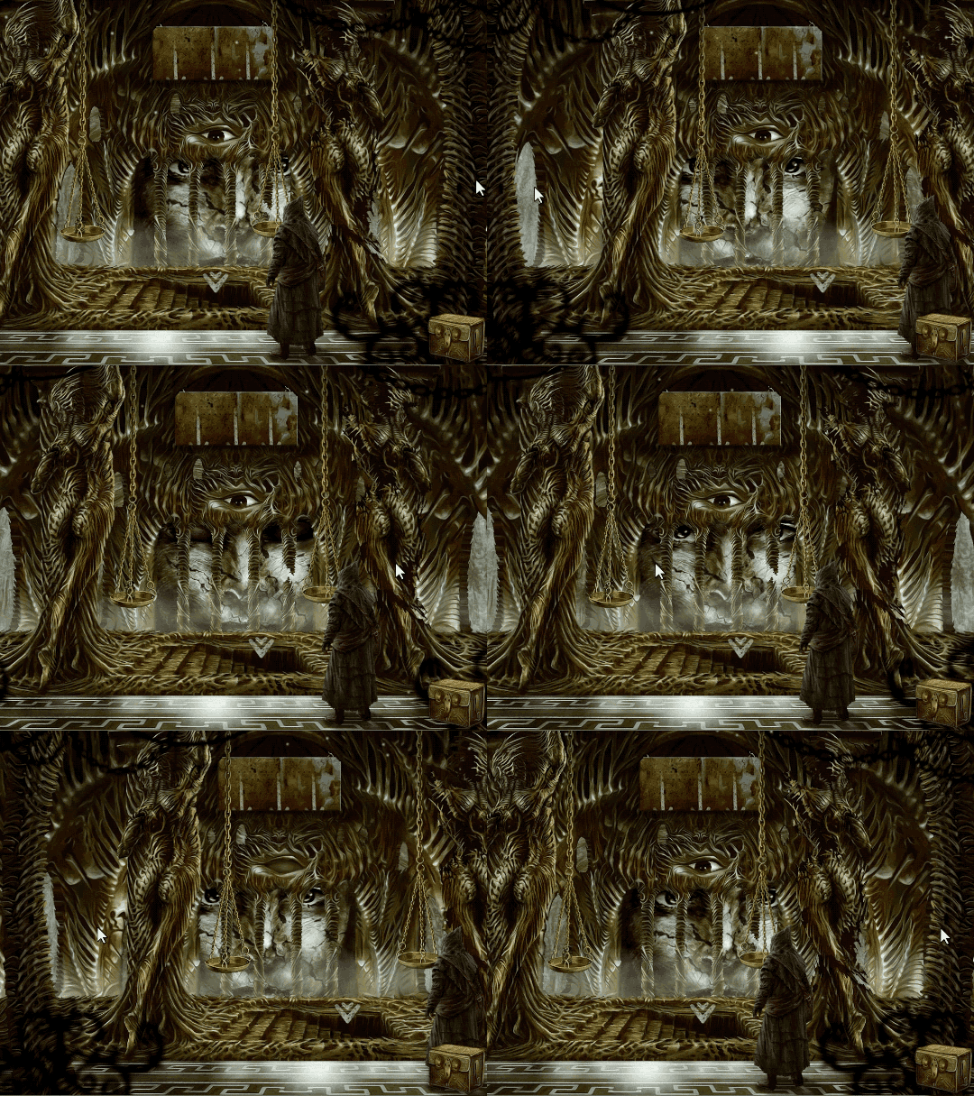
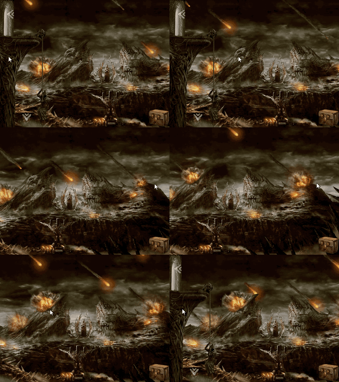
first 2 animated gifs for you showing parallax effect in our game. It takes several layered planes to get that parallax effect.


now some "static" screens..


Hope you guys liked it!
I wanted to show off some game-art I was created 1,5 years ago for an independent game called "Tormentum".
It's still in development mostly by our fellow programmer. We are small three-man team and our goal was to make 2D point and click adventure game. The action of the game is set in a dark world, veering between dreams and nightmare.
here is the trailer
Feel free to check out Tormentum's Indiegogo page where you can find all the details about the project. Also you can find us on Greenlight. Of course we would be greatful for any kind of help.
so let's begin..

first 2 animated gifs for you showing parallax effect in our game. It takes several layered planes to get that parallax effect.


now some "static" screens..


Hope you guys liked it!
Replies
I hope you guys succeed backing the project!
however i think this is the largest weakness of those pieces, there is no direction to the viewer, everything has the sameish level of detail, no matter if far or close. Everythig has somewhat similarish values and simlarish in material (spec, gloss) making all those images pretty hard to read. So Basically you have a lot of local contrast (visual noise) but in the grand scheme there is just color contrast and that isn't even that high.
look at this
see how everything blends together?
the guy in the cape blends perfectly to the background, the chains on the walls blend perfectly with the walls. There are rarely any points that stick out. the skeletons head and the helmet of the knight. those 2 UI elements (at least) but thats about it. I'm really missing atmosphere, materials and values in those pieces, to tie them together.
Neox- Yes thanks for pointing out the mistakes. Of course you are right! I'm not good painter or graphic designer I know that.. I just do what I was able to do. Let's hope that parallax effect will save these images a little bit.. I will try to improve next time.
I really really like your concepts! Remind me of the great Hironymus Bosch, do you know this Painter?
I agree with what was pointed out earlier. The value on the on every part for itself look okay but as a whole it doesn't fit together very well. Now , every layer of the parallax seems to have the same value where there could be a slightly darker foreground a bright mid ground and a darker background. That would help to make it feel more natural. But on the other hand I'm very fond of this akward look because it underlines the whole atmosphere of the game, so it is a good thing that it doesn't fulfill the clich
We still have to finish our indiegogo campaign. If you like our game and want to help pleaseee share link to Tormentum campaign: http://igg.me/at/Tormentum/x/7378278
Thanks ^^.
PS. Everyone who buys the game through our Indiegogo page for 9$ will get a key Steam when the game releases!
Here's a brief glimpse of Tormentum in action (beta version).
https://www.youtube.com/watch?v=79ij_8iK7zc
BUT, I just checked out the youtube video, and it looks awesome! the still images does not show this thing justice, the paralax and the animations are adding sooo much to the overall image, great job!
A few days ago we have released the demo so if you like you can download and play it by yourself:
Windows, English, 48 MB
OS X, English, 41 MB
or you can watch Let's Play by FrozenFoxy:
https://www.youtube.com/watch?v=3z6fegiP720