[UDK] Hive city alley
First UDK scene, so dirty wip inbound 
Background : This alley belongs in a kind of hive city (terraformation, too much pollution, this kind of scenarios ) , where people stack up in this type of alley that you kind find everyhere in the city.
And because they lived here for a long time, they personalise the alley for their particular needs.
What remains to do in the near future :
-Texture (only place holder diffuse atm) , shader
-a lot of tubing, water hose running on the floor
-plants (hanging from metal grid on the walls, in homemade flower pots etc) , -doors and windows and few others modular parts.
And of course assets to populate the scene after this.
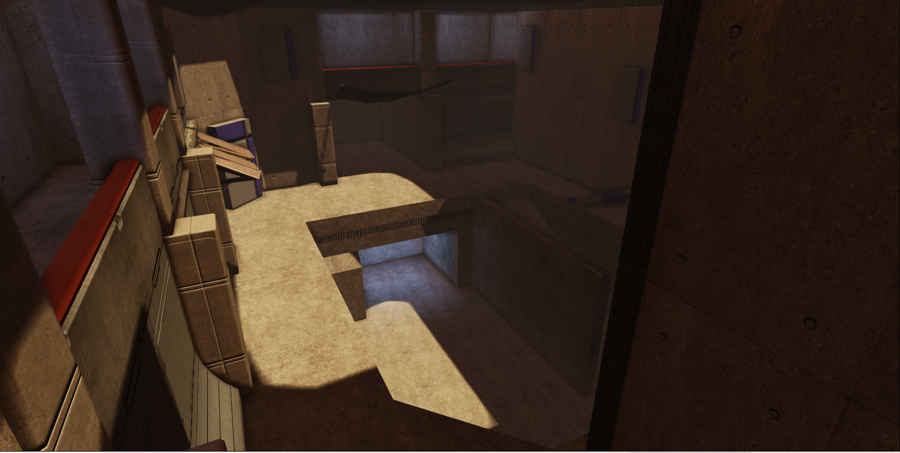
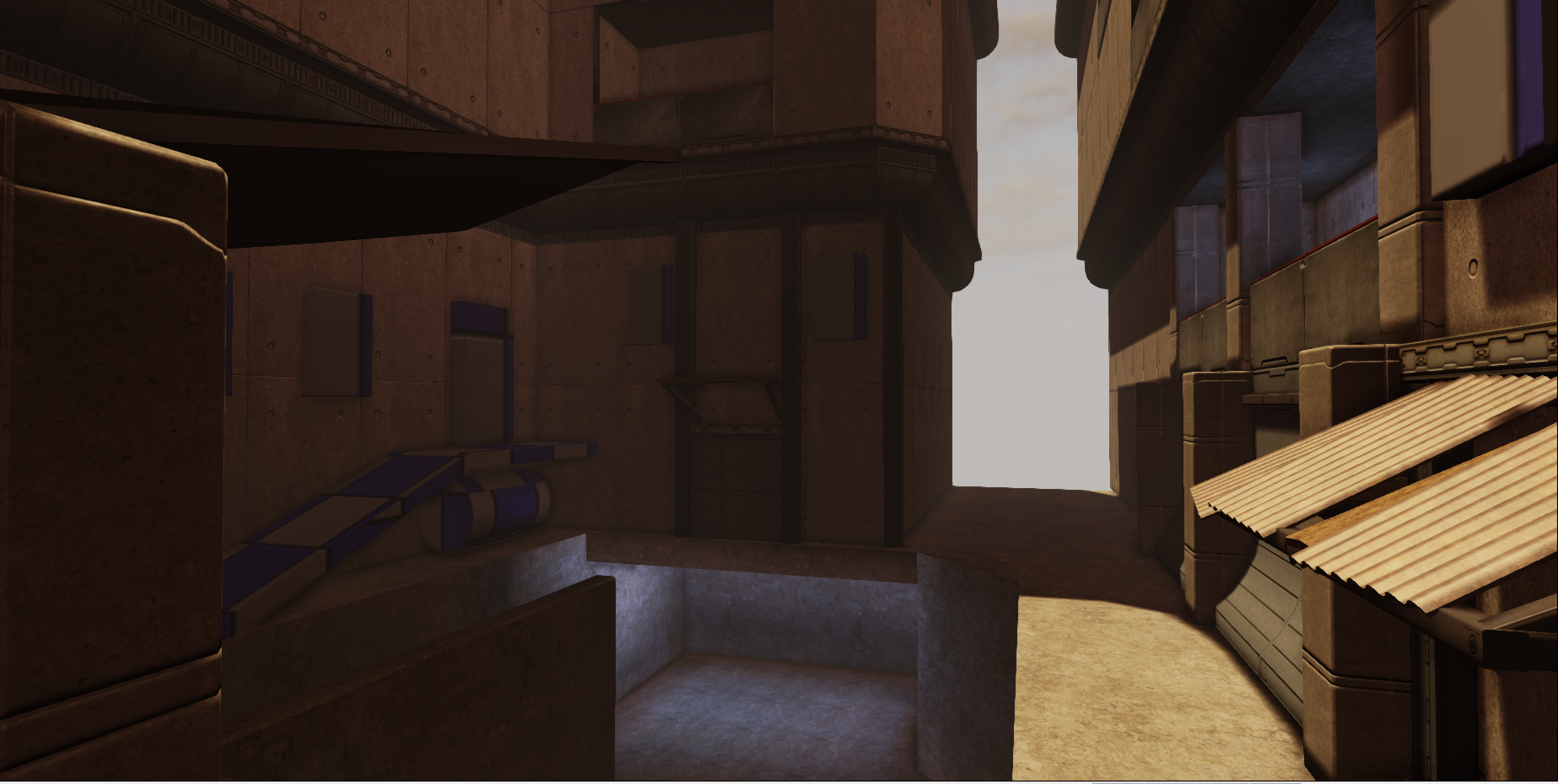
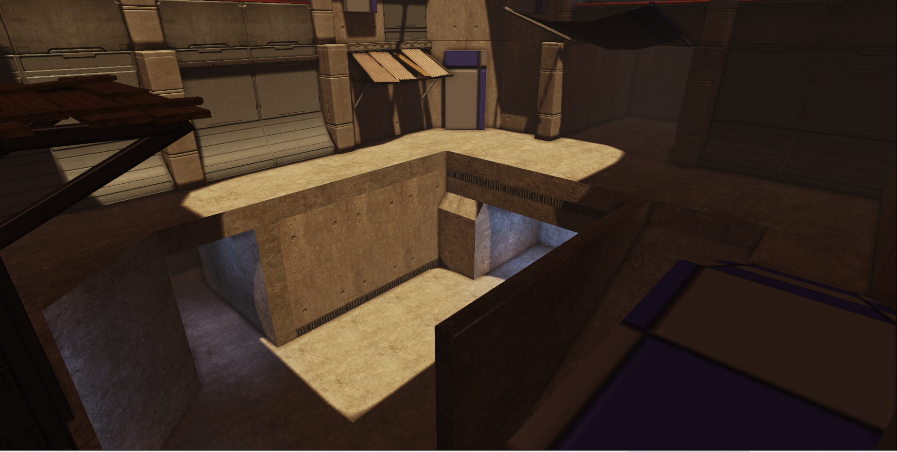
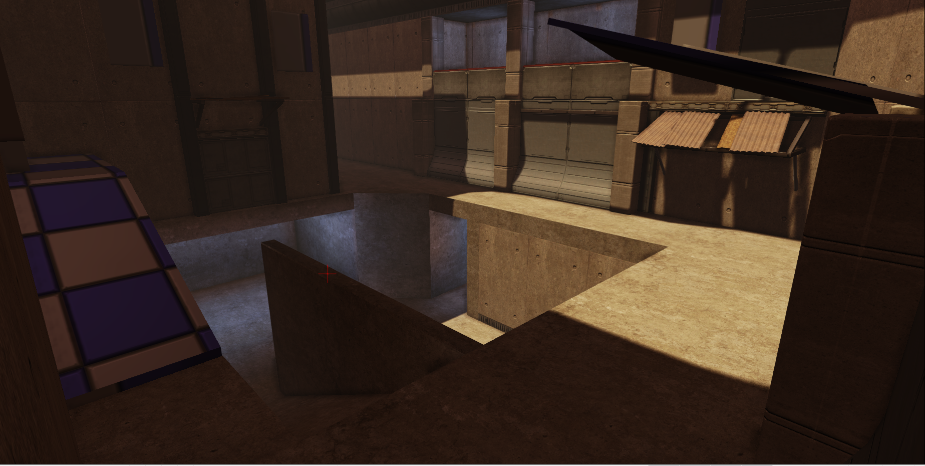


Replies
Jumping into UE4 without knowing UDK feels like skipping a step to me!
I'm on the main assets now!
Assets-wise it goes pretty well, later it can be converted to deathmatch map. Of course this is a different story because aspects like gameplay and item placement should be considered. Basically, you need to be familiar with the game or collaborate with level designer. But actual playable map makes a better piece of portfolio than just an environment, IMHO.
I don't want to take the time to do a playable level with this, I have a little project with another artist for the ''playable'' part
More wips :
The concrete is not a tiling texture, it's several concrete panels! With the future props and vertex blending I guess that it will not be obvious like it is right now!
For the ivy , I'll quote my first post
I'll do tubing and flowers/plants growing in pots, barrels, this kind of thing. The hole in the ground will be a growing zone for plants that are usefull for people living here.
For the moment it's just structural assets, there is some unique assets planed for the scene obviously.
Small update again with another view from the other side :
I'm looking forward to seeing your progression ^_^
This two weeks I'll not be at home, and I'll work on my laptop, therefore I'll mainly do the assets, it can handle UDK very well
Reminds me of AC:Black flag
(I've messed the compression for this screenshot, sorry!)
Can't wait for the week-end!
In world properties go to the lightmass settings and change the environment colour to a nice cool mid range blue and push your sun light colour a bit closer to white, plonk in a exponential height fog too
nuclearjelly : I started the scene trying to be the cleaner possible (few textures, modular stuff, everything tidy etc) but with time it started to be a little mess.
I really think switching from UDK to UE4 with a not-so-clean scene is not the best way to learn it! I want to finish this scene and start another work (PBR ready of course) from fresh!
jestersheepy : For the following screenshots I haven't touch the lightning! I will try what you said , thanks for the help
But I don't want to loose the warm lightning , I fear that a bluee-ish light will not achieve the same mood.
Thanks for the advice, I'll redo it and get back here to post after work
I'll probably see things to change and stuff to add, but it's time to move on. During the summer I haven't work on it a lot, and now I'm feeling late. I want to jump into pbr/ue4.
I've learned a good amount working on it. Even if it's through fails sometimes
I know you are done with this but something that could improve this scene a lot is a proper color pass. The geometry and textures are pretty nice, but the entire scene has only one color which makes it look very boring. You can easily compensate that by having a different lighting setup (either go for a more "white" sun or even a blue'ish night) and by desaturating the textures a bit, leaving only a few ones with the current saturation for interest.
Well done
I'll not be at home for two weeks, so no big PC with dx11 for udk on it :poly118:. I'm doing a lightning pass right now.
I'll try to counter the warm sun with more cold and blue shadows where the sun is not hiting.
Thanks for the advice
I'll post the screenshots tomorrow or the day after.
peanut Thanks , I appreciate the words
B_Korth Thank you! Haha , I'm glad too, it's satisfying to see the 1st and last screenshot of my thread. Now I need to do better for the next one :poly124:
Couple of things are still standing out for me though. The floor area with the pit doesn't make sense as a believable space. Examples:
I would expect some sort of railing, or slight curb surrounding the central pit area. Alley texture/slab concrete not believable, meaning there appears to be a two story structure built on top of a concrete slab that is only a foot thick,might be more believable if there were support beams for that structure but currently they do not exist. (referring to the last image mainly). The overgrowth seems spotty, and haphazardly placed, I would suspect if it were a naturally growing moss that it'd spread from an area and not be so spotty. Bonus points for being only being placed in shaded areas where moss tends to grow. I'd like to see more separation between your framing texture and your filled in wall textures, It all blends together pretty uniformly at the moment. You'd also gain a lot more interest varying up your wall shapes; everything pretty much is flat, no inlets or balcony's that go into the structure, or roof line variation. Your main structure silhouettes are not that interesting.
I know the style is different, but here is a possible direction....there are interesting shapes, strong building silhouettes, and varying inlets, awnings, and balcony's. Might be worth the effort, to re-work what you have and come up with a better composition.
Looks great though. Keep going.
I can see what you're talking about, good points! Too bad I didn't came across this concept haha, my fault
I don't have the scene with me for the holiday, I'm working on another asset.
I'll try to use the existings assets, adding and moving stuff following your advices. (railing, support for the cavity in the pit, placement of vegetation...)
But I don't think I'll take time to make new assets or really big changes for this scene, I really want to move on
I appreciate the advices