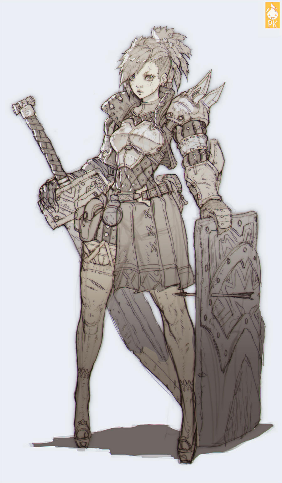
Female knight character based on Zeronis/Paul Hyun Woo Kwon concept
I'm working on a character basd on Zeronis/Paul Hyun Woo Kwon concept. His work is really great (LINK).
Concept:

The pace on this one is not to fast because of exams. I am zbrushing a bit day by day.
The main problem is to balance between this stylized style and realism. I don't have a lot of experience in creating anime style characters. I won't be going for 100% similarity since I really want to finish it and I don't want to get stuck on making things perfect. I need some crits though. I feel that I'm getting to a point where I should finalize the proportions and main shapes. I already started sculpting detail which may have been mistake. One way or another I need your opinion on main shapes so I can move forward.
Here are some orthos for proportions (I know this gradient doesn't help to check out the silhouette. Further down there is a shot which helps a bit. Further on I will stick will more readable shots than this.)

Face shot:

Way more readable shot:

Also not feeling those shoes.
Concept:

The pace on this one is not to fast because of exams. I am zbrushing a bit day by day.
The main problem is to balance between this stylized style and realism. I don't have a lot of experience in creating anime style characters. I won't be going for 100% similarity since I really want to finish it and I don't want to get stuck on making things perfect. I need some crits though. I feel that I'm getting to a point where I should finalize the proportions and main shapes. I already started sculpting detail which may have been mistake. One way or another I need your opinion on main shapes so I can move forward.
Here are some orthos for proportions (I know this gradient doesn't help to check out the silhouette. Further down there is a shot which helps a bit. Further on I will stick will more readable shots than this.)

Face shot:

Way more readable shot:

Also not feeling those shoes.
Replies
First, let's talk about the face. You've definitely got the right idea, but some of your forms and shapes are off. For a character like this, I would highly recommend you read through Hazardous' (Jon Troy Nickel) tutorials on the female face and tackling anime characters. You can find both at the following:
http://www.hazardousarts.com/Miku_Tutorial.pdf
http://www.hazardousarts.com/G_tutface.html
These should help you develop her face and really push the forms. Don't be afraid to drop down a few subdiv levels and really mess around with the move and move topo brush. Combine that with some clay buildup and you can quickly start bringing the key shapes and curves into her face.
Second, try not to leave anything behind detail wise. Try build all your clothing, armor, and accessories up at the same time. If not you can sometimes be left feeling dissatisfied with how certain things are turning out etc.
Finally, I'd double check some of the proportions you've got with her legs and other sections of the anatomy.
Great start with an excellent concept!
Like your progress on her sleeves so far. Keep going !
traistanCarter - thanks for those links.
JordanN - why heels ? coz concept ;p I want to stick to the concept. I agree those are too high though.
Welcome to the Female Character Concept Art for Games my friend
OK I normally forbid myself from giving critics to other artists' work for many reasons, but let me try. I'll be as precise as possible to save time.
- You are modelling an anime character. You don't have to be realistic too much. Let your brush flow.
- Your brows, nose and jawline are too powerful and sharp- looking. She has more of a smooth-liner for her face.
- Chest feels to large, and to accomodate that I suppose you enlarged the hip. Instead try to shrink the rib cage. Wİll save you ton of trouble.
- Neck is too tick for the face but I guess you are going to do something about that.
- Arms should look even thicker thanks to the leather armour wrapped around it.
- Well of course: eyes. The anime eyes maybe challanging for new comers. But I'll give you the best single word advice for anime eyes: "Almond" . Yep; Almond Eyes. Google it.
- As the last and the most important advice ( if I say so myself). Never forget:
She is an experienced,cocky and self-confident small girl who wraps herself in thick armour and wield oversized weapons to make herself look threatening. Whenever you find yourself questioning something fundemental about your sculpt always think about this main idea. It will guide you well.
Well if I could help I am a happy man. I hope you finish it with greatness. Good luck and odspeed mate !
yeah and i would add she's too heavily armored lol :poly142:
First time seeing those PDFs great stuff just what i need thanks
Since there is no like system. Feel like i gave you a like.
The best thing about the concept is the proportions, the face, and the cool detail he added to the armor. You should tackle each one of these things (in the order mentinoed) before moving on.
Right now the proportions need a lot of work.
Try this, make your model all black and look at the silhouette. Does it look like the concept? You could even try to draw some orthos and perhaps get some feed back on your orthos.
The thing is, your models is super wide. The concept is impossibly thin, and those forms are really cool. Check the size of the head in the concept. Its like twice as big as her waist. Check the curve created in her hips, not much curve right? Now check yours.
I hope I'm not coming off as a dick, but you have already got a lot of nice crits and I don't see this going in the right direction right now. I really want to challange you to get those forms right and not quit till you do! Keep up the good work man, do this concept justice!
[edit] I just saw your comment and that you are considering not going for the anime style with the concept. I see people do this a lot and I think its a mistake. The whole purpose of having a great concept is to use it to set the bar for what your work looks like. Can you even imagine what your character would look like if you go for a realistic version? At the very least you would need to do a mock up, either create your own concept or gather very specific references and piece them together to get a clear understanding of what you want. But again, I would say that if you are not confident making the character as it appears in the concept, then you might as well just create another character from a different concept that you feel you can actually follow thru with. You are still at the very early stages so it wouldn't be a huge loss.
No problem, but credit definitely goes to Jon Troy Nickel, who goes by Hazardous around here. He put a lot of work into those documents and other tutorials he does, all I did was merely link to them. Regardless you're welcome and I hope it helps!
On a critique note, I agree with brad that keeping the anime style is incredibly important. It's what makes the concept piece really stand out as giving the character real proportions breaks the dramatic/impossible silhouette and figure that character has. I think making the proportions similar to the concept is really going to help. I'd start by going in and redoing the head from a dynamesh sphere and really focusing on the shape and size of the head. Then start bringing in everything else stylistically like the pdfs I linked show. The Hatsune Miku one should cover most of what you need to know to nail anime style proportions for the face. Then I'd definitely start reworking the proportions on the body and slimming the waist down and really widening the shoulders. She has some crazy wide shoulders, but if you get the proportions right it'll really pop.