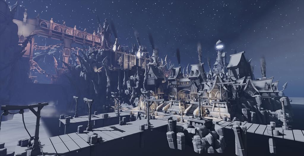
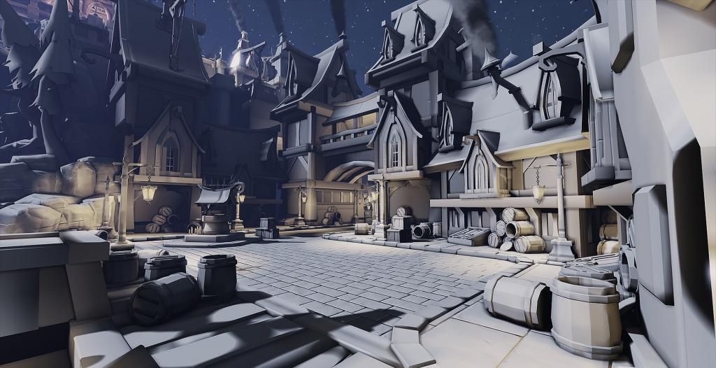
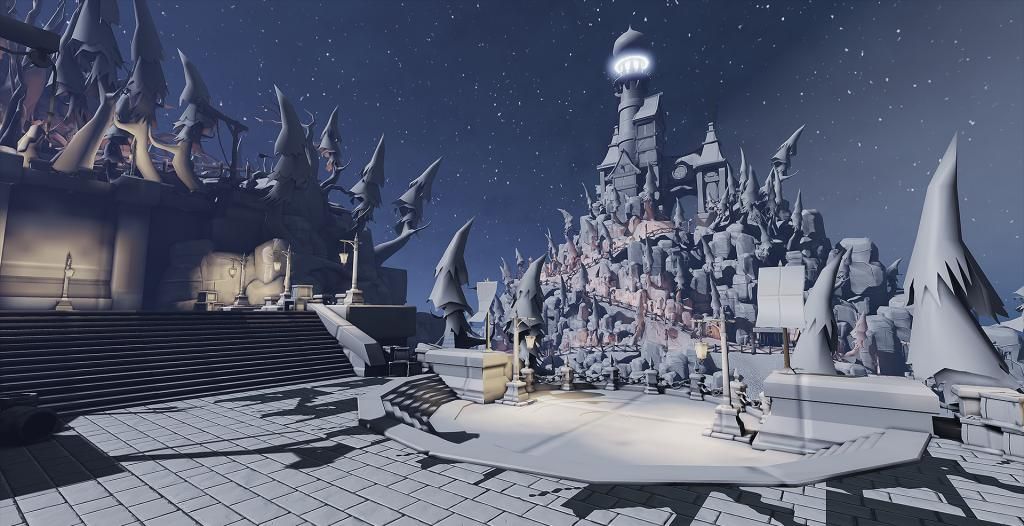
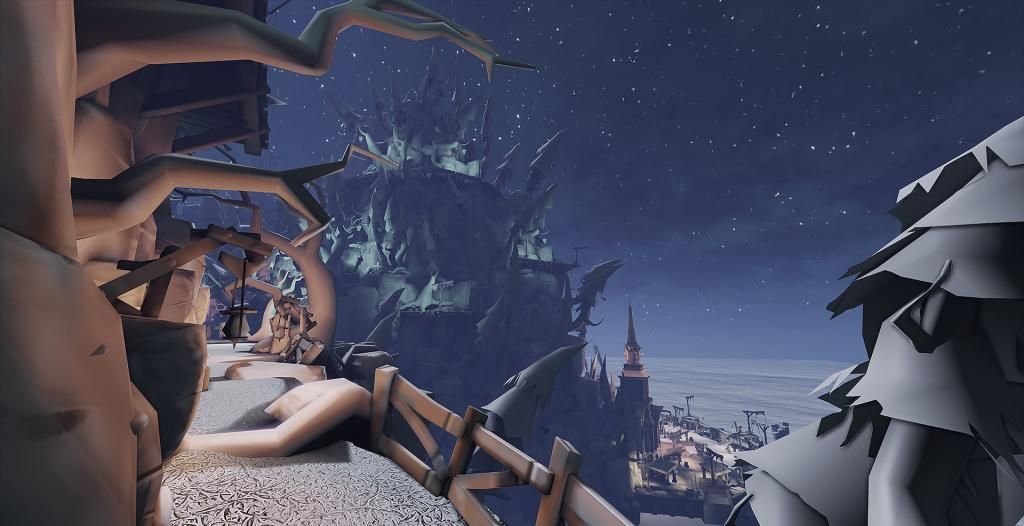
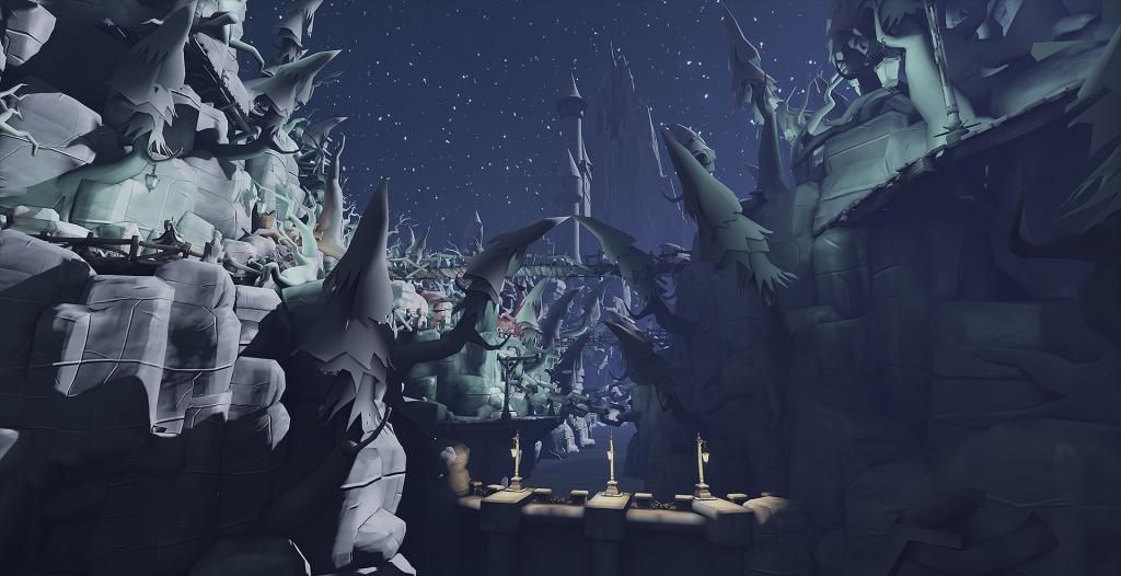
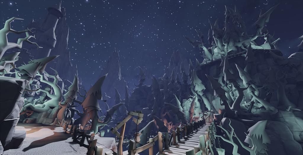
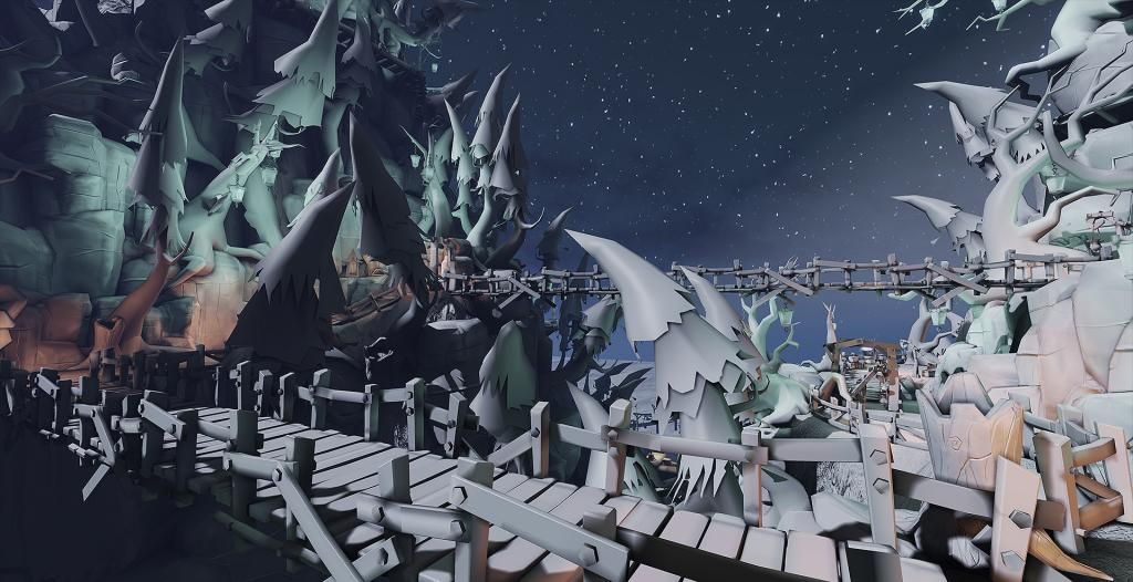
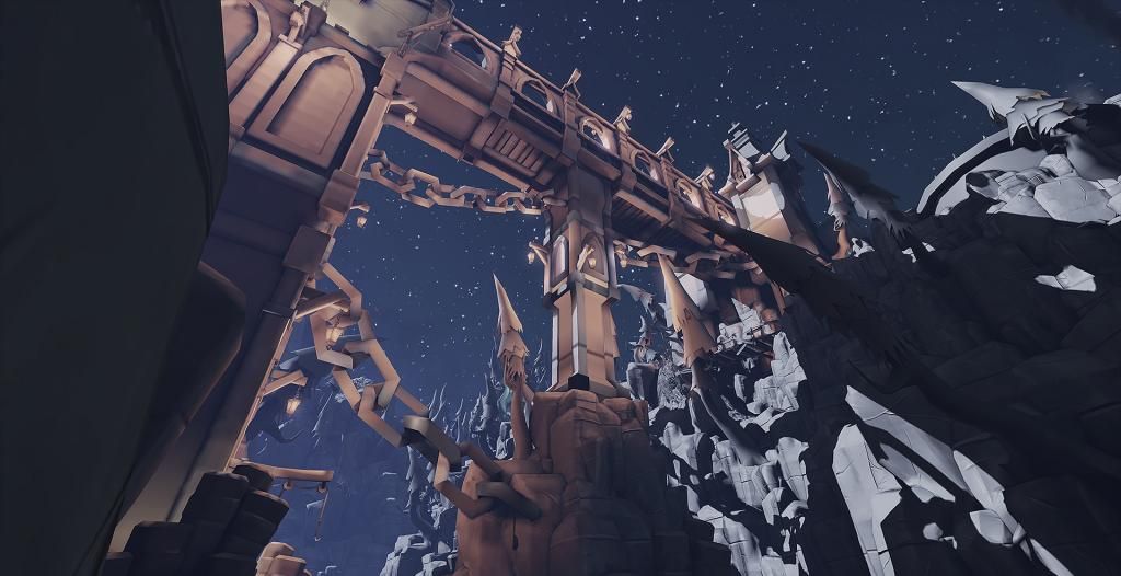
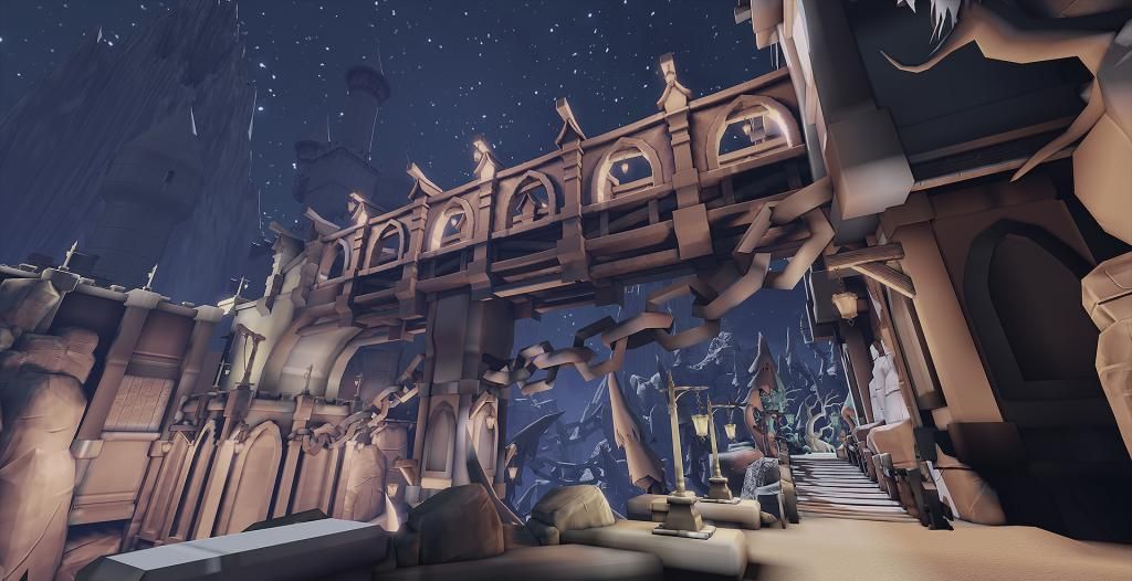
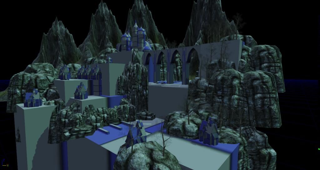
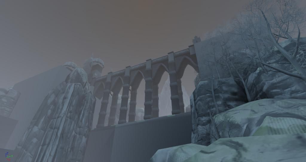
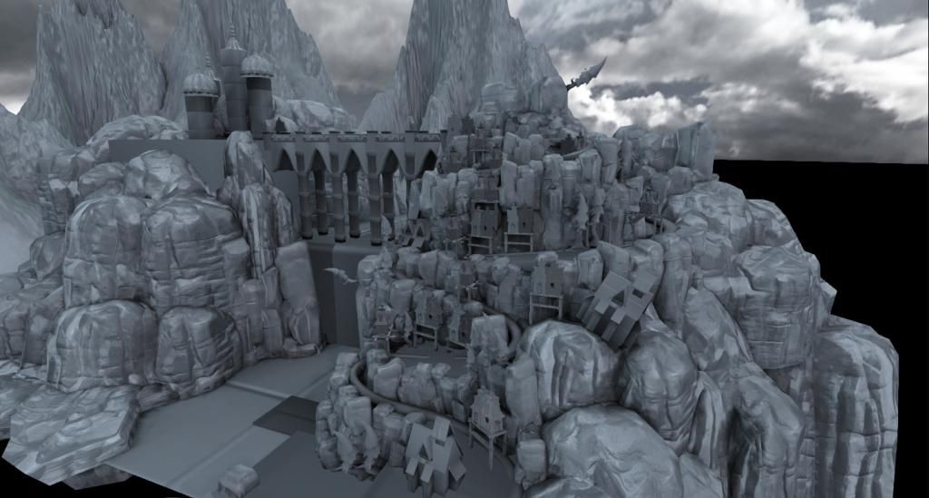
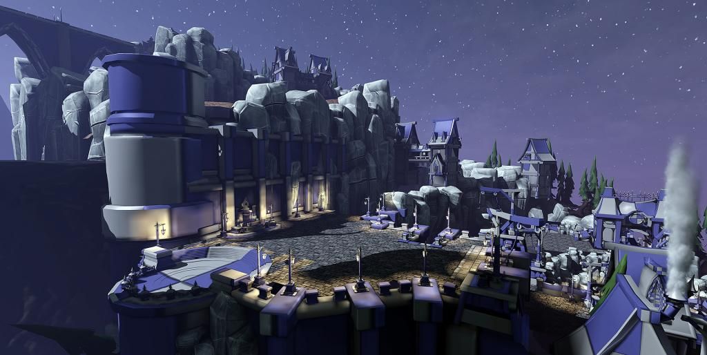
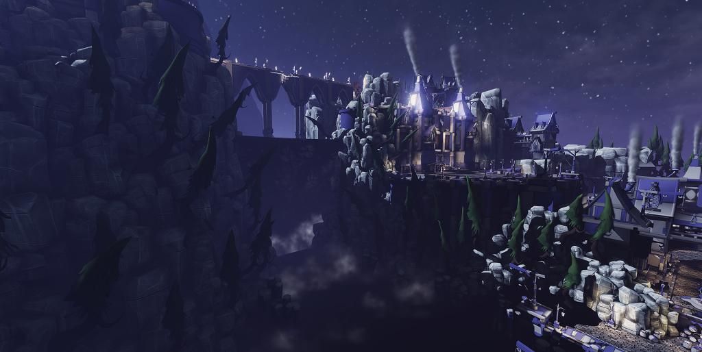
For my final school project I am creating a stylized environment inside the UDK. Right now I am still busy modeling and blocking out/placing the geometry. Main inspirations and references are taken from the Worgen environment from World of Warcraft and classic Disney movies.
I can't give you usefull critics, I'm a noob in environment art, but, I can tell you that I really like the style The silhouette of the trees works great imo. Looking forward to the texturing etc!
Damn, that is awesome! Got no critique at this point but as CougarJo said, those trees look awesome as does everything I see. Can't wait to see textures being added so Good Luck and Good Job thus far!
That is an INCREDIBLE blockout! "King's Landing" is the capital in Game of Thrones, so I was expecting something completely different based on the title.
That looks amazing! Im really enjoying the blockout. This is gonna look insane when you are through. The shapes look alot like you are mixing Howling fjord and Stormwind from WoW. I also am seeing a slight roman style with the Aqueduct-like bridge, or maybe thats just me.
That is an INCREDIBLE blockout! "King's Landing" is the capital in Game of Thrones, so I was expecting something completely different based on the title.
Great work though, I want to see more, MOAR!
Dammit, I should really start watching GOT and come up with a different name..
Thanks people, all that is really encouraging to hear.
I made a few textures back when I started. Was going for a mixture of sculpted and handpainted textures. Not sure if this is the right way to go. But I'm focusing on the blockout for now.
I think the stones look really really good!
The wood however, (is it wood?) looks like carved stone to me. I dont know if that is what it is, or if it is intentional or something. But I have difficulty knowing what it is, if that makes sense.
But I really like the stone walls
Looks pretty awesome!
It might be best to go with something less detailed for the textures though. From the shots without any textures it looks already really busy on the eyes, which might be also because of the high contrast lighting. In the textures you have a lot of small high contrast details, it is a nice crisp look but I fear it will end up too much as busy noise in the further away shots. So bigger and less wood carvings and less and bigger rock scratches should be better. Some space without any detail is also good to break it up and have something for the eyes to rest on.
I don't know if "less detailed" is necessarily the name of the game, but IO do agree that the wood looks like carved stone. It might be that the normals on the wood are too pronounced, or the color choices are just too different?
It's definitely the normals. In real wood, the grain and rings from the wood have a minimal effect on the surface of a board -- they might define wher cracks may show up, but right now it looks like somebody took a board of wood and etched the grain into a stone, then painted it. The colors aren't bad, but the normals should not reflect the grain of the wood. Also, the little spiral bits add to the feeling that it's carved in stone -- consider dropping them, and refer to some real wood to see what you might expect.
I'm surrounded by wood textures, from my desk to the doors in my room -- and while there is a place for the surface to be affected by the darker spots -- but it's going to be very subtle on normal or displacement, and more pronounced, possibly, on specularity.
What was your workflow? Did you start with concepts or a top down view of the map? I'm curious how other people go about it because I want to focus on level design.
I started very with a very "freestyle" approach which was quite a bad idea. Didn't gather enough reference and the concept was quite boring. I knew I wanted to make a town environment but that was pretty much it, so the first blockout was quite flat.
After getting some feedback from others and getting a better idea of what I wanted to make, I decided to have a more vertical level design which is a lot more interesting and there is a lot of renference in movies and games on cities built against a mountain and such.
This is a very fast blockout mainly using UDK default meshes and a few custom ones to get the idea down.
After that I thought about the player point of view and how you would reach the top of the mountain and what path you would follow.
Once I had that skeleton I could built around it. There are a lot of iterations especially for the terrain which I had to redo a few times to fit all the geometry in but it definitely helped me with the layout. I am no level designer and focus more on the aesthetics but I am trying to tell a bit of a story and make it interesting for the player to walk through.
I also planned out areas of interest and different sections and landmarks like the market place, harbour, lighthouse, bridge, cliff, forest and so on for the player to get a better sense of orientation. A lot of structures can be seen from far away because they are that tall/big.
Hope that explains my thinking process a bit.
Thanks for the wood texture feedback. It's true it does look a bit like a stone carving. Will give that another shot after I completed more of the blockout. Currently UVing a few remaining models, but I almost got everything UVd.
Tried wood again with the tree this time, because that is probably the most used object in the level right now. Still need to make a few variations. Maybe I shouldn't sculpt the wood or textures in general and tone it down a bit? I am a bit afraid that there might be too much going on on the screen as you all said. I'm currently using a mix of sculpting and hand painting.
Got everything UV'd right now and I am cleaning up the scene and start adding textures.
Seem to be missing some of the lightsources for those lights, overall still looking quite good! The grave, second from the right here
Seems to have some lighting artifacts? A lot of them seem too, maybe it'll be less noticeable when textured, but right now some compression/low resolution artifact seems to be marring what I assume to be ambient oclussion/GI baking.
At the moment there are to much black shadow areas for my taste.
Here for example:
Due to the many small black areas everything seems kinda chaotic and a little dirty. Maybe you should improve the lighting a little to make it a liiittle more even, so that the shadow are still dark but have a little more informations and aren't that black.
Some updates on the Graveyard area which is on top of the right mountain. Trying a spooky/cold mood here. Overgrown parts and different height levels with a few dead ends invite the player to look around a bit. It's still pretty obvious where you need to go (just follow the paved road).
Thanks for the feedback so far! I will work on the lighting, because those pure black shadows annoy me as well. The light artifacts come from the light map resolutions I think. I need to increase those to fix it. Could also be that all the screenshots are taken with preview lighting and therefore the quality is lower. Need to make some tests. Correct me if I'm wrong or there is a better solution for this.
The way the ground texture blends from brick to dirt looks bad. Use an alpha to get a nicer blend. Eat3D has nice tutorial on this if you haven't done it before. http://eat3d.com/free/vertex_painting
Ok I am finally digging this out again, because I have now time to finish this over the coming months for my graduation. Was kinda busy for a whole while with an internship so there were no updates. I am going to post more frequenly from now on.
I decided to move this environment to UE4, mainly to get a little more familiar with the engine.
I started with the harbour area by mostly adding textures, refining some models and build a better modular system.
Looking fantastic!Looks so much better in UE4 too, so it was definitely worth it. How did you manage to move the project from UDK to UE4? Did you just have to re-place the meshes and remake the materials?
@ReneFisher As far as I know there is no easy way to port the UDK work to UE4 so I had to reimport everything and make new materials etc. But this way I can improve some areas and I am quite happy where this is going with UE4 and I think it is going to be worth it.
This is superb on all possible levels man! Really awesome work!
Would love to leave some constructive crits here but I personally can't find anything to crit...all I see a fantastic environment really coming together! Keep at it! I'm super keen to see how this turns out!
here's some more progress.
Mainly adding more areas to the environment, texture work and switching out some old models. I stick to my old layout but tweak it here and there to make it more interesting.
It's quite busy in areas and some textures are still quite noisy. I am working on reducing that so the eye has some time to rest.
A lot happened since I posted the last time. Replaced and polished a lot of the models and textures, worked on the lighting, world building and worked on the look and feel of the scene. These screens are mainly from the market area which at the moment is the furthest in sense of completion. I am planning to bring all areas to a similar state and then give the whole thing a final polish pass.
Replies
Great work though, I want to see more, MOAR!
Great job and MOAR PLZ.
love the newest shots. the ones further away seem kind of messy but I'm sure you'll make some focus spots once the texturing/final lighting starts
nice work
Dammit, I should really start watching GOT and come up with a different name..
Thanks people, all that is really encouraging to hear.
I made a few textures back when I started. Was going for a mixture of sculpted and handpainted textures. Not sure if this is the right way to go. But I'm focusing on the blockout for now.
The wood however, (is it wood?) looks like carved stone to me. I dont know if that is what it is, or if it is intentional or something. But I have difficulty knowing what it is, if that makes sense.
But I really like the stone walls
It might be best to go with something less detailed for the textures though. From the shots without any textures it looks already really busy on the eyes, which might be also because of the high contrast lighting. In the textures you have a lot of small high contrast details, it is a nice crisp look but I fear it will end up too much as busy noise in the further away shots. So bigger and less wood carvings and less and bigger rock scratches should be better. Some space without any detail is also good to break it up and have something for the eyes to rest on.
subbed.
I don't know if "less detailed" is necessarily the name of the game, but IO do agree that the wood looks like carved stone. It might be that the normals on the wood are too pronounced, or the color choices are just too different?
It's definitely the normals. In real wood, the grain and rings from the wood have a minimal effect on the surface of a board -- they might define wher cracks may show up, but right now it looks like somebody took a board of wood and etched the grain into a stone, then painted it. The colors aren't bad, but the normals should not reflect the grain of the wood. Also, the little spiral bits add to the feeling that it's carved in stone -- consider dropping them, and refer to some real wood to see what you might expect.
I'm surrounded by wood textures, from my desk to the doors in my room -- and while there is a place for the surface to be affected by the darker spots -- but it's going to be very subtle on normal or displacement, and more pronounced, possibly, on specularity.
I started very with a very "freestyle" approach which was quite a bad idea. Didn't gather enough reference and the concept was quite boring. I knew I wanted to make a town environment but that was pretty much it, so the first blockout was quite flat.
After getting some feedback from others and getting a better idea of what I wanted to make, I decided to have a more vertical level design which is a lot more interesting and there is a lot of renference in movies and games on cities built against a mountain and such.
This is a very fast blockout mainly using UDK default meshes and a few custom ones to get the idea down.
After that I thought about the player point of view and how you would reach the top of the mountain and what path you would follow.
Once I had that skeleton I could built around it. There are a lot of iterations especially for the terrain which I had to redo a few times to fit all the geometry in but it definitely helped me with the layout. I am no level designer and focus more on the aesthetics but I am trying to tell a bit of a story and make it interesting for the player to walk through.
I also planned out areas of interest and different sections and landmarks like the market place, harbour, lighthouse, bridge, cliff, forest and so on for the player to get a better sense of orientation. A lot of structures can be seen from far away because they are that tall/big.
Hope that explains my thinking process a bit.
Thanks for the wood texture feedback. It's true it does look a bit like a stone carving. Will give that another shot after I completed more of the blockout. Currently UVing a few remaining models, but I almost got everything UVd.
Got everything UV'd right now and I am cleaning up the scene and start adding textures.
Seems to have some lighting artifacts? A lot of them seem too, maybe it'll be less noticeable when textured, but right now some compression/low resolution artifact seems to be marring what I assume to be ambient oclussion/GI baking.
Love the trees by the way!
Here for example:
Due to the many small black areas everything seems kinda chaotic and a little dirty. Maybe you should improve the lighting a little to make it a liiittle more even, so that the shadow are still dark but have a little more informations and aren't that black.
Thanks for the feedback so far! I will work on the lighting, because those pure black shadows annoy me as well. The light artifacts come from the light map resolutions I think. I need to increase those to fix it. Could also be that all the screenshots are taken with preview lighting and therefore the quality is lower. Need to make some tests. Correct me if I'm wrong or there is a better solution for this.
http://eat3d.com/free/vertex_painting
Ok I am finally digging this out again, because I have now time to finish this over the coming months for my graduation. Was kinda busy for a whole while with an internship so there were no updates. I am going to post more frequenly from now on.
I decided to move this environment to UE4, mainly to get a little more familiar with the engine.
I started with the harbour area by mostly adding textures, refining some models and build a better modular system.
also how do I change the name of the thread?
Once I subscribed to this thread. Im very pleased to see new screens.
About work: Its dammmm good Really pleases my eyes. Great work.
Would love to leave some constructive crits here but I personally can't find anything to crit...all I see a fantastic environment really coming together! Keep at it! I'm super keen to see how this turns out!
Mainly adding more areas to the environment, texture work and switching out some old models. I stick to my old layout but tweak it here and there to make it more interesting.
It's quite busy in areas and some textures are still quite noisy. I am working on reducing that so the eye has some time to rest.