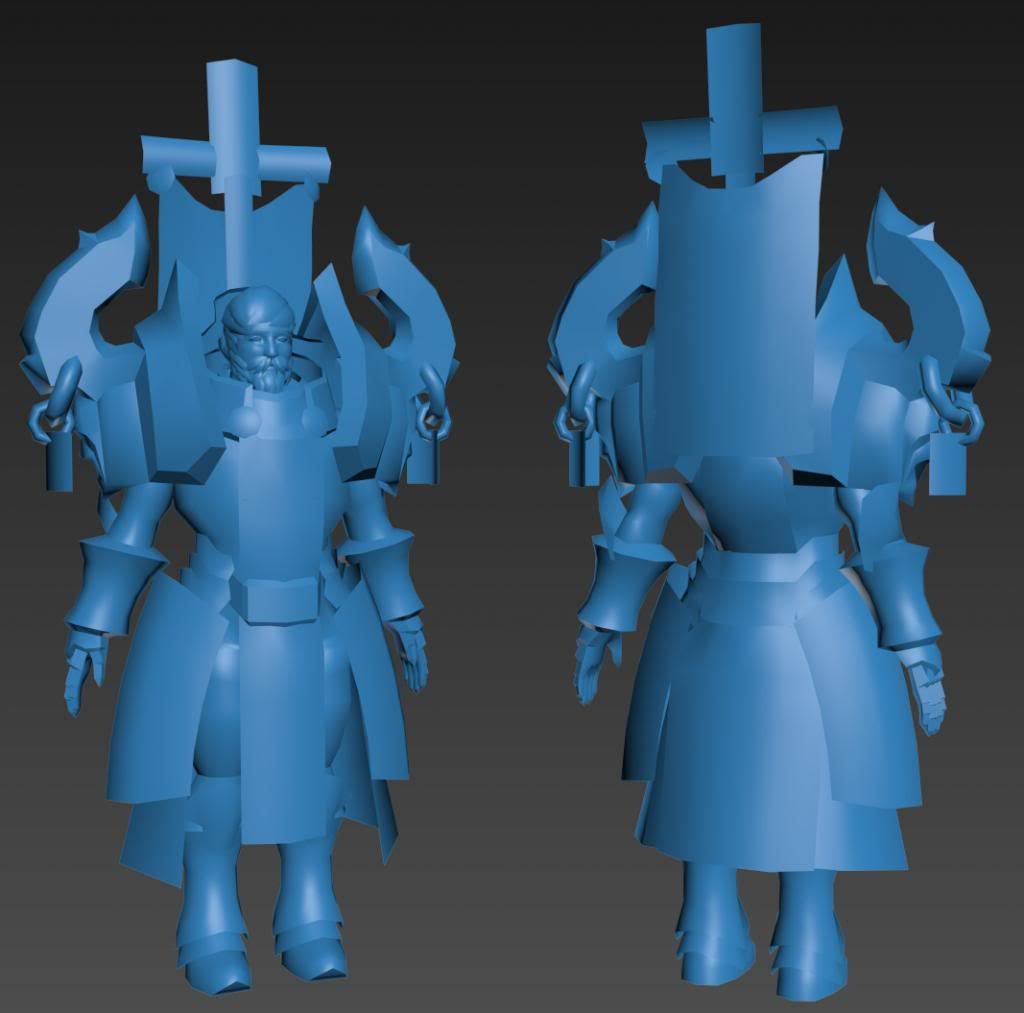
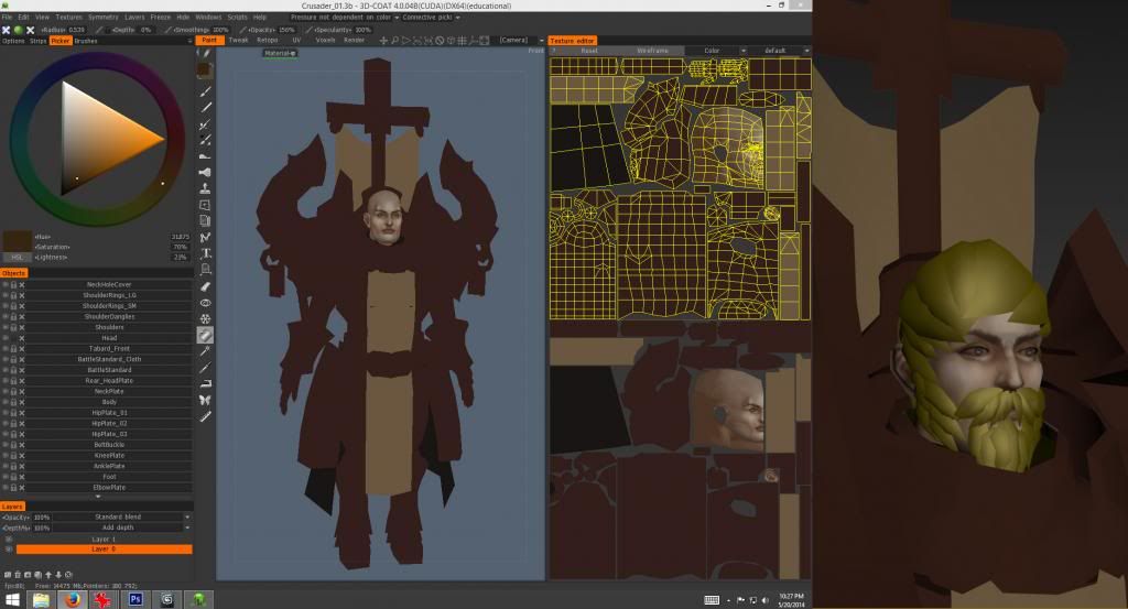
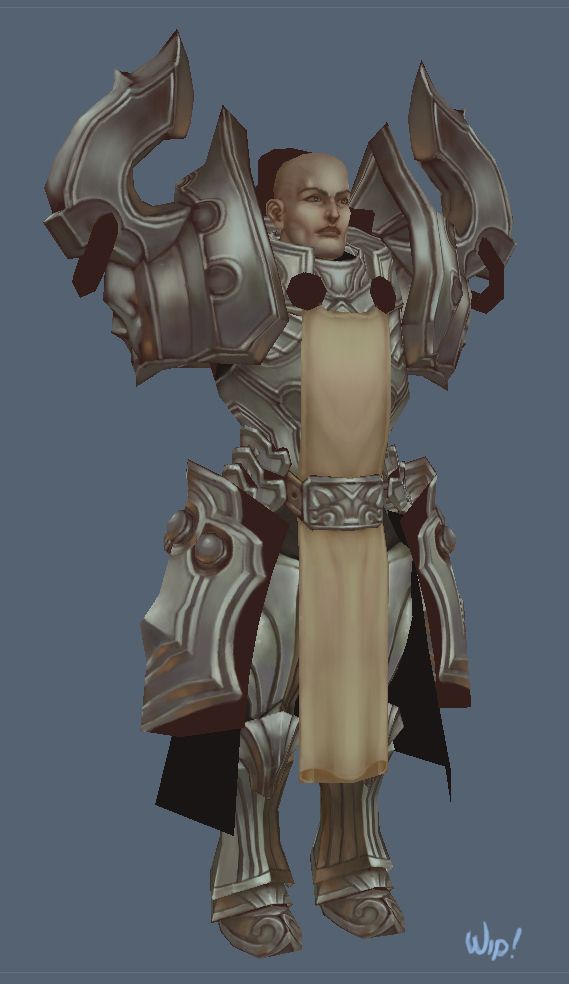
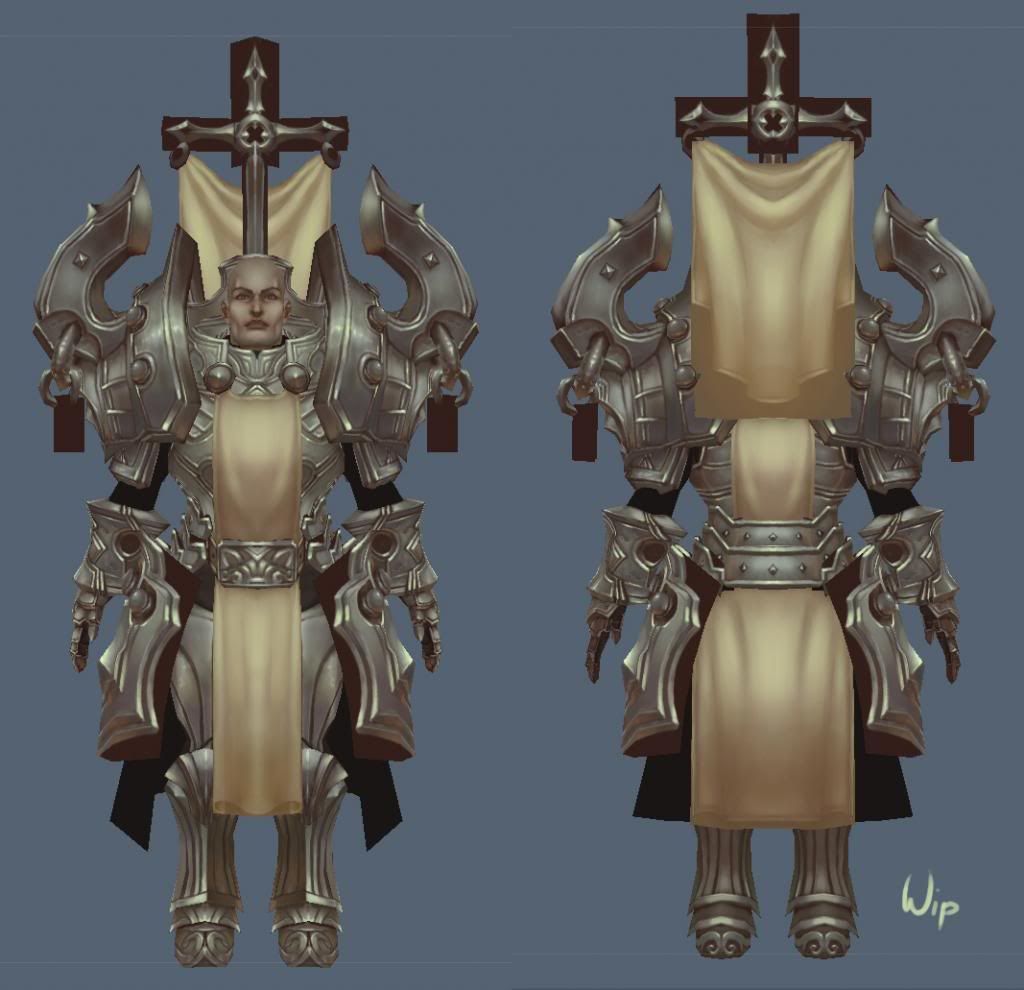
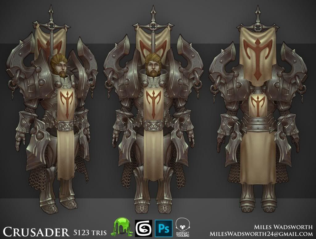
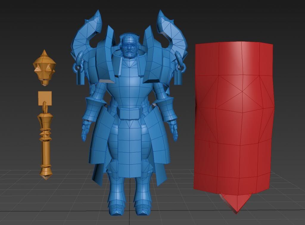
Hey gents.. been working hard on some hand painted goodness. My crusader about 99.9% where I want him-- if I find something to nitpick at, I'll put more time into it, but at this point I'm calling him done. Here are some process pics, as well as a link to a live stream I did a few days ago to show some process work.. it's a bit long, but just be sure to skip to about 6:30 or so, as I was setting up my sound and mic. Hope you enjoy as much as I did working on him-- I have weapons in progress too, all modeled already and unwrapped. and I will rig and pose and make a nice illustration for him, as well as a few other model sheets-- show my wires and stuff.. cheers!
yeah man thanks!-- yep all diffuse-- 1024 map-- yeah I've been balancing the contrast with the over all lighting of the guy-- I see what ur sayin tho-- some of the edges could be a bit close in value..
Looks good. Face could use some love. The skin tone looks very monotone and very dead at the moment. The armor could also use some refinement. As someone suggested, value variation will help but I think adding some more subtle colors would be nice too. Still nice job so far. A nice facial expression and pose will really sell this in the end.
Looks amazing! Loving the silhouette and the shapes.
I agree the face does look monotone, I feel like this guy is sick with something when i see his face.
Cant wait to see what you do with the weapon and shield.
Okey doke-- took some time to make some adjustments and play with some color variations.. bumped up my contrast and put some more color into the face-- you guys were right.. made a whole lot of a difference.. must have been staring at this thing too long
wow nicely done! i think the middle one is my favourite - 'cyan' but i do think you need to blend the beard/burns into his face, right now it looks like yellow leaves are sitting on his chin
I think a bit of subtle colour variation to help seperate forms would help though, such as the blades on the pauldrons from the rest of the piece, and the forearms from the legs (they kinda bleed together in that pose).
This is a great model and texture, However to me this does not say Diablo to me. It looks a lot more like a WOW character. I think that is to do with the proportions. The lower half from the belt down seems very short making it look a bit cartoony. Where as the Diablo characters are a lot more heroic. Here is a quick comparison.
non the less the texture and model looks great. But as an Avid Diablo player i'm not sure i would be happy with this character in my Diablo world despite it's beauty.
thanks so much for the crits you guys they really help--
UltraLrod-- I totally get ya man-- a shaved head or even a short fohawk might be more apt as he's clergy, so to speak-- there's tons of room for hair styles for sure, but bald probably the most as this speaks soldier a lot more..
Gilmore! good to hear from you too man I totally get ya. I went a more painterly approach to the look of my guy-- totally feels more WoW for sure.. it's been more of a practice in that respect than anything else.. I already have a plan to re-make this same guy again, but w/ next gen speks, I could also do it again a third time to really try to capture the diablo essence.. and I'd make him even lower poly than he is now.. probably should have been my intent from the start, but I got carried away w/ this look to stretch this muscle more.. it'll be a nice long personal project for sure. Thanks for stopping in man-- you still in Austin?
Looking hot Miles! You're doing some killer work man. Keep it up!
Only gripe with this is the lack of rest area. It's a lot of detail. I'm not sure where to look at first and it doesn't stop. Be nice to figure out how to keep the focus areas confined.
Also this dude looks like he just dropped a couple $$$ at the armor shop. I imagine this rich kid just rolling in with like 10k in gold and getting the uber armor and barely being able to stand as he walks out of the store. Needs battle damage otherwise!
Hey folks.. had some time before bed to crank on this dude some more. Color adjustments, lighting adjustments, and a proportion change.. trying to get him to look more heroic than he was. totally loving this
looks beautiful!
interesting choice of hairstyle ^^
love the textures, the shoulder pads look really neat.
I personally feel his shoes are off in terms of design, looks a bit like an armor piece belonging to some other set. But maybe it just me.
Replies
I think some contrast in texture will make this look sharper, especially on the armors.
Now I wanna try handpainted on the next piece ! (will probably fail at it though)
Impressive!
I agree the face does look monotone, I feel like this guy is sick with something when i see his face.
Cant wait to see what you do with the weapon and shield.
I like the last 2 most, but almost all of them are pretty nice.
Great work - can't wait to see him posed !!
Xaragoth -- yeah man for sure-- still tho, I think it's more impressive that they keep their meshes and mats as low as they do.. efficiency kings
Mr Smo -- yeah man I'll get a pass on those and blend them up-- thanks for catching that.
Pior! gotta keep that old school spirit alive, right?
Well they are, like D3... lol.
I think a bit of subtle colour variation to help seperate forms would help though, such as the blades on the pauldrons from the rest of the piece, and the forearms from the legs (they kinda bleed together in that pose).
Long time no see.
This is a great model and texture, However to me this does not say Diablo to me. It looks a lot more like a WOW character. I think that is to do with the proportions. The lower half from the belt down seems very short making it look a bit cartoony. Where as the Diablo characters are a lot more heroic. Here is a quick comparison.
non the less the texture and model looks great. But as an Avid Diablo player i'm not sure i would be happy with this character in my Diablo world despite it's beauty.
UltraLrod-- I totally get ya man-- a shaved head or even a short fohawk might be more apt as he's clergy, so to speak-- there's tons of room for hair styles for sure, but bald probably the most as this speaks soldier a lot more..
Gilmore! good to hear from you too man I totally get ya. I went a more painterly approach to the look of my guy-- totally feels more WoW for sure.. it's been more of a practice in that respect than anything else.. I already have a plan to re-make this same guy again, but w/ next gen speks, I could also do it again a third time to really try to capture the diablo essence.. and I'd make him even lower poly than he is now.. probably should have been my intent from the start, but I got carried away w/ this look to stretch this muscle more.. it'll be a nice long personal project for sure. Thanks for stopping in man-- you still in Austin?
No i am no longer in Austin, still in Texas tho.
keep up the great work man, you have come along way since the FCB days ha.
Only gripe with this is the lack of rest area. It's a lot of detail. I'm not sure where to look at first and it doesn't stop. Be nice to figure out how to keep the focus areas confined.
Also this dude looks like he just dropped a couple $$$ at the armor shop. I imagine this rich kid just rolling in with like 10k in gold and getting the uber armor and barely being able to stand as he walks out of the store. Needs battle damage otherwise!
Keep it up !
Cremuss-- yeah for sure, the hair will definitely be reworked. hehe
interesting choice of hairstyle ^^
love the textures, the shoulder pads look really neat.
I personally feel his shoes are off in terms of design, looks a bit like an armor piece belonging to some other set. But maybe it just me.