Home 3D Art Showcase & Critiques

Hand-painted Goblin Character

polycounter lvl 4
Offline / Send Message
Old Wither polycounter lvl 4
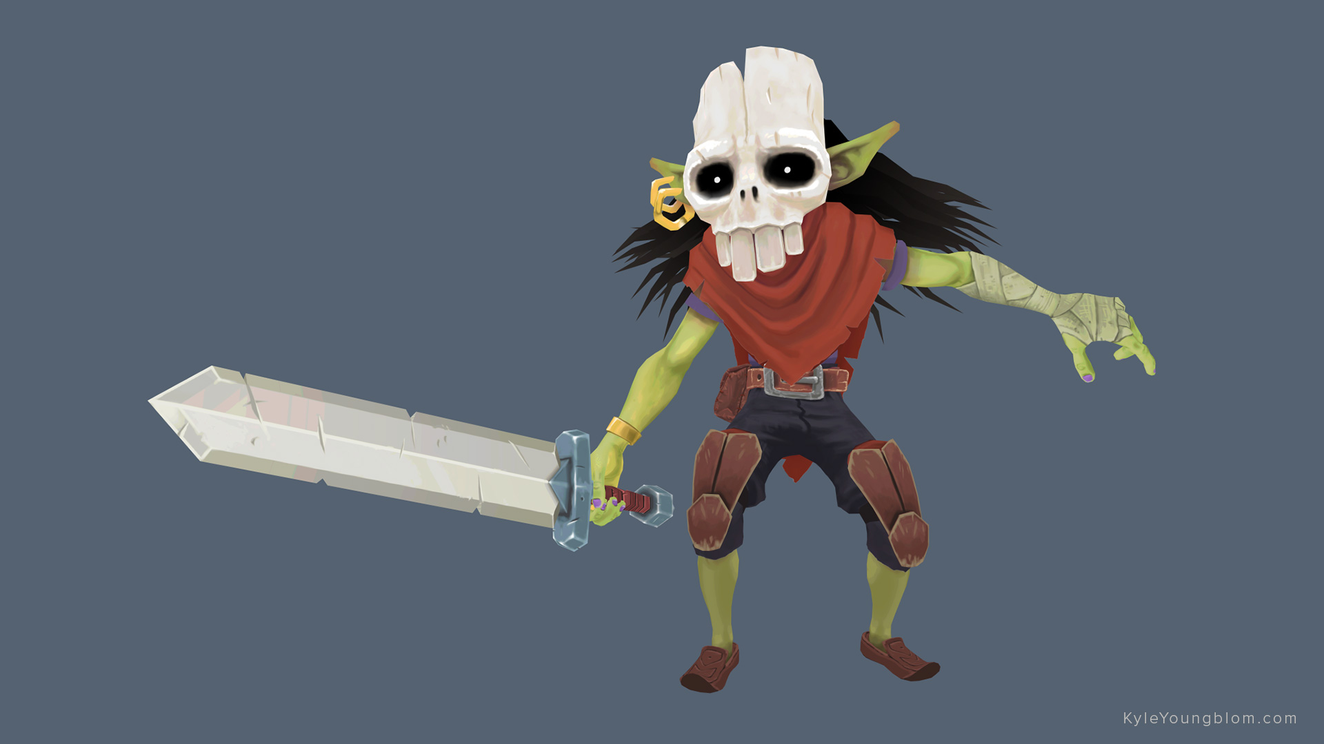
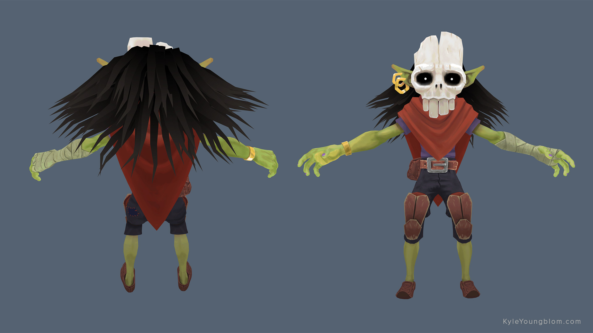
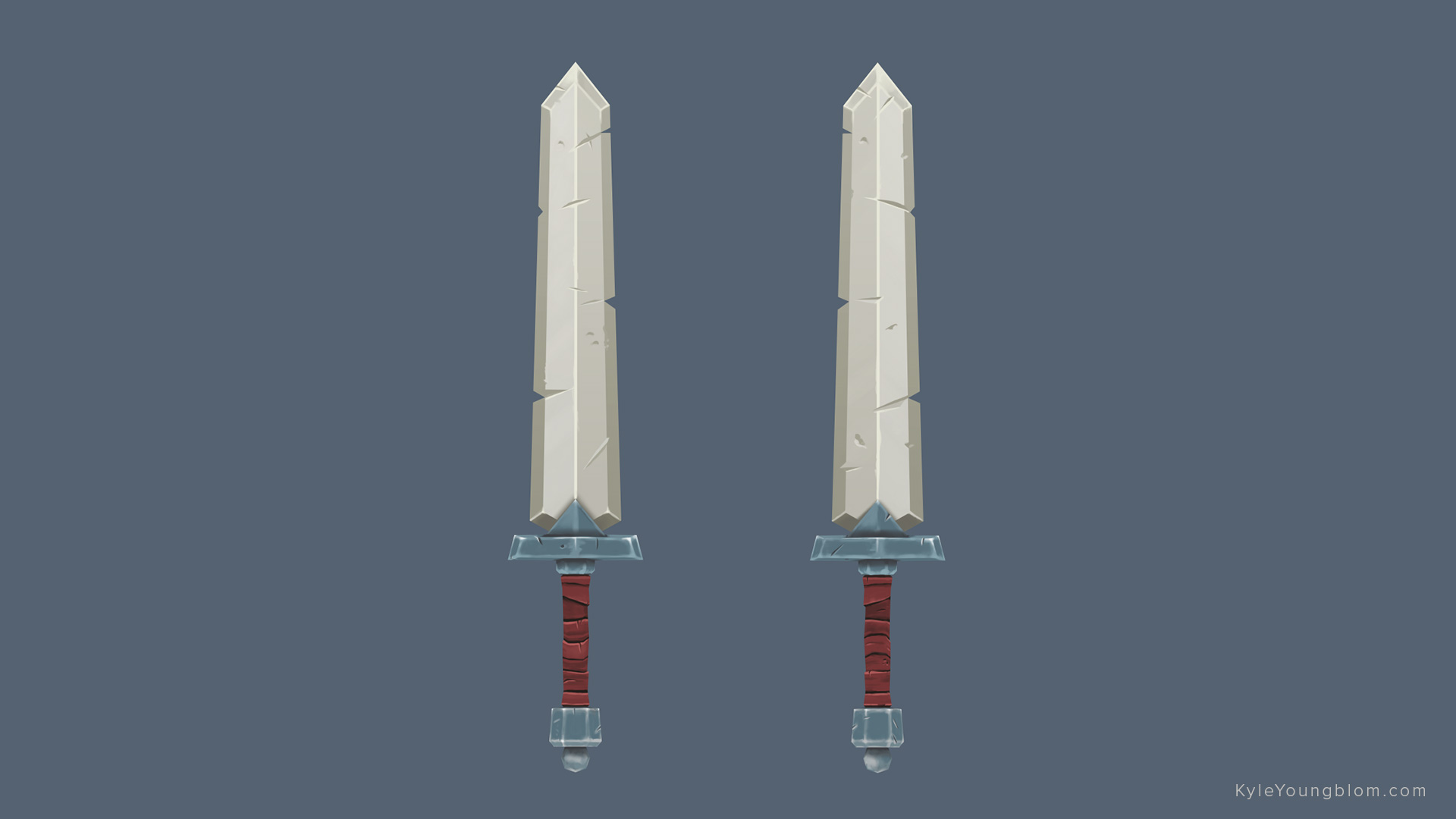
Hi Everyone! I've been working on this character on-and-off for a while and getting ready to call it done and move on to another project. I'd love to get some feedback on things I can do to improve. This is the first time I've painted textures in this style, and it was definitely a learning experience. I realize there are some z-sorting issues with the alpha map. Thanks for taking a look!

5zyPxDpL91.jpg

foGqYfVWib.jpg

Pros6dNSAs.jpg

Replies

  • Obscura
    Offline / Send Message
    Obscura grand marshal polycounter
    Could you show wires/textures? The z-sorting thing confused me. I thought it doesn't use alpha. Looking cool by the way, maybe it could use a bit more contrast/darker values in the shadowed areas.
  • Old Wither
    Offline / Send Message
    Old Wither polycounter lvl 4
    Thanks for the feedback on the contrast, I'll take a pass at that. Looks like the front/back shot I posted didn't include the alpha channel, sorry about that.

    I definitely could have been more efficient with my modeling. I started this character a long time ago, dropped it, and picked it up recently, and along the way I kind of lost track of what my goals were in terms of style and specs. I actually brought it into Zbrush and started sculpting and applying realistic PBR textures and details before realizing how silly that was and starting over hand-painting things. Wires/texture:

    p4pPCm0bDC.jpg

    FSwj-bNXrx.jpg
  • Gazu
    Offline / Send Message
    Gazu polycounter lvl 12
    Nice man!
    Remembers me on Zelda Wind Waker ^^
  • Obscura
    Offline / Send Message
    Obscura grand marshal polycounter
    Well. You could've done the tears on the cape with geometry cotuouts, so you wouldn't need alpha anymore.It would be a cheaper solution.The char already use enough poly to be good for doing that. Those tears are "straight" so geometry cutout would work the same good in my opinion. You could probably remove a few edgeloops. On the fingers for example, and on the snap of the belt, but maybe there are other areas too. The texture has nice style, but I'f still recommend more contrast, and maybe more surface definition/detail. The amount of the detail is a bit unbalanced in my opinion. Like the belt looks really nice on your tex, and the cape, and some other pieces looks like they are still under the first pass.
Sign In or Register to comment.