[Watch Dogs]Art dump
Hi all,
Watch Dogs was just officialy released today, and I thought I could share the work I done at ubisoft on the game ! You can find all of this on my portfolio here http://alexandrestroukoff.blogspot.fr/p/watchdogs.html
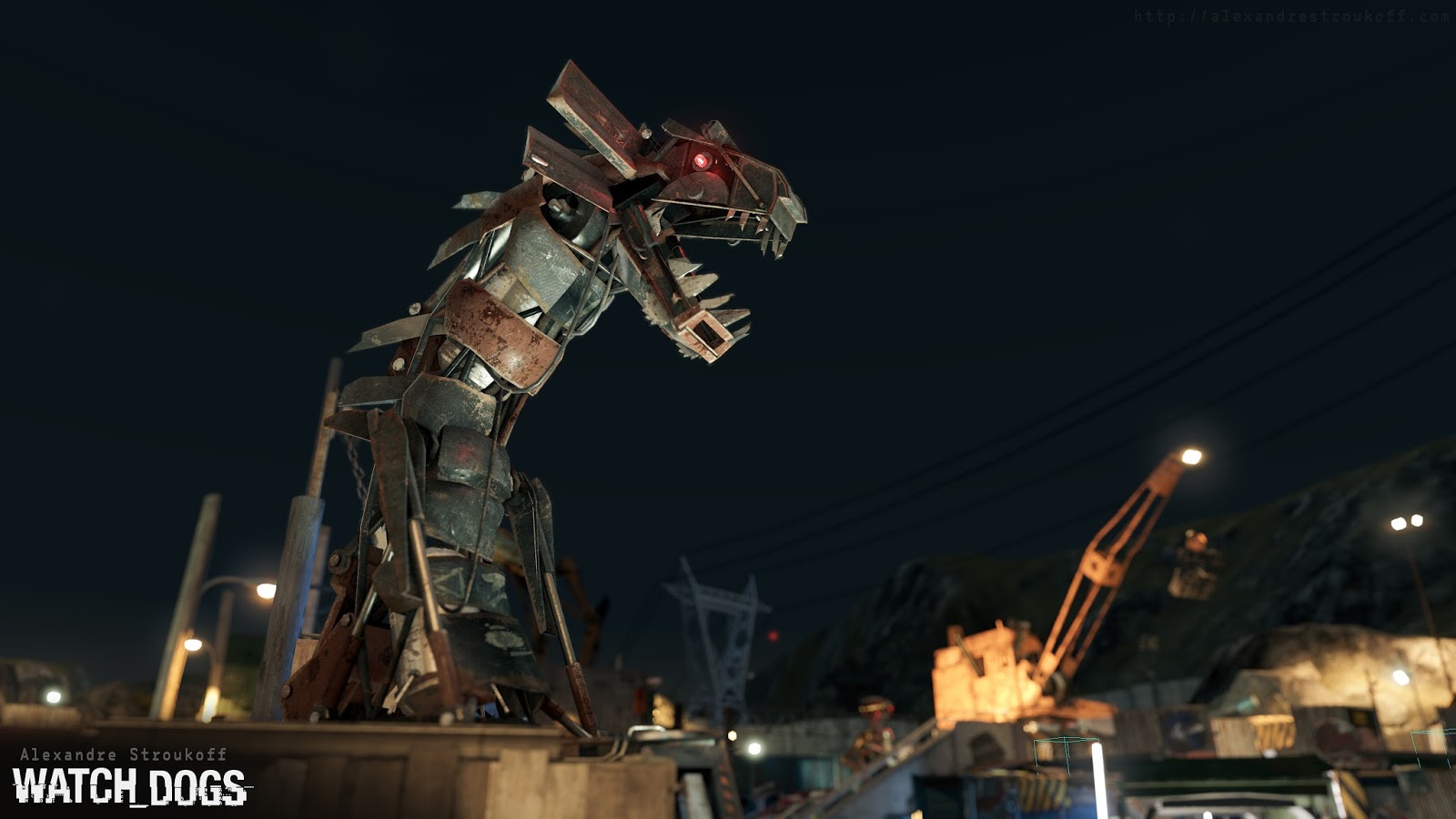
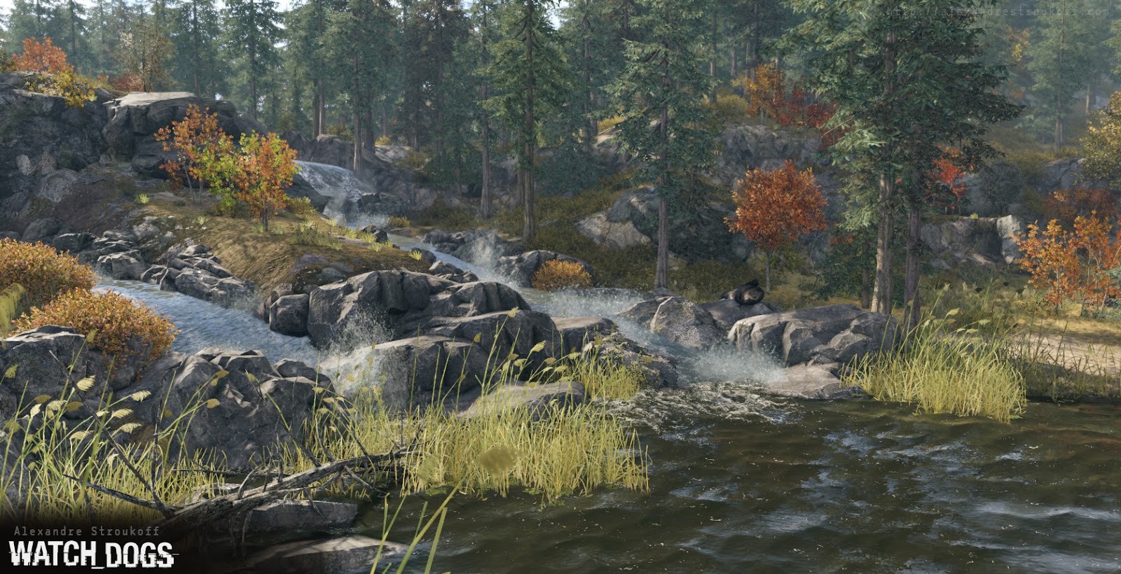
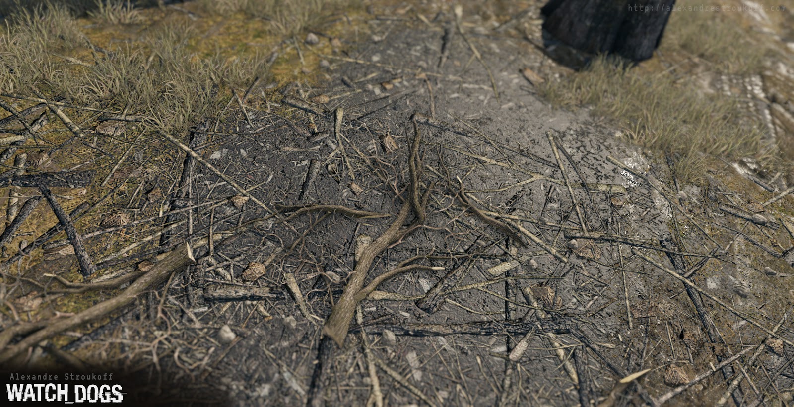
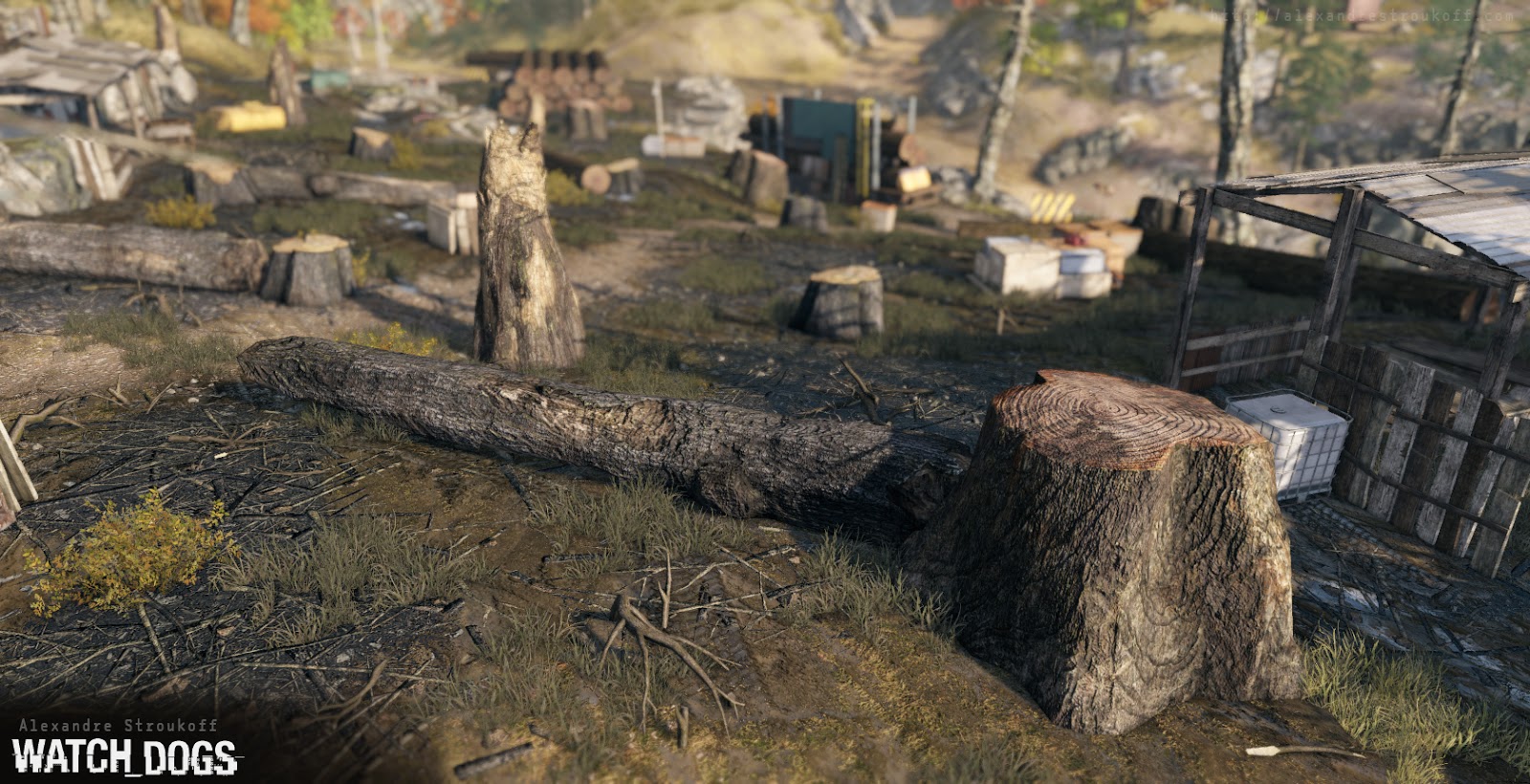
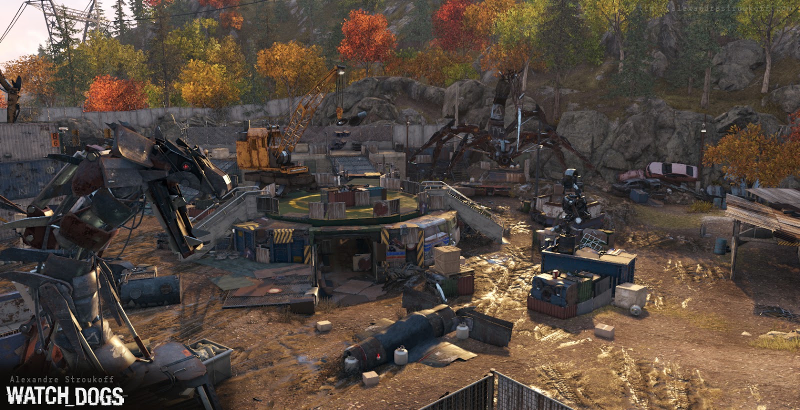
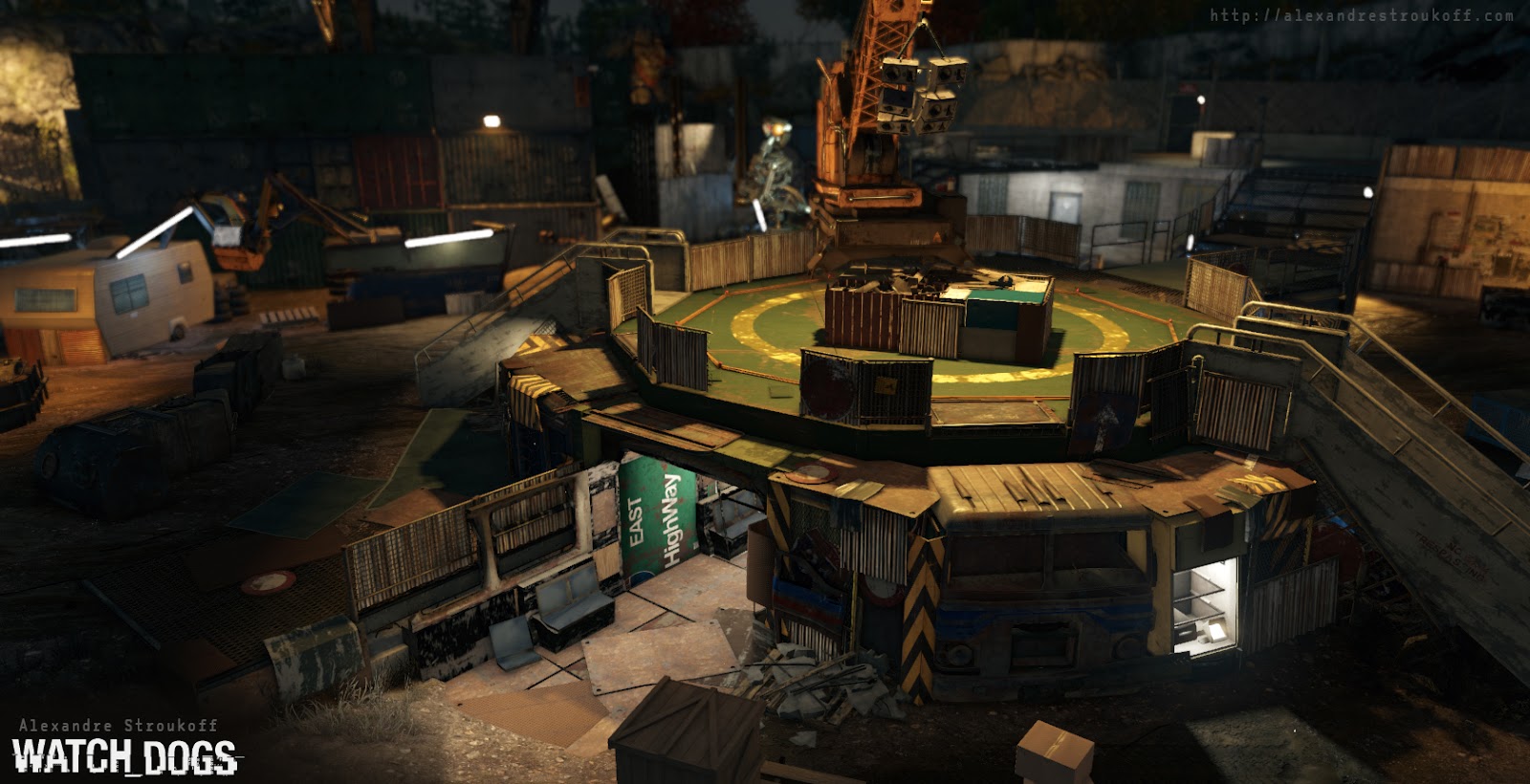
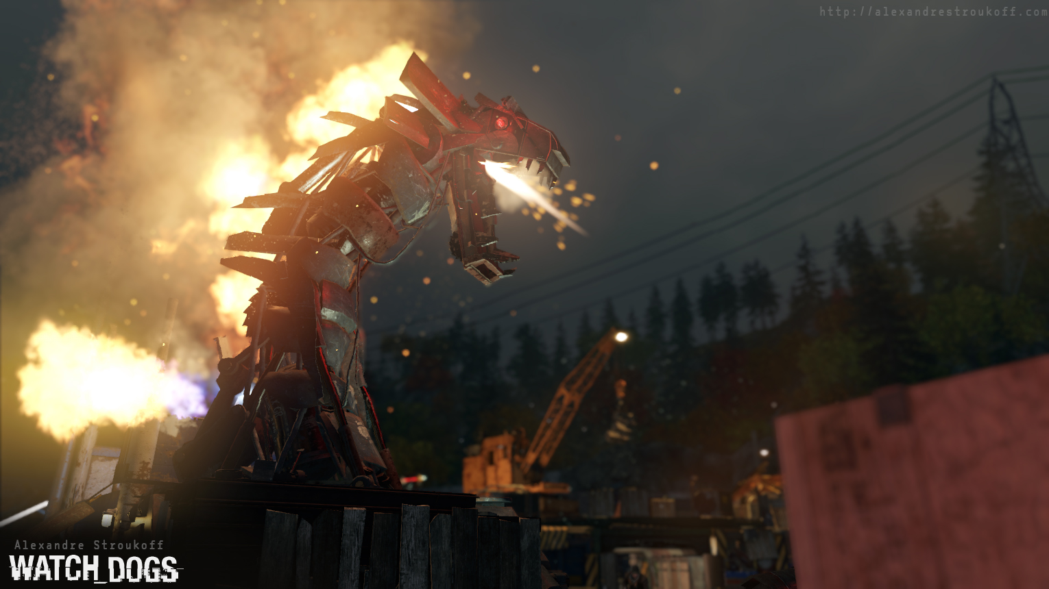
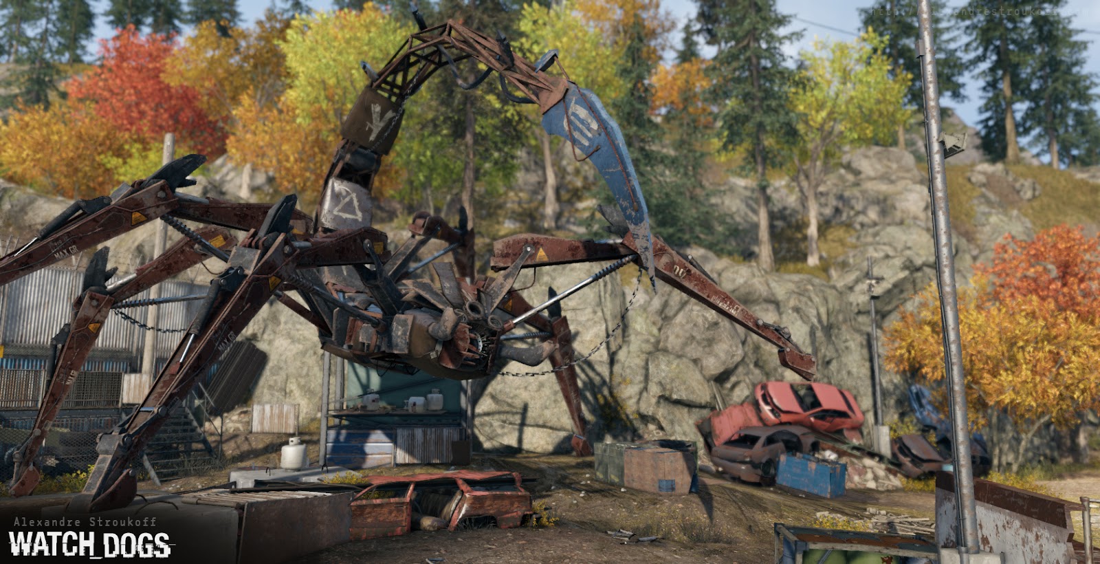
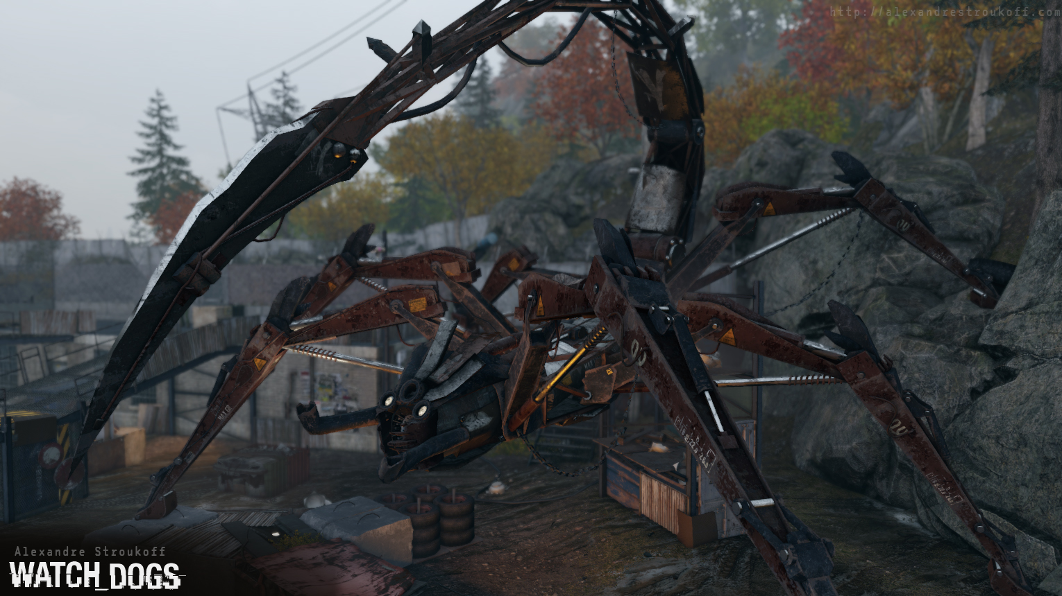
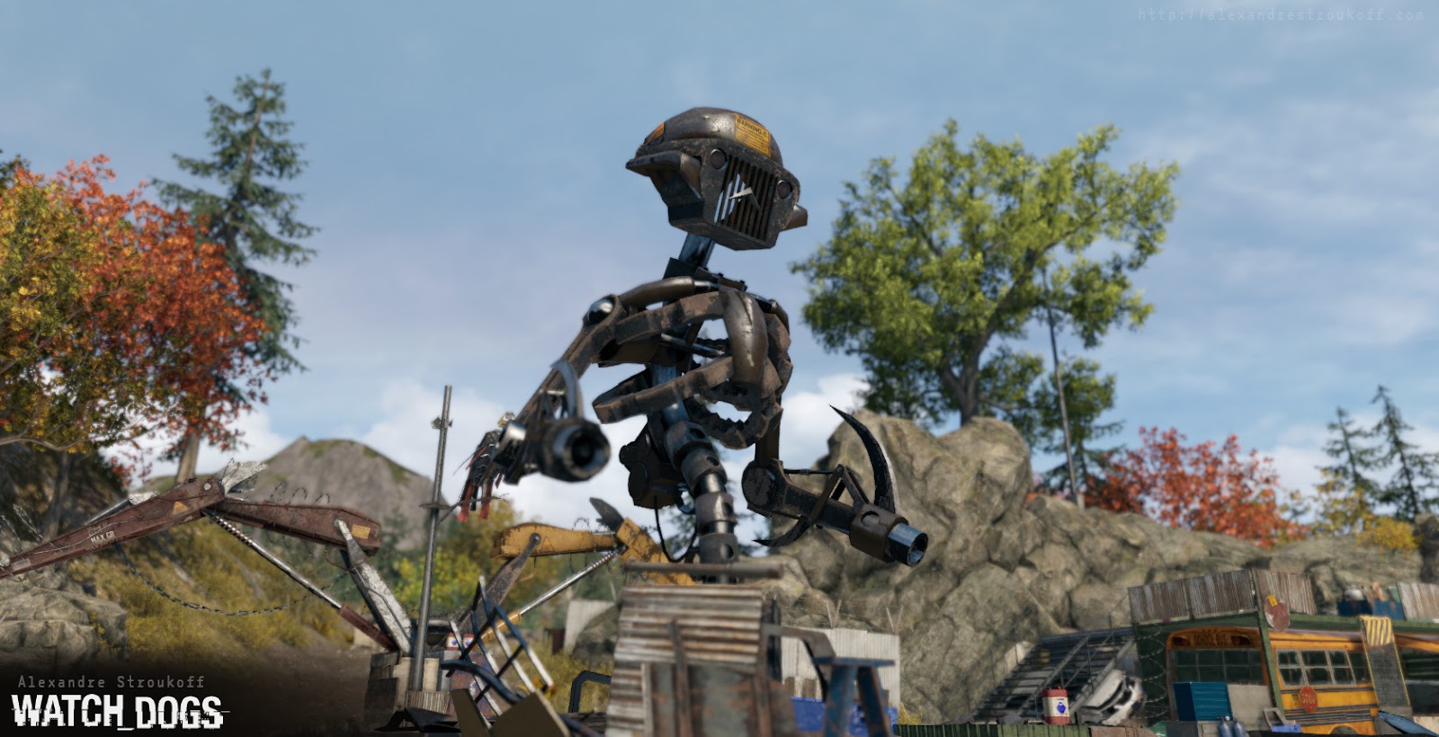
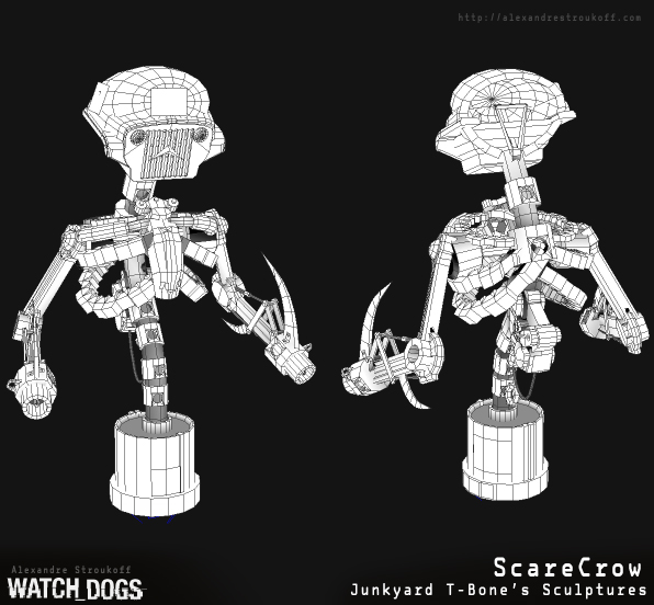
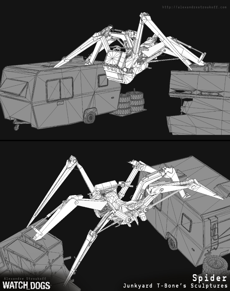
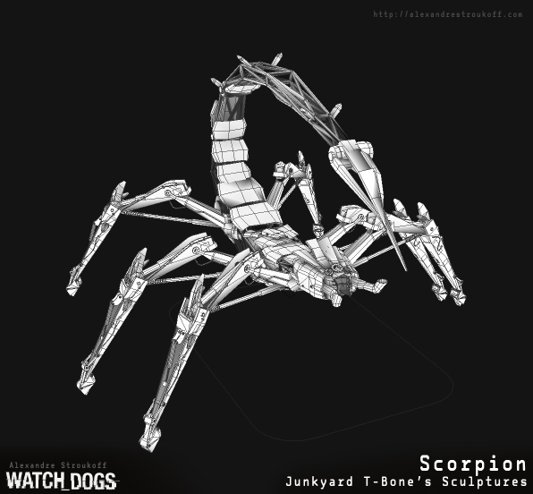
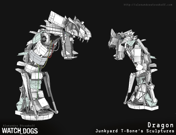
I was mainly charged with doing naturals assets & rocks (especially in the pawnee disctrict), and was in charge of the art of a few zones (mainly The construction bridge, and the Junkyard!)
Here are the screen, and don't hesitate to ask if you have any questions, thanks for checking out !
Lot of pictures, beware !


Replies
:-)
For some reason I'm totally digging this matcap you used for the rock, any tipps where I can find it/something similar?
@Skyralon : here a list of the one I used (you can find them all in the zbrush website, I'll try to make a .rar with with all of those)
gw_frosty_bronze / gw_grouce / Ok_lunar_eclipse (my favorite
@mstankow you are totally right !
But you're totally right, I do find that the look we have is not the kind of lanscape you would find in illinois, but I guess (I hope!) it still work ingame nonetheless ^^
Welcome to every video game/movie/comic ever - I lived in the area portrayed in Vice City and Fallout 3, they didn't get South Florida or DC/NoVA perfect. Just enjoy the macro and don't focus on the micro.
Yeah, pretty much the only game I can think of that actually nailed an area is STALKER: Shadow of Chernobyl, but they spent a lot of time and effort actually photographing and visiting the zone of exclusion.
Either way, the artwork's sweet
But yea, awesome work dude! Looking forward to having time to play it.
My only issue is your presentations, specifically the Zbrush shots. Its sort of odd to me that you took a picture of the entire zbrush UI and included it in the presentation... it takes away from your work IMO. Also it shows a lot of wasted space that could be used for better res images of the actual sculpts.
For the screens with the zbrush interface, I already had this conversation with a friend of mine, and my point of view was that, I like to show some of the software interface or wireframe or this kind of stuff sometimes, because without any of this, the portfolio feels a little bit lifeless. I like to see what's behind the curtain, and not only pretty images. But that totally a subjective point ! ^^