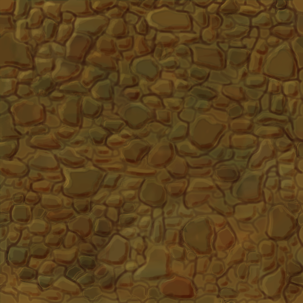
Hi, Teaching myself painted textures without AO or Curvature maps for guidance so am looking for some good tutorials that go over different tricks and methods. Below are some attempts at painted textures please give pointers. Thanks.
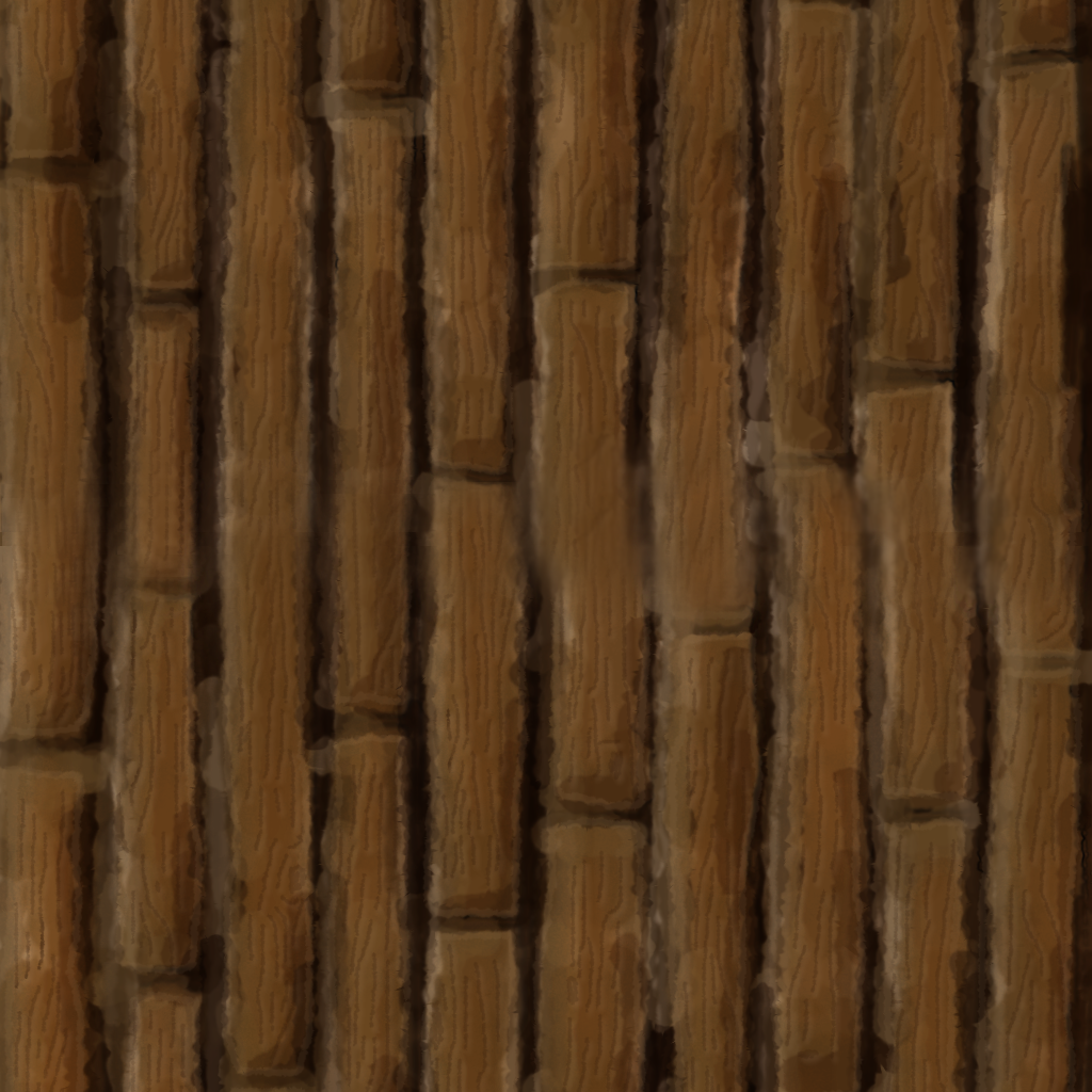
Wood Tiles, rocks where created to tile but due to colorization are now not tiling and hard to blend.
I put up a hand-painted texturing tutorial in Blender a couple days ago. I can probably do one on tiled wood or something in a week or two when I get freetime.
That's a big improvement! Your colors are starting to mud together, it's better than your older attempts, but all of the colors are really soft and blended. You should have some harsher edges between color patches. JenZee does this really boldly:
The surface could use some painterly details to help with describing the material.
My friend Devin Busha made this:
The painted axe has all of these little divots and pockmarks that add a lot to describing the material. I'd say to experiment a bit to figure out what will work with describing rock.
Also, I'd really suggest to get a tablet of some sort, you can pick up a decent used Intuos for $50 USD or so, but painting with a mouse will really restrict what you'll be able to create effectively.
Yea with a mouse, don't have a pad. Thanks for the link ill check that out.
EDIT: thanks for the link, was looking for something more in Photoshop but the ill have a look anyway for the methods.
I would definitely look at picking up a tablet. It is going to help you SO much in the long run and speed up your work a ton. Unless you're just a pro with a mouse..Which I can't imagine being an easy life :P
If you're low on cash thats alright man, theres no need to get a new $100-200 tablet right off the bat. Grab a $10 used off ebay, even if it doesn't have a ton of levels of pressure, its still going to help speed you up and make your life easier
Highly recommend one!
Other than that, you're making progress! Have you chosen which direction your light source is coming from? I'd make a mark or something on another layer you can hide, because as of now it feels like its coming from more than one direction (IE some of your bricks are highlighted on the right side while others aren't, and all are highlighted on the top and then a few are highlighted on the left and even a couple on the bottom)
Hi, thanks for the advice, I added some more details and added more light at the top of the bricks to try to define the light source more.
I also wanted to see what it would look like in an environment so moved it quickly into Blender where I added an auto generated normal just to see what it would look like but have ended up rendering out the texture through blender because of the detail it added. so below are the two new updates the one rendered out through blender and the one completely hand painted.
obviously I want to be able to get the detail as shown in the better quality texture without having to render it out, but for now it dose the job and realy helps me to see what I need to do for future textures.
but dont use white for highlights, or black for shadows for that matter. try to pick a color thats close to your core but lighter and more saturated, and the opposite for shadows.
your understanding of shape and lighting is good. the weakest part of your textures are your actual digital rendering skill in my opinion, wich is good, because thats the easiets one the learn
I have seen some excellent progress over the course of this thread. One thing I always like to do in cases like this is take at look at really best case examples of artists that do this kind of work. In terms of hand painted textures, WOW is always a great resource.
I think that you could stand to go a little bolder with the thicknesses of your imperfections and edges. Something that might read well as a single brick, can kind of get lostwhen a part of a tiled wall texture.
Just an FYI on tablets, Monoprice has a really good selection and they work absolutely fine. They are between about $30 and $50. I have product number 10594 and use it daily, most times 6-8 hours a day (sometimes more). Has performed perfectly in all that time (maybe about a year now?). Before that I had product 6814 (same tablet, previous gen) that worked just as well. I accidentally damaged the surface when I placed a hot soup bowl down without thinking and it defomed the surface plastic. It still worked fine, it just had a tiny divot that would catch the pen and it bothered me.
Monoprice, impressively is an affordable alternative to$200-$300 or more "brand name" tablets.
I used them in photoshop and Zbrush without nearly any complaints. One warning, the tablet doesn't convey pen pressure in 64 bit photoshop so you need to use 32 bit if you are looking for pen sensitivity.
Aware the Texture is very red, that's due to color overlay, texture also needs to be a little darker. Was trying to get a rock layer or cobble style texture, I think it worked but I think that I can do more to it, I can see the texture is not perfect but cant see the imperfections please reveal them to me.
Its been a while since I last did painted textures and have been trying to get back into it with this wood texture, I have been messing around with it for a few hours now at its current state and am struggling to progress with it.
I cant seem to find the right sort of reference for it so would love for feedback and guidance.
I have uploaded 2 versions because I think that the crevices are too pronounced but overall I am not sure.
I just throw this piece of advice here,regarding the latest image: if you use warm colors for lights (like in this case) then use cool colors for the shadows. If you use cool color for the lights,then use warm colors for the shadows.
but don't take it for granted,is just something I heard recently,so maybe if you try it out let me know if it works better
EDIT: Just for the fun of it (and a bit of curiosity) I wanted to quckly try,I don't even know if I applied correctly what I was saying,I also may have pushed the contrast and added some dark value to the cracks, you can see it here side by side with the original http://i.imgur.com/dnSydXj.png
I don't know,hope somehow this helps
Good start. Like said above do not use straight black and white for your highlights and shadows. I sometimes use the color cube but most times just use a Hue Saturation slider to control my shades. Also do not be afraid to mix more colors into your work, you would be surprised how many different colors will complement each other and give a very nice effect.
Replies
https://www.youtube.com/watch?v=L7ALfRw6I5I
EDIT: thanks for the link, was looking for something more in Photoshop but the ill have a look anyway for the methods.
Completely Tillable along X axis, not tillable with itself in Y due to intentional gradient and decoration.
http://fc02.deviantart.net/fs70/f/2013/308/7/1/squigly_by_jenzee-d6t3m5k.jpg
The surface could use some painterly details to help with describing the material.
My friend Devin Busha made this:
The painted axe has all of these little divots and pockmarks that add a lot to describing the material. I'd say to experiment a bit to figure out what will work with describing rock.
Keep it up!
I would definitely look at picking up a tablet. It is going to help you SO much in the long run and speed up your work a ton. Unless you're just a pro with a mouse..Which I can't imagine being an easy life :P
If you're low on cash thats alright man, theres no need to get a new $100-200 tablet right off the bat. Grab a $10 used off ebay, even if it doesn't have a ton of levels of pressure, its still going to help speed you up and make your life easier
Highly recommend one!
Other than that, you're making progress! Have you chosen which direction your light source is coming from? I'd make a mark or something on another layer you can hide, because as of now it feels like its coming from more than one direction (IE some of your bricks are highlighted on the right side while others aren't, and all are highlighted on the top and then a few are highlighted on the left and even a couple on the bottom)
I also wanted to see what it would look like in an environment so moved it quickly into Blender where I added an auto generated normal just to see what it would look like but have ended up rendering out the texture through blender because of the detail it added. so below are the two new updates the one rendered out through blender and the one completely hand painted.
obviously I want to be able to get the detail as shown in the better quality texture without having to render it out, but for now it dose the job and realy helps me to see what I need to do for future textures.
but dont use white for highlights, or black for shadows for that matter. try to pick a color thats close to your core but lighter and more saturated, and the opposite for shadows.
your understanding of shape and lighting is good. the weakest part of your textures are your actual digital rendering skill in my opinion, wich is good, because thats the easiets one the learn
keep at it!
http://www.polycount.com/forum/showthread.php?t=125737
I think that you could stand to go a little bolder with the thicknesses of your imperfections and edges. Something that might read well as a single brick, can kind of get lostwhen a part of a tiled wall texture.
I'm pretty sure that his texture is too short to fill UV island correctly.
As I said a WIP, I will get around to fixing things like that, but keep posting anything you see that can be improved , thanks.
+ part of the reason was because my Unwrap was not 100% strait.
Monoprice, impressively is an affordable alternative to$200-$300 or more "brand name" tablets.
I used them in photoshop and Zbrush without nearly any complaints. One warning, the tablet doesn't convey pen pressure in 64 bit photoshop so you need to use 32 bit if you are looking for pen sensitivity.
Maybe sharper edges are needed?
I cant seem to find the right sort of reference for it so would love for feedback and guidance.
I have uploaded 2 versions because I think that the crevices are too pronounced but overall I am not sure.
but don't take it for granted,is just something I heard recently,so maybe if you try it out let me know if it works better
EDIT: Just for the fun of it (and a bit of curiosity) I wanted to quckly try,I don't even know if I applied correctly what I was saying,I also may have pushed the contrast and added some dark value to the cracks, you can see it here side by side with the original http://i.imgur.com/dnSydXj.png
I don't know,hope somehow this helps
I darkened the Shadows as they where lost and experimented with some wood grain, i'm not sure if i'm going in the right direction.