Cannon Scene
---- LATEST ---
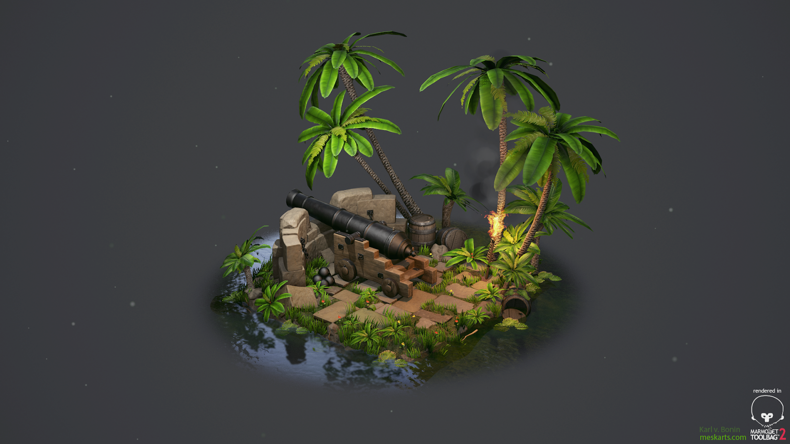
Hey Guys -
so here we go - build up a new folio scene,
wanted to improve my texturing and modeling skills and
make a little interesting scene.
(alsmost everything is PBR so far)
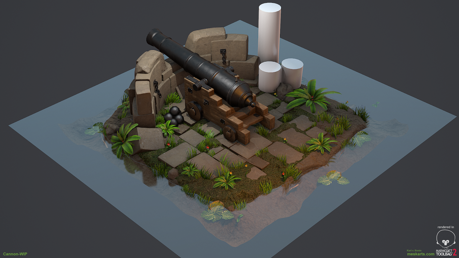
Here is my progress so far:
(plants are wips - also thinking about a barrel and torchlight)
Planning to fade out the water.
If i have enough energy - ill like to put the scene into UE4.
Crits are welcome
Progress Shots:
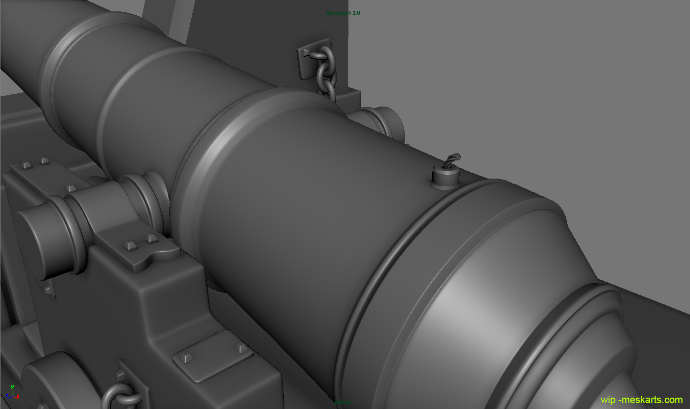
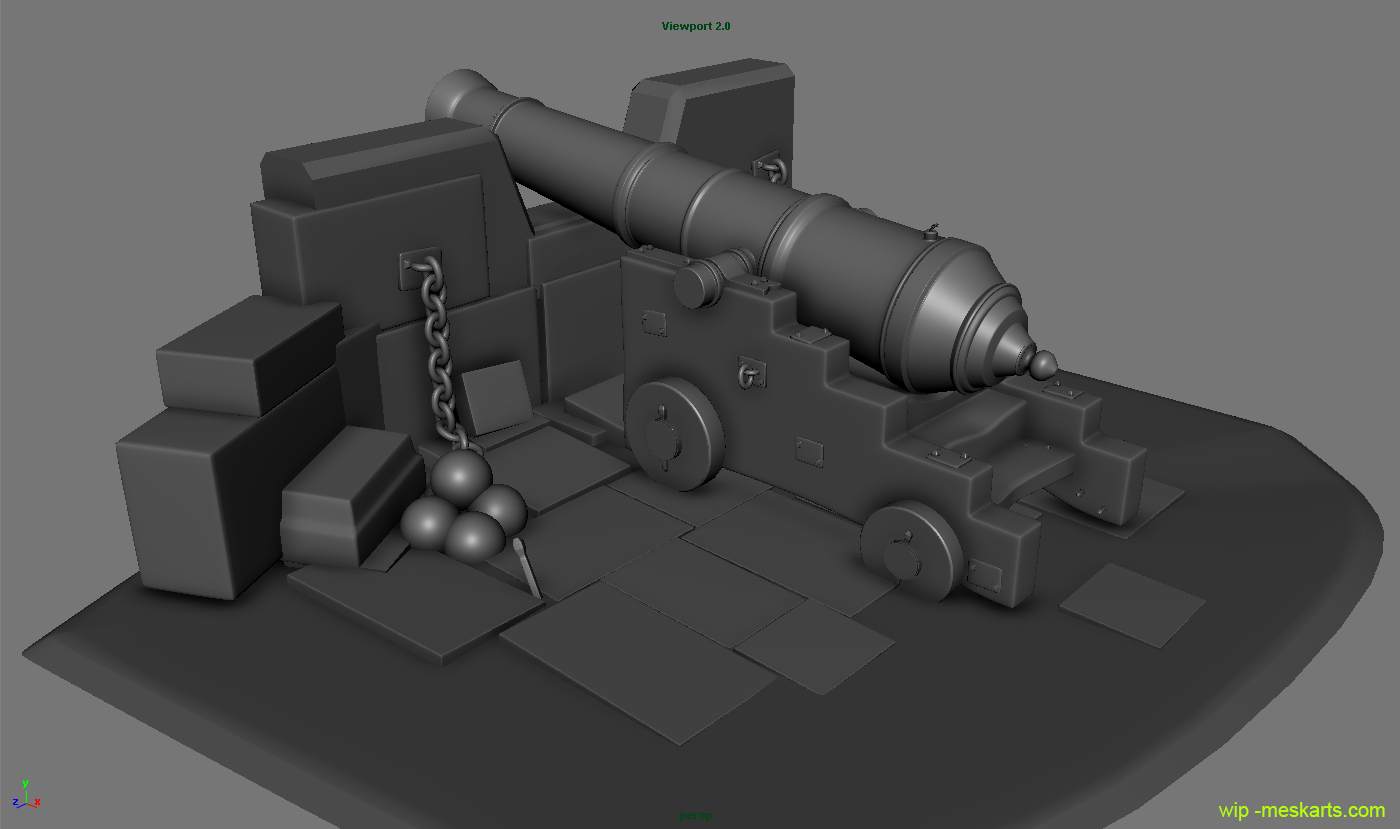
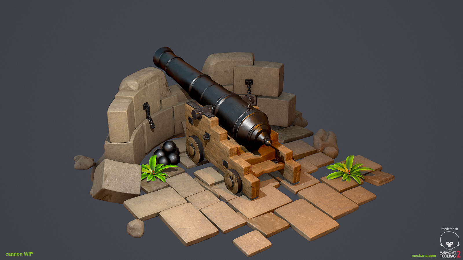


Replies
good set dressing.
Texture need more love.
IMO going for more realism would do the trick
check out this image below.
Your thoughts ?
The cannon balls could use some additional polygons.
For such a small piece why not go in and sculpt alot of detail into the ground stones etc
Thanks for your replys
@ Tobbo: thanks i will
@ Harbinger: thanks for your hint - i added a detail normal map - looks alot better - what do you think ?
@ Mistry10 - thanks dude, good tips - textures are still wip - ill add some decals on the next update. But i added some colorvariations and polished the texture a bit more
@DWalker: thanks - fixed it
@butt_sahib: the stones are sclupted in zbrush - but i baked the normal map wrong - fixed it now...
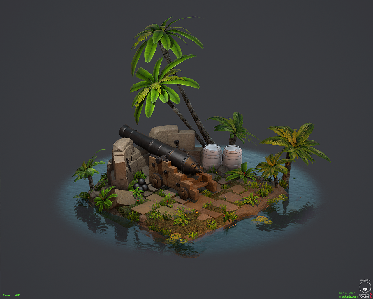
here my updates:
- ill add some more stuff soon
I really like your scene, the water, all the little details & the lighting is pretty cool.
One little detail seems a bit imperfect to me, the Palm texture. In my opinion its a little bit too dark and less detailed.
I would come over with maybe a brighter, higher resolution and more defined texture like these.
However I like the idear and the style, keep on the nice work!
Thanks man - absolutly right - the palms need more love,
Maybe i combine it with a height map - to bump the details out!
Was a great experience - going more to pbr, also next time iam going for UDK or cryengine. Marmoset was so great - but at the end it has its limits (of course)
Let me know what you think:
So awesome. It holds up really well at the pulled back shots you have. When you get closer the details aren't there in the textures or sculpt. Not knocking it. Cause this is great. Just avoid those super zoomed in shots when you're putting it in your folio.
Nice job on this!
@James: thanks
@gekigengar5: youre right, have to tone it down a bit
@DWalker: Im not so good in Post-production - marmoset has it weaknesses if i try to render it out with transparency ( the water for example ) - i look into it - thanks.
@Jeff Parrott - thanks, glad you like it! Actually the scene wasnt ment to be seen from very close distance. Just wanted to pimpt up my cannon and see where it goes - wanted to make it more interested instead of dropping a cannon "lonley" into my folio.
But at the end - some assets could be polished a bit more and maybe going for a "real" engine would be the trick - marmoset is great but it reached its limits. Couldnt archive everything id like to do - especially particles and lightning.
Also feels good to finished it up - time for a short rest and move on to my summer project in UE4
Cheers
Strong points: Colors, contrast, scene composition, canon, and barrel.
Room for improvement: Texture work on the trees and some other assets. Objects penetrating the ground.
Agree with Jeff about pulling the camera back for portfolio shots. Great work! Thanks for sharing.