Home 3D Art Showcase & Critiques

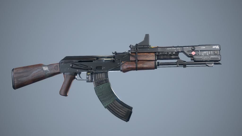
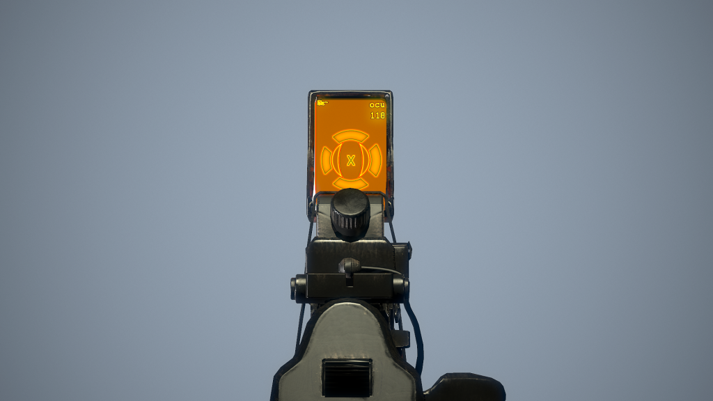
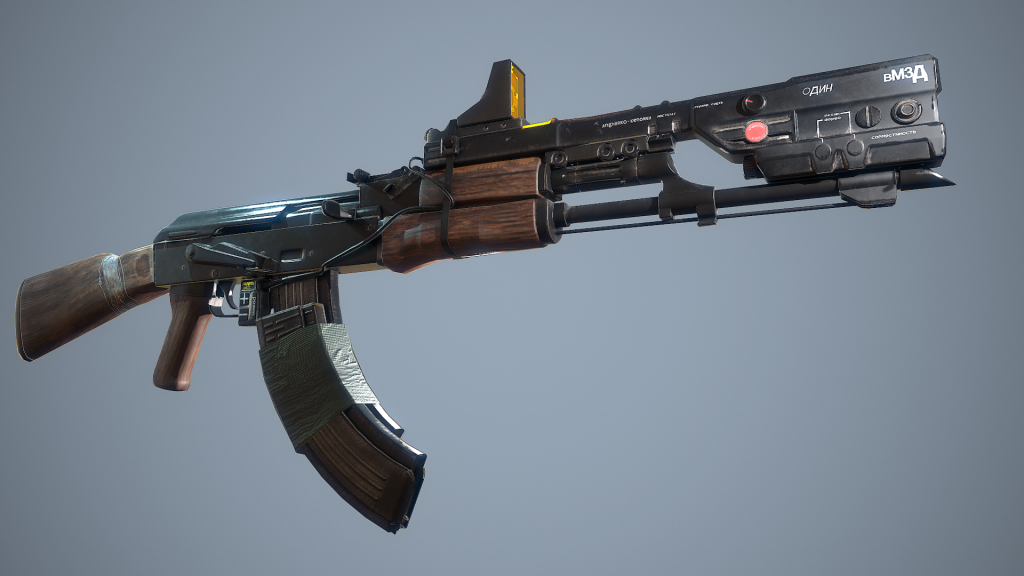
Elysium AK47

polycounter lvl 9
Offline / Send Message
mr grimm polycounter lvl 9
It's been over a year since i've posted what i'm working on, figured i'd get some feedback.

It's a WIP, I still need to give the grip some love. The tape is only a normal with metal map and I haven't added detail to the mags or the receiver yet. I should be done with this soon. Time has been a bit of a problem lately.


Reference
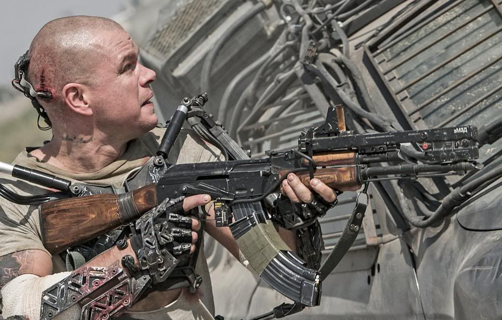
elysium2013akm5.jpg

WIP 1
screenshot014.png

WIP 2
screenshot012.png

WIP 3
screenshot011.png

Replies

  • Mellon3D
    Offline / Send Message
    Mellon3D polycounter lvl 13
  • oxblood
    Offline / Send Message
    oxblood polycounter lvl 9
  • _Kratos_
    Offline / Send Message
    _Kratos_ polycounter lvl 11
    result is great...some more tweaks on the shader and you got it!
    Awesome work!
  • Ehsan Gamer
    Offline / Send Message
    Ehsan Gamer polycounter lvl 6
  • mr grimm
    Offline / Send Message
    mr grimm polycounter lvl 9
    Oh hey thanks guys, I appreciate the feedback. I'll definitely get on this as soon as I can, then after this is done a few friends of mine might get a Dredd playable prototype going.
  • woot
    Offline / Send Message
    woot polycounter lvl 5
    mr grimm wrote: »
    Oh hey thanks guys, I appreciate the feedback. I'll definitely get on this as soon as I can, then after this is done a few friends of mine might get a Dredd playable prototype going.

    dredd as in film dredd?

    love it :D

    the model is great, really nice detail work on it. material definition is superb as well.
  • Shrike
    Offline / Send Message
    Shrike interpolator
    It looks like there are a problems with the proportions

    The pistol grip is too small and a little oddly formed, the stock looks too small aswell, also it the angle it extends from thin to wide at the end is too narrow and the form at the connection point is not right aswell,
    the barrel is dangerously thin , the laser + sight elysium thing looks a lot bulkier at the front in your version , the back of the AK casing has a wierd shape aswell, the big fireswitch of the ak is also pretty off, and the wood front handguard is not correct either. The double mag tape is not even really taped on the surface, it looks very loose. The magazine needs a closer look aswell. All in all, proportions of pretty much everything are off it feels

    I dont want to be the bu-man here, and im not the weapon expert, but those are very obvious errors that could be avoided by having more references and paying more attention to proportions and shape, especially when doing a model thats as widely known as a AK / type 56. Choosing that subject means that you have to be especially careful about the proportions, as people know it very well. But to clarify again, these are big issues and im really not nit picking here about minor details.

    On the other hand, I think the texturing is pretty nice, mainly on the elysium part, the dirt looks well done and definition is good, the ak is missing some points of interest in form of wear tho, mainly on the metal parts, and the HUD looks a little like something from the first xbox : P The render is really nice aswell
  • GrungyStudios
    Offline / Send Message
    GrungyStudios polycounter lvl 8
    great work here. Looks photo realistic
  • NurmanZh
    Offline / Send Message
    NurmanZh polycounter lvl 10
    wireframe please!
  • mr grimm
    Offline / Send Message
    mr grimm polycounter lvl 9
    Shrike wrote: »
    It looks like there are a problems with the proportions

    The pistol grip is too small and a little oddly formed, the stock looks too small aswell, also it the angle it extends from thin to wide at the end is too narrow and the form at the connection point is not right aswell,
    the barrel is dangerously thin , the laser + sight elysium thing looks a lot bulkier at the front in your version , the back of the AK casing has a wierd shape aswell, the big fireswitch of the ak is also pretty off, and the wood front handguard is not correct either. The double mag tape is not even really taped on the surface, it looks very loose. The magazine needs a closer look aswell. All in all, proportions of pretty much everything are off it feels

    I dont want to be the bu-man here, and im not the weapon expert, but those are very obvious errors that could be avoided by having more references and paying more attention to proportions and shape, especially when doing a model thats as widely known as a AK / type 56. Choosing that subject means that you have to be especially careful about the proportions, as people know it very well. But to clarify again, these are big issues and im really not nit picking here about minor details.

    On the other hand, I think the texturing is pretty nice, mainly on the elysium part, the dirt looks well done and definition is good, the ak is missing some points of interest in form of wear tho, mainly on the metal parts, and the HUD looks a little like something from the first xbox : P The render is really nice aswell


    I really appreciate the feedback man, you made some obvious points. I actually went ahead and changed some of the things you pointed out. The pistol grip does need some love, that's for sure. And yes about the texture on the Attachment, I haven't finished my texturing on the AK yet, but I did make a few passes at the Elysium part. I plan to finish this within the next few weeks. I have a few more projects that are a little more important right now. Once those are done this AK will get the love it needs.

    ohh and NurmanZh, posted 2 wireframes, the wires are thick, so some areas look like they're dense with polys, but they're not. This weapon is only 14,580 tris. ;) My next weapon will be more, I suffered a bit trying to make this work with the polycount I had.


    screenshot003.png
    screenshot002.png
    screenshot000.png
    screenshot001.png
    screenshot004.png
  • ruukuu
    This is looking great!
  • mr grimm
    Offline / Send Message
    mr grimm polycounter lvl 9
    Thanks man. Made some changes to the roughness a bit and changed the lighting.

    0ff9ff_eca8e4f00bde477a8c9cda5e479e969a.png_srz_p_955_536_75_22_0.50_1.20_0.00_png_srz
  • Stirls
    Offline / Send Message
    Stirls polycounter lvl 8
    Damn, this is so good. Wouldn't mind seeing the airburst ammunition in that magazine, though. Would be the icing on the cake.
  • PitelinM
    Offline / Send Message
    PitelinM polycounter lvl 8
    Good job man, but I think the high specularity on your last shot made it too obvious that details on this attachment thingy are not a real geometry and some surfaces there reflect lighting a little bit weirdly. Also it seems like there is some problems with normal map on the front wooden grip. Have to say I liked previous lighting/material more.
    82u1IOG.png
    And do you considering adding some scratches and stuff to it? I really liked how they nailed this feel of dirty worn metal in movie. I think model would only benefit from it, but its up to you.
    P.S. Im sorry if Im wrong at some points. Im not really very experienced in hard surface. Hope I was helpful ;)
  • Jonas_Thomas
    Offline / Send Message
    Jonas_Thomas polycounter lvl 5
    That's a really cool gun. Good choice. Nicely done.
  • mr grimm
    Offline / Send Message
    mr grimm polycounter lvl 9
    I made so many corrections to this thing back then.  

    I actually used the final product to get a job.  It worked, but the source files and screenshots were purged years ago.

    thank again for the feedback everyone.  it helped a lot
  • Xyrho
    Offline / Send Message
    Xyrho polycounter lvl 6
    Bruh, still looks sick.
  • mr grimm
    Offline / Send Message
    mr grimm polycounter lvl 9
Sign In or Register to comment.