First character WIP

polycounter lvl 7
I am a student studying animation is South Africa. I am currently working on texturing my first 3d character. Been working in Maya and dabbling a bit with Mudbox and Zbrush. The character is a space miner. My initial concept art for the character:

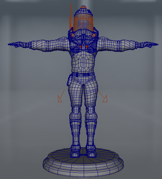
Here is a screen grab of the wireframe, it had to be all quads:
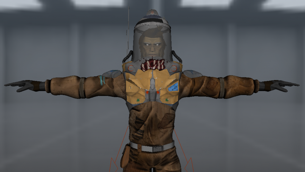
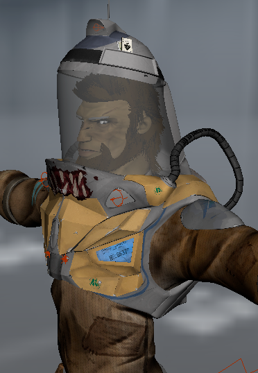
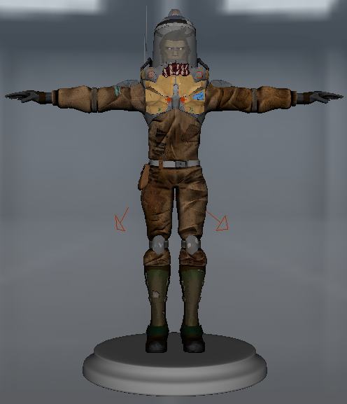
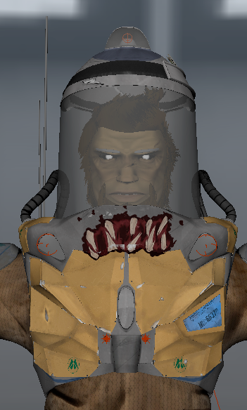
Some things have changed since the initial concept when it came to modelling and texturing. Here are some screen grabs of my textures so far, from maya's default viewport:
The character is still in its infancy, so textures are not finalised yet and the character still needs to rigged and it is going to be animated. Any critiques, tips or bit of advice would be greatly appreciated.
Here is a screen grab of the wireframe, it had to be all quads:
Some things have changed since the initial concept when it came to modelling and texturing. Here are some screen grabs of my textures so far, from maya's default viewport:
The character is still in its infancy, so textures are not finalised yet and the character still needs to rigged and it is going to be animated. Any critiques, tips or bit of advice would be greatly appreciated.
Replies
which is depicted nice in the concept but on the model it makes him look feminine
especially around the waist-hips area.
The textures are pretty messy for the brown cloth part and you have strong folds
only in diffuse which looks pretty weird since the rest of the character seems
to make good use of geometry.
Your concept is pretty cool just work on getting that dynamic cartoony feeling down
, and want to work on some sss. Just need to read up some more on that