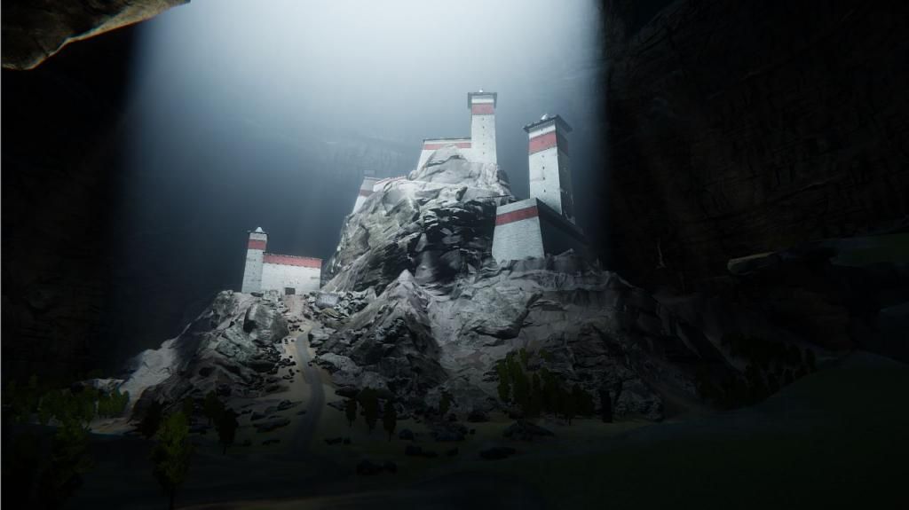
I found this awesome looking picture and it inspired me to create an environment from it. This is also my first time using CryEngine so we'll see how it goes!
Any crit is very welcome and desired!
Hey nice idea man, Id say your castle is getting a bit lost though maybe scale that up a bit or add some taller towers or structures to give the environment a better focal point.
You are absolutely right. I altered my blockout and adjusted my camera settings a bit. Here is the result:
Silver is right about the symmetry. But I can't tell if you have vegetation set up yet or if the terrain is just green in the parts where there will be vegetation. Because I think once that is added it will help break things up a bit as well.
The green parts are the colors of the terrain. I will create grass and other vegetation for both the ground and to cover the stones.
I revamped my blockout. What do you guys think? I might add more asymmetry in the future!
I fiddled a bit with lighting, learning as I go. I'm almost done with my main texture sheets but I've still got a few texture to do and a lot to model before I start tweaking lighting and materials.
You've got some amazing details here, but it's reading as a miniature castle in a normal sized cave to me, not as a normal sized castle in a huge cave as I think you're going for. Assuming you are going for a huge cave, I think you need to rework to rock walls.
I think you are onto something. What do you think exactly is the problem? Is it too bulky or are there not enough details?
I cant quite put my finger on why, but I can't stop thinking that this looks like a miniature set, and not a full, life-sized city. It might be the shape of the bloom coming from the rock ceiling. Maybe its the uniformity in materials on the structures...not sure.
Maybe in the shot where the city is at a distance, put some props somewhere that give a sense of scale.
Yeah, I've gotten that feedback from a number of people but nobody was able to tell me exactly what gave them that impression. I will have to look at more reference pictures to get to the bottom of why it doesn't have that sense of scale.
Replies
You are absolutely right. I altered my blockout and adjusted my camera settings a bit. Here is the result:
The green parts are the colors of the terrain. I will create grass and other vegetation for both the ground and to cover the stones.
I revamped my blockout. What do you guys think? I might add more asymmetry in the future!
I changed the blockout of the city yet again. I created placeholder textures and started modeling out more details
I also ditched the lions because I felt they distracted more than they added.
loving the pot
Thanks man!
I made some updates to a part of my scene that I want to bring to a more polished state:
I think you are onto something. What do you think exactly is the problem? Is it too bulky or are there not enough details?
Oh I'm sure you do!
Sorry, I'll show myself out...
(Nice idea tho, gonna keep my eye on this.)
Hehe thanks man
I cant quite put my finger on why, but I can't stop thinking that this looks like a miniature set, and not a full, life-sized city. It might be the shape of the bloom coming from the rock ceiling. Maybe its the uniformity in materials on the structures...not sure.
Maybe in the shot where the city is at a distance, put some props somewhere that give a sense of scale.
Yeah, I've gotten that feedback from a number of people but nobody was able to tell me exactly what gave them that impression. I will have to look at more reference pictures to get to the bottom of why it doesn't have that sense of scale.