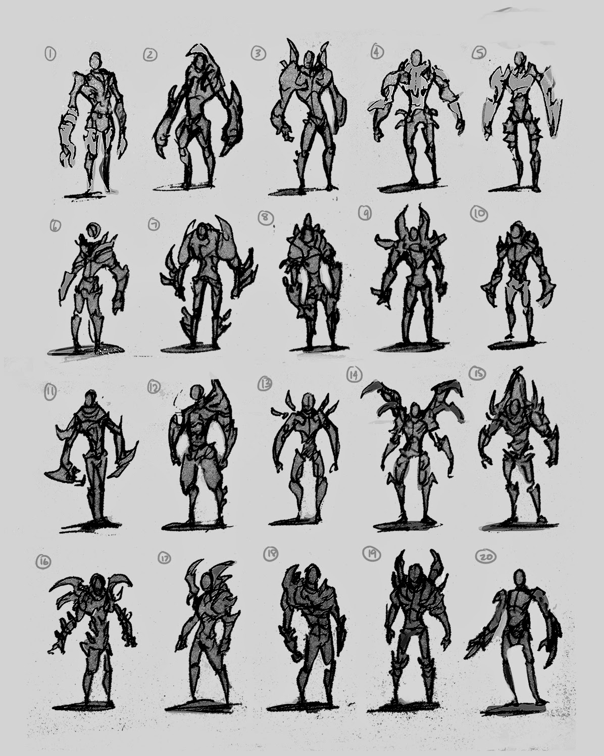
Starcraftmonsterhunter - help me design a character
hey Polycount, So i thought it would be cool to use the 2d forum to come up with a 2d concept of my character and then when that's done move over to the 3d forum and model over there
For the design I'm going for the monster hunter kind of vibe i.e. parts from a monster to be used as armour. The monster being a zerg. I also want him to look fast and deadly. lean not bulky.
I won't have that much time to work on this so i apologize if it takes a while for an update
Anyway here are some thumbs. I'm leaning towards 3, 19 and 2 but i would like to see what you guys prefer.
I'll get a ref board up soon.


Replies
My favs are 2,8,18, because if there are different parts of monsters used in his armour design, the final look might not be symmetrical.
Looking forward to seeing your model.
2 definitely seems to be the winner and I like it so I'll develop that.
And here are my ref boards
artists in there;
phil gonzo
samwise didier
mrjack
jeremey gritton
ldaustin
dominic qwek
rafael grassetti
melvynyeo
I think most people liked it because its the obvious "cool" one.
If you want a more unique design that really stands out I think you should try introducing some of the elements from the other versions as well.
I might be completely wrong here, but its just something that came to my mind: what if nr 2 is not the one we like the MOST, but rather the one we dislike the LEAST.
anyways, thats my thoughts, good luck!
Only 4 concept developments atm. Need to pump out more and get some back views. I think i will only polish the final concept because i'm lazy.
also again would love to see what people prefer and maybe what part they prefer.
@lotet - hey man thanks for the feedback. Yeh this is my personal project so in the end I will pick the one I like the most, I asked what people preferred becuase I was interested to see what silhouettes other people liked. The results were quite surprising. Thanks though, I appreciate your concern
As for your other point. I think I may be misunderstanding what you are trying to get at because it feels like a case of a cup half full or empty. Even if they didn't like any of the designs (which is fine) if they picked the ones they disliked the least that is still technically their favourite? Please correct me if I misunderstood
@yourname942 - Huzzah! someone who likes 19. Out of all the people I asked you and I are the only ones who like 19 .__.
but a helmet could add alot to the silhouette.
Also I was originally going for a sword and shield but monster hunter 4 has a charge axe which sounds ridiculous but aweesome. but but then it also has an insect staff which matches the zerg theme...what do
If you're going for the Monster Hunter vibe, you should really exaggerate the size of some pieces, right now all of the armor pieces are very restrained in size, but if you push the size of the pauldrons and give him a top-heavy look, he'll be a lot more dynamic than these overall rectangular shapes, and again, that would mirror the thick-into-thin and upside down triangle shapes you have going on right now.
The big shoulder/chest armor that kind of wraps around the head on #4 gives a nice silhouette, and looks like it protects, but doesn't sacrifice showing the face like you mention. You can also do a ton of other things with the head itself to alter the silhouette, anything from hair to some kind of native-american inspired headdress made of alien bits.
Looks good though!:)
And I agree with a lot of your points and thanks for reminding me of the thick to thin, I was too focused on designing that I forgot a lot of design fundamentals haha. Personally no.4 was my least favorite just because it looked like it was hard to move in and i didn't like the design in general. So I didn't go with that one.
So here are just some sketches. The circled one is the one I'm leaning for. I have accumulated quite a lot of paper with random sketches but i don't think any are presentable. The current design I have is a bit of a farcry from the original silhouettes and i definitely need more development on it. I also think the charge axe wont work because from what i've seen it looks slower than a switchaxe.
So my choices are the insect staff or the dual swords. Face is placeholder
guidelines for myself.
- A more realistic style. (learn more that way)
- try to echo the design. e.g. I dont want to blatantly take parts and stick them on for reasons other than "just because".
- mobile character, try to avoid bulky.
- make the armor look organic.