Sun Queen - Progress Thread
Hi Poly! It's been some time since my last post, so I'll try to fix that 
I'm planning to do a portfolio illustration of one of my OCs, there's no deadline so I want to improve it the best I can. I'll need your feedback, guys, last time I got it I improved a lot! (:
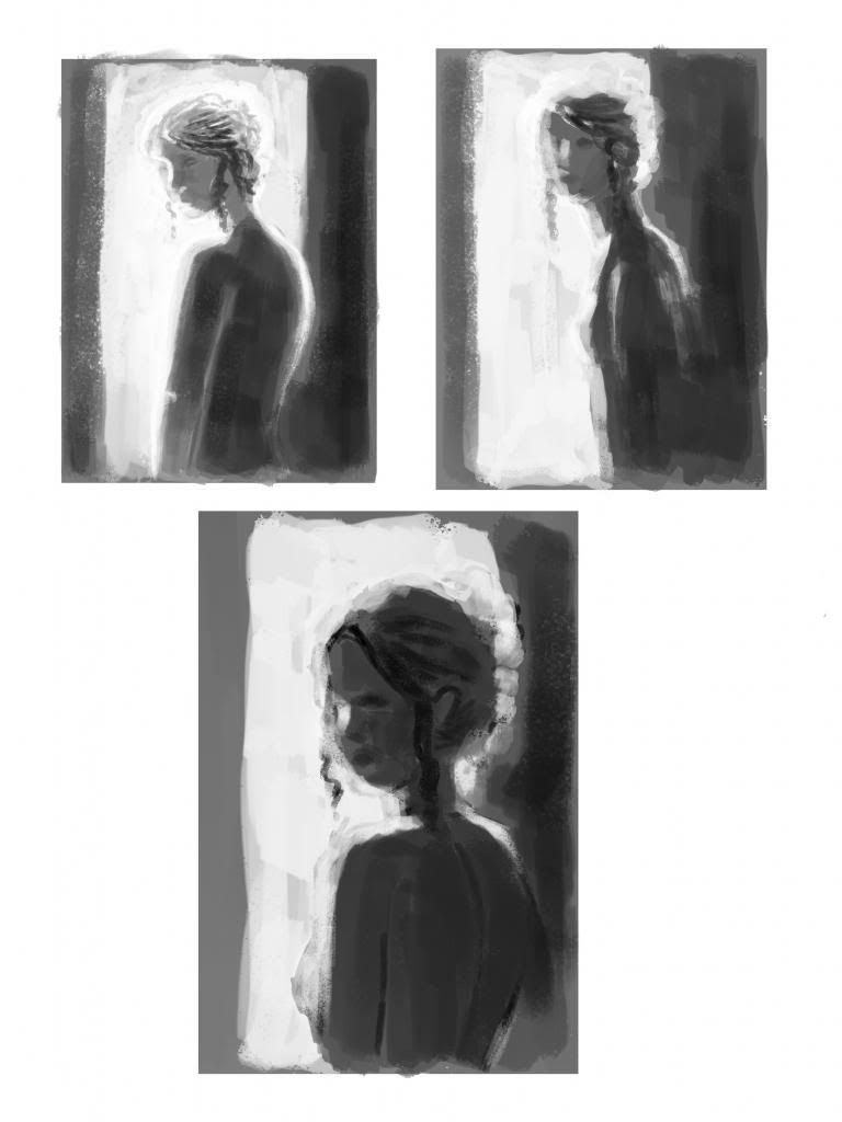
Here are the final three thumbnails I selected:

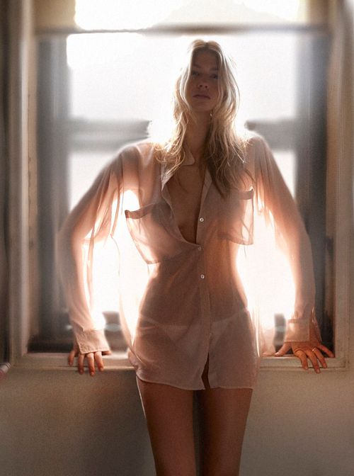
My idea is to make her looking at the viewer but with the body in side view, with a huge sun light from behind. I want to make her hair and clothes with an effect like this one:

The overall color scheme will be teal (maybe with some golden jewelry) as that's the usual color my character wears (:
I love the third thumbnail, it was the initial idea on my mind but I explored first the other options. What do you guys think? Any suggestions?
I'm planning to do a portfolio illustration of one of my OCs, there's no deadline so I want to improve it the best I can. I'll need your feedback, guys, last time I got it I improved a lot! (:
Here are the final three thumbnails I selected:

My idea is to make her looking at the viewer but with the body in side view, with a huge sun light from behind. I want to make her hair and clothes with an effect like this one:

The overall color scheme will be teal (maybe with some golden jewelry) as that's the usual color my character wears (:
I love the third thumbnail, it was the initial idea on my mind but I explored first the other options. What do you guys think? Any suggestions?
Replies
Are there any anatomy mistakes? I think the face is still awkward, mainly the eyes and lips. Lips don't seem a problem to me, usually they start like that on lineart but I fix them while rendering. But those eyes... I have problems doing his right eye and the left one still doesn't convince me. Any tips on how could I improve that?
I have the sensation that face features are too small for her face, am I right?
Also, are the values correct?
Of course, I'm still working on it
Tomorrow I'll make the base hair and will start with the body. I'm making tons of changes for almost every single feature, so that's slowing it, but I'm proud of how it started and I have a very good feeling with it.
It's a very relaxing piece between some client work (:
I'm leaving all the rim light for the end since it seems to be hard for me going zone by zone now. It's going slowly but I want it to be really good this time *_*
Also, made the canvas wider, but I'm not really sure if it works for the composition :S