Modular Hand Painted Building
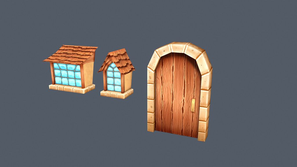
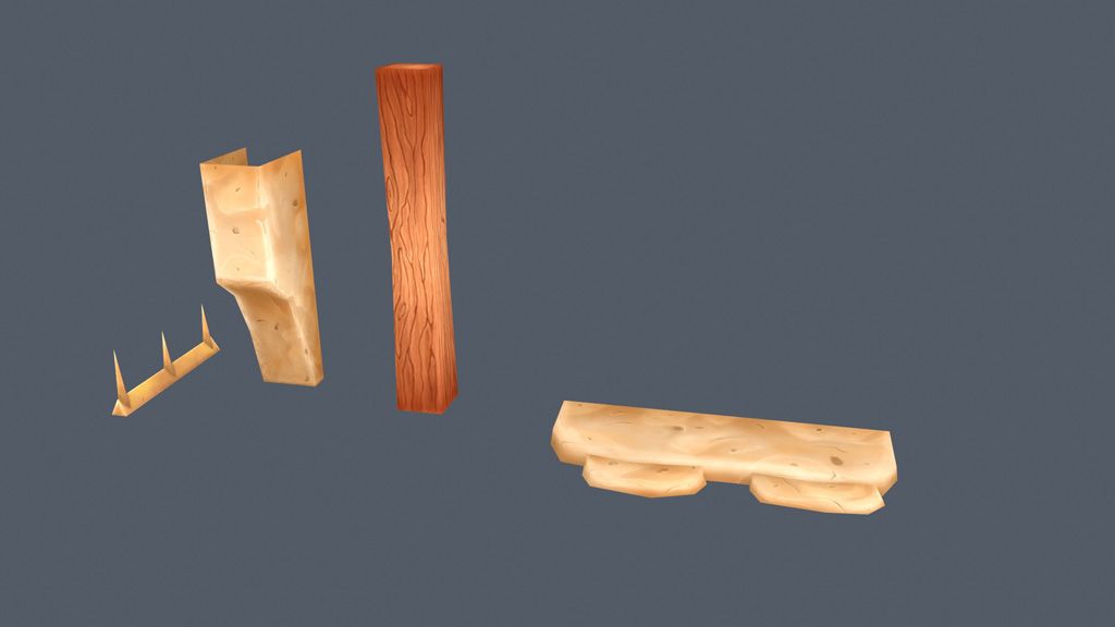
I felt that this was the perfect project to keep improving my hand painting skills with tiling textures and reusable props and structures. As you can see from the pics, modeling and most of the texturing is well underway.
I like the way the textures are coming out, but i feel they are missing the last 10% polish to really make them shine, but I'm not sure what it is?
What does everyone here think so far? Next step will be mocking up buildings from the pros.
I like the way the textures are coming out, but i feel they are missing the last 10% polish to really make them shine, but I'm not sure what it is?
What does everyone here think so far? Next step will be mocking up buildings from the pros.
Replies
Maybe this thread by a fellow polycounter is kinda helpful LINK since you can see some great wireframes here using some extra geometry.
Do you have a reference?
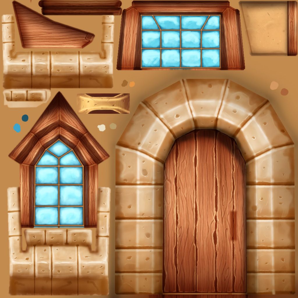
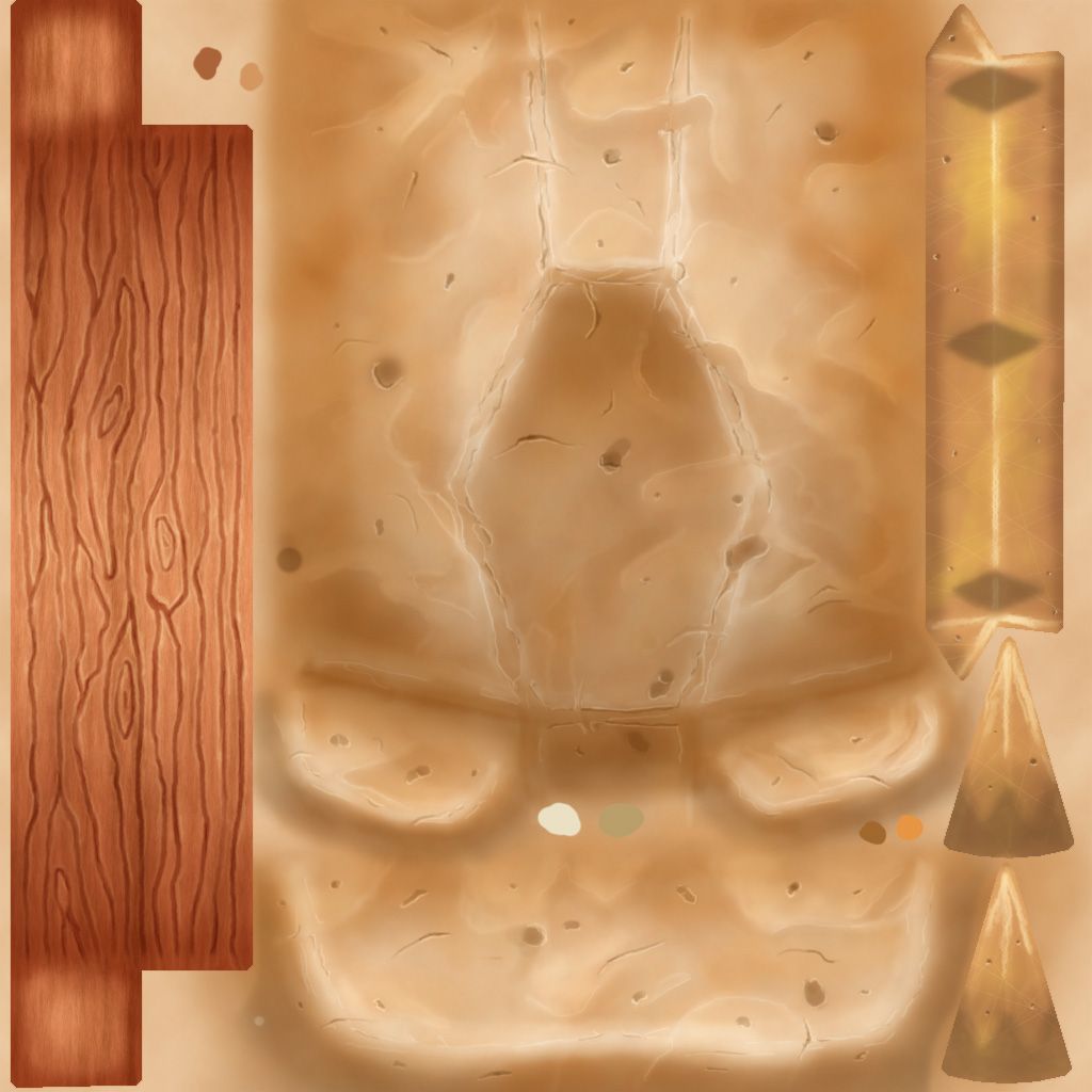
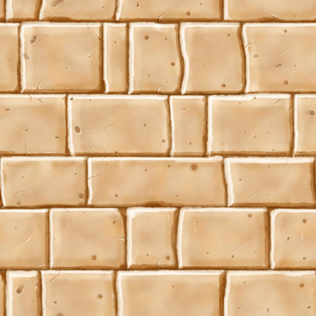
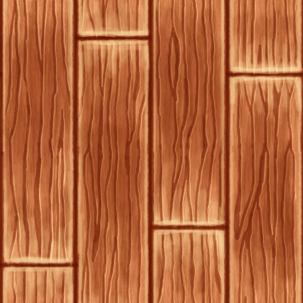
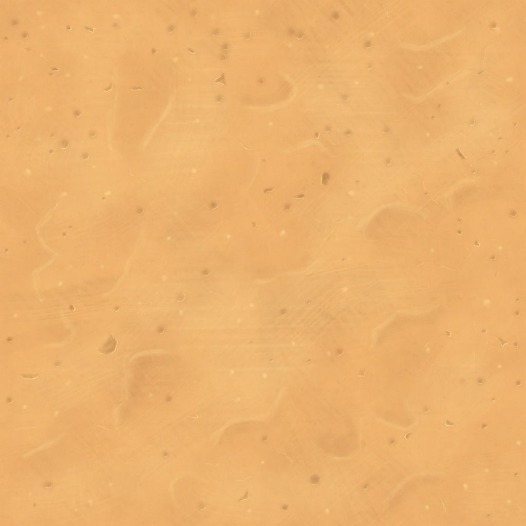
What stands out to me is that all the textures except the plaster seem too light. Try making your midtones and shadows darker. The highlights on your edges should really stand off.
As to the individual textures:
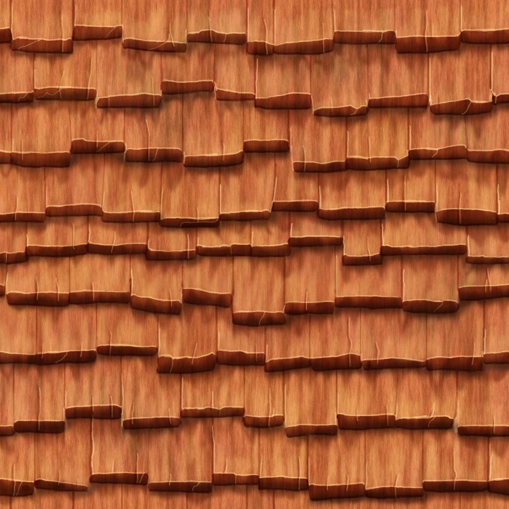
Roof Tiles - The darker areas under the slates - possibly shadows - need to follow the shape of the slates. Think of them as shadows and think how the light will hit the roof - example below:
http://www.google.co.uk/imgres?imgurl=http%3A%2F%2Fimg.archiexpo.com%2Fimages_ae%2Fphoto-g%2Finterlocking-roof-tiles-slate-imitation-63722-5513203.jpg&imgrefurl=http%3A%2F%2Fwww.archiexpo.com%2Fprod%2Fludowici%2Finterlocking-roof-tiles-slate-imitation-63722-1197461.html&h=733&w=1158&tbnid=Fo7VLDmfeQuCNM%3A&zoom=1&docid=q9yXRuIZ7tExUM&ei=oEtnU9HmGY6rOtzSgWA&tbm=isch&ved=0CIoBEDMoITAh&iact=rc&uact=3&dur=304&page=2&start=30&ndsp=36
Brick - this is looking good although right now it looks more like marble than brick due to the lightness - if it is meant to be Marble you can ignore me
Plaster - good job on this one. It is just the right shade for plaster - plaster is quite reflective so you'll find it's lighter than the other materials you have there.
Wood - I'd desaturate this a bit. Also when you lay your gradients down try to think about where the light is coming from. As these are tileables you may want to keep the gradients subtle. You can also think of your gradients in terms of where you want to draw the eye - this may help you in planning where to put them.
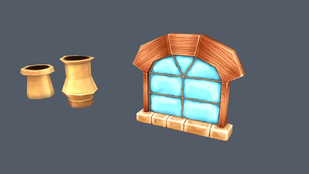
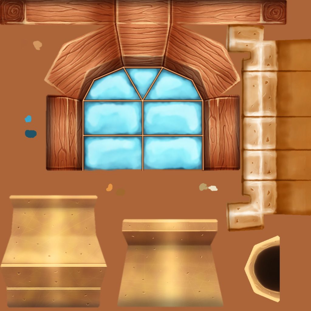
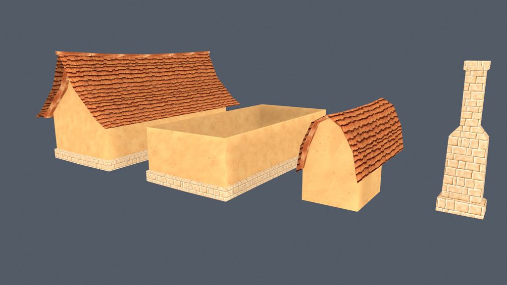
The chimney looks rather forced; the 45 degree stone poking out of the roof is odd, and the cap seems rather ornate for the building.
@ToffeApple: Thanks for the critique. I have a some concept references that gave me some idea for individual pieces, but the texture pallet is my own. I was going for a redwood/sandstone/adobe plaster look.
I havent added a shadow to the roof tiles, so I'll do that, the darker streaks on them right now are supposed to be leaking from water.
Yeah the brick should look like sandstone, it was the first texture I did, I think I got closer to the sandstone look with the door and window sills. So i'll go back and tweak.
Good tips on the wood, I'll make some adjustments.
@DWalker: Since I'm going with a sandstone look, maybe saturating the stones and adding more yellow would do the trick? I was also trying for a brass chimney topper, but it doesnt seem that its coming off that way haha.
I didnt give the chimney placement much thought, I also need to adjust the mesh to make the chimney look more interesting on the whole.
Another epic polycount thread on hand-painting: http://www.polycount.com/forum/showthread.php?t=87797&page=13
Yeah I didnt spend much time putting the pieces together so to speak, I just wanted to get something before I had to head out. I have a few reference buildings I'll try to emulate in my next update