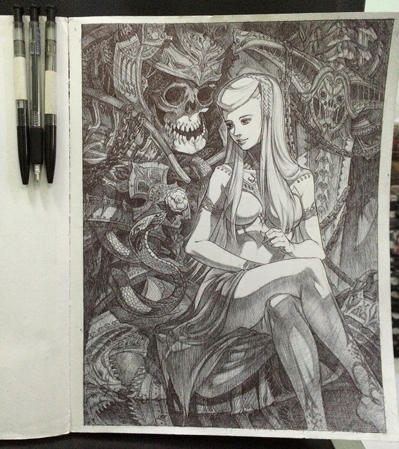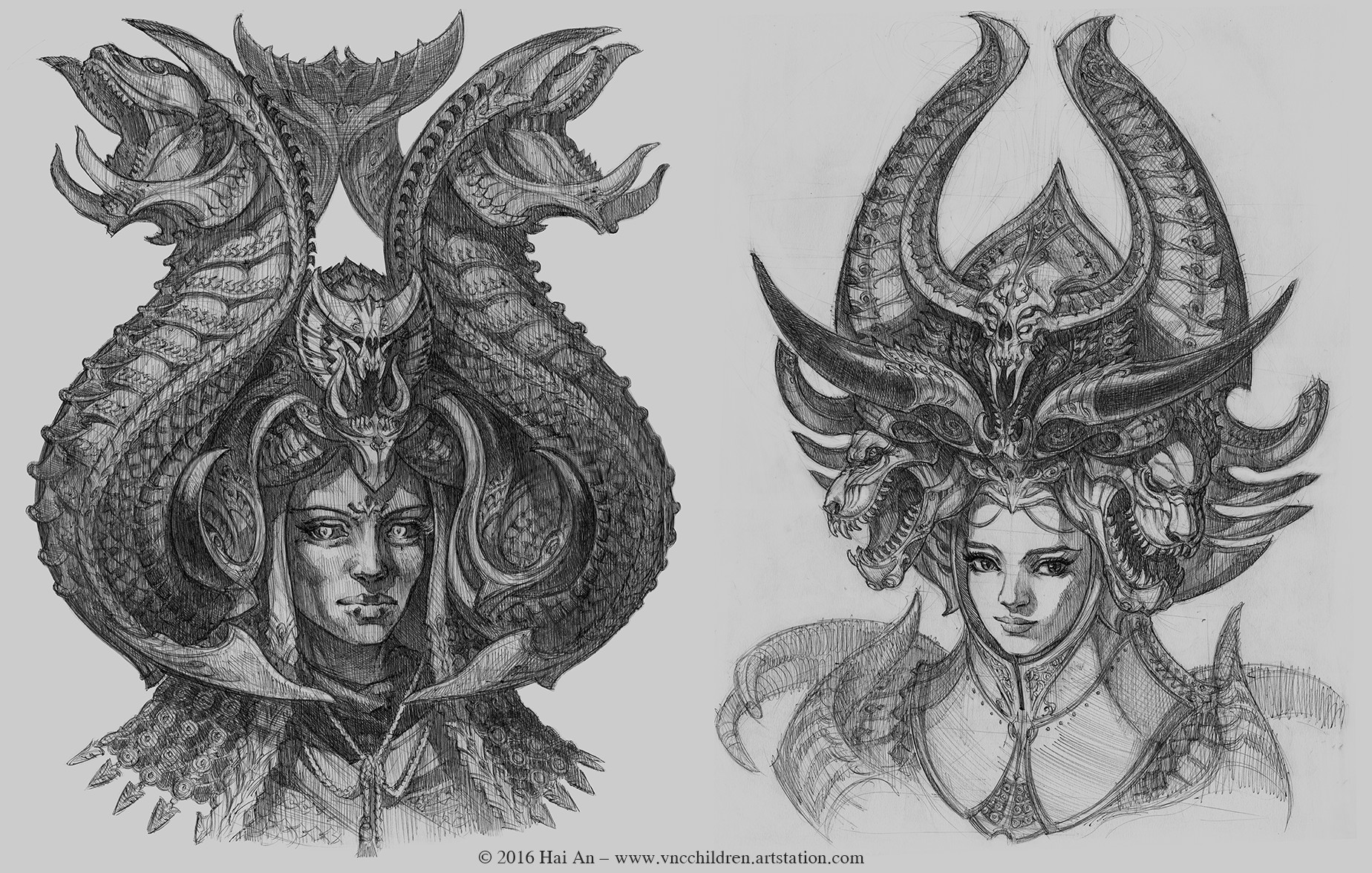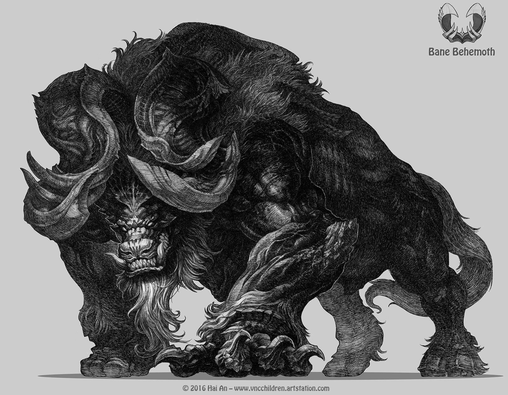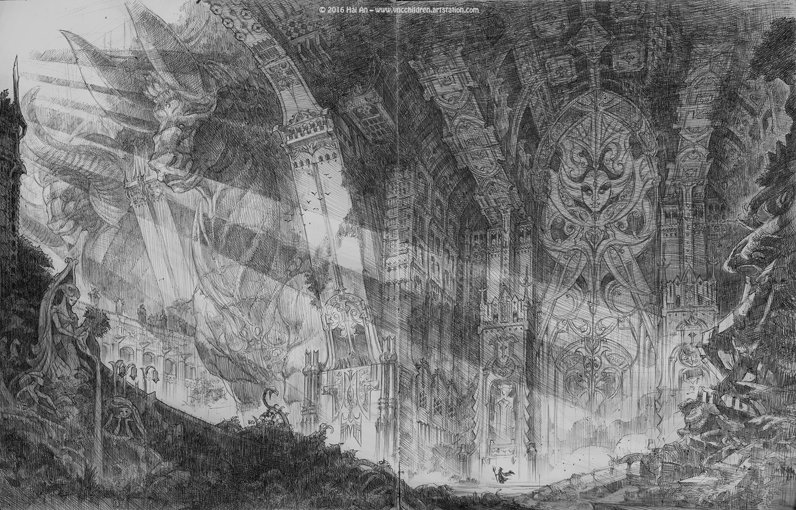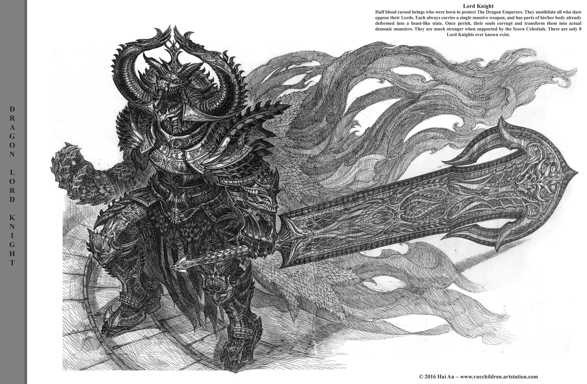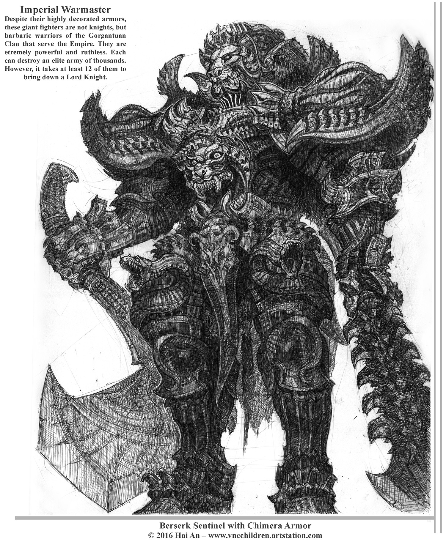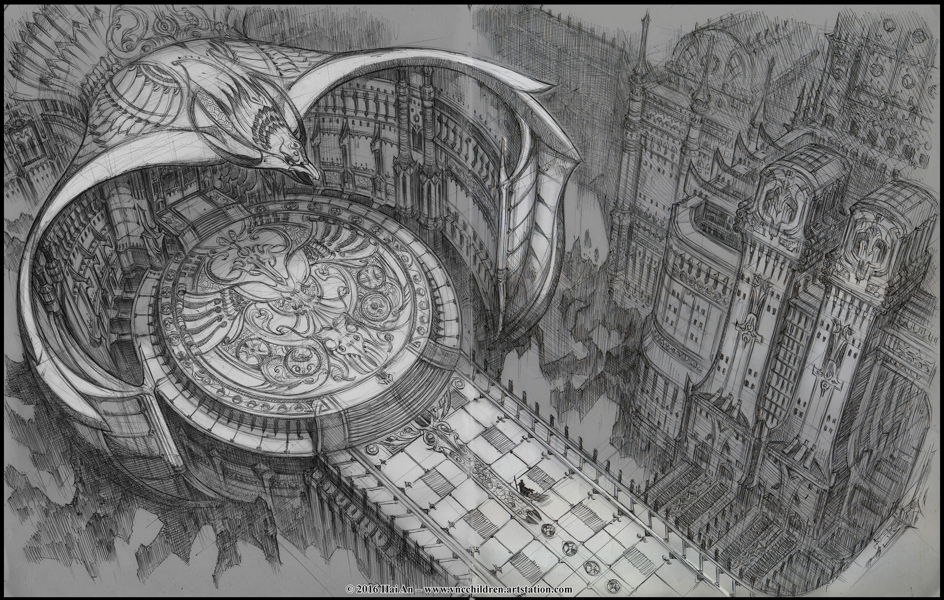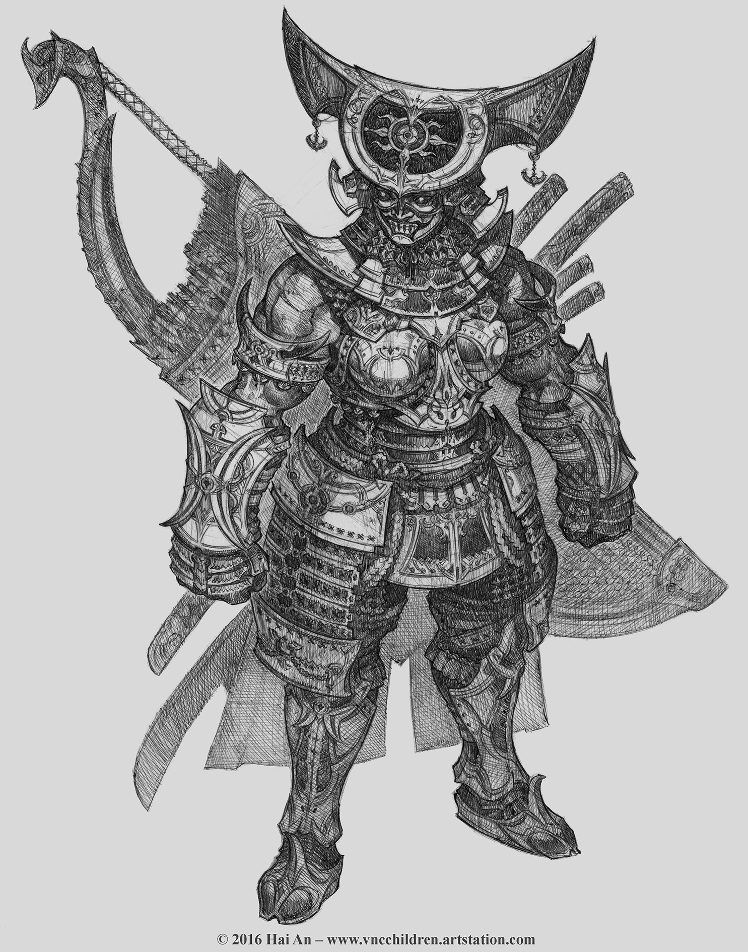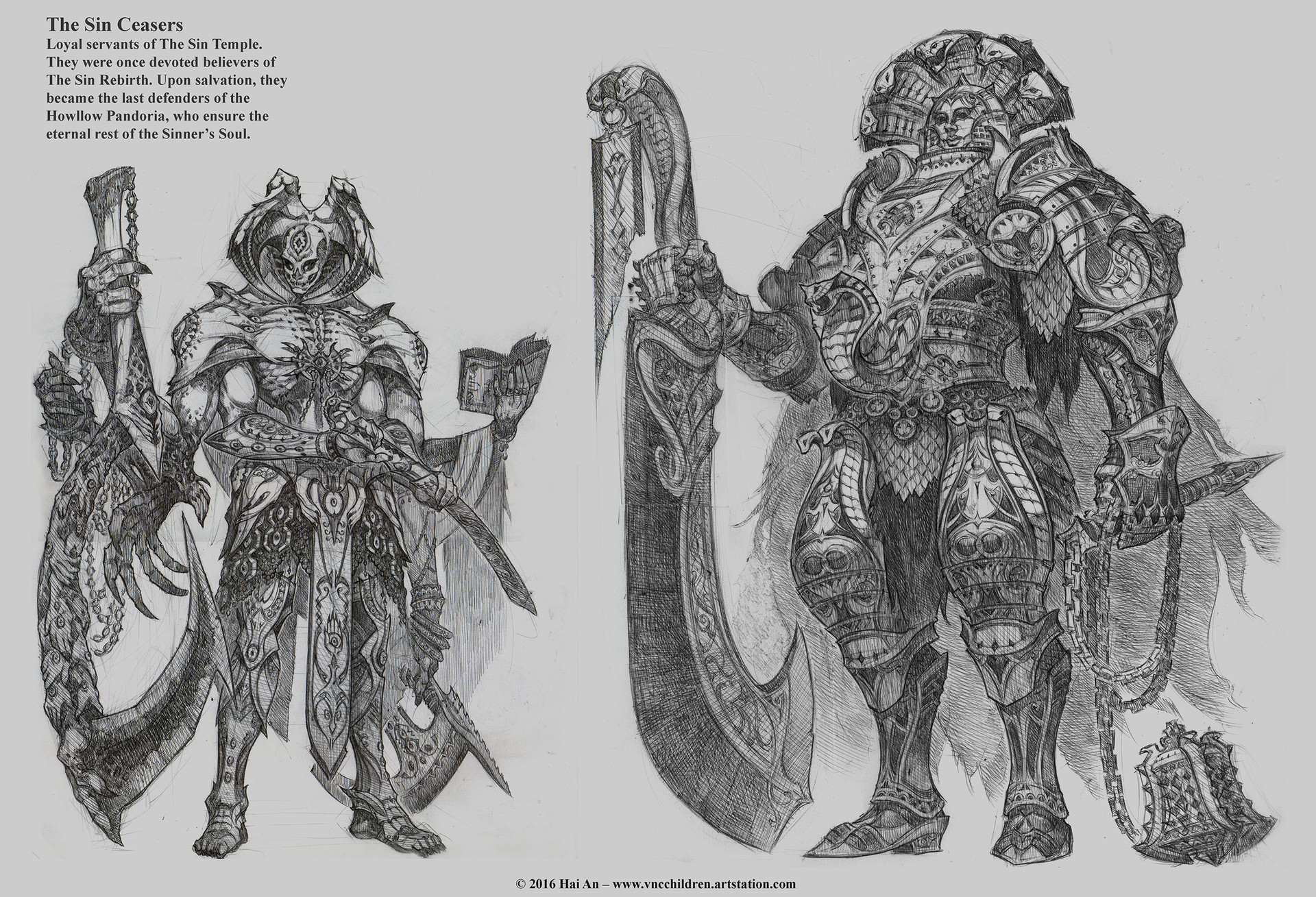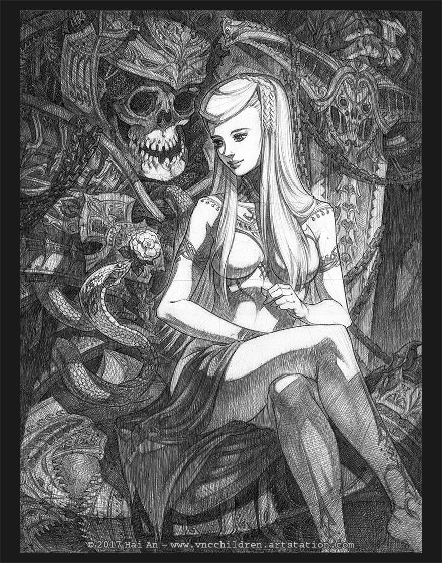
My name is Hai. I'm a concept artist and illustrator from Vietnam. I started posting on Polycount in 2014. However, I suffered a massive skill block in the past 2 years. I stopped for a while to practice. I became a bit better I guess. I would like to share some of my newest stuff, especially the Week Sketch thing with pen&ink and ball point pen I've been doing. Hope you like them
Yes ! Nice ! I've never seen such Dragon like that ! Such a cool concept !
My only critic would be... the birds :poly136:. I know from Feng Zhu videos that it's quite useful trick, to give the drawing a sense of scale and all, but I suggest you might work just a bit more the birds so they don't look as cheap as they do right now, especially in the Root of Elder Rasha shot.
Thanks for the feedback. I really appreciate this
Final week was crazy but I finally got it done. Here is a new character, my version fo the wiked witch
Thanks a lot for the kind words and awesome feedback. I truly appreciate this.
My 2 biggest problems right now are colors - composition and rendering - detail. I overdid a lot with rendering my concept, thus making them too heavy handed and not artistic. I'm working on fixing those right now with my new stuff.
Taking a break from the exhausting jobs hunt, I decided to join Helpful Bear Production' s Kaiju design contest. Not sure what will be the prize but most importantly, I will get feedback from the creature designers in the movie industry.
Here is the design of the monster head. She is named Ashatasia, or Lady God Breathe. She actually belongs to the same story Dragon Castle, along with the princess dragon I posted in the 1st post. I decided to give her a long lance-like head, which is inspired by the whale skull. She uses her head as a giant blade for melee combat. Aside from that, the head indeed can open up into the shape of a 5 fingers hand, and her actual head is inside, attached to the tongue. When opened up, she can talk with her real face or fire powerful energy beam toward her enemies. The 5 parts of the dragon head shoot out lightning to enforce the beam she fires. It works like Gypsy Danger's plasma cannon . I really appreciate any feedback and opinion on this. I want to know what other people think about my stuff, so that I can keep on improving. Thank you so much
I have been busy lately, but finally got the dragon done in a new style I didn't normally use. Not very happy with it, now I understand why Peter Jackson didn't do 6 limbs for Smaug. Also, I'm working a comic called The Stop Moment, my friend Luc Tieu Mi is the writer. Here is a few sample pages from the comic, done with pen& ink on paper:
I love seeing all the pencils work, I often feel like concept artists (myself included 100%) lose sight of the importance to traditional media to the efficiency of photoshop.
Looking at the comments you make on your own work: we're always our own worst critic, but I think you're overly hard on yourself. Your work is strong, and if you put forward the stance that you aren't happy with work it starts to come across, almost like a mar on what other people would otherwise view as great. Put confidence behind your work, you deserve to. That dragon concept is one of the most creative dragon concepts I've seen in a long time. Personally, I'm a fan of the six-limb dragon (and couldn't stand the Smaug design in Peter Jackson's version) so I actually love the direction you went.
Long time no post. Thanks for the kind words and feedback, guys. I really appreaciate this.
Here are 2 of the all the art tests I' ve done for some companies. These two are the failed ones ... So sad ... Being a concept artist sure is tough nowadays ...
Looks awesome! Decent rendering and nice composition.
I can't help to notice that perspective gets quite bizarre on the gun, mostly around barrels.
Also the way the axe is attached isn't very convincing imo.
It looked fine on earlier WIPs but after you removed the barrel cover and changed gun's angle it just doesn't seem to work.
Thanks, guys. @Blaisoid: I know the gun looks really weird, but if you google Gatling gun or Mini gun or Vulcan you will see mostly the angle will turn just like what I painted. I was confused at first but learned that it due to 3 point perspective and decided to floow those references. Anyway, did a catfish inspired monster design lately, think I should post it for some critique before finalizing
Hai, I think the perspective looks fine man. I think the only problem with the gun is for the size the contrapposto is probably going the wrong way. I think his right hip ( or his left if you're him looking down, would be load carrying when the way you drew it the base of the neck is over the left foot. Also the center of gravity of the gun would make it incredibly hard to hold that way because instead of using load bearing muscles he has most of the weight loaded on the shoulders. It could just be that the dude is incredibly strong and doesn't need to worry about that, but it will always feel just a bit off.
That being said, awesome use of atmospherics. It adds a ton of depth to your scene. You may want to try and squeeze in a foreground element just for more depth. Keep it up man this is looking really pro.
Long time no posting. I've suffered from a big skill block. I fought my way out a bit. I would like to share some new things here. More update on the top post. Hope you guys like them
Thanks.It depends on the amount of idea and detail for a single piece. Normally, it took me from 2 hours to several days for each of them. I'm currently working on some a revision of a character I did a while ago. She is a cursed lady that turned into a dark dragon. These are some sketches for this and a ongoing line drawing:
Wow, your work is amazing. The detail in every piece is well clear and concise lines make me just love your work. As well as the imagination you have to create such beautiful pieces. I'm currently a game art student, hoping to be a concept artist and your work is inspiration to me.
I've been off for a while focusing in job. Finally have a little time to do something of my own. I'm planning on opening an online print shop, but not quite sure if it would work. Anyway, this is my newest drawing, done with ball point pen on 10x13.5 inches paper. Hope you guys enjoy :P !!!
Replies
Here is some drawing I did for the temple ruin.
Good work mate, this looks fantastic.
My only critic would be... the birds :poly136:. I know from Feng Zhu videos that it's quite useful trick, to give the drawing a sense of scale and all, but I suggest you might work just a bit more the birds so they don't look as cheap as they do right now, especially in the Root of Elder Rasha shot.
Otherwise, I've nothing to say ! Great skills
Final week was crazy but I finally got it done. Here is a new character, my version fo the wiked witch
the stylized stuff looks good too
I love your less-rendered work, the pieces with flat colors and less shading.
Seems like improving your rendering is all you need (or just stick with the more awesome, simple rendering). Really awesome stuff!
My 2 biggest problems right now are colors - composition and rendering - detail. I overdid a lot with rendering my concept, thus making them too heavy handed and not artistic. I'm working on fixing those right now with my new stuff.
Taking a break from the exhausting jobs hunt, I decided to join Helpful Bear Production' s Kaiju design contest. Not sure what will be the prize but most importantly, I will get feedback from the creature designers in the movie industry.
Here is the design of the monster head. She is named Ashatasia, or Lady God Breathe. She actually belongs to the same story Dragon Castle, along with the princess dragon I posted in the 1st post. I decided to give her a long lance-like head, which is inspired by the whale skull. She uses her head as a giant blade for melee combat. Aside from that, the head indeed can open up into the shape of a 5 fingers hand, and her actual head is inside, attached to the tongue. When opened up, she can talk with her real face or fire powerful energy beam toward her enemies. The 5 parts of the dragon head shoot out lightning to enforce the beam she fires. It works like Gypsy Danger's plasma cannon . I really appreciate any feedback and opinion on this. I want to know what other people think about my stuff, so that I can keep on improving. Thank you so much
All of your tiny thumbnails also read instantly, that's a sign you're doing a great job.
Keep up the good work!
I have been busy lately, but finally got the dragon done in a new style I didn't normally use. Not very happy with it, now I understand why Peter Jackson didn't do 6 limbs for Smaug. Also, I'm working a comic called The Stop Moment, my friend Luc Tieu Mi is the writer. Here is a few sample pages from the comic, done with pen& ink on paper:
That is not "scribbling," it is cross-hatching and it looks fantastic.
Looking at the comments you make on your own work: we're always our own worst critic, but I think you're overly hard on yourself. Your work is strong, and if you put forward the stance that you aren't happy with work it starts to come across, almost like a mar on what other people would otherwise view as great. Put confidence behind your work, you deserve to. That dragon concept is one of the most creative dragon concepts I've seen in a long time. Personally, I'm a fan of the six-limb dragon (and couldn't stand the Smaug design in Peter Jackson's version) so I actually love the direction you went.
Here are 2 of the all the art tests I' ve done for some companies. These two are the failed ones ... So sad ... Being a concept artist sure is tough nowadays ...
all the best to you
Lou
WIP:
I can't help to notice that perspective gets quite bizarre on the gun, mostly around barrels.
Also the way the axe is attached isn't very convincing imo.
It looked fine on earlier WIPs but after you removed the barrel cover and changed gun's angle it just doesn't seem to work.
@Blaisoid: I know the gun looks really weird, but if you google Gatling gun or Mini gun or Vulcan you will see mostly the angle will turn just like what I painted. I was confused at first but learned that it due to 3 point perspective and decided to floow those references. Anyway, did a catfish inspired monster design lately, think I should post it for some critique before finalizing
That being said, awesome use of atmospherics. It adds a ton of depth to your scene. You may want to try and squeeze in a foreground element just for more depth. Keep it up man this is looking really pro.
Fantastic work, especially the armor characters and creatures. His cross hatching technique is amazing.
Congratulations!
I'm currently a game art student, hoping to be a concept artist and your work is inspiration to me.