New Environment Art Portfolio Site
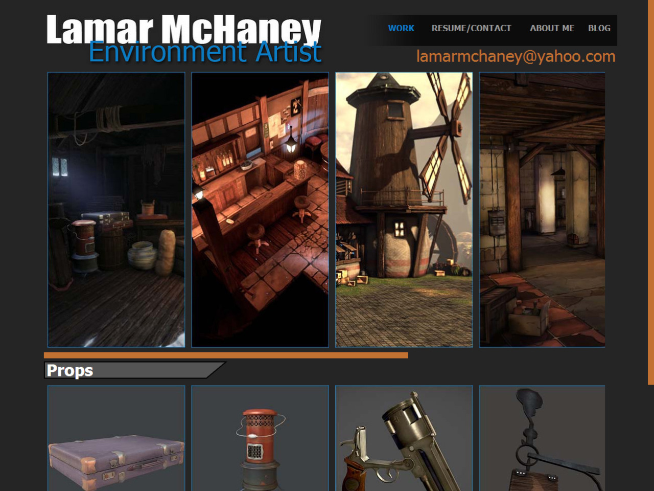
Hey guys, I want to share my new portfolio site with the polycount community. I decided to make it straight to the point. There is no flashy background or crazy drop down menus, it's straight to point site with no distraction from my work. I would love to here what you guys think.

http://lamarmchaney.tumblr.com/index.html

http://lamarmchaney.tumblr.com/index.html

Replies
Alternately, you could do what this guy did: http://nathanielflower.carbonmade.com/
This guy showed just his environments on the front page, but when you click on an image, it shows you beauty shots of the environment and the individual props he made for the scene.
Cook
Prepare food for the consumer"
Your employable has raised by 1000% well done
On a serious note I would remove this and other things that are not related to the job you want (environment art)
EDIT: I would recommend you also read this
http://halo.bungie.net/News/content.aspx?type=topnews&link=werk4usplz
@Robeomega: Yeah me and my roommate was just talking about. I am going to remove it thanks for the advice.
The cylinder is a separate piece, and there's usually a small but noticeable gap between the front of the cylinder and the frame.
The grip looks rather wide, almost as though it has a circular cross section. Some pistols had circular grips, but these tend to be very old - 18th century. The distance to the trigger looks too long; you might want to measure it with a reference hand to see if everything fits.
On your resume page, there should be a space between 3ds and Max. I'm not certain about your arrangement in the skills section; it's more common to split tools & experience into separate columns rather than assigning skills to tools. Your experience section could use some editing; some verbs are in the present tense, some tasks are missing a verb, and some are in passive voice ("Chosen to...").
Your "About" section has some grammatical errors. Try to get people to proofread for you; even if they aren't English majors, they might spot things which you missed. For example, it should be "my friends and I" rather than "me and my friends". You've also used commas in a few spots instead of periods (or my personal trademark, semi-colons); in general, if you've got two verbs, you have two sentences, and need a conjunction or a period. Minor details, I suppose, and many - or even most - readers won't consciously know what is wrong.
In regards to the pistol, that's Hellboy's Revolver. I tried my best to research where Mike Mignola drew his inspiration for the pistol. I do understand it was Hellboy's left which is his normal size hand, however, he is a very big creature. I also did some research on old revolvers just to get an idea for the revolver in general. What can I say, I still have some work to do. Thank for your input, I really do appreciate it.
I think the briefcase, heater, and signs sign are pretty bland compared to your guns and other whole environments. You could easily replace these with some bulk shots of props from your environments, sort of like how Jessica Dinh did it:
That's good idea for some of the props, I've seen jesseica's site before and I like how she displays her props. However, I'm already in the process of getting rid of most of those props as they are a weak part of my site. I'll be uploading new props that are at the quality of my other work.
I also subscribed to your PBR evvironment post, I already like your take on the concept. When I participated in the challenge, I wanted to capture more of a Jim Lee, Scott Williams, Alex Sinclairs comic book style. I was really aiming for it to look like Superman Earth One comic when it came to the textures.