Hi guys, I posted some images for the game I am working on, but they got taken down when cghub went down, so I thought I would make a new thread and host the images elsewhere. So sorry about the reposts, but I do have some new art to show. I have been taking a stab at environment and figuring out our level so here are some updates.
A little info about Overpower:
Overpower is a free to play Fantasy Shooter game I am making with a friend in Unity. Hes doing all the coding / programming and I am doing the art. We have some friends chipping in here and there but its primarily been the 2 of us.
This is the first time I am attempting to make a game on the side. So I am learning a lot and just trying to figure things out. Anyways, here is some art
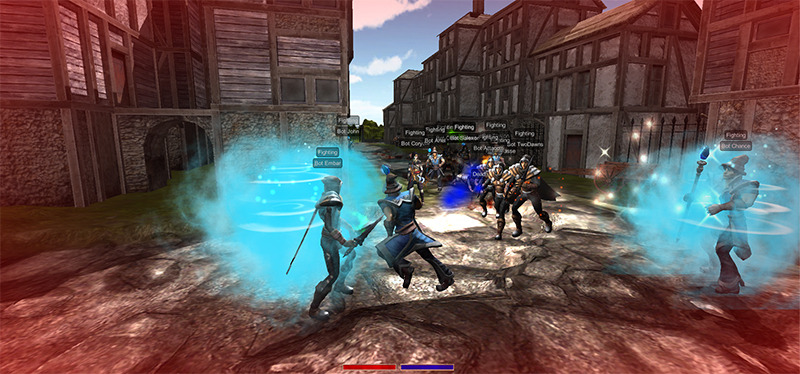
Crazy Bots running around fighting each other (temporary environment)
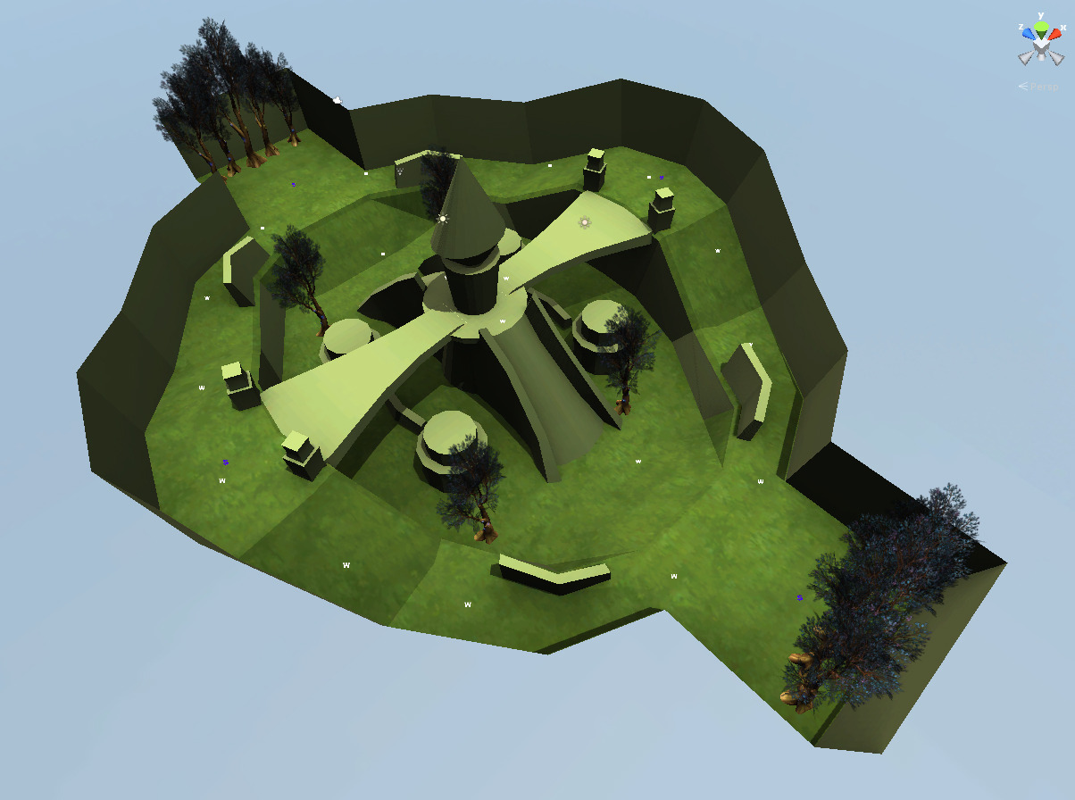
Arena Level prototype in Unity
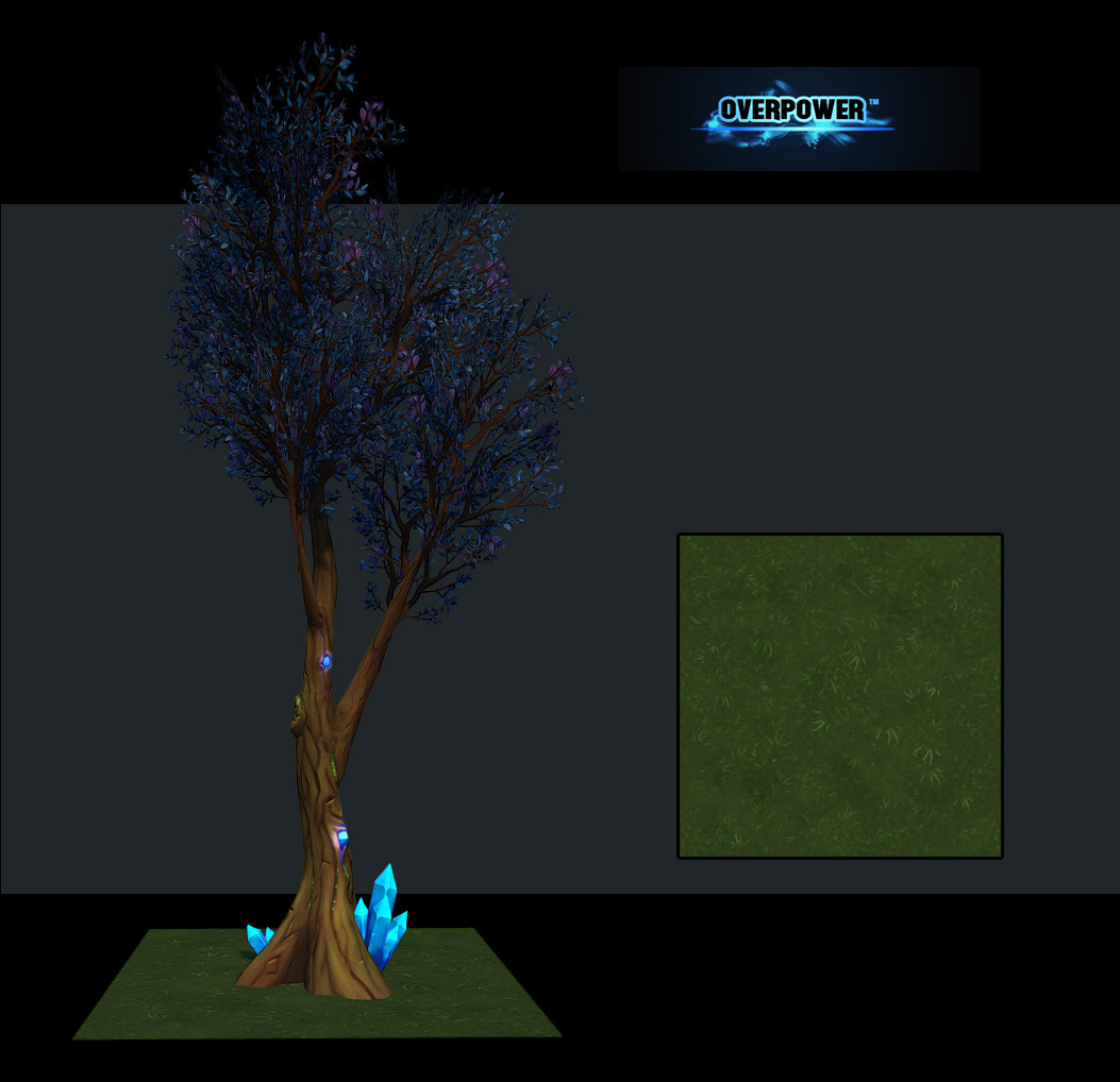
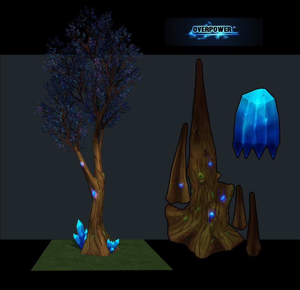
Take on forest Trees:
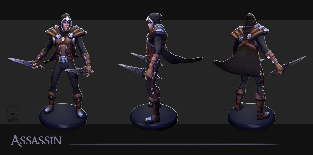
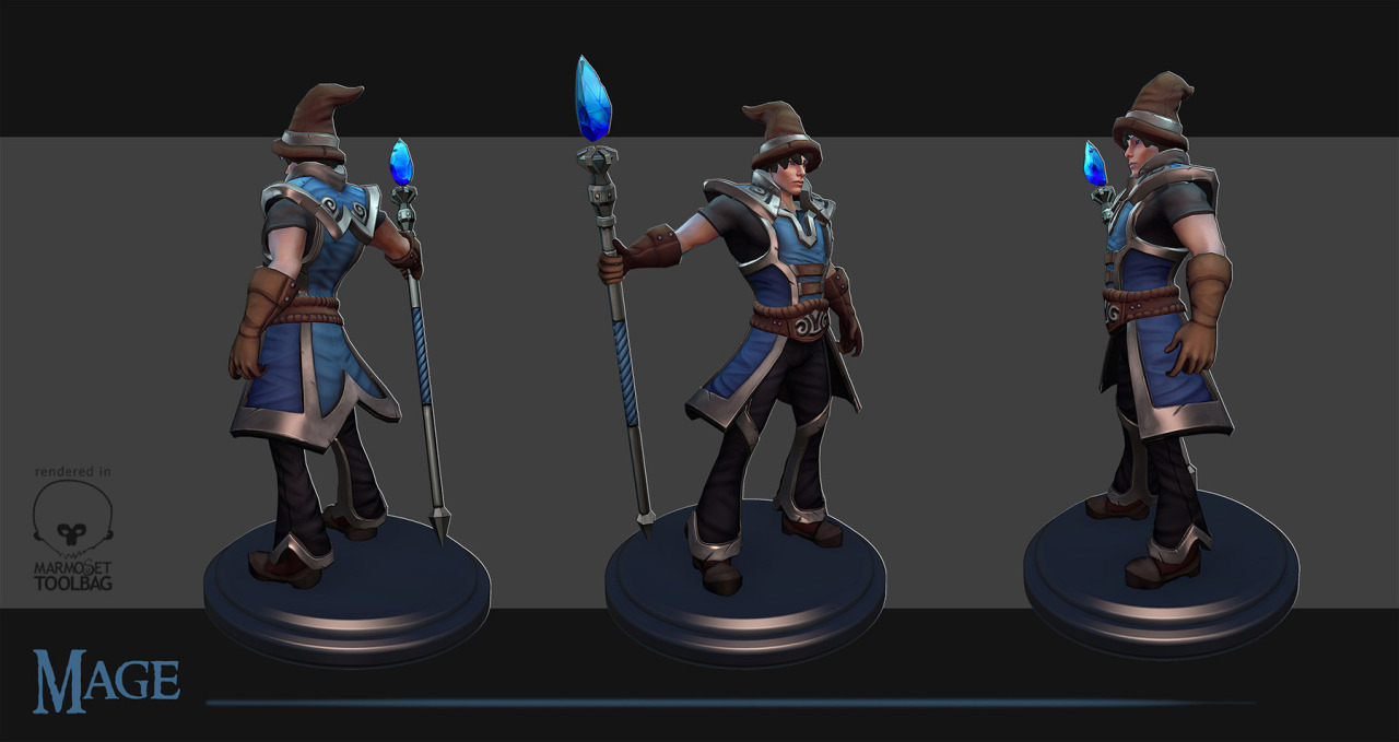
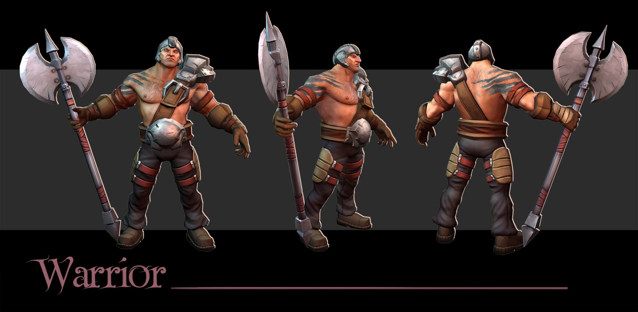
Characters, which I previously posted in another thread
Thanks for looking, I will continue to post updates in this thread from now on.
Hi guys, Its been a while since I have posted anything. I have been transitioning from character art to Env / UI / Logo stuff. I just wanted to share with you the progress on Overpower.
We have a new logo, we also have some new Icons for our classes and here are some in-game screenshots from Unity using Marmoset Skyshop Plugin to show how our first level is shaping up
I also made a tutorial for how I tile my subtools in zbrush to create tileable hand painted textures with a normal map! (see last image)
If you want to follow our development process more closely you can Like our facebook, follow our twitter, or tumblr:
The scale for the wood texture looks off - the planks appear to be 3 feet wide and 10 feet long. Planks are usually much longer than they are wide. I'd tone down the gaps on both the stone and the wood, reducing both the size and the contrast.
Try to use a different stone texture for the floor than for the walls - it's visually confusing when both look the same.
Rather than using stone walls for obstacles, why not use hedges? Water is another excellent obstacle, slowing down or blocking characters while not affecting visibility (except for those pesky rogues hiding in it...)
I'd lose the shrubbery above the border walls - it doesn't look natural. A decent skybox/dome with a decent texture would suffice for a distant background - that's what the first few dozen Unreal Tournaments did, after all. Part of me, though, would like to see the entire arena dropped into a coliseum; sure it'd be expensive to do properly, but it would explain why people are running around killing each other.
Some of the stone textures - most notably those on the stairs - line up, forming obvious artificial lines.
It would probably make life easier for the players if the characters' colors were team, rather than class. based.
Hey Dwalker,
Thanks for your feedback. I appreciate you taking the time to write that up. The level is very much a work in progress so some of the things you mentioned are temped in others like the texture scales I can easily adjust so thanks for bringing that up.
I would like to include some of the things you mentioned, water and hedges etc. I am still pretty new to Unity and have alot to learn about their Env tech before some of these things can be impleneted. Thanks again!
soo its been a long time since I posted an update, and I have a lot of new stuff to show you. I finished up the first arena level you will see it in the screen shots below along with a preview of the next level I am working.
I learned a ton about env art / level design / unity through the process of making the first level. I am taking these lessons and applying them to toward the 2nd level, I plan on going back and recreating the first arena again and it will be even better.. but until then here are some screen shots from Overpower!
Well thats it for now, I hope you enjoyed the update. If you want to know more about the game and how it plays etc then check out our EPOCU profile, we have a design summary written up there and you can check us out and other indie games as well!
Watch out for the harsh transition between the wall and the ground, a trim would make it look better and believable. For the lamp, the stone parts look wet so I would turn it down on the specular and gloss.
I remember seeing your work on some of the characters for the game, they look great! The only crit I would give is regarding the mage, it would be cool to see him with a larger staff or more exaggerated, just because the other character weapons seem quite exaggerated so it would be fitting with the style. Good stuff
Watch out for the harsh transition between the wall and the ground, a trim would make it look better and believable. For the lamp, the stone parts look wet so I would turn it down on the specular and gloss.
That's because it's metal, not stone. Maybe it could be more obvious material wise but why on earth would those parts be made of stone? xD
Hey guys,
Trying to get into the habit of updating more frequently the thread. So here is a WIP of the next warrior armorset for OP. Its still in the rough dynamesh state but I am using zbrush to concept the design. I basically just keep changing pieces until I find something I like. I am trying to make it look sweet without over detailing it. Feel free to let me know what you think. Thanks!
Its been a super long time since I have updated this polycount thread. So I want to introduce / re-introduce this game to people.
Overpower is a third person fantasy shooter game that I have been developing for over a year with some friends. It plays a lot like counter-strike but with melee weapons and magic.
I have a lot of art to share with you as well as a trailer!
Here are some recent screenshots from the game. I am using PBR Shading inside of Unity to light the levels / characters.
All new character art:
BaseMesh Sculpts
Here are some creatures I am working on that are part of one of the upcoming game modes!
I'm not sure what to name them. They are based off a Cat / Skunk / Turtle!
Well thats about it for this update. If you are interested in the development of the game I will post all our social media outlets. If you are interested in playing Overpower / and or supporting us as we release I would recommend signing up for our newsletter on our website at http://www.overpowergame.com
Hey, since one of your guys has a 6-pack you are gonna have to place the top 2 packs above the thoracic arch, directly underneath the pectoralis major.
Hey! nice work here! You made a great improve with this characters. I really like your stylized anatomy and proportions! Great job with hand painted textures too. I cant wait to see more! Keep working good luck!
Hey Brian "Panda Choi, Thank you, I have a video for you to check out gameplay. It's from a few months ago, so the game is a little further along but it still captures the gist of what we're doing
Hi everyone, I have another update on the game here and a new trailer! The trailer describes our current development status much more then pictures will so check that out!
Our goal is to recreate an MMO style PvP experience that is just as amazing as playing an MMO game but you don't need to grind for months beforehand!
Our inspirations are Counter - Strike / TF2 / Vanilla WoW / League of Legends / Tera
If you're interested in playing we have a newsletter sign up on our website!
hey there, just want to say i really like your game it looks fantastic!
but i have a question im new to sculpting and im litte curious, how much detail you sculpted into your characters? don't get me wrong but it doesnt seem that much i would love to know
Hi @Casly Im glad you like the game thank you for checking it out. I didn't put much detail into my characters. I wanted to go with a more simplified type of look. Does that answer your question?
Hi everyone, It's been a few months since my last update. We're finally getting ready to release the game! On January 19th we're going to launch a simultaneous Kickstarter / Greenlight campaigns and move into closed beta immediately afterward!
Here is some gameplay footage that we used to apply for a spot in PAX East 2016.. 3 mins showing a bit of each class.
Hi @cleankid , your game looks great, I love it. I always appreciate for game artist who have completed their assets to be published in game. I have to say that I'm following your game through greenlight and kickstarter soon. Good Luck
Hi everyone.. 2 weeks until our Kickstarter launches.. here's a small update. We had a chance to play Overpower with the guys from MMOs.com. They did a video review which was just uploaded to youtube. Check it out!
Hey everyone! Overpower has launched on Steam Greenlight and Kickstarter! Plus we have a brand new trailer Check out our Kickstarter if you want to help support us in making an awesome game!
LOVE all your guys' art!! the style is so clean and optimistic! my personal preference would be this with just a tiiiiny bit more bite, but the proportions and gestures in the shape are so much fun! Really well done!! Downloading the client now!
Replies
Hi guys, Its been a while since I have posted anything. I have been transitioning from character art to Env / UI / Logo stuff. I just wanted to share with you the progress on Overpower.
We have a new logo, we also have some new Icons for our classes and here are some in-game screenshots from Unity using Marmoset Skyshop Plugin to show how our first level is shaping up
I also made a tutorial for how I tile my subtools in zbrush to create tileable hand painted textures with a normal map! (see last image)
If you want to follow our development process more closely you can Like our facebook, follow our twitter, or tumblr:
https://www.facebook.com/overpowergame
www.overpowergame.com
@Overpowergame
Cheers!
Try to use a different stone texture for the floor than for the walls - it's visually confusing when both look the same.
Rather than using stone walls for obstacles, why not use hedges? Water is another excellent obstacle, slowing down or blocking characters while not affecting visibility (except for those pesky rogues hiding in it...)
I'd lose the shrubbery above the border walls - it doesn't look natural. A decent skybox/dome with a decent texture would suffice for a distant background - that's what the first few dozen Unreal Tournaments did, after all. Part of me, though, would like to see the entire arena dropped into a coliseum; sure it'd be expensive to do properly, but it would explain why people are running around killing each other.
Some of the stone textures - most notably those on the stairs - line up, forming obvious artificial lines.
It would probably make life easier for the players if the characters' colors were team, rather than class. based.
Thanks for your feedback. I appreciate you taking the time to write that up. The level is very much a work in progress so some of the things you mentioned are temped in others like the texture scales I can easily adjust so thanks for bringing that up.
I would like to include some of the things you mentioned, water and hedges etc. I am still pretty new to Unity and have alot to learn about their Env tech before some of these things can be impleneted. Thanks again!
soo its been a long time since I posted an update, and I have a lot of new stuff to show you. I finished up the first arena level you will see it in the screen shots below along with a preview of the next level I am working.
I learned a ton about env art / level design / unity through the process of making the first level. I am taking these lessons and applying them to toward the 2nd level, I plan on going back and recreating the first arena again and it will be even better.. but until then here are some screen shots from Overpower!
Art Images:
In-Game Shots / Maps
Youtube Tech Demo showing Capture Points
Well thats it for now, I hope you enjoyed the update. If you want to know more about the game and how it plays etc then check out our EPOCU profile, we have a design summary written up there and you can check us out and other indie games as well!
Cheers
[SKETCHFAB]eaf107881219457dae093c2933256940[/SKETCHFAB]
That's because it's metal, not stone. Maybe it could be more obvious material wise but why on earth would those parts be made of stone? xD
Trying to get into the habit of updating more frequently the thread. So here is a WIP of the next warrior armorset for OP. Its still in the rough dynamesh state but I am using zbrush to concept the design. I basically just keep changing pieces until I find something I like. I am trying to make it look sweet without over detailing it. Feel free to let me know what you think. Thanks!
Its been a super long time since I have updated this polycount thread. So I want to introduce / re-introduce this game to people.
Overpower is a third person fantasy shooter game that I have been developing for over a year with some friends. It plays a lot like counter-strike but with melee weapons and magic.
I have a lot of art to share with you as well as a trailer!
We have a new logo! Courtesy of Mike Kasper (http://www.creatureartist.com/)
We also have a new gameplay trailer! If you only click 1 thing then watch the trailer
[ame]https://www.youtube.com/watch?v=NmGaWIe__UE[/ame]
Here are some recent screenshots from the game. I am using PBR Shading inside of Unity to light the levels / characters.
All new character art:
BaseMesh Sculpts
Here are some creatures I am working on that are part of one of the upcoming game modes!
I'm not sure what to name them. They are based off a Cat / Skunk / Turtle!
Well thats about it for this update. If you are interested in the development of the game I will post all our social media outlets. If you are interested in playing Overpower / and or supporting us as we release I would recommend signing up for our newsletter on our website at http://www.overpowergame.com
OP Facebook
OP Twitter
OP IndieDB
Thanks!
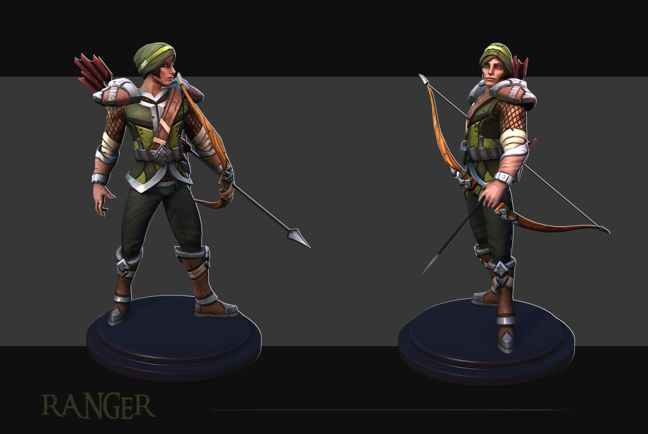
And a WIP sculpt of the male ranger playable class:
[ame]https://www.youtube.com/watch?v=NmGaWIe__UE[/ame]
Thank you Karytsukino, Glad you like the style!
Here are the finished renders of the male ranger:
With wireframes:
Our goal is to recreate an MMO style PvP experience that is just as amazing as playing an MMO game but you don't need to grind for months beforehand!
Our inspirations are Counter - Strike / TF2 / Vanilla WoW / League of Legends / Tera
If you're interested in playing we have a newsletter sign up on our website!
[ame]https://www.youtube.com/watch?v=lIyTqP9SjeY[/ame]
Wallpaper render of the characters posed in Marmoset
Here are the 9 levels we have playable currently.
These are some of our other social media outlets if you're interested in keep up with development as we head towards Greenlight!
Facebook
Twitter
Instagram
Tumblr
but i have a question im new to sculpting and im litte curious, how much detail you sculpted into your characters? don't get me wrong but it doesnt seem that much i would love to know
greetz
Here is some gameplay footage that we used to apply for a spot in PAX East 2016.. 3 mins showing a bit of each class.
https://www.youtube.com/watch?v=D4uCm4cPX2s
If you want to follow along / support us or be part of our launch you can check out these links:
https://www.youtube.com/watch?v=3cf_gofFSXk
https://www.youtube.com/watch?v=Ar1MOZ5q8ho
Download the PC and Mac versions here!
For full Closed Beta Access on Steam launching February check out our Kickstarter Campaign
model