Critiques would be great!
Hello, hello! Figured I'd get some input from you masters on here (love all the work I've seen!). I'm working on building up a portfolio, as a student, and I do realize that my work still as a long way to go. I'd love to work in concept art, and I hope to get some input on my WIPs. ")
The first is a character scene titled "Roach Noir". Trying to go for that film-noir look. I do need to fix some perspective issues here, as well as lighting and values.
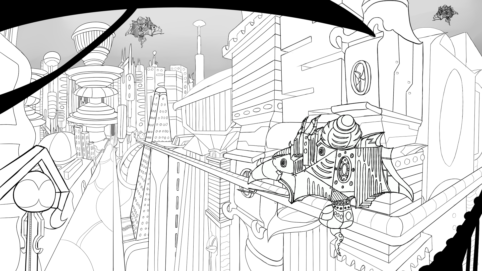
The second attachment is a WIP of a sci-fi cityscape.
The third is a WIP of a character sheet I started, for a dromaeosaurid dinosaur I have named "Ria".
Let me know what you all think I should improve on/add/change/etc (don't hold back)! Any links to resources would be a great help!
Thank you all, in advance, for your time.
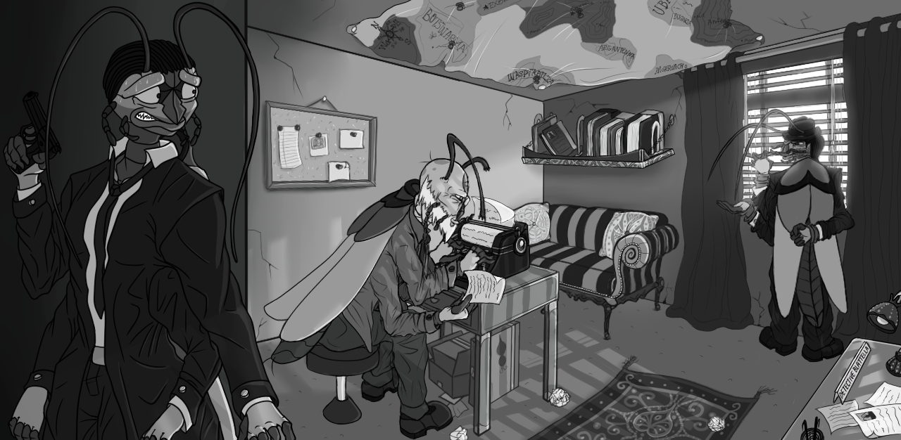

The first is a character scene titled "Roach Noir". Trying to go for that film-noir look. I do need to fix some perspective issues here, as well as lighting and values.
The second attachment is a WIP of a sci-fi cityscape.
The third is a WIP of a character sheet I started, for a dromaeosaurid dinosaur I have named "Ria".
Let me know what you all think I should improve on/add/change/etc (don't hold back)! Any links to resources would be a great help!
Thank you all, in advance, for your time.
Replies
Noted, thank you!
Just fixed the image issue, too, thanks.
For the first two I'd particularly like to know if the composition works, and if not, how it can be improved.
Thank you!
my 2 cents:
On your first image, your perspective is too much accented, you need to rework that. The vanishing point you used are too close of the frame of your scene. (Am pretty sure one is actually IN the image, wich, for a interior scene, can cause problems.)
On this high poly/next-gen environment modelling done in 3 minutes on sketchup (with a 35mm lenses camera) you can see how the foreshortening of the lines of the walls and ceiling are less prononced:
(At the start, don't hesitate to use sketchup to establish perspective while you're not very used to perspective, it's an awesome tool for artist)
Composition wise, the dude on the left as some tangents with the frame, especially the hands. Watch that!
I'm not an expert on light but the 2 guys in the room could uses more shadows. Plus you need to push the contrast waaaaaaay more, especially if you want a "film noir" style. (I mean, come on, type film noir on google image and look how much pure blacks and white they had! :cool: )
For the cityscape, well more less same stuff about perspective... And it needs some more love, the vehicle is lost on the background, not sure about the focal points. And watch out for tangents with the vehicle and BG!
Comp wise you've got the thirds, wich works. And we understand that the ship is zooming in this big avenue with lots of building, but you need more refining on this! Look up for movie stills to help you out, like: http://image.toutlecine.com/photos/5/e/m/5eme-element-1997-09-g.jpg
Hope I was able to be helpful. Cheers and keep on drawing!
Ahhh, yes, The Fifth Element is certainly a great reference for my cityscape. Don't know why I didn't think of that. I will definitely look up more movie stills.
Thanks again!