Home 2D Art Showcase & Critiques

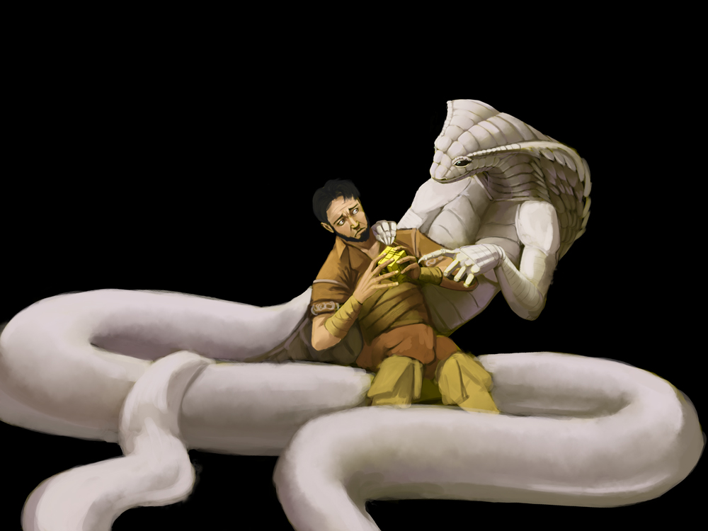
trying to find common ground WIP

I like to throw negative steryotype in their heads (which is why 'mainstream' will never accept me)
so here you have the 'beauty and the beast' idea thrown on it's butt.

i have been working on this for a while (off and on) and the black background is there to pump up the contrast and make it easier to see the lights and darks on both characterstrying_to_find_common_ground_refine_by_hattonslayden-d7doyuc.jpg
Replies

  • AlecMoody
    Offline / Send Message
    AlecMoody ngon master
    You can get the high contrast look that you want without using a black void. The black background totally flattens the image. One option would be to just drop in a hint of floor surface with shadows coming towards the camera.
  • hattonslayden
    AlecMoody wrote: »
    You can get the high contrast look that you want without using a black void. The black background totally flattens the image. One option would be to just drop in a hint of floor surface with shadows coming towards the camera.
    a valid point and this is what it currently looks like without the black... like i said, the black is only temp layer1524_by_hattonslayden-d7efywq.jpg
  • hattonslayden
    i spent many attempts trying to make a brush that would speed up the application of scales but none worked, when i did this version i simply made a new layer and put it on overlay with lowered opacity. with the final version i will simply add more detail
    cutesy_nell_oh_so_pretty_by_hattonslayden-d7e2oq5.jpg
  • Muzzoid
    Offline / Send Message
    Muzzoid polycounter lvl 10
    Nice! I really like the feel in that first pic. You have a lot of potential!

    The best advice i've heard for working out the key of your image, is this phrase.

    High key is a pinch of dark, a handful of mids and a glass of lights.
    Low key is pinch of light, a handful of mids and a glass of dark.

    The reason why the first doesn't work is because you did high key lighting, but used a black background, throwing out your value range.

    Anyways this is what i would do value wise on the image.
    JNINwwp.png?1
  • hattonslayden
    1398298344.hattonslayden_1561.jpg
    adding more contrast and redoing the background with a different feel to it and more like what i am trying for. bright and cheerful. Gerrard's discomfort is based exclusively on Nell's appearance and not the complete person she is as he represents mainstream opinion on those who are different. but rest assured, as this is fantasy he will be able to overcome his racism and bigotry without need of her turning into a human like mainstream demands
  • Muzzoid
    Offline / Send Message
    Muzzoid polycounter lvl 10
    Huh.... I'm confused?
  • hattonslayden
    Muzz wrote: »
    Huh.... I'm confused?
    well have you ever seen a human male have a romantic relationship with a xenomophic female without one of them physically changing into the other? in Mainstream Media i mean
    added more contrast
    1564_by_hattonslayden-d7fsuwa.jpg
  • hattonslayden
    as this work was going along i noticed it started feeling disjointed

    i was using reference of artists the were too 'conflicting' in style and it was leaving my work un-unified so i went back to my roots, norman Rockwell, Frank Frazetta and Mark Schultz 1576_by_hattonslayden-d7g9ovv.jpg
Sign In or Register to comment.