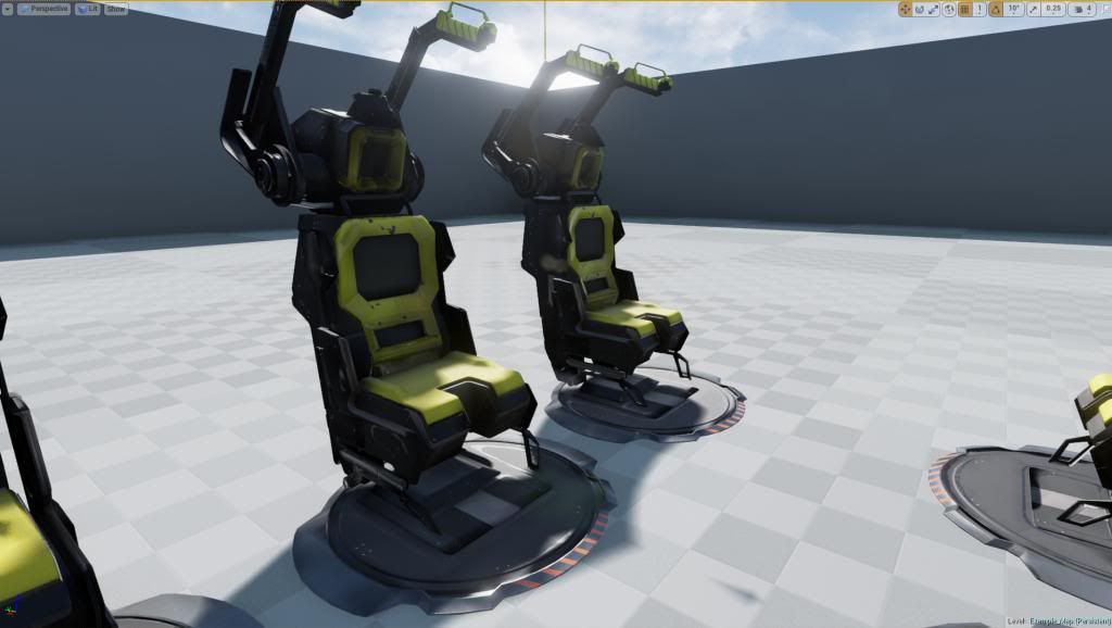
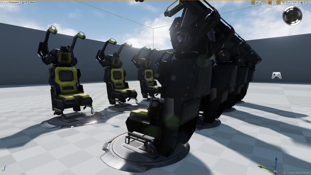
Refining my portfolio with a lot of new skill sets and programs. Here is the very beginning of a drop ship scene that will be my main piece. Major WIP.. shaders need work and texture are only at 1:2 res. right now. Input appreciated! Based on concept. I will show in next post. UE4 is awesome so far!
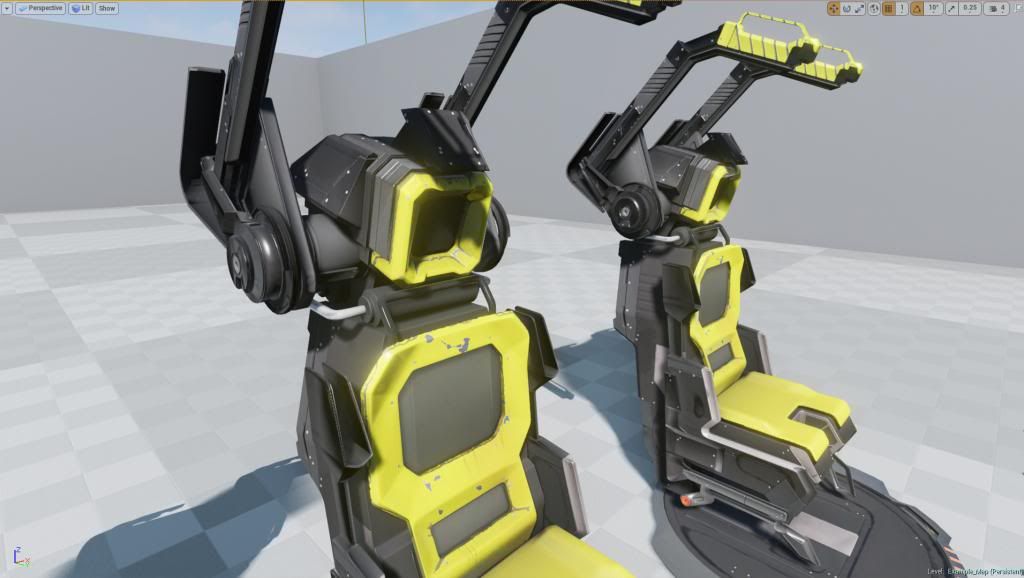
Another modular piece out of the way! Really loving the way metal can look in this engine. I am finding the "roughness map" to be much more appealing than the old "spec maps"
Another part completed. Also updated the materials a bit. Added some lighting as well. I am working on a ddo/ndo pipeline currently. Seems to working well so far!
Some more geometry in the scene. Further refined the lights and textures. I want it to look worn/used.. but not so dirty that it looks like noone has been in there for years. I am trying to apply realistic wear and tear only. Opinions?
Are you using material blending shaders for your metals in your scene? For example that surface that the chairs are sitting on, that black looks very opaque and the underlying metal from the scratches looks like it would reflect a lot more.
Swarm22: That is a good question! I am aware of the blending shader system that ue4 has developed. I have used it. However, in this scene I my goal was to develope a pipeline that used regular textures and acheived the same end result as a blended material. In other words, I am using a metal map, a roughness ("gloss") map. (Which is playing a role similar to a spec map in other engines) and a regular diffuse map to acheive the look that you see in the pictures. I have found that the result is the same.. and i can save on memory and calls by instancing one material and making any/all alterations to the texture files rather than the material parameters themselves. I am not at home right now, but when I am... I will snap shot the simple material I am using. All of the majic is in texture. However, I will add some vertex painting/blending to the master material in order to add unique details and I will also use some decals. I hope I answered your question. Thanks for the reply! More soon!
I think you should try working on defining your different materials more. For example, the chair materials are reading as the same material, just with a different color. It looks like the roughness values should be different on certain parts of the chair but it's all reading as a single roughness value.
If you can define and distinguish your different materials more I think that would really help.
Tobbo: Thanks for the feedback. While I agree that I could probably stand to put some more contrast on materials definition.. I have to chalk this one up to bad lighting. I will show some better shots of the chair and I would like to hear your feedback again. I actually am using very different gloss levels on the chair. for example: the yellow backing is very shiny pastic.. while the yellow seat is a cushion with almost no gloss. parts of the chair are metal.. and parts are plastic. this is all very clear in the engine. It did not come across so well in the pics. Either way.. you have brought it to my attention and I appreciate it. I will work on that! Thanks again!
Just a few more snap shots of progress so far. Thanks for the feedback so far! Looking forward to hearing more. I set up te scene with lighting that will be closer to the end result. Also added a few more assets. Still many more to come.
Swarm22: That is a good question! I am aware of the blending shader system that ue4 has developed. I have used it. However, in this scene I my goal was to develope a pipeline that used regular textures and acheived the same end result as a blended material. In other words, I am using a metal map, a roughness ("gloss") map. (Which is playing a role similar to a spec map in other engines) and a regular diffuse map to acheive the look that you see in the pictures. I have found that the result is the same.. and i can save on memory and calls by instancing one material and making any/all alterations to the texture files rather than the material parameters themselves. I am not at home right now, but when I am... I will snap shot the simple material I am using. All of the majic is in texture. However, I will add some vertex painting/blending to the master material in order to add unique details and I will also use some decals. I hope I answered your question. Thanks for the reply! More soon!
Thanks for the reply, i'm still trying to get my head around this new PBR workflow. When you say you're using a metal map, what exactly is that? I was told instead of doing it the long way through materials, you can create a black and white image, like a mask, that has different white values in the areas where you want your metal to shine more or shine less and plug that into metal. Is this what you're doing? Great work on this, it's coming along great!
@ Swarm22 - The metalness map tells the shader when an area is a metal. The shader then darkens the diffuse and increases the spec in that area. It also takes the painted information in the diffuse and makes that the specular control. That's all that is happening with the metalness map. It's important to note that everything that isn't a metal has a standard spec value. You want to keep the map essentially black and white and avoid grey tones wherever possible.
Swarm22: That right. Stevston89 explained it very well. Basically ue4 did some work for you by implementing a 'metal' feature that does what he said. What the engine flaunts.. is the ability to layer materials that are metal.. with other materials like plastic.. etc. all in one blended material. What I have done is mimicked the effect by using the metal mask you spoke of. Black areas are non metal.. and white are metal. According to epic.. the best use of this feature is to either turn metal all the way to 0.. or all the way to 1. Therefore there is very little mid values in my maps. This works because black =0 and white =1. Make sense?
Yeah maybe it was just the lighting in the first pics. It's looking better under the newer lighting conditions. Will you just be doing the inside of the dropship? Or will you also be doing the outside as well?
Tobbo: Im not sure at the moment. This is really for my portfolio.. so i am focusing primarily on the environment aspects of the world. I plan to make a ruined fantasy type outdoors... as if this ship just landed on another planet. So i doubt ill do the outside. but maybe. Thanks btw! I thought you might think it looks better under the current lighting conditions!
A couple more updates. More assets. Lots of texture/material work to do.. but I think I've got at least 90% of the assets in scene at this point! woohoo!
I keep hearing "Klendathu Drop" from Starship Troopers playing in my head. So good job! The seat areas look oddly dark for all those super bright lights above them, but the contrast it lends looks neat.
Personally I think adding the white lighting has ruined the sci-fi moodiness. some times you need to sacrifice functionality for the mood and or story you are trying to tell.
I really like the direction it was heading before those lights where put in.
ON another note, you have a lot of room between the chairs... may I suggest putting some weapon racks or storage units? It would add alot, more complexity to the scene, in a good way.
I keep hearing "Klendathu Drop" from Starship Troopers playing in my head. So good job! The seat areas look oddly dark for all those super bright lights above them, but the contrast it lends looks neat.
I agree. I plan to brighten it up a bit. But I was really feeling the contrasting mood it set. I will def. play with it some more and post some varying results. Thanks for the feedback!!
Personally I think adding the white lighting has ruined the sci-fi moodiness. some times you need to sacrifice functionality for the mood and or story you are trying to tell.
I really like the direction it was heading before those lights where put in.
ON another note, you have a lot of room between the chairs... may I suggest putting some weapon racks or storage units? It would add alot, more complexity to the scene, in a good way.
Thanks for the input! I was going for a functional type environment i suppose, but more importantly.. I was trying to stikck to a concept I was working off of. I checked out your scifi hallway done in 1 hour.. impressive! nice work/keep it up! Do you have any suggestions for alternative lighting?? Anybody else feel this way also? I want to make sure this scene is attractive and well refined because It will be a portfolio piece for sure. Thanks again! I really enjoy hearing feedback on my work.. always room for imporvement!
ps There are actually some assets that go in between the chairs as well as some railing.. I have not placed them yet. Hopefully that will fill the void. The concept was quite simple in some ways.. so I am definately looking for ways to beef up the scene. Any other suggestions will be noted! Also, there is a big monitor type display that hangs from the ceiling... so thats covered already. I will add that last.. probably this weekend. More pics coming soon!
Another update! Added some simple vertex painting to the ground. Just wanted it to look like some sand and debris kind blows in and build up near the door. Nothing dramatic. Your thoughts? I plan to add some water too.. still trying to figure that out. Any suggestions? Also.. re calibrated the lighting. the texture emitting seemed a little to bright..Almost done.. on to decals and material refinement. I am happy with the results so far!! Looking forward to more feedback form you guys!
Nice work, I would only reduce the glow on the top neon light a bit (It seems you already reduced it in your last update, but I'd still reduce it more)
Thanks, I will reduce it further.. the longer you stare at something.. it gets harder to tell how accurate it is.
Can anyone recommend any good tutorials for getting environments into udk? Also what anyone suggest using udk or Unreal 4? Don't mind dropping 20 bucks a month if it means a significant change in how scenes look
xChris you can pick up Unreal 4 for $20 and then unsubscribe and continue using that version of Unreal 4 for as long as you like. If you want to get an updated version of UE4 and your subscription has ran out, you will have to subscribe again in order to pick up the newer version.
Unreal Engine 4 also makes use of PBR. I highly recommend you give it a shot!
oh wow! Didn't know that thanks Tobbo!
edit: sooo much better and user friendly than udk, thanks a bunch for the recommendation!
Replies
If you can define and distinguish your different materials more I think that would really help.
Just a few more snap shots of progress so far. Thanks for the feedback so far! Looking forward to hearing more. I set up te scene with lighting that will be closer to the end result. Also added a few more assets. Still many more to come.
Thanks for the reply, i'm still trying to get my head around this new PBR workflow. When you say you're using a metal map, what exactly is that? I was told instead of doing it the long way through materials, you can create a black and white image, like a mask, that has different white values in the areas where you want your metal to shine more or shine less and plug that into metal. Is this what you're doing? Great work on this, it's coming along great!
All I can really say at this point is keep it up!
I really like the direction it was heading before those lights where put in.
ON another note, you have a lot of room between the chairs... may I suggest putting some weapon racks or storage units? It would add alot, more complexity to the scene, in a good way.
I agree. I plan to brighten it up a bit. But I was really feeling the contrasting mood it set. I will def. play with it some more and post some varying results. Thanks for the feedback!!
Thanks for the input! I was going for a functional type environment i suppose, but more importantly.. I was trying to stikck to a concept I was working off of. I checked out your scifi hallway done in 1 hour.. impressive! nice work/keep it up! Do you have any suggestions for alternative lighting?? Anybody else feel this way also? I want to make sure this scene is attractive and well refined because It will be a portfolio piece for sure. Thanks again! I really enjoy hearing feedback on my work.. always room for imporvement!
ps There are actually some assets that go in between the chairs as well as some railing.. I have not placed them yet. Hopefully that will fill the void. The concept was quite simple in some ways.. so I am definately looking for ways to beef up the scene. Any other suggestions will be noted! Also, there is a big monitor type display that hangs from the ceiling... so thats covered already. I will add that last.. probably this weekend. More pics coming soon!
Thanks, I will reduce it further.. the longer you stare at something.. it gets harder to tell how accurate it is.
Unreal Engine 4 also makes use of PBR. I highly recommend you give it a shot!
oh wow! Didn't know that thanks Tobbo!
edit: sooo much better and user friendly than udk, thanks a bunch for the recommendation!