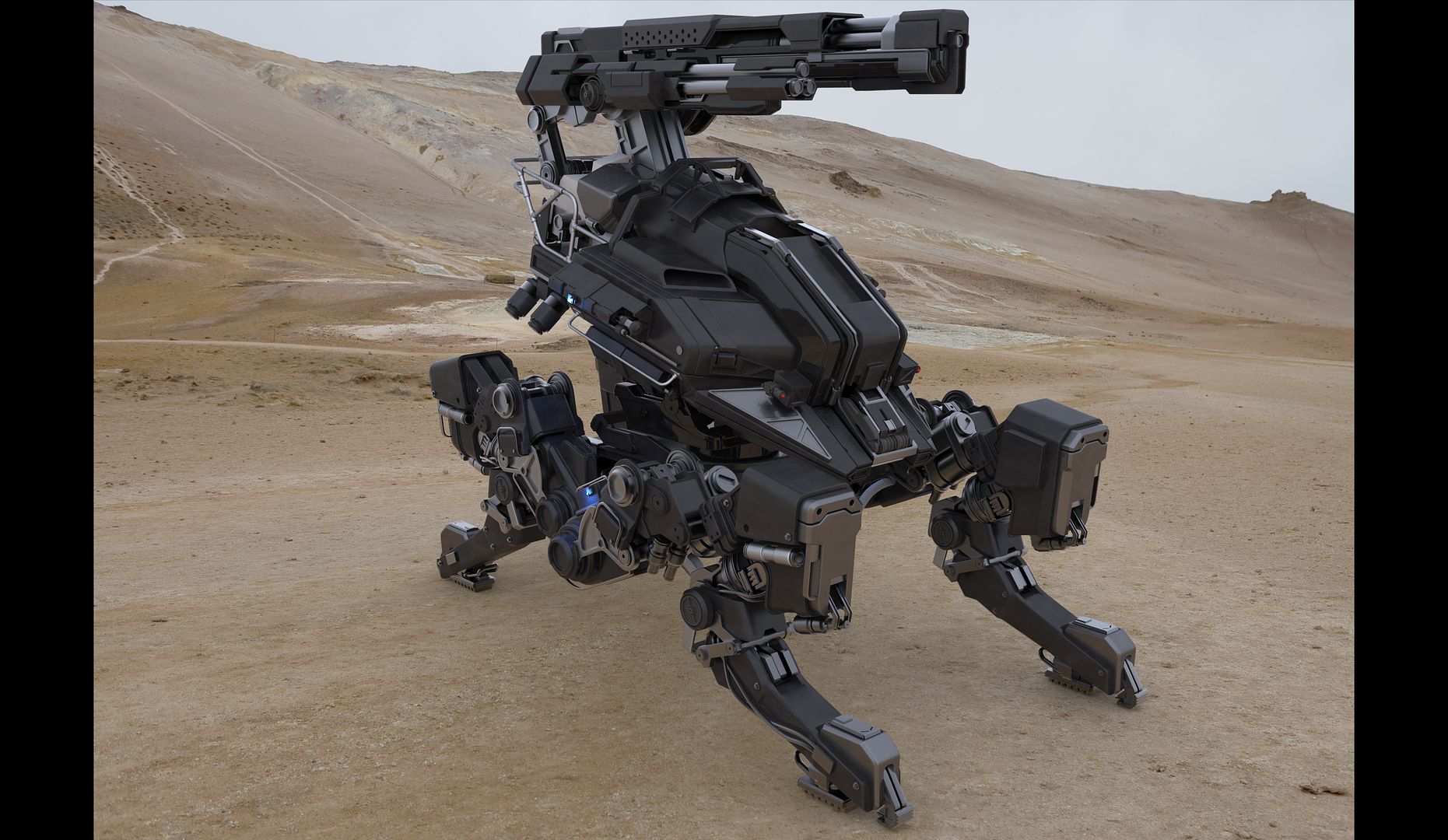
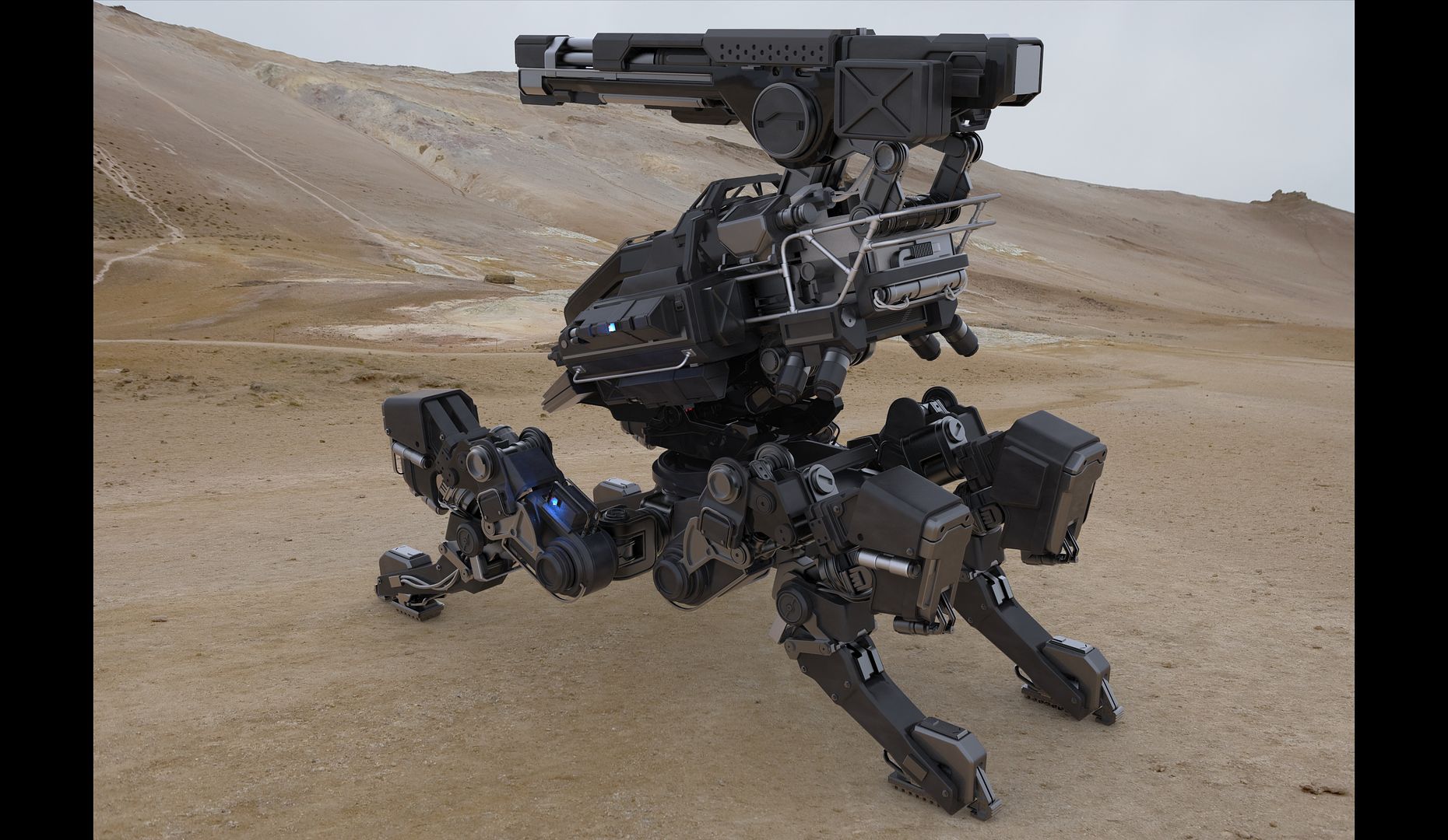
Hello, been working on this mech for a couple of weeks and wanted some feedback. Its not meant to be a game model, but more just to show modeling and design skills. Any feedback is appreciated. I use 3dsmax for the modeling.
The design looks awesome. However, the image is way too small and there's also the compression problem.... To really show the details, you gotta upload a much bigger image (and with better compression). Wireframe shots would be nice too. Anyway, i liked the design.
But I barrely could see - how it moves.
Also - some parts intersections looks "boring and cheat" - its just bring together like on glue - without holes or bolts ot some other thing that keeps it together.
And - looks like main black parts - are plastic. Because for metall it look too monolith and heavy, because there are no stiffeners
If you don't plan to add damage to it, perhaps a bit of color, perhaps desert camo?
Looks nice otherwise for being made in 3dsmax.
Thank you for the critique D4V1DC. I tried some camo but it was taking away from the spec and topology. Looked too busy. I will experiment with it some more.
And I will have to shoot myself for learning, teaching, and earning money for years on an inferior program such as 3dsmax. I obviously made a mistake.
But I barrely could see - how it moves.
Also - some parts intersections looks "boring and cheat" - its just bring together like on glue - without holes or bolts ot some other thing that keeps it together.
And - looks like main black parts - are plastic. Because for metall it look too monolith and heavy, because there are no stiffeners
thank you skyground. I will tighten it up with some extra fasteners and bolts. And i will do away with any plastic looking shaders
Amazing. Gotta love industrial-futuristic concepts. I see you've been inspired by names like Aaron Beck and Vitaly Bulgarov. The only suggestion I can make is to add finer and even smaller details. And maybe render the model in a more atmospheric environment with some postprocessing.
Looks great overall, keep it up !
Thanks dude! I'm adding more details as I type. Aaron and Vitaly are beasts and very inspiring. I appreciate the feedback.
Replies
Looks nice otherwise for being made in 3dsmax.
But I barrely could see - how it moves.
Also - some parts intersections looks "boring and cheat" - its just bring together like on glue - without holes or bolts ot some other thing that keeps it together.
And - looks like main black parts - are plastic. Because for metall it look too monolith and heavy, because there are no stiffeners
Thank you for the critique D4V1DC. I tried some camo but it was taking away from the spec and topology. Looked too busy. I will experiment with it some more.
And I will have to shoot myself for learning, teaching, and earning money for years on an inferior program such as 3dsmax. I obviously made a mistake.
thank you skyground. I will tighten it up with some extra fasteners and bolts. And i will do away with any plastic looking shaders
Looks great overall, keep it up !
Thanks dude! I'm adding more details as I type. Aaron and Vitaly are beasts and very inspiring. I appreciate the feedback.
There is a lot of great details here , but not as much in texture .
great job