Home 3D Art Showcase & Critiques

[UE4] Indoor Courtyard

greentooth
Offline / Send Message
garcellano greentooth
Hey everyone!

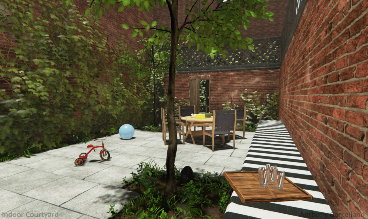
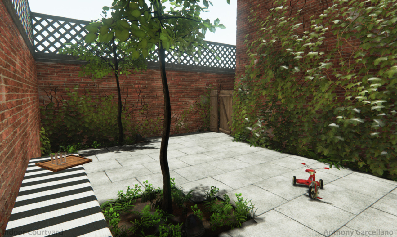
I've been working on an indoor courtyard scene for a while. I'll be adding in updates on the thread, still in its early process.
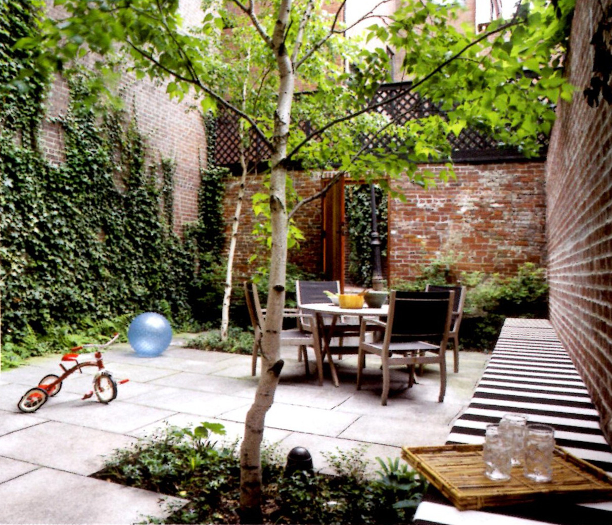
Here's the reference image that I'm basing it off of. Scanned from a book.
tumblr_n3sqfsMNGe1ricnv1o1_1280.jpg

5/18/14
tumblr_n5t3s2d9Ms1ricnv1o3_1280.jpg
tumblr_n5t3s2d9Ms1ricnv1o1_1280.jpg
tumblr_n5t3s2d9Ms1ricnv1o2_1280.jpg
tumblr_n5t3s2d9Ms1ricnv1o4_1280.jpg

Replies

  • luge
    Offline / Send Message
    luge polycounter lvl 4
    first comment, everything looks very flat. especially your foliage.
  • theslingshot
    I think it's a great start! Your brick may be a bit shiny though.
  • Ssjtroll
    Offline / Send Message
    Ssjtroll polycounter lvl 8
    It is a good start, but everything you have looks flat. The foliage most of all.
  • luge
    Offline / Send Message
    luge polycounter lvl 4
    looking at it some more, i think your lighting is killing your normals, making everything look flat. as far as your foliage goes, it looks like you put everything on a plane and then just placed it, when it comes to ivy, you want it to be done like leaves on a tree, a single plane for a leaf. for other foliage, like bushes and such, you want to make your cards intersect with a few different sides to make it have volume. also rotate them, obviously xD
  • MooseCommander
    It looks very cartoony right now. Not sure if that is your desired result. From the color choices on the foliage to the flatness of the lighting, there is a lot you could do to improve the realism of the piece. Just keep comparing it to the concept - you need a stronger contrast in your lighting. You also need more photo based textures to achieve realism. Nothing feels grounded or realistically placed / grown.

    My suggestion would be to strip away the foliage and rework your lighting and base textures. Get everything you want in the scene and then start building the foliage last.
  • yurid9
    Offline / Send Message
    yurid9 polycounter lvl 10
    Nail the lighting like everybody is saying. Also, the specular/gloss on the bricks are too high. Also check the size of the bricks, they are big compared to the concept as well as the size of your scene. Look at the door and the bricks around it to get a better sense.
  • garcellano
    Offline / Send Message
    garcellano greentooth
    Thanks guys for the feedback. I removed the plants and ivy on the walls for now once the rest of the pieces are in the scene. I may use ivy generator to make patches for the wall. Changed the look of the leaves on the trees. Adjusted the lighting and reduced the size of the bricks around the walls.
  • garcellano
    Offline / Send Message
    garcellano greentooth
    Hey guys,
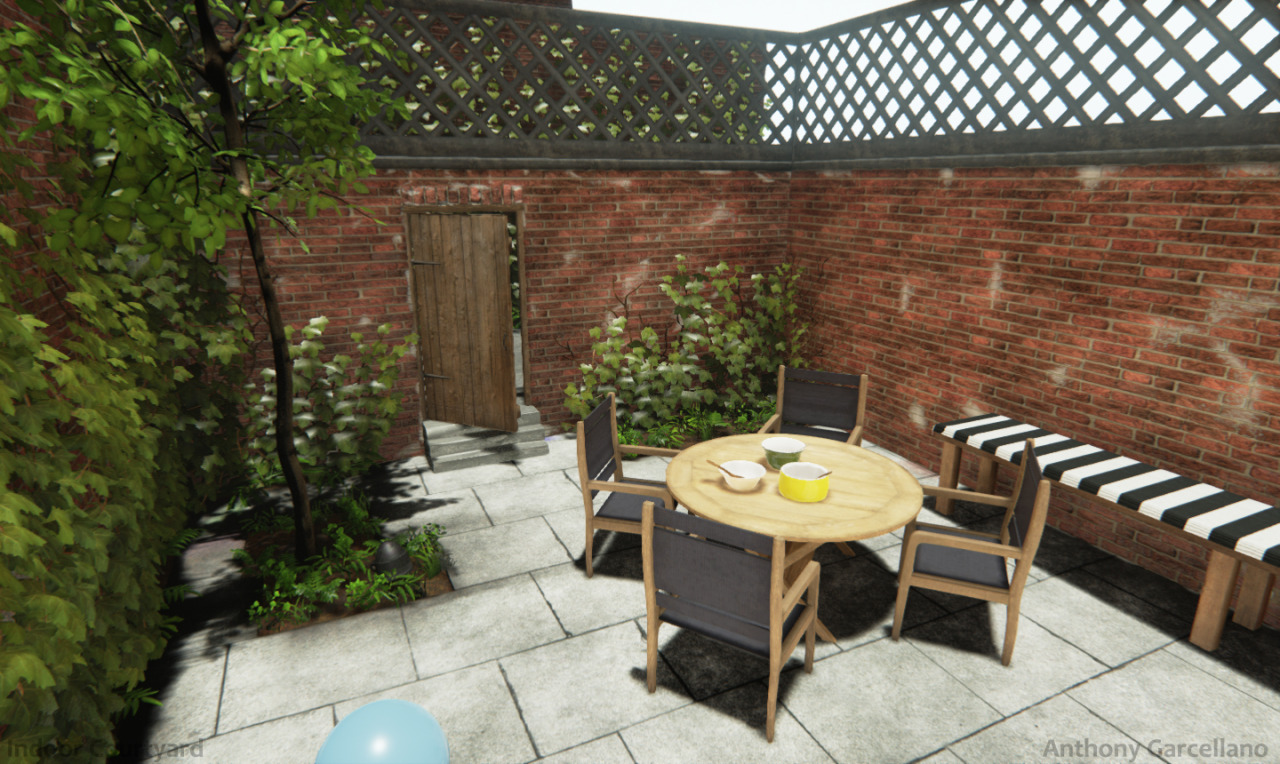
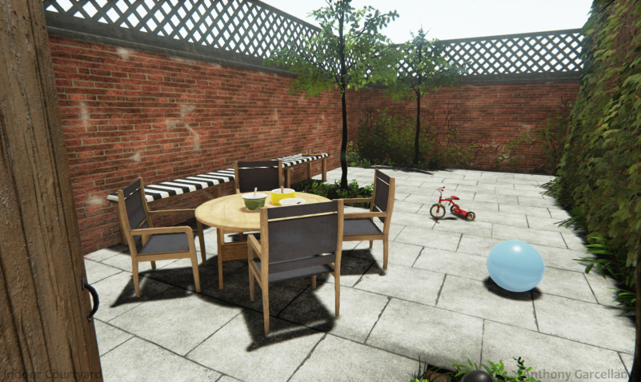
    I've made a bunch of updates since the last post, doing more polishing. Started using Substance Designer and Substance Painter on the main props. Changed the look of the vines and the tree leaves. I adjusted the color and lighting in the scene, and added vertex painting with the brick & mortar, tree/pavement floor and ground. I changed the layout on the back of the courtyard, a bit different from the previous posts. I'm near in finalizing the scene, but any criticism, comments, or feedback are much appreciated.
  • luge
    Offline / Send Message
    luge polycounter lvl 4
    the lighting doesn't seem very strong, feels... overcast, if thats what you're going for then you did it well i guess, but it takes away from the scene to me. essentially, your lighting is very soft.
  • garcellano
    Offline / Send Message
    garcellano greentooth
    Thanks for the feedback luge. I did add some fog and made it less as bright compared to the reference, but I can add more tweaks to the lighting.
  • luge
    Offline / Send Message
    luge polycounter lvl 4
    i'd say remove the fog... or make the depth less.
  • garcellano
    Offline / Send Message
    garcellano greentooth
    Update on the scene, I placed the latest images on the first post.
    -Gave little to no fog in the scene.
    -Changed the vertex painting to add more mortar and added bright/dark areas on the brick walls.
  • reverendK
    Offline / Send Message
    reverendK polycounter lvl 7
    You've got to get the bricks darker behind the ivy - in both texture and lighting. it looks super floaty as is.
  • garcellano
    Offline / Send Message
    garcellano greentooth
    Updated the scene, edited on the first post. Thanks reverendK for the feedback. I redid the lighting in the scene, adjusted the shadows, tweaked the levels on the textures and changed the vertex painting around the brick wall.
  • Vertrucio
    Offline / Send Message
    Vertrucio greentooth
    I'd redo the ivy on the wall to better represent when the ivy coverage is so thick that you can't see the wall at all. It's in your reference image, and is pretty common in real life.

    That and darken the wall underneath in a stronger way. What patches of wall do show through the ivy are mostly obscured in shadow, where the color red is known to become muted.
Sign In or Register to comment.