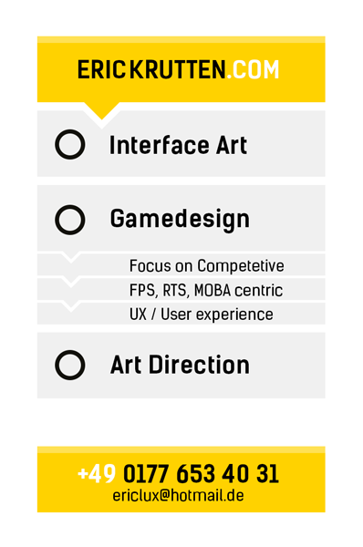
Business Card

interpolator
Hey guys, jumping on the new portfolio wagon and started with a new
Business card, since the old one is damn cheesy and has too much info and well, its bad
I put up a new one and i`d really like some input
Also not sure if I should write art direction, but thats what I did for a couple projects, and you gotta dress for what you want to be right ? Else I would write something like "Game Artist"
The problem is to somehow appeal to non-game people aswell, or make them alteast understand that I can do "artist stuff" that they could use aswell, like graphic design for ads or things in that manner.
(the new website does not exist yet)
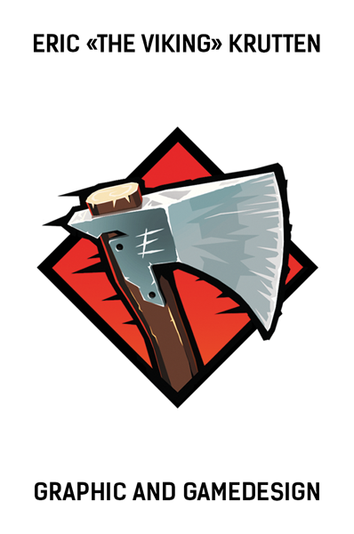
Here is the old logo for comparison
https://hostr.co/5CgChzgx1S4k
Some people said they liked the color on the edge of the previous one, but im unsure
Here is a colored variant:
The orange gradient reminds me on african sunset tho and dont like that in particular, but
it needs to stay aggro somehow but I cant use red twice Id say
What do you think ?")
Business card, since the old one is damn cheesy and has too much info and well, its bad
I put up a new one and i`d really like some input
Also not sure if I should write art direction, but thats what I did for a couple projects, and you gotta dress for what you want to be right ? Else I would write something like "Game Artist"
The problem is to somehow appeal to non-game people aswell, or make them alteast understand that I can do "artist stuff" that they could use aswell, like graphic design for ads or things in that manner.
(the new website does not exist yet)
Here is the old logo for comparison
https://hostr.co/5CgChzgx1S4k
Some people said they liked the color on the edge of the previous one, but im unsure
Here is a colored variant:
The orange gradient reminds me on african sunset tho and dont like that in particular, but
it needs to stay aggro somehow but I cant use red twice Id say
What do you think ?
Replies
Looks nice, but when your Phone Number starts with the Country Code +49, you dont have to use the 0 for the 0177.
Only +49 177
^^
I agree with the above comments, Gamedesign, when it is written like that looks like a typo.
Your name is almost lost on the front of the card. Consider your businesscard as a miniature sales pith for you and your abilities. You want your name to stand out, without being gaudy. Maybe by making it a tad larger it won't get lost on the front?
On the back side "focus on competitive FPS..." is laid out as if they were there separate items on a list. It makes it awkward to read a full sentence when it is broken between three lines and indented.
Hm, yes im aware it is more art heavy and not as clean, but somehow I wanted to not make something different that
expresses myself and not use the same flat iconography everyone uses in traditional graphic design and be a little
more playful
I think (hope) the card shows that I know how to make clean stuff, atleast on the backside, so that both of these things are covered, but I guess a black and white flat version would be a good idea
The back side, the 3 things are seperate items, I guess i have to seperate them more
I added "centric" in the second line and hoped that does the trick but dosnt seem so
Edit: here is the iteration so far
Oh ignore the border, thats for cropping forgot to hide
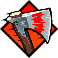
That is what i see not to be mean or anything but an axe is not something i think about when i think art, perhaps a picture of yourself (in animated mode) with your thumb up in that diamond would probably be a bit smoother.
My .02 cents and not one that many take critics from but you decide.
(you holding the axe with a viking helmet with your thumb up after reading all of 1st post
Imo that would just be cringe-inducingly cheesy. And I don't think anyone decides whether someone is worth keeping on between projects based on their business card logo lol. At least no one worth working for in the first place.