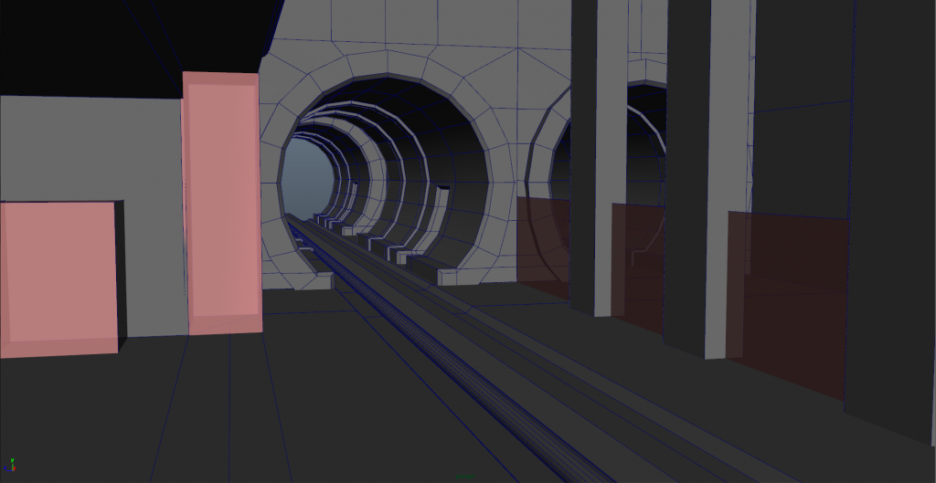
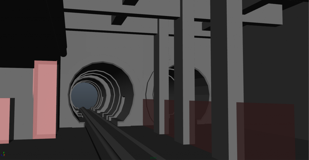
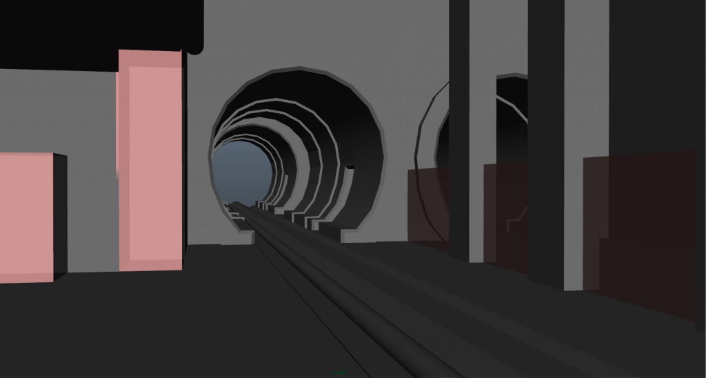
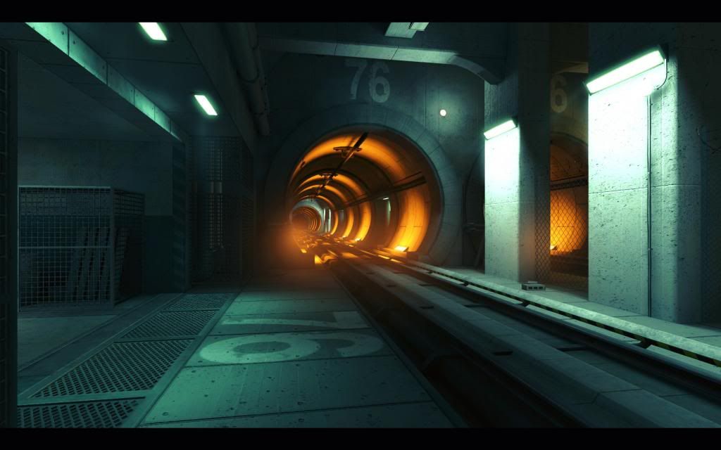
So I'm finally deciding after long time lurking on these forums to post up what I am currently working on. Right now I am working on the subway scene from Mirror's Edge that was also on of the Monthly Noob Challenge. Loved the colors for this and wanted to give this project a shot, also want to work on being able to finish a project haha.
I'll try to update this project as much as I can due to work.
Great to see you on here
What engine are you making this for and are you going all out for a portfolio piece or will you try to conform to some system specs?
I want to make this a portfolio piece. Also haven't decided on what engine yet. I gotta relearn UDK and I also want to learn CE3 but leaning to CE3 for this one
more Mirror's Edge is always good in my eyes! although I think you can definitely give the tunnels more sides to reduce the jagged look, especially if you're aiming for current / next gen specs (and extra especially for a portfolio piece!)
What Juniez said. The days of worrying about those few extra polygons to get a nice round curve are over. Just bombard that geometry with polygons until it looks nice and round. The pipe on the bottom left looks a bit strange, it's almost like you manually rotated half of it then tried to create a bend yourself. Let the Bend modifier (if you're using 3ds Max) do it for you, quick easy results that look clean.
Also, for the fences/gratings I think it would look better if you used a flat texture with a normal map etc. - you can throw in more details and realism that you could never fit into actual geometry without using obscene amounts of triangles (let alone having to unwrap such a mess).
The concept also has the edges of the concrete pillars smoothed, some chamfer (more than one edge added) would make it look nice.
@Juniez - thanks man, I didn't want to go to overboard. That is def good to know
@logithx - The pipe right now is a stand in but it will def get fixed to look nice and clean. For the fence never thought of that way thanks, that would def save me a hella of a time For the pillars I have one on there but I see it that it's just to subtle.
Also question on the tunnel, how much is to much for amount of edges? not really looking for a definitive answer more along the lines of whats useful vs what just a waste.
Thanks for the CC guys, love having the feedback to help me get this going. I wont be able to make really any updates today but I will be back on this project tomorrow
It depends on how close the player can get to the cylinder. If you're going to be able to stand right in front of it then you will need enough sides so that it doesn't look jagged. I'd probably use around 36 sides depending on how large the tunnel is. For something smaller like a barrel 24 sides or slightly less is ok. In your case I'd probably go for 36 or higher.
Here's a new update on the model, been busy for the past couple of days with work, but I think I can call this part for modeling done, now on to UVing and texturing.
So finally starting to get a life back again and def gonna try and get this beast of a project down. I just finished up UVing this thing and baked an AO map for the main level and have a base text for it.
I don't truly love the AO bake and will def go back in and fix it before moving forward with this. Do anyone have any tips for baking an AO map? I'm using Maya 2014
New update to textures and a test render shot from today. As always C&C are always welcome. For the fences I gotta go in and figure out why only the first 1 is showing up and not the others.
New update for the night gonna try to get this finished up by Sunday, only thing I have left is minor texture to finish up on and then export to UDK light er up and put a for in it. As always C&C always welcome.
Nothing really 'wrong' to critique but I would suggest next time to go to engine sooner. That way you can see how what you made works with the tools you want to display it in. Right now we can't comment on lighting at all and you want to already be done by end of the week.
Also, I notice some repetition on the pilars, if you're doing this for UDK try this: http://www.chrisalbeluhn.com/UDK_Asset_Position_Offsets_Texturet_Tutorial.html
You can create a damage texture that will offset on the mesh based on world position, that way it wont repeat Of course that will work best if your UVs are set up for it but it looks like they are.
You mentioned AO bakes earlier, have you tried the TURTLE plugin?
I got some amazing and super fast results with that for my project.
No never heard of a turtle plugin, I will def take a look at that, and also thanks for the link. I'll read over it tomorrow/later today haha, I just only skim through it right now but it def will help me out thanks man.
I have to agree with Ervin, the tunnel is rather small and the track is quite narrow. In the concept, the tunnel is a major focal point and the orange lighting contrasts nicely with the rest of the environment, however the lighting in your scene is rather flat. Maybe you were going for a different look? I think the lighting could be improved with a little bit of work.
Thanks for the Critiques, I'll def go back and fix those spots up, I had a hard time trying to get the lighting down for this level, haven't lit anything up in awhile especially in UDK.
Replies
Great to see you on here
What engine are you making this for and are you going all out for a portfolio piece or will you try to conform to some system specs?
Cheers
Also, for the fences/gratings I think it would look better if you used a flat texture with a normal map etc. - you can throw in more details and realism that you could never fit into actual geometry without using obscene amounts of triangles (let alone having to unwrap such a mess).
The concept also has the edges of the concrete pillars smoothed, some chamfer (more than one edge added) would make it look nice.
@logithx - The pipe right now is a stand in but it will def get fixed to look nice and clean. For the fence never thought of that way thanks, that would def save me a hella of a time For the pillars I have one on there but I see it that it's just to subtle.
Also question on the tunnel, how much is to much for amount of edges? not really looking for a definitive answer more along the lines of whats useful vs what just a waste.
Thanks for the CC guys, love having the feedback to help me get this going. I wont be able to make really any updates today but I will be back on this project tomorrow
C&C always thanks
I don't truly love the AO bake and will def go back in and fix it before moving forward with this. Do anyone have any tips for baking an AO map? I'm using Maya 2014
But as always C&C are always welcome
Nothing really 'wrong' to critique but I would suggest next time to go to engine sooner. That way you can see how what you made works with the tools you want to display it in. Right now we can't comment on lighting at all and you want to already be done by end of the week.
Also, I notice some repetition on the pilars, if you're doing this for UDK try this:
http://www.chrisalbeluhn.com/UDK_Asset_Position_Offsets_Texturet_Tutorial.html
You can create a damage texture that will offset on the mesh based on world position, that way it wont repeat Of course that will work best if your UVs are set up for it but it looks like they are.
You mentioned AO bakes earlier, have you tried the TURTLE plugin?
I got some amazing and super fast results with that for my project.
Cheers
Looking forward to any updates