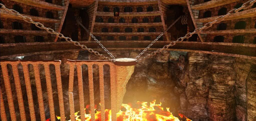
Volcano Prison
Hi Polycounters,
I am part way through a new piece for my portfolio and need some advice from the community. My issue is that I cannot come up with a way to break up the modularity of the walls/cells. I do have some torches that need uv's and textures doing which will break it up a bit but I just wondered if anyone had any ideas on how I could further break up the modularity.
*This is very much a WIP*

Replies
I'd also fix up your lava texture a bit, maybe add some molten lava rock pools to it, dark patches essentially. also, sharpen up your textures, pull back some of the lighting. with the way it is now, having torches is irrelevant, just pull back the lighting a little bit, then use the torches to bring some interest. also, i'd add some torches leading to that center piece. and work on your camera angle, i wouldn't keep your focal point dead center. think of the rule of thirds, the golden ratio.
As a general critique, one thing I'm struggling with is getting any sense of correct scale. I feel like if I was to place a character on the centre platorm they would be small but various elements are making it difficult to give me that sense of that huge scale. Maybe put a correct scaled character in and adjust texure scaling accordingly to match and more identifiable objects.
I like the idea of creating variants of the same asset and will definitely use that idea.
The lava texture and lighting are just place holders at the minute and the camera angle shown is not the final one it just shows the modularity issue well.
I like the idea of putting torches along the bridge and I have been having trouble displaying the correct sense of scale.
I will continue to work on this project and hopefully post an update soon.