Grainy Textures from Photo reference
I'd received some Portfolio advice at GDC I'm not sure I completely understood. So I was hoping the experts here at Polycount could help bring me up to speed.
I think the gist of what was being said is that all textures derived from photographic reference ultimately end up feeling 'Grainy' and 'Busy'. Do I have that right? And if so, what are some strategies and tips to control that?
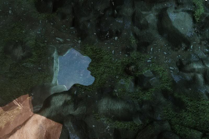
Specifically the picture that evoked that reaction was an aerial view of my environment's floor;

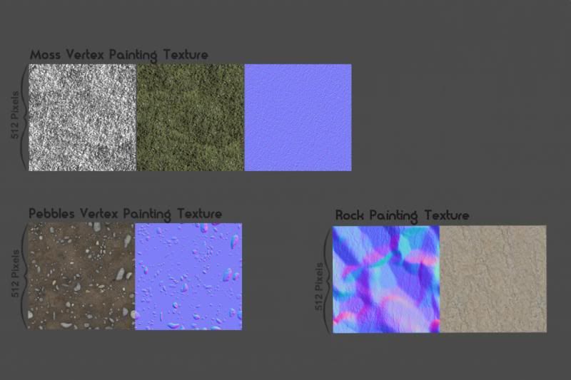
These are the textures being blended;

Any insight would be greatly appreciated.
I think the gist of what was being said is that all textures derived from photographic reference ultimately end up feeling 'Grainy' and 'Busy'. Do I have that right? And if so, what are some strategies and tips to control that?
Specifically the picture that evoked that reaction was an aerial view of my environment's floor;

These are the textures being blended;

Any insight would be greatly appreciated.
Replies
But from first glance, you have to much subtle noise going on, especially that grass,the black in is is coming off very noisy.
Are you sure they were referring to the textures though? The image/level itself seems pretty chaotic.
@fwap
Yes, here are the textures at a 1:1 ratio:
I don't think there's anything wrong with your textures per se, I think it's just the way you're presenting them. That overhead shot is just a very unflattering camera angle, do you have a different angle? And you've only got plain textures on a terrain, instead of just a grass texture, add in some actual grass/plants.
It also seems like you're using very small textures for your environment, any reason for that?
As for the textures:
On your first texture you have very small details in your diffuse, it almost looks like sand. But you have very big details in your normal map. You can't really rely on your normal map to do all of the heavy lifting. Get some shadows in your texture. Or use displacements.
And you can use a detail normal map for your small details.
It also doesn't have the right scale. I'd use something like this for the big details http://www.cgtextures.com/texview.php?id=9570&PHPSESSID=e52512hki2j5tmhu1fjd4safk0
And then add a detail normal map on top of that.
The second texture has a weird scale, if you were going for pebbles it's pretty good. But in the level it's scaled so big that they look more like round rocks.
And your moss texture just doesn't look like moss at all. I know you probably found it on cgtextures but i'd look for better textures.
something like this? http://www.cgtextures.com/texview.php?id=41601&PHPSESSID=e52512hki2j5tmhu1fjd4safk0
And lastly, I don't know much about vertex painting but you've got very soft transitions everywhere.
You're right; my sense of scale is off, the shadows were weak, the high frequency detail needs to be controlled, and that ended up being a much better moss.
Thank you kindly.
I'm in the middle of putting this all into practice, and I'll admit, I'm a bit hung up on how to go about setting up a detail normal map. I get that it's a second normal map of only details needs to be added based on pixel depth, but I can't seem to puzzle out the the structure of it.
Do any kind folks about have a picture reference of a udk shader set-up with a detail map they can toss my way?