GDC Portfolio Review Wrap Up
Hey guys,
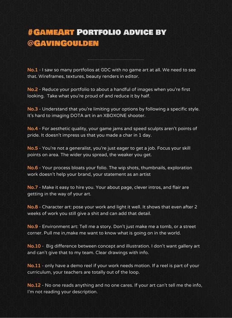
As some of you know - I reviewed a ton of portfolios at GDC. I'm estimating around 75 (Character, Environment, and Concept) - within about 10 hours spread over 3 days. There were lots of common problems, and lots - if not all - I noticed last year as a common trend. I wanted to do this last year, and would still like to elaborate on these points, but without a workstation and having my things at home...I'm basically reduced to just a series of Tweets. I posted these yesterday, and someone was kind enough to put them into a reference image, just thought I'd share them here and either take part in a discussion, or help add to common problems.
I know a few of us were in similar situations, and I think have very similar recurring feedback to give. There were also points regarding execution that I just didn't get into because they are very specific...things like "your anatomy is wrong", "you need to decide on a light source", "the posing makes it impossible to read details", etc.

Cheers,
Gav
As some of you know - I reviewed a ton of portfolios at GDC. I'm estimating around 75 (Character, Environment, and Concept) - within about 10 hours spread over 3 days. There were lots of common problems, and lots - if not all - I noticed last year as a common trend. I wanted to do this last year, and would still like to elaborate on these points, but without a workstation and having my things at home...I'm basically reduced to just a series of Tweets. I posted these yesterday, and someone was kind enough to put them into a reference image, just thought I'd share them here and either take part in a discussion, or help add to common problems.
I know a few of us were in similar situations, and I think have very similar recurring feedback to give. There were also points regarding execution that I just didn't get into because they are very specific...things like "your anatomy is wrong", "you need to decide on a light source", "the posing makes it impossible to read details", etc.

Cheers,
Gav

Replies
For No.2 A handful is 3-5. You can have more content, but with your portfolio imagine people only seeing the first 3-5 things on your website. Each image needs to be able to stand on it's own.
At the end of the day, isn't it Art Directors that decide the narrative? I'm not sure how much input environment artists have (if any).
I think the problem is a lot of new enviroment artists make very sterile scenes that are too plain and boring, that makes them seem detached from reality. Even a simple scene can add narrative.
What type of SciFi corridor is this? Is it a military ship? Is it new? What type of people would use this corridor? Is it supposed to be a clean corporate type, almost office building like hall way? Is it supposed to be a maintenance access corridor? Is the ship new? Has anything happened to or on the ship? How would crew members interact with the ship? How advanced is the tech? Does there need to be access panels? What about signs, alarms, air vents, lights, display panels, speakers, etc.
You need to show thought, or that the choices you've made have reason. Thats why you see just a lot of "boring work" - but to me, what makes it boring, is lack of thought and the story behind the choices. Cliches can be cool, you can have a sci fi corridor that everyone has seen but it can be executed in a way that is totally unique.
Shouldn't you be applying to studios that have an art style you enjoy doing? I could put some modern military shooter characters into my portfolio but when it comes to the interview it will be obvious that I'm not that excited about working there.
It's hard to imagine DOTA art in an Xbox One shooter but it isn't hard to imagine it at Blizzard or many other MMO studios, mobile studios, etc...
No.5 is more of a technical thing - having seen a lot of just..."everything." Life drawing, anime, poorly lit envs, half finished chaacters, etc. all in one folio.
I think the bigger issue is that some people looking for jobs may be applying too broadly. I agree that you should only make art that you like making: be it DOTA, Blizz-like, or realistic.
The problem is showing art to studios that do not match the styles you like to make.
My suggestion is limit who you show your work to. You'll save your and other peoples' time!
I know this doesn't make a ton of sense to newer folk, but why show a bunch of hand-painted work to a studio that only makes realistic art? Why show realistic art to a studio that makes hand-painted work?
In 2009 I had massive success at GDC largely because I didn't waste my time showing my folio to studios that didn't at least partially match my work.
edit: I might make sense for GDC, I've never been but as an outsider it seems more AAA focused.
Plus knowing lighting will pretty much sell or destroy a character or environment. Same can be said with modelling and texturing, they all relate to each other.
I know focusing in one area is what you should do, but I don't think it should stop you from learning related areas of CG and will probably improve your focused area in the long run.
Hopefully you're always getting better at what you do. Keep a gallery of your past works for posterity, but if you're applying for a job don't send a portfolio with everything you've done the last 5 years of your career. Send a sample of the top handful of things that say who you are right now.
it seems as though showing low poly guys was a no good move on my part.
Mid poly fellows are the way to go from now on.
Most helpful indeed.
We get 'super next gen' portfolios all the time. I just close them. It's clear to me they love doing that type of stuff. I want to hire someone that lives, breathes, stylized art. That would be reflected in their portfolio.
Have you seen any 'super next gen' but stylized portfolios yet? Like Rime, The Witness, Sunset Overdrive, etc. How do you feel those?
The whole demo reel thing really bothers me when I see students work, applications and portfolios. Its even more annoying to me that teachers are constantly opposing this by shoving the "must have demo reel" motto down student artists throats - that however is another conversation :poly124:
Could they even just post a concept art along with the ad to signal what new franchise they're gonna make so people can tailor prep their art.
I want justification to continue to be lazy and not take tons of wireframe shots. I bet I've done a lot of heinous things to pare designs down to 350 tris for Dota.
It's not that hard to guess?
Just make realistic art? Grounded in reality things? Sci-Fi with realistic materials etc etc, the rest is just sci-fi or fantasy dressing.
I think what it really comes down to is process and doing what you can to show that. I heard that a lot too.
That said I personally like to work in a lot of styles just to push myself and learn. I definitely have a preference though for paid (40 hour+ a week) work that I prefer to work in though.
As far as wireframes I've never been at a place and heard people look at a folio and go 'oh wow they only used 5 polys for the whole thing?'. It's more 'I can't believe the waste here, here, and here and why didn't they put detail here and here?'. In the end I think wireframes are fine for some things. I would suggest like props and characters.
Oddly no. That would be a nice change of pace.
I think the issue there is that most schools teach that 'next gen' is realistic and 'stylized' is hand painted only. That's flat out wrong.
I would gladly consider 'super next gen' stylized portfolios.
i've been looking at a lot of character artists portfolios recently and one of the biggest thing ive found that hurts them is there sheer lack of anatomical understanding, notably being able to sculpt pleasing human figure. instant pass. essential skill for a character artist.
I like to see portfolio that are ''blogs'' like. Just don't overwhelm the page.
We even hired a guy who had his demoreel from 10years ago( he his now a senior ).
His reel was just awfull....
I can garantee you he made a joke on it at the interview and broke the ICE right there.
Interesting to hear about the stylized/realistic portfolio breakdown stuff. What sort of next-gen qualities are studios that work in stylized art looking for these days? There is the famous "Stylized PBR dagger" thread, wondering if there are more examples.
I think this thread has inspired me to cut down my portfolio by at least half.
That being said, I think more often than not it's always a good idea to present your best work when applying for a job and, if you have a blog that shows your virtual history - fine. But don't line up with that at a convention and not expect eyes to glaze over.
atomander: Thanks dude! I think, because these are from Twitter, maybe I misused the term stylized. I'm not exactly sure how to put it, but, showing a clear understanding of technical breakdown is one thing (PBR can totally work on a stylized model), but then there is a level of fidelity, general interest, and ability to execute on your studio's games. i know not everyone agrees with me on this, but I know a lot of people do. If you're working ona particular type of game - most studios have some sort of "house style" - and you see someone apply who generally shows no interest in those types of games and seems to just be looking for any job, it's sort of a turn off. Plus, translating form from one to another isn't always the case, I've worked with plenty of artists who did great stylized work (like, more exagerrated proportions, more Disney like) who weren't great at creating something photo realistic, and vice versa. I'm rambling. but in the end, I think it's a multi-pronged issue. I think theres execution (at the time, this was mostly referencing last gen WoW art for people applying to something like Bungie), and tone (if it doesn't seem like something you'd be generally interested in, maybe it's not a good fit - if your portfolio is all anime characters, and I'm making Red Dead Redemption...maybe it's not meant to be?)