Project: creating a world; a runner and a ring
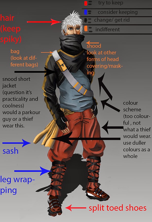
SO to start this project i wanted to redesign the character i made for my final year project, so i first looked and noted what i liked and hated about that design. so parts liked the spiky hair and split toed trainers i still liked a lot. whilst things like this made up snood jacket thing and the general colour scheme i didn't like at all, thought they didn't suit the kind of character i wanted to go for and wanted to get rid of it.
the original idea was for thew character to be a tracuer/ urban explorer maybe kinda thief-y guy and ultimately i wanted to make a more practical/ sportier outfit for the character
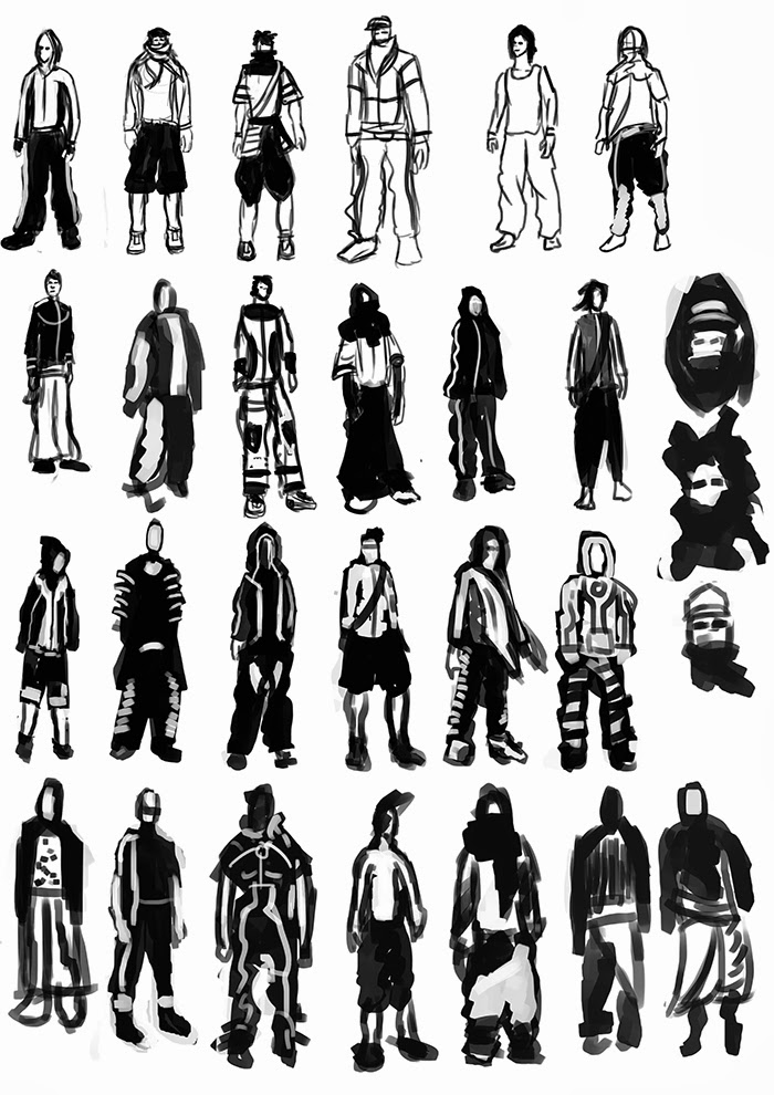
from there i did some rough quick sketches to loosen up and kind of flush out some of the crap that was going through my mind
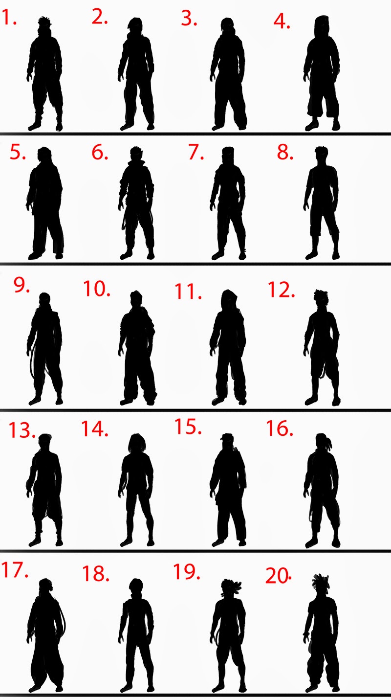
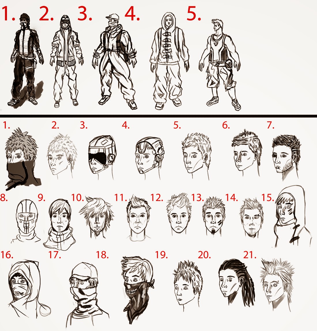
from here i started doing some silhouette sketches from a base sketch hence why they all have the exact same stance, it was something i wanted to try as it let me add random lines and forms quickly to sort of add to a human figure to give cool silhouettes without having to worry abut getting correct form and proportion in a silhouette.
one thing i do notice is that whilst practical they maybe look a little similar. and silhouette wise, perhaps not instantly recognizable. though perhaps with more grounded(design wise) characters, it's the detail you put into them which makes their designs pop more.
(although that's just a theory I've been thinking of lately)
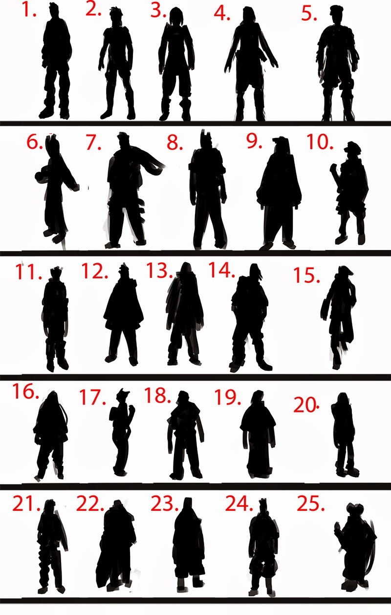
i also did silhouettes freehand, automatically you notice more interesting outfits and what could be more wild costume design. you'll also notice some proportion and form issues human wise on them, which grates on me.
following from the silhouette i did some sketched, whilst i did do some full body sketches to quickly see how i liked maybe having him bulkier, most of the sketches were to explore head, facial features and some masking ideas.
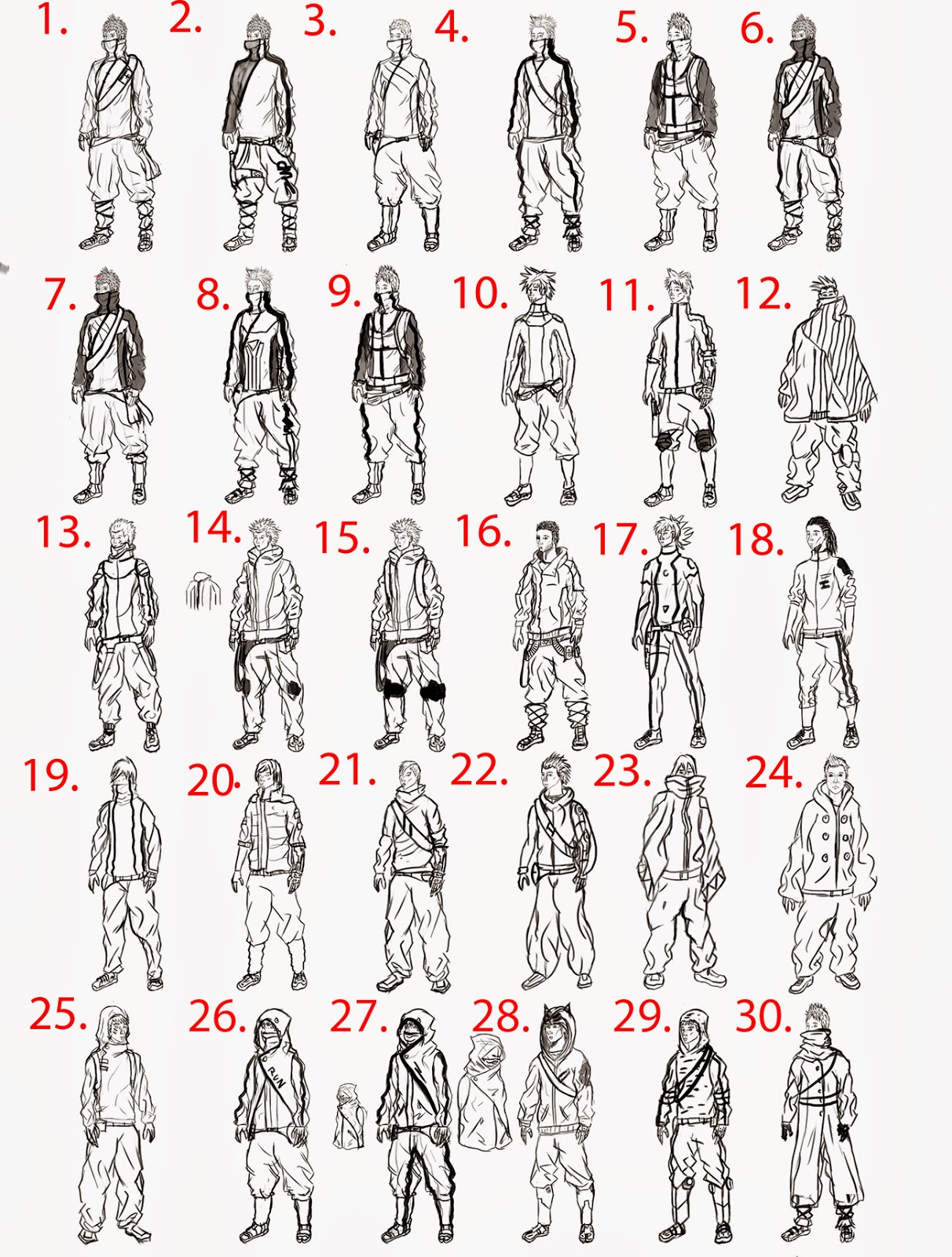
from that came sketches which were done over select silhouettes mostly from the first batch, partly because i wanted the forms correct and more importantly i wanted the costume to be practical, and they looked more practical as a whole.
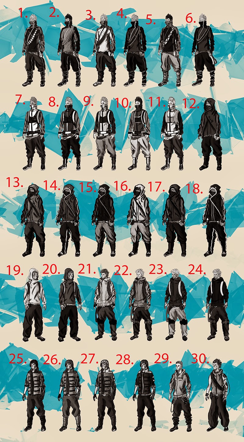
from there values were created from the select sketches in order to create a good read for the character, and give then almost a path to follow up and down the body, which hopefully was accomplished.
the original idea was for thew character to be a tracuer/ urban explorer maybe kinda thief-y guy and ultimately i wanted to make a more practical/ sportier outfit for the character

from there i did some rough quick sketches to loosen up and kind of flush out some of the crap that was going through my mind

from here i started doing some silhouette sketches from a base sketch hence why they all have the exact same stance, it was something i wanted to try as it let me add random lines and forms quickly to sort of add to a human figure to give cool silhouettes without having to worry abut getting correct form and proportion in a silhouette.
one thing i do notice is that whilst practical they maybe look a little similar. and silhouette wise, perhaps not instantly recognizable. though perhaps with more grounded(design wise) characters, it's the detail you put into them which makes their designs pop more.
(although that's just a theory I've been thinking of lately)

i also did silhouettes freehand, automatically you notice more interesting outfits and what could be more wild costume design. you'll also notice some proportion and form issues human wise on them, which grates on me.

following from the silhouette i did some sketched, whilst i did do some full body sketches to quickly see how i liked maybe having him bulkier, most of the sketches were to explore head, facial features and some masking ideas.

from that came sketches which were done over select silhouettes mostly from the first batch, partly because i wanted the forms correct and more importantly i wanted the costume to be practical, and they looked more practical as a whole.

from there values were created from the select sketches in order to create a good read for the character, and give then almost a path to follow up and down the body, which hopefully was accomplished.

Replies
at this point, i though"what if he had a hookshot/ batclaw, type accsessory in that arm, as a means to save himself from big drops, escape and fight with . so i tossed around the idea a little with these to see how could it really fire out of his cybernetic limb.
following on from the values was the colour schemes, where i played around with a lot of darker/ duller tones to give of a stealthier look. though a fair amount of brighter schemes were made.
a second group of colour schemes were made.
after that i decided to to do some bag designs and variations, in order to come up with a nice bag design that suited the character. i looked at a lot of bags and backpacks before hand to see how they strapped onto a person.
i also did a sketch/ redesign of the shoe from the original concept, i looked at ninja tabi, running shoes, parkour shoes, and mountain bike shoes when coming up with this.
i also thought of coming up with some concept designs for a hip bag/ fanny pack type accesory which was seen on most of the later schemes.
i decided to thumbnail the final concept sheet to see how i wanted to do it, some of zeronis's final concepts for League of legends such as this:
http://zeronis.deviantart.com/art/Karma-Rework-RiotZeronis-375544318
were an influence on these thumbnails. right now i'm liking 2 the best, which i why i started the portrait/ head-bust.
which started of like this, which i really hated, it just looked to basic and flat, especially when colour was added. didn't like the way the hair looked either
( it's kinda bad I've been working on this on and off for over a month now, which isn't super grate time wise, but life does get in the way i guess.)
i decided to look at all of the colour schemes and narrow it down to the one's i felt were better/ the one's i liked. i narrowed it down to 30, which probably isn't narrow enough.
however the one's on this page that stick out to me are 1, 4, 9, 10, 13, 14, 15 and perhaps 30( which even though the colours are kind of too bright i do like it)
also got started on sketching out the final concept sheet.
anyway i finished up to portrait for now and started going the final concept. when i got a reply ( which i only saw a few days to a week ago" from you "rapxic". on the concept art thread , so thanks for the reply .
"pretty cool i like number 23
but in all fairness wouldn't all that clothing make him hot, i suggest ya give him a khaki pants, lose the boot straps give him a tite shirt without sleeves to show off the cyber arm, probably give him a futuristic night vision goggles to go with the stealth manner also give him a drone
so he can send it in to scan inside of a house he's robbing or to alert him if there's anyone following.
as for the bags i think they might be outdated if you're going for futuristic, either design the bag to look or have a sense of the future.
and yes that mouth needs to be covered then again if he's a fast thief and strategic thief maybe he shouldn't.
number 19 in your black silhouette is very strong.
right now the guy you portraying looks like an ordinary dude who likes ninja stuff,probably lives in a cold place and goes to school, you need to show he's really from the future and you have to ask yourself how would his urban community be like so you can draft out elements to show that.also you can show him stealling something or about to.
take a look at Cable from xmen, the first thing that pops up is futuristic compared to someone like beast.
apart from that nice work.
Read more: http://www.conceptart.org/forums/showthread.php/276597-Project-creating-a-world-a-runner-and-a-ring#ixzz2zMQUIaAc
i looked at the design i did kinda realized that aside from the arm his clothes don't look very different from what i might see on the street now( except maybe the split toed shoes and the leg wraps). i sort of understood what was meant by the difference between cable and beast, but the the issue of making it look more like cable was the skin tight soldier uniform look is something i'm trying to avoid, going for a more civilian clothing look( perhaps saying thief/ theif-y wasn't the most accurate work but it's still the most accurate for the idea in my mind).
the other thing is the goggles.i still want to at some degree hide the characters face, i am worried that goggles along with hiding his face might de-humanise him/ his head too much.
it did however give me the idea to look at the moodboard i had made in terms of practical clothing and actions and proportion and look at them.
i looked at them and reliased i picked a lot of now looking images, and perhaps i should have made one or 2 just for the sci fi-ish/ cyberpunk-y clothing.
so that's what i did. i created 2, one for real clothing, that exists that struck me as somewhat futuristic, and one for fictional attire from games, anime, random drawing on the net etc.
i also decided to to type out a few buzz words that struck when i saw these clothing and see how many images they correlated to .
with that i started a second iteration from these, with more look into making the character's attire look more fictional/ futuristic, and work on outfits, with more focus on showing off the arm more.
i decided to take 5 designs i was liking and decided to make a series of alterations to the designs to see whether or not any of the alerted versions look better
just some thumbnail/ quick and loose sketches for the final concept pose today
i decided to do another batch of colour scheme on some of the new selected costumes, some have the same colours as some of the preferred previous schemes on the previous iteration and some are new.
started the final concept pose. not liking the hands at the moment they look a little awkward. also trying to figure out how to maybe make the bag look more cyberpunk/ sci-fi and work on the rendering a little more.
tried some of the schemes i liked with the final concept to maybe give me an idea of what looked best.
Been a few days since I've updated, been working on this final concept during it. i'm still not happy with the (normal) hand, it still doesn't look quite right to me after spending ages trying to fix it( i suppose it's batter than before but I'm still not completely satisfied). anyway until i can figure out that detail I'm considering this done for now.
now I'm going to model him and work on other aspects and character's of the project now he's been finalized.
(besides i've spent too long working on this guy)
i also tried shortening his legs a little, so he's roughly 8 heads in this one whilst i think he nears 8.5 heads in the other. i did this to make him a closer to the "idealistic(loomis)" proportions and make it easier to model with the proportions being easier to manage at exact head heights.
so got started on the sculpt a couple of days ago, I'm trying to go for realism and getting the anatomy as good as can, I'm aiming for a sculpt good enough to both retop and use as a next gen game character and something i could use for illustrative purposes.
i still haven't worked out exactly how i'm going to get the hookshot to convincingly come out the arm yet, same with how to tackle his spiky hair.
also worked on the face more, it doesn't look quite right to be from a more 3/4 view still so i'm still working on that
i'm still working on the head
uberren i took the sharpness thing into consideration, so i looked at some anatomy photos and began softening and improving the forms of the face and body. I'm still working on the face, palm of the hand, feet area and the back a little.
ok been a week or 2 since last update, went on a short holiday then got sick, anyway her's whats been done since the last update.
the clothing has folds painted into it. the reason why is that i'm going to use the polypaint and convert it to a texture map with uv master, make it an alpha and use inflate balloon in the deformation tool pallete to create the bases for the folds to clean up and edit.
i've also got most of the mechanical arm essentially done and in place, i might be missing 1 piece of detail on the arm.
i'm still working on ideas/ plans on how to model/ sculpt the arm to animate the hookshot appendage coming from it. also how I'm going to create/ sculpt the piping, inorganic muscle fiber looking stuff underneath the arm.
also worked on the face a little more, still gotta work on the brow and forehead a little more, maybe the cheeks as well as make the eyes a little smaller/thinner.
ok been about a week or so since i've gotten to work on this.
so i've got a fair amount of the folds in, gotta get more in on the main torso area, looking flat compared to the rest of the jacket. need to clean the folds up that are already there and work the trousers/pants, shoes and everything else.
Can someone else chime in?
the hands i'll look into after the clothing folds, one of the hands due to the metal parts i expected/ kinda wanted to look a little bigger, but not both, so i'll look at the hands.
right now i essentially have the whole sculpt there now, think i need to tweak 1 or 2 things but it's all there now. above is a shot of every subtool together but i slowly break down the whole thing.
here is a shot of the jacket on it's own. as with the cyber arm with the hookshot canon thing it clips through. when it's all retopped the jacket's sleeves will be retractable and so will the guys hookshot arm thing. i like the idea that an animator would be able to roll up the sleeves and lower the arm and hide most of the arm but it's hard to show with the sculpt.
here he is with just a t shirt
and here he is with just his trousers. i like the idea that he could just remove his clothing which could be used for game plots or cut-scenes or something, i was kinda looking at delsin from infamous second song and how all the layers of clothing on his torso looked like they acted separate from each other so i had the shirt sculpted to have a similar effect( though the jacket and shirt clipping though each-other is an issue i haven't figured out how to %100 fix as i can see it being hard making them not clip through)
here's a close up of the head.
(tobbo dunno if your gonna see this or not, on the neck being too long and the hands being too large. i fixed the neck but I've yet to figure out the hands and whether to big or not. haven't found a valid way to measure, though about comparing the hand to the head but remembered cause i made it it either means the hands to big or i made the head size wrong.)
also got the teeth and tongue in the model.
i actually spent a week- week and a half looking into hair techniques trying to find a technique that would allow me to model the hair quickly and allow me to tweak it on the fly, looking as sculpting and z brush hair/ fibers and a bunch of stuff. the only way i knew of how to do it before was brute forcing it, but it was a long tedious method and takes a long time to see how it's really gonna look, especially with this kind of hair which is lot's of fairly random sharp spiky strands
(the model i made from the old design you can see at the start of this page)
eventually i came across a method in max which consists of drawing sufaces on the head seperate from the model similar to this except i spilt it down the middle for more control
then crated a plane and went into hair and fur modifier going into tools and clicking on instance node and using the plane as the instance.
then tweaking the size, number and styling to get the results.
https://www.youtube.com/watch?v=a-TsteJQGg8
(here's the link to the vid where i eventually learned the technique from)
i did have to enlarge the spikes in order to cut the tri count to as low as possible( think it's 8,532 or something currently.
think i still need to model the actually hook and wire, which shouldn't take me very long at all.
and maybe tweak some of the details some more.
suppose i should start thinkging retopping, rigging then texture him soon. maybe start concepting a new character
after doing more research killzones character were around the same too as stated here :
http://www.eurogamer.net/articles/digitalfoundry-inside-killzone-shadow-fall
then trying to find out other game characters i found that ryse's character/s were 85,000:
http://gearnuke.com/ryse-downgrade-officially-confirmed-crytek-ceo/
and the main characters in Infamous Second Son were 120,000:(check page 71)
http://suckerpunch.playstation.com/images/stories/GDC14_infamous_second_son_engine_postmortem.pdf
I'm not sure how much of an improvement these tri counts make to the character, outside of the meshes having smoother normals which hug closer to the sculpt and smoother cloth, hair and body animations.
closeup of the head
anyways here's a breakdown of the mesh as it stands
still gotta sort out the hair clipping through the snood/jacket , I'm wondering if there's a physics trick to make the hair stand down whilst it's there and pings out as he runs around and jumps and stuff, or whether I'll just have to redo the hair to some extent .
or perhaps just widen/ lengthen the back of the snood to compensate his wild hair would be a better easier fix.
onto the next step for now
any tips on how to improve it, or even maybe more closups are need, thoughts would be appreciated.
just saying i have closed the holes on the guys back, first thing i noticed.
You have a very complex character and I see still anatomy and edgeflow problems. I think it's too late to change these things, but I think that you want to make a complete work cycle and I see that you are working with passion on your project. Soo keep it running and finish your character.:thumbup:
But after the end of your project, you should make a post mortem. I think, this will help you for further projects.
Are you skinning the clothes seperate? I ask because you have a complete body under your clothes, In my experience this will be a problem during the skinning. Try to make one combined mesh with a minimum of overlapping geometry.
For the anatomy: The body looks unatural flat in the side view, try to bring more volumes in it
i will definitely keep that in mid and keep a keen eye on the edge flow to make sure there's no weird poly distribution in future.
the clothes are separate to the mesh so i suppose i will be unless i come across another method. i have run into problems with skinning with layered meshed on the previous iteration, however i have come across in game meshes which do have clothing layered over a body( Dante from DMC devil may cry 2013 is the most prominent example, i think you can find it's model online somewhere). i'm going to pursue this method but if i absolutely can't get it to work i will likely try the method you advised
it probably won't be very hard to tweak the side view to be a bit more volumous(can't think of the actual word) i'll try and get on the after I've sorted the deformation issues.