Texture - How to improve

polycounter lvl 10
Hi all:)
I post my last texture have done.
So tell me how I can improve it ? and what you think about it.:poly142:
Of course any comment/advice can help me.
The Zbrush :
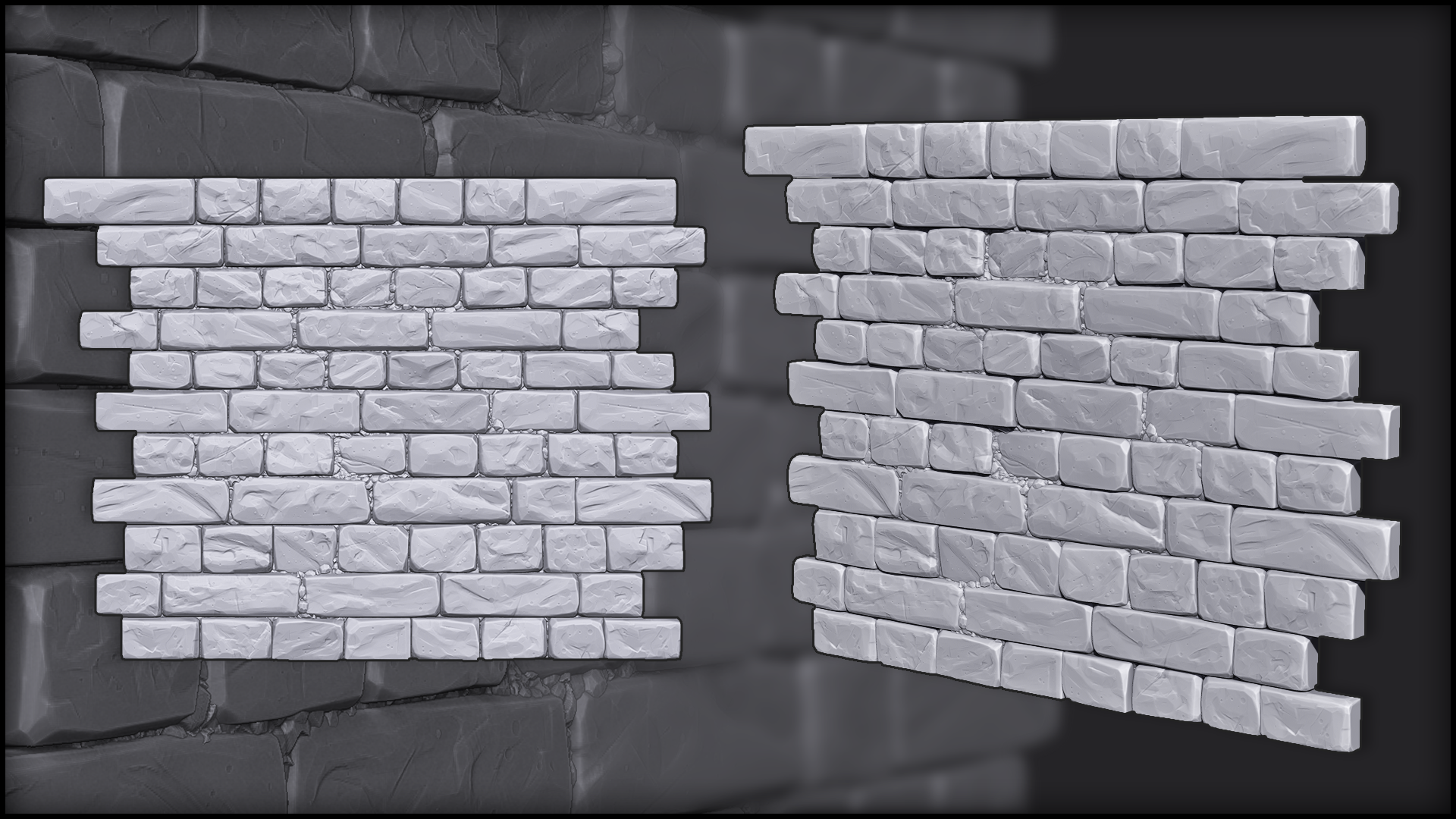
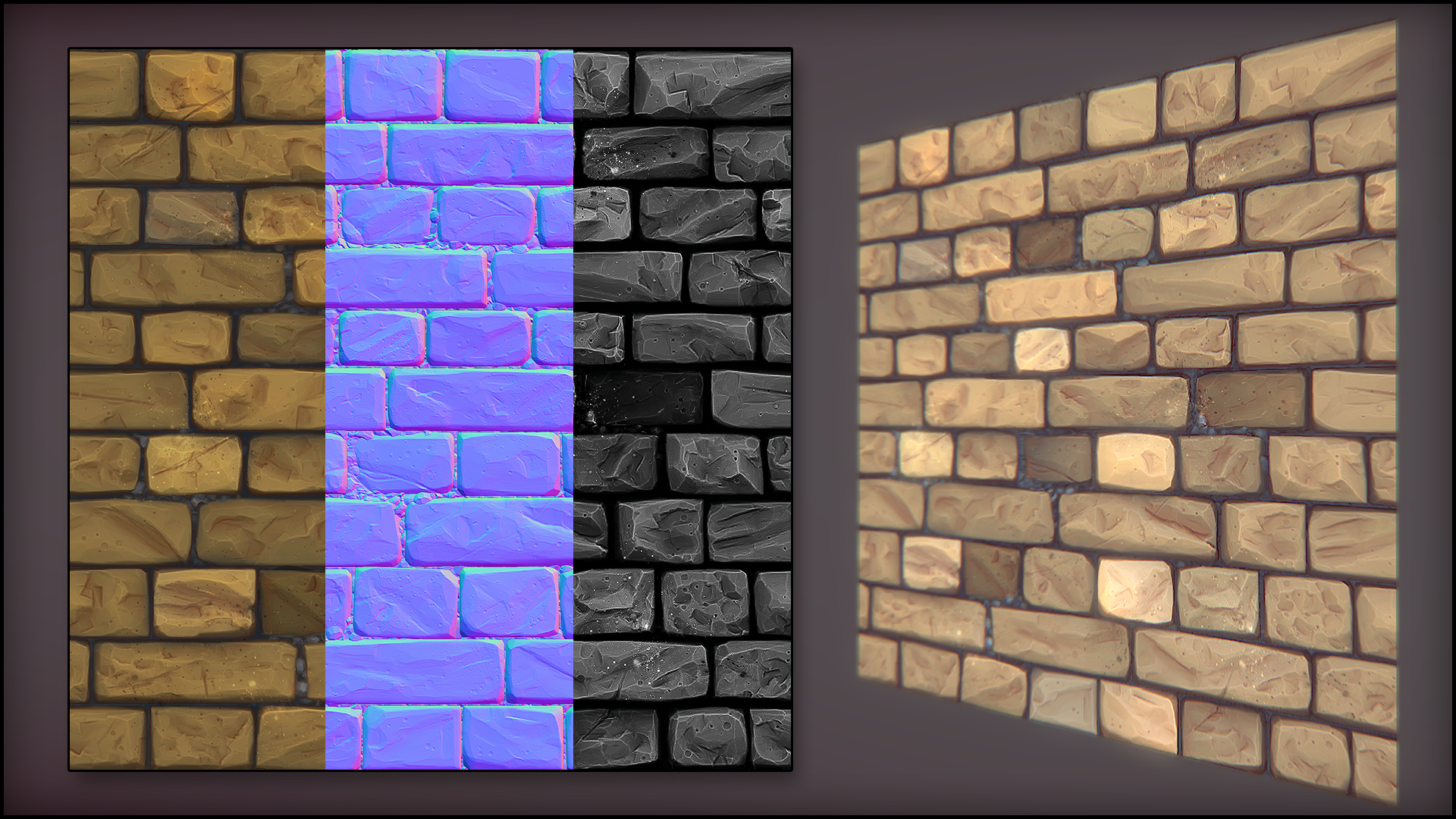
And here the final render on Marmoset Toolbag :
I post my last texture have done.
So tell me how I can improve it ? and what you think about it.:poly142:
Of course any comment/advice can help me.
The Zbrush :
And here the final render on Marmoset Toolbag :
Replies
I think you could tweak the contrast a bit to make it really pop color wise
https://www.youtube.com/watch?v=rNgs2DcAsF4
thanks you for your advices but a special thanks for @Grindigo.
Your link is just amazing and useful !
@silvershrimp : Yes it's a tiled texture
If you have or someone else have a idea to improve again my work don't hesited.
Here a render on Marmoset Toolbag :
And there you have the texture (only diffuse map) :