The Blue Door
Hello!
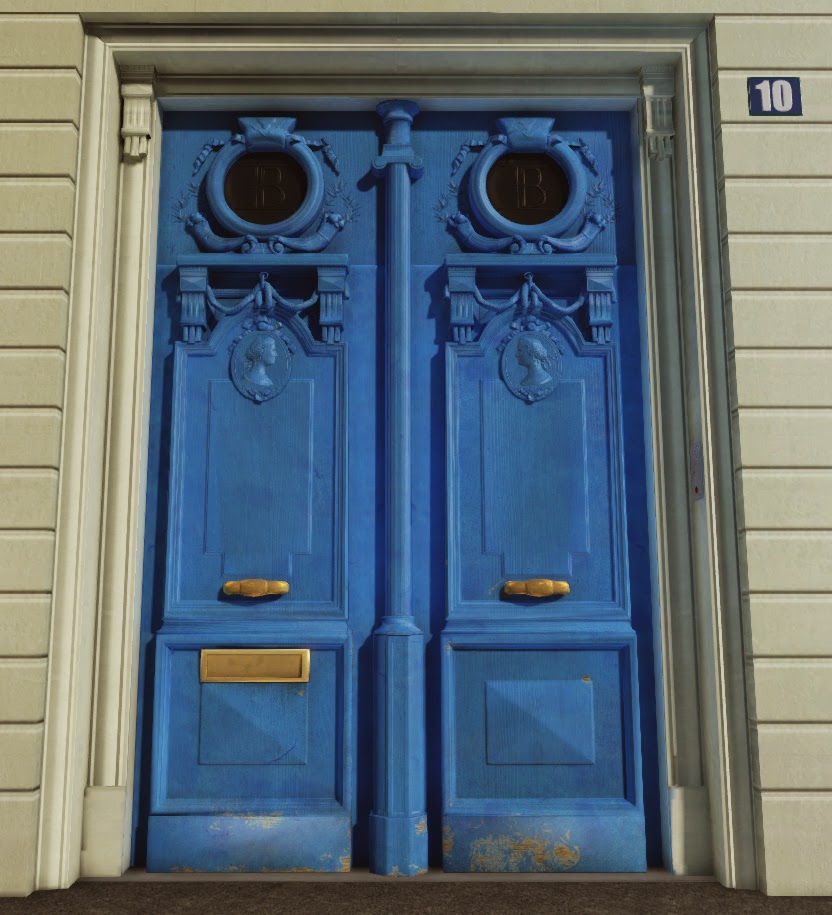
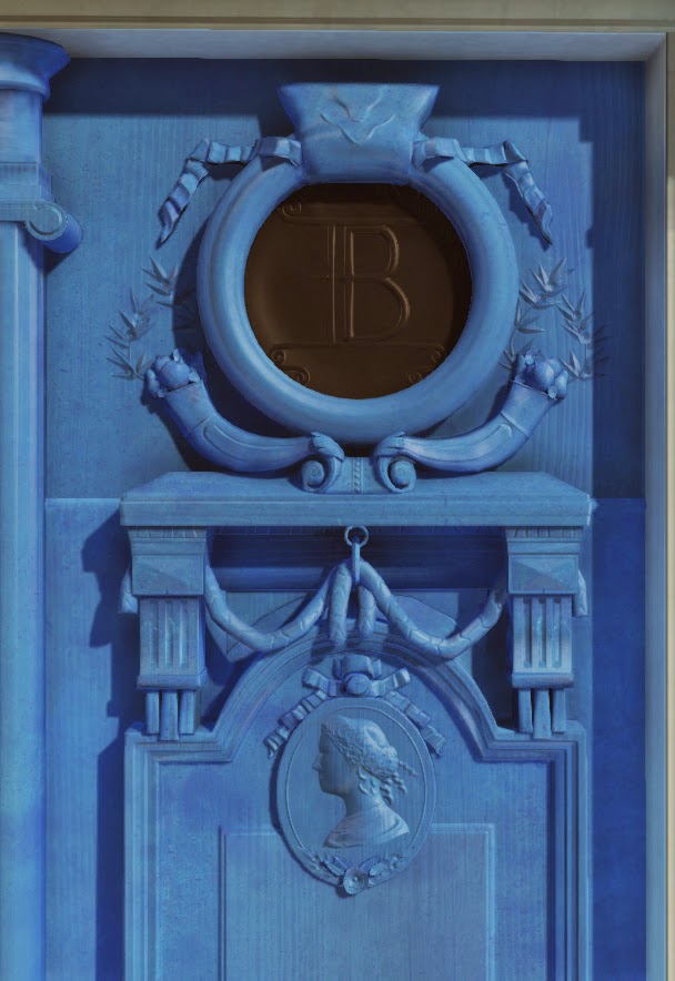
I have been working on this little project for a few weeks now and I thought I'd post this up on here before I called it done. The one thing I'm really concerned with is the amount of dirt/chipping. Did I do too much? Not enough? Is there something else that really sticks out and I just can't see it? I've been looking at this for too long now to be able to tell anymore!
Any input would be greatly appreciated!
Referenced, but not copied:


Replies
I don't know how much wear & tear you're going for, but for game art it's usually better to go with more than in real life. It's always easier to take away some of the wear than to add more.
Some things I'd add:
-More "edge wear", right now you have some chipped paint, but paint tends to chip away mostly at edges and flat areas that take a lot of abuse, like the bottom of the door.
-The chipped paint at the bottom of the door doesn't look natural. I'd make it go all the way down to the bottom of the door.
-more dirt/grime
-A trick I use for painted wood is to use a texture of wood grain to mask away some of the paint. Paint usually fades in the crevices of wood (not always though). And it makes the paint look less boring imo
-You can also use ndo2 on your mask for the chipped away paint to add some more depth.
Some reference to look at:
http://thumbs.dreamstime.com/z/old-rustic-wooden-doors-painted-blue-29071406.jpg
loads of good reference on cgtextures:
http://www.cgtextures.com/texview.php?id=97827&PHPSESSID=jrinln4dgvag6a1ojdqembrf03
http://www.cgtextures.com/texview.php?id=105571&PHPSESSID=jrinln4dgvag6a1ojdqembrf03
http://www.cgtextures.com/texview.php?id=87509&PHPSESSID=jrinln4dgvag6a1ojdqembrf03
http://www.cgtextures.com/texview.php?id=88021&PHPSESSID=jrinln4dgvag6a1ojdqembrf03
Some references and textures from my own "archives", appreciate this because it took ages to upload
Notice how the paint is peeling away upwards on this one, I'd try to simulate this on your door, though tone it down a bit if you don't want this much wear.
http://i.imgur.com/vdlGbjH.jpg
http://i.imgur.com/uFy8ckS.jpg
http://i.imgur.com/MsN0rxm.jpg
http://i.imgur.com/Rs11ZG1.jpg
http://i.imgur.com/DiYdBGE.jpg
http://i.imgur.com/LPZ5g4G.jpg
http://i.imgur.com/80phveA.jpg
http://i.imgur.com/BMVZ525.jpg
http://i.imgur.com/BMVZ525.jpg
http://i.imgur.com/4Z6Q17w.jpg
http://i.imgur.com/aIAonYC.jpg
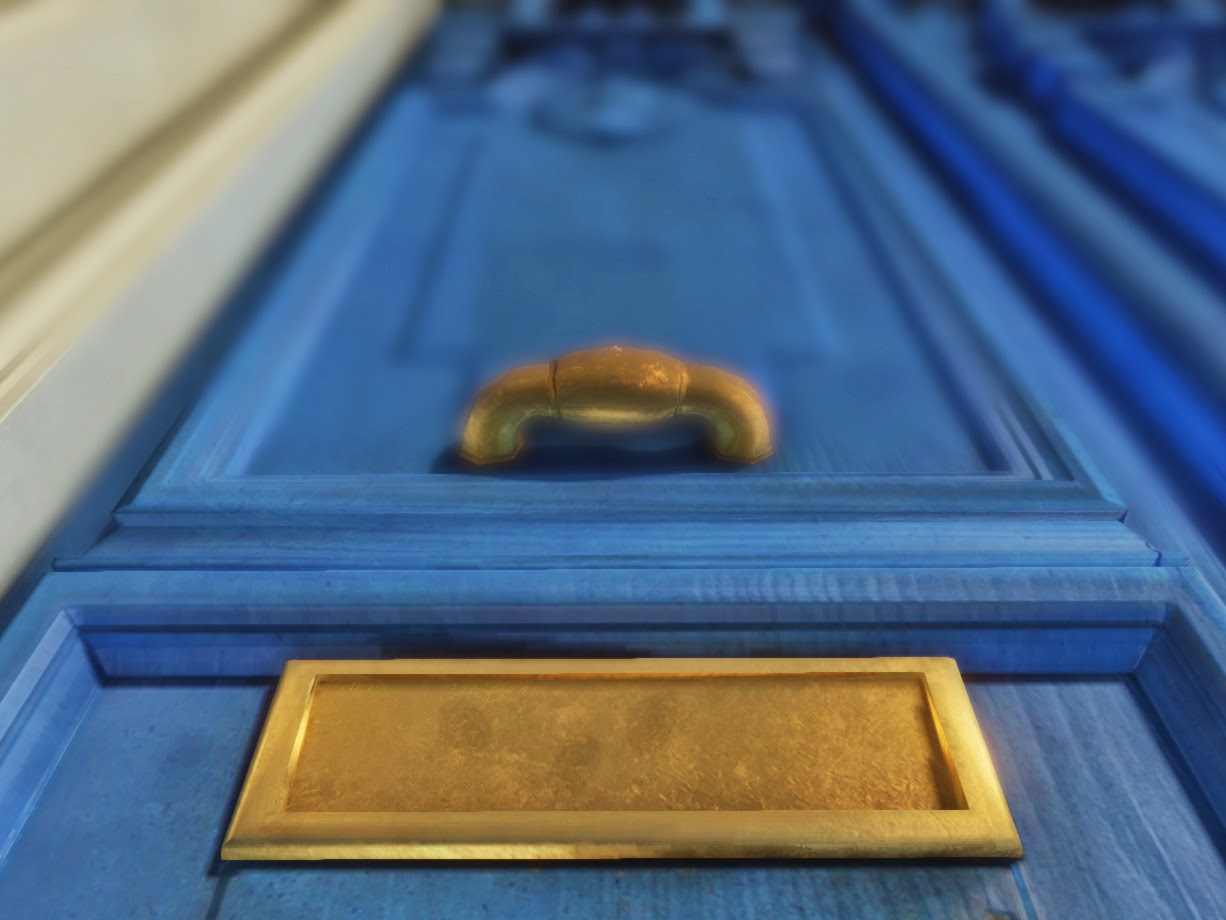
I already had a cube map and reflection vector set up for both the handle and the letterbox, but tried bumping it up some more so you can see it. I also added some more dents/general deterioration to the letterbox to make it less perfect.
I touched on the walls a bit. I chamfered the edges and added some normal map work in there to make it look a little more interesting.
I also tried messing around with the lighting, but honestly I don't really know what I'm doing when it comes to lighting! Any input with that would really help me out.
Here's some more reference:
http://free-images-etc.rb-d.com/wp-content/uploads/IMG_9807.jpg
http://www.healbyrain.com/wp-content/uploads/2012/01/green_painted_distressed_wood1.jpg
http://fc03.deviantart.net/fs70/i/2010/279/0/5/painted_wood_by_juutin_stock-d307oj7.jpg
http://psdmockups.s3.amazonaws.com/wp-content/uploads/2013/03/old-peeling-knotted-pine-wood-green-painted-fence.jpg