Games with standout menus
Hey all,
I was recently thinking about an often under appreciated part of gameart/ development and decided to come here to get some opinions on it.
MENUS!
What are your favourite game menus, I found it to be a tricky thing to think about because when they are done well you don't notice them all that much.
As an aside if you have any examples of different or extremely well done UI's feel free to chuck that in.
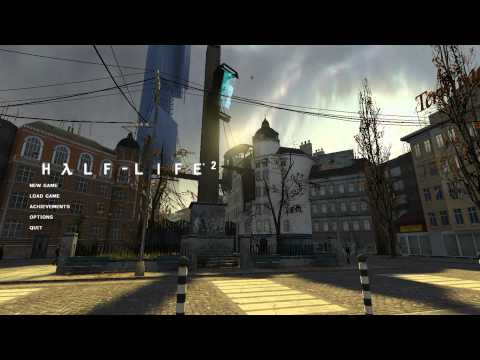
For my personal preference I was always partial to Half Life 2 main menu with the simple options overlayed on the 3D back ground.
[ame=" https://www.youtube.com/watch?v=pWsLyU9uu-M"]Half-Life 2 attract mode / main menu - YouTube[/ame]
It sets the stage while not being too in your face. Also (correct me if I'm wrong) but it was one of the first games to use the 3D background as a menu.
Another one I played recently and enjoyed was Tomb Raider -
[ame=" https://www.youtube.com/watch?v=asbhX5GrnOU"]Tomb Raider - MAIN MENU - YouTube[/ame]
The slight parallax and interaction and the introduction to the world was pretty brilliant while being relatively simple. Looks like they used scaleform?
Anyway, sorry for the ramble. Feel free to post any other examples you enjoy
I was recently thinking about an often under appreciated part of gameart/ development and decided to come here to get some opinions on it.
MENUS!
What are your favourite game menus, I found it to be a tricky thing to think about because when they are done well you don't notice them all that much.
As an aside if you have any examples of different or extremely well done UI's feel free to chuck that in.
For my personal preference I was always partial to Half Life 2 main menu with the simple options overlayed on the 3D back ground.
[ame="
 https://www.youtube.com/watch?v=pWsLyU9uu-M"]Half-Life 2 attract mode / main menu - YouTube[/ame]
It sets the stage while not being too in your face. Also (correct me if I'm wrong) but it was one of the first games to use the 3D background as a menu.
Another one I played recently and enjoyed was Tomb Raider -
[ame="
 https://www.youtube.com/watch?v=asbhX5GrnOU"]Tomb Raider - MAIN MENU - YouTube[/ame]
The slight parallax and interaction and the introduction to the world was pretty brilliant while being relatively simple. Looks like they used scaleform?
Anyway, sorry for the ramble. Feel free to post any other examples you enjoy
Replies
[ame="
[ame="
And dead space:
[ame="
Actually it reminds me of a video I saw the other day of HL2 being converted to VR, something interesting they did with the UI -
[ame="
[ame="
Awesome game by the way, anybody that likes the horror genre needs to try this game, it's free on Steam!
Another game (I like space games) was X-Beyond The Frontier. All ingame menus were displayed on ship panels. When you opened the "map" a arm with a display came into the players view and was there in 3d space. https://www.youtube.com/watch?v=BrDxlBY8afw 5:50. And the main menu was 3d too
Negev I watched that video for 2 minute waiting for it to move before I realised it was just the theme
[ame="
[ame]www.youtube.com/watch?v=3kPI8zVGzMY[/ame]
[ame]www.youtube.com/watch?v=tNhu2_8Kyew[/ame]
Elegant, unobtrusive, perfectly functional, no fat, easy to understand. When i saw UT3's menu I almost punched the screen at what they'd done.
Here a making of
[ame="
The Starting Screen is full playable
Just looking at that menu again makes me want to reinstall that on my computer.
Well the two I was gonna point out were Dead Space and Tomb Raider, which were already mentioned. If you haven't see it yet, there's some good stuff in the polycount wiki on menus and ui design http://wiki.polycount.com/CategoryUserInterface
[ame="
[ame="
Metal Gear Solid series: VR Missions, 2, 3, Peacewalker
Metroid Prime 2
- loved the input and menu control, with the menu items being in 3d, and you rotate them around to select them.
Half-Life 2: beautiful.
Halo 3, 4: well balanced, lots of info
Diablo 3: So consistent, clear, elegant, and easy to use. Never takes attention away from the game, and only competes for your attention when is absolutely necessary. I'm not as big of a fan of the new "Quest/Story" setup menu in the latest patch, feels clunky in the overall flow of creating games.
Patapon: They go the route of simple text option menus, and visual design to convey game systems.
2:
3:
main game menu:
^This
And I also remember being quite impressed with the menus from Chronicles of Riddick: Assault on Dark Athena.
[ame="
http://m.youtube.com/watch?v=59dvZS44fuI
Now if only there was a Mafia 3 out already
Vanquish definitely great ui work aswell and super flashy main menu
Loadout is kinda nice, but stylized
Sniper Elite nazi zombie army
Warframe is pretty unique, too hard to read for my taste tho
Metro games have a really nice diegetic UI in full 3D
Warhammer 40000 Space marine
http://youtu.be/HNl7VX3MJUY
Oh shit the music, forgot how nice it was
Forgot about too many already
Oh yeah, the brutal legend one, that one was nice