WorkShop two_larsens
Hi,
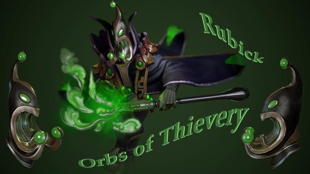
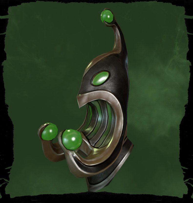
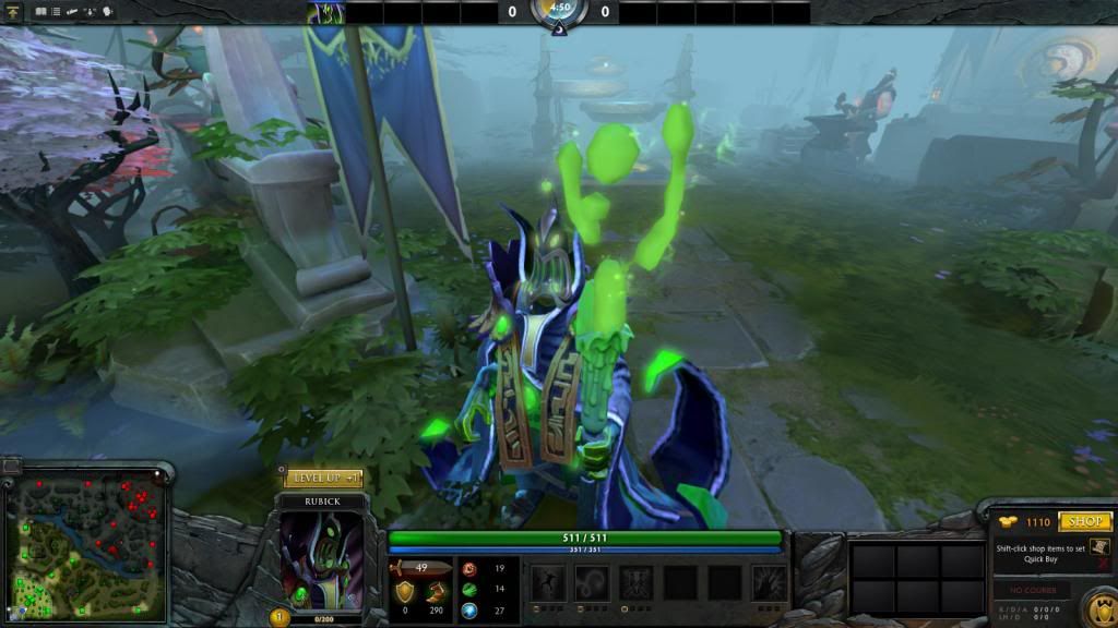
This is what I have been working on over the last few days, and hope to upload it tomorrow - a Rubick helmet. The design was something I thought would look interesting and quirky, with lots of curves and silhouette - I hope. I have no idea if a helmet stands a chance, when not part of a set, but I'll give it a whirl anyway.
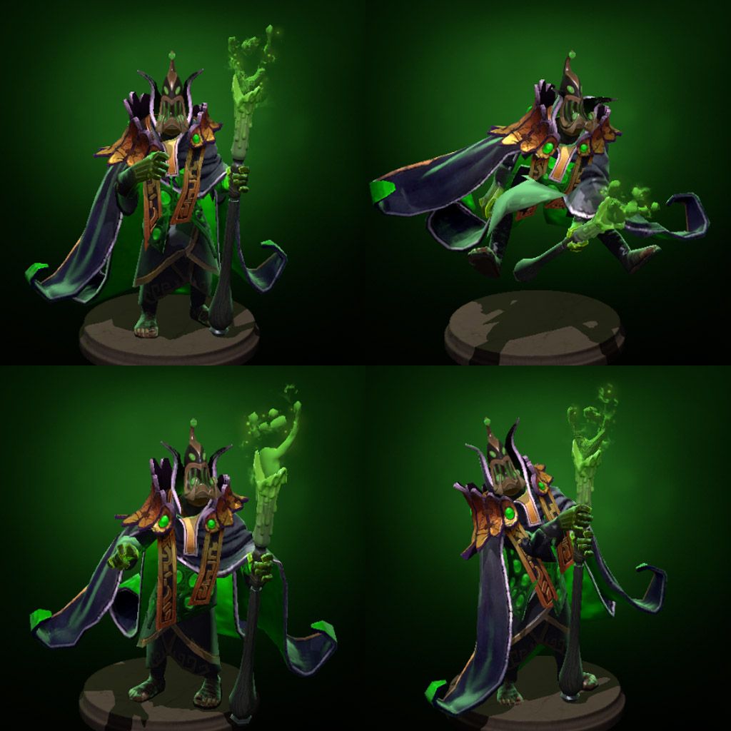
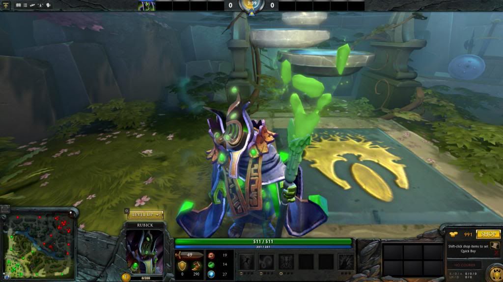
Anyway - any thoughts or feedback? I tend to sit in a vacuum here, and can stare myself blind on what I do. As for looks, then I tooled around with it till it stood out well in game and on the model stands - at least I hope. It was rather tricky getting enough contrast, and for it to stand apart from the rest of his outfit. As said, it won't be uploaded until tomorrow, after I've cast another look at it.
After this, I was going to throw myself over the Polycount challenge, and try and tackle a weapon for Elder Titan.
Thanks for any feedback.
Henrik Larsen
This is what I have been working on over the last few days, and hope to upload it tomorrow - a Rubick helmet. The design was something I thought would look interesting and quirky, with lots of curves and silhouette - I hope. I have no idea if a helmet stands a chance, when not part of a set, but I'll give it a whirl anyway.
Anyway - any thoughts or feedback? I tend to sit in a vacuum here, and can stare myself blind on what I do. As for looks, then I tooled around with it till it stood out well in game and on the model stands - at least I hope. It was rather tricky getting enough contrast, and for it to stand apart from the rest of his outfit. As said, it won't be uploaded until tomorrow, after I've cast another look at it.
After this, I was going to throw myself over the Polycount challenge, and try and tackle a weapon for Elder Titan.
Thanks for any feedback.


Henrik Larsen

Replies
Apart from that, the mask itself looks great!
ya colour is kind of dull for me.
also combine all your older submission wip/progress into 1 thread will be better so i can stalk you in 1 thread
I haven't seen Tiny Toons. I'm almost afraid to do that now...
Thanks,
Henrik
Anyway, I tried hard to come up with something different and quirky, and something that fits his twitchy avatar, and also slightly different colors that what normally is associated with a Rubick helmet. So, instead it was golds for a main outline, and dark purple for contrast, as per his cape and shoulder piece.
Thanks for any feedback.