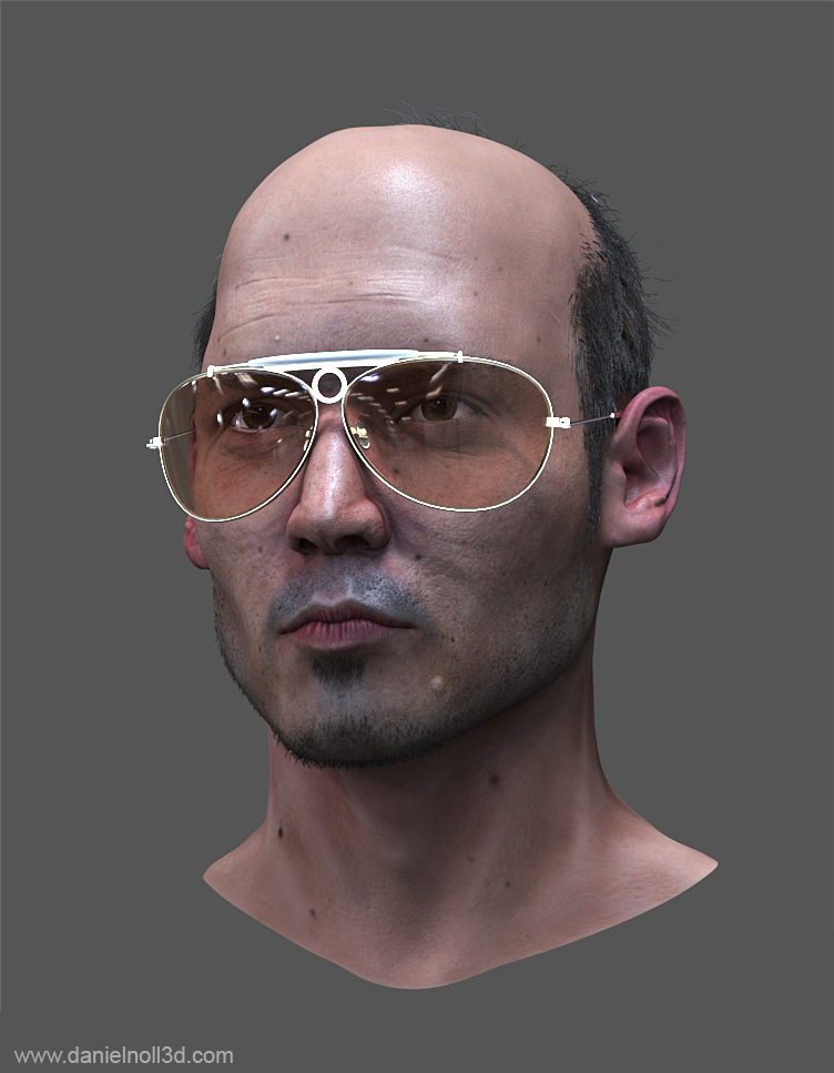
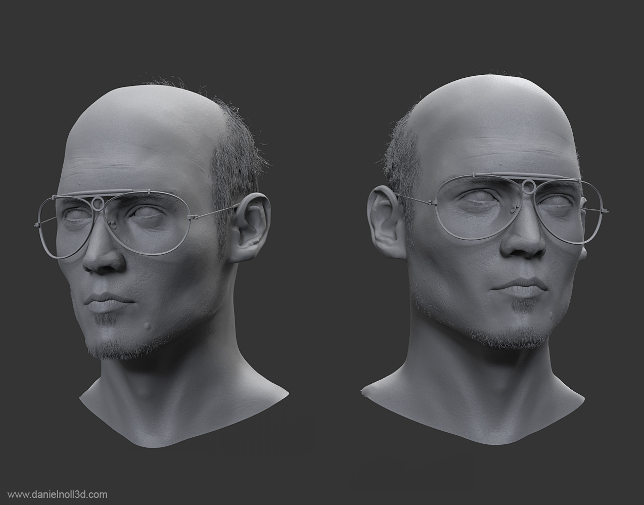
Johnny Depp - This is Bat Country!
Hi everyone,
I thought i share what I am currently working on. It is supposed to be Johnny Depp as Hunter S Thompson.
Whole thing is rendered in Keyshot. Hair is done with Maya Paint FX converted to polies. I plan to model shirt, hat, cigarette and one or two expression that we are familiar with.
Hope you like it.


Replies
XD
Small update. Neck is slightly too long I think. Also an early pass on the shirt. Next step would be to add some "fur" on the shirt.
Love this! The cigarette and hat are a must! And more Alcapulco shirts!
Awesome idea! I really want to see more of it!
I changed quite a bit. I went back to the sculpt and tried to tweak a bit. I pronounced the cheek bones a bit more (maybe too much now?) and gave the area around the mouth more volume. Then I basically redid the whole texture as I decided to put the neck and head together (before head and chest were seperated chunks d'oh). I also kicked the PaintFx poly hairs and decided to go for a real hair solution (Yeti) and render everything in Maya/Vray. I am not happy with the hair yet. I hope I can improve it!
On the 1st picture you see a basic 2 point lighting and the other one is a comparison shot of different hdrs. Especially in the more drastic situations (2nd and 4th) I noticed that there is still some work to do. The micro gloss might be a bit too strong and the area below his mouth corners need some work, aswell as the wrinkles on his forehead.
For the HDR lighting I currently use two domes. One for diffuese and spec with a lower res HDR and a 2nd that only affects reflections with a higher res HDR. Is that the correct way to do it? And currently the Background uses the higher res HDRs, but somehow they look quite pixelated. I didnt find any way to crank up the res there. Any tips?
Comments and crits welcome!
Cheers
Daniel
As for the HDRi problem, you should get Sibl gui. It uses a very low res HDRi for the lighting, medium res for reflections and a (sharpened) tonemapped LDR for the background. I've got some free ones in my signature and there's a big library of free ones here But it looks like you're already using those. Of course there is a limit to the resolution, so if you're using a very narrow field of view you'll probably always get some pixelation, so just use DOF then.
http://www.hdrlabs.com/sibl/framework.html.
P.S.:Now make Dr. Gonzo!!
After weeks of tweaking, endless back and forth and mental breakdowns, I decided to release it. I could go on forever probably with tuning etc. but at this point I am quite happy with the results. I had big troubles with the expression. Keeping the likeness especially in such an extreme expression was a nightmare.
I am quite shocked now if I look into the project folder and compare with previous and early renders. But it is always nice to see progress!
I hope you like it! Feel free to ask if you have any questions about the process etc.
Cheers
Daniel
Few questions about workflow...
How did you created the skin texture?
How did you created the stubble on his face?
How did you make the fur robe?
What program did you do the final render in?
Again awesome work man!
@BradMyers82:
1: The Skintexture is a combination of photo and painting with texture brushes. A lot of veiny and "spongy" brushes were used. However since I used Vray and the SSS skin material more maps were used, like SSS color and a scatter map
2: The stubbles were done with a hair solution called Yeti
3: Again, Yeti was used here
4: I used Maya and Vray.
Hope this helps
Daniel
I mean I am definitely seeing it, and maybe its the lighting or noise, but it seems like there is something wrong with the way its scattering. If you have a lot of GI, or depending on how you setup those HDRI lights 'linear workflow' wise, could be contributing to it. Do you have gamma correction nodes on the HDRI?
I always let the HDRI maps on gamma 1.0 ( as they are supposed to stay linear, from what I read)
Sorry that i spam the thread with such a giant pic. But it's quite similiar in pose and the mouth is a lot bigger.
Other than that it's spot on.
Maybe it's just me and the mouth got the correct size, but something there catches my eye, that is not looking 100%
You were right there was indeed something weird going on with the scattering. I used a scatter color map that was apparently not so good. I removed it and now just a single color is used. The difference is not that much but it is noticeable I think.