[CE3] Abandoned Warehouse enviroment Wip
Current progress

Original post
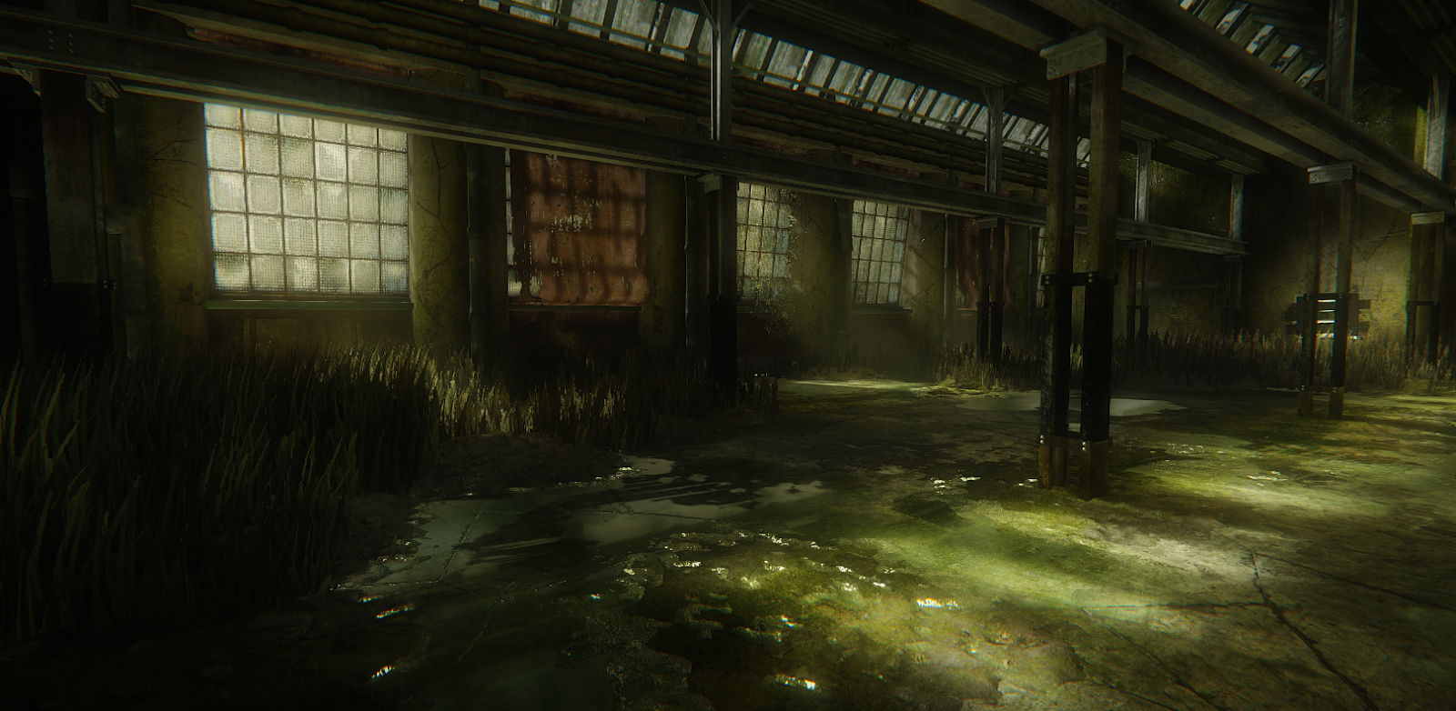
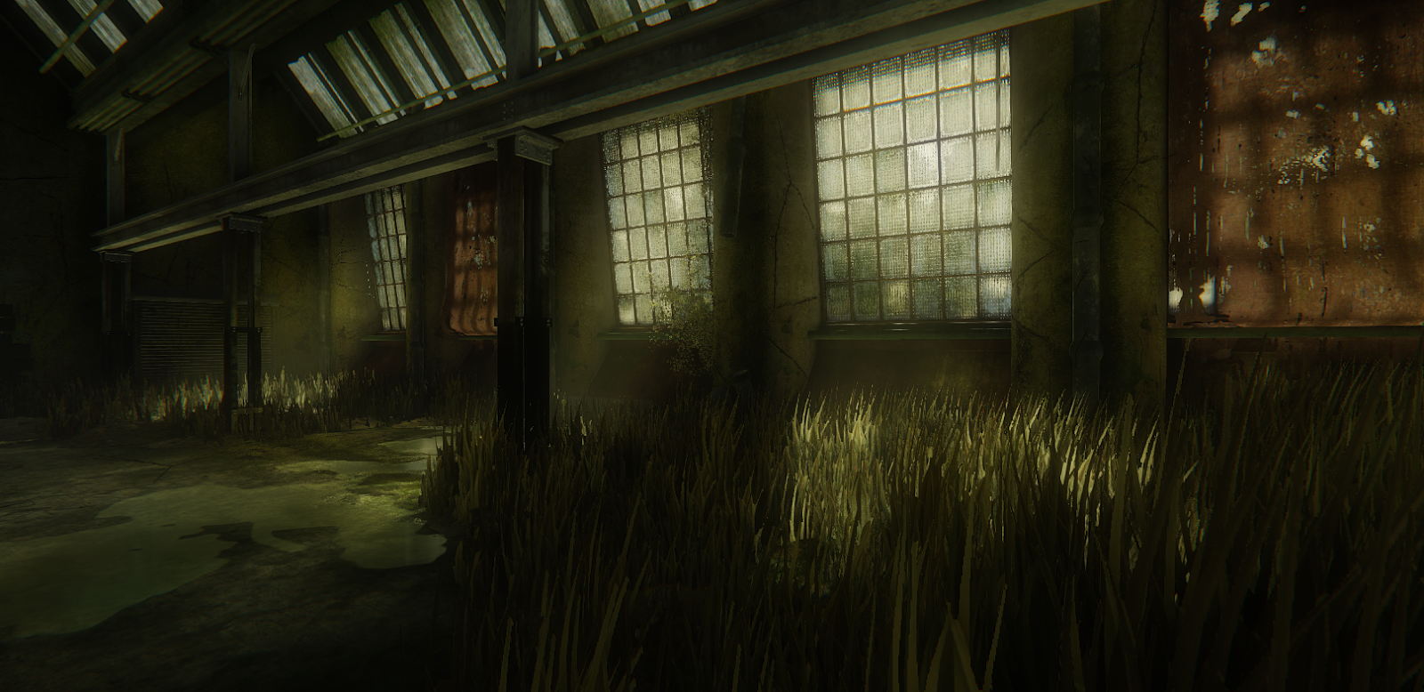
I've been working on my final year project. For this im doing a old abandoned warehouse loosely based of a concept by Snatti (AKA Atey Ghailan). I want the overall feel to resemble the concept art but i'm trying to do my own twist on it, so ive been going a lot more overgrown that in the concept art as well as adding a lot more grime and slime around.

Here are my Wip shots of it so far:


as you can see ive still got quite a lot to do but ive been trying to get the side area mostly finished, that way not only is it quite a morale booster but also if i run out of time it means i can cut my enviroment down and hand in just that finished bit.

Original post
I've been working on my final year project. For this im doing a old abandoned warehouse loosely based of a concept by Snatti (AKA Atey Ghailan). I want the overall feel to resemble the concept art but i'm trying to do my own twist on it, so ive been going a lot more overgrown that in the concept art as well as adding a lot more grime and slime around.

Here are my Wip shots of it so far:


as you can see ive still got quite a lot to do but ive been trying to get the side area mostly finished, that way not only is it quite a morale booster but also if i run out of time it means i can cut my enviroment down and hand in just that finished bit.
Replies
I feel the grass could be improved. The blades are a little thick and most of them are pointing straight up (at least those that I recognize the most).
I'd recommend you to think of some focal point. Something, that draws the viewers attention. Right now I tend to look at that red color contrast. But that red cloth isn't really interesting. Through it's a really, really nice environment so far, it's missing something that tells a story or at least gives you a point to focus on.
In the original concept there are those big numbers (110 and 29) and that technial stuff, that add a little to the scene. Maybe you should think about some leftovers from whatever could have been in there...