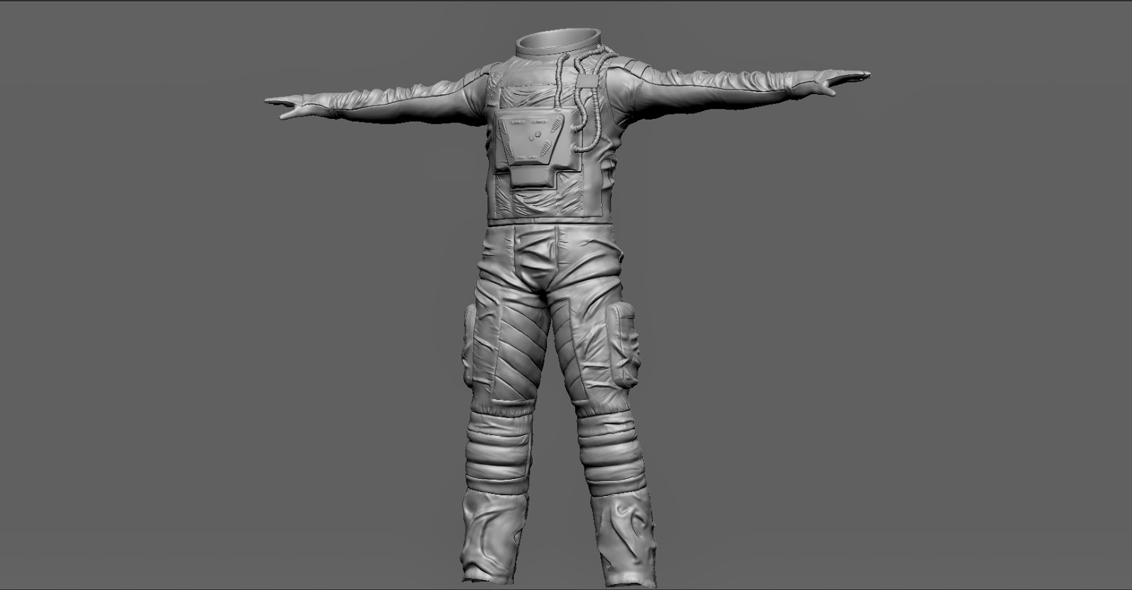
IMO it looks solid tome. What I really like is the thing on the chest.
One thing that seems a bit odd to me is that the suit is very thin. So it could be easily a racing suit as well.
Is its setting sci-fi? Than it would make kinda sense. (At least to me )
Still a good suit . Maybe you could add some references or inspiration to this suit.
I would have to disagree with shad0w and say the weakest thing on this is the chest piece. It's base form looks a bit wavy, and then it looks like you just threw some stamps on top of it. Really define the base shape, with hard defining edges. Then try and figure out how to make the stamps make sense, right now they seem very random and quickly thrown on.
Everything else on the suit looks pretty nice, but that middle piece is really throwing it off.
You need to redesign it a bit. The symmetry is wrong, Google astronaut and you'll see that most space suits have asymmetrical chest pieces at the minimum and many have arms and legs covered with instruments, flags and tubes. The main area that is technically weak is the folds. There's a variation of quality with some nice ones on the arms then some big ugly ones on the legs and some wavy ones across the groin. They need to be flattened and harder. [ame="https://www.amazon.co.uk/Dynamic-Wrinkles-Drapery-Solutions-Practical/dp/0823015874"]This is a good text[/ame] on wrinkles, but I find observation, looking at scan data and just practising are very helpful. Good luck it's not bad just needs refining.
Replies
One thing that seems a bit odd to me is that the suit is very thin. So it could be easily a racing suit as well.
Is its setting sci-fi? Than it would make kinda sense. (At least to me
Still a good suit
Cheers man
Everything else on the suit looks pretty nice, but that middle piece is really throwing it off.
I agree now with your comments.!
They're bugging me now. haha
I shall improve the chest.