Trying to texture like Naughty Dog (Critique is Welcome Here])

polycounter lvl 8
I've been trying to step up my texture game. Naughty Dog has put out some awesome hints on the subject, so I've been trying to follow along and emulate the processes shared by some of their artists.
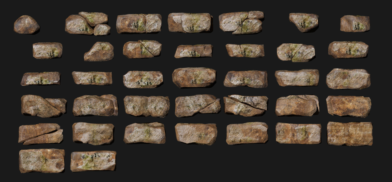
Right now I'm working on doing simple bricks using a technique presented by Tate Mosesian over on Pixologic. This technique uses the insert multi mesh brush to draw out brick prefabs.
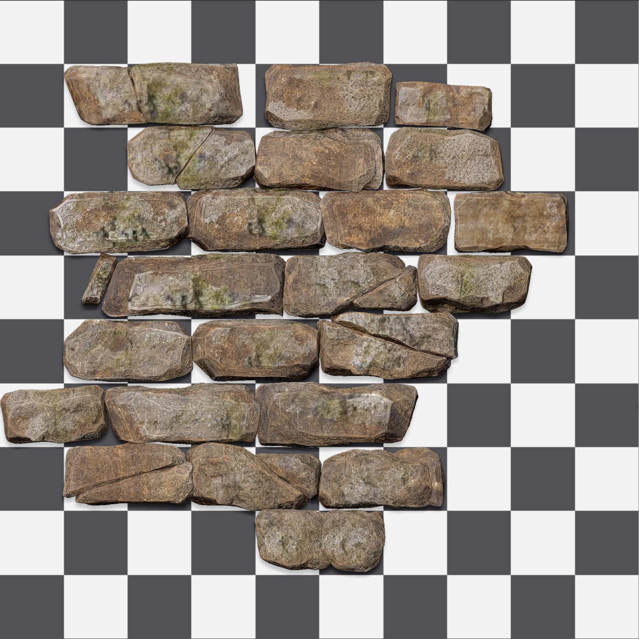
I ended up with 40 bricks in my IMM brush of various size and shape, then drew them out on a grid.
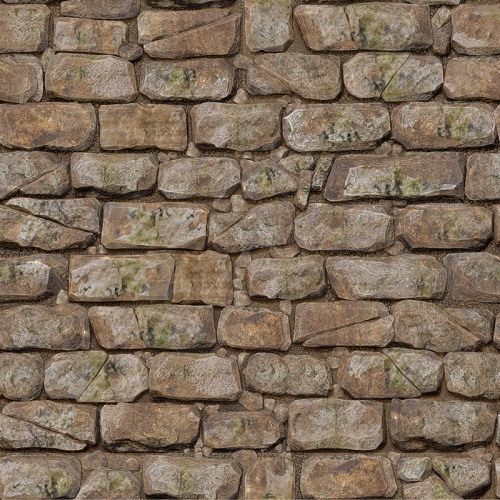
If I can do some self-critique for a sec, I'm pretty ok with how it's coming out.
I probably could have spent more time sculpting the individual bricks themselves. Although they don't look bad for a 30% decimation.
Another thing was the scale of the individual bricks. I realized late that I did not plan them according to the grid and that flustered me in some places. However, many fit the grid well enough, and in places where full bricks didn't fit, I used my broken brick subtools. So I think in the end, it might have worked in my favor cos it looks a lot more organic that way.
The bricks with the diagonal fracture make it too easy to spot the tiling and look samey. I should go back and make at least one more brick to hide the tiling better.
The diffuse lacks contrast atm, but I figure I can fix that with some baked maps. I've barely touched Photoshop yet. I want to run this through Xnormal as well to get that good AO.
These are just things I've taken note of after a good night's sleep.
Feel free to contribute your thoughts and thanks for reading guys and gals
Right now I'm working on doing simple bricks using a technique presented by Tate Mosesian over on Pixologic. This technique uses the insert multi mesh brush to draw out brick prefabs.
I ended up with 40 bricks in my IMM brush of various size and shape, then drew them out on a grid.
If I can do some self-critique for a sec, I'm pretty ok with how it's coming out.
I probably could have spent more time sculpting the individual bricks themselves. Although they don't look bad for a 30% decimation.
Another thing was the scale of the individual bricks. I realized late that I did not plan them according to the grid and that flustered me in some places. However, many fit the grid well enough, and in places where full bricks didn't fit, I used my broken brick subtools. So I think in the end, it might have worked in my favor cos it looks a lot more organic that way.
The bricks with the diagonal fracture make it too easy to spot the tiling and look samey. I should go back and make at least one more brick to hide the tiling better.
The diffuse lacks contrast atm, but I figure I can fix that with some baked maps. I've barely touched Photoshop yet. I want to run this through Xnormal as well to get that good AO.
These are just things I've taken note of after a good night's sleep.
Feel free to contribute your thoughts and thanks for reading guys and gals
Replies
http://www.artbypapercut.com/ Vertex Vol. 1 I believe had something about naughty doge texturing
Here it is.
[http://pixologic.com/zclassroom/homeroom/lesson/environments-with-tate-mosesian/
Thanks for the crits!
I finally ran this through Photoshop applying different masks and overlays to get edges and AO to pop. I messed with the diffuse a bit to lessen the flattened look and boosted the red. Also got it in Marmoset and I was VERY HAPPY with the results of the normal. It looks pretty poppin atm
Self crit time: I left the layout of the stones since I'm not sure I can go back that far in 2.5D mode. Ohhhhh well
In the meantime, I made another texture out of a different arrangement. I wanted to put sand in the crevices so I spent time making a few masks in Photoshop to get the job done. Very little hand painting. Looking at it now, it looks like I lost a bit of depth when I added the sand. Better check on that.
I like the bricks, but am having more trouble repurposing them in Zbrush than I would in Max. Probably cos I don't know the tools as well. Like how could I make the bricks BEND into a cylinder? Does Zbrush have an answer to Max's Bend modifier?
Next up after feedback, I'd like to do a few more arrangements of bricks, then move on to some trim sheets
As always, crits wanted and welcome
This tutorial may also be helpful
http://www.philipk.net/tutorials/materials/tilesold/tilesold.html
it's more a combination of the naughty dog one with finishing it in max. You were asking about easier ways to bend the bricks into curves, this tutorial touches on that.
I took bits from both tutorials and ended up with this:
like yourself I got caught up in trying to make certain bricks interesting, and then having to get rid of it because it was obvious when tiled.
Watch your normalmap, you got shadows in there. BIG no no. Use the normal material found on pixologics site. The one that ships with ZB is broken. It highlights stuff very weird. Have a look in the different channels if you want confirmation
Thanks again for the feedback
I focused on getting the bad moss out, getting better moss in. Painted a new moss texture in Zbrush then blended it all in via masking in PS. This version also has cavity reduced substantially.
The second arrangement of bricks has to have the sand part completely redone. I worked on the file outside of home and did not remember to reupload it, darnit.
@sltrOlsson: I didn't have a target engine atm, but I've prepared a shadowless and AO-less version and a question about Marmoset 2 if anyone knows it.
Problem: I have a material. I have only albedo and normal maps hooked up. Gloss and Spec sliders are set to zero. There are no lights in my scene but the skylight and both mats use a copy of the same mesh with the same tangent space set to Marmoset
Why the heck is my diffuse coming in so much brighter?
I loaded a default mat included with Marmoset 2 and got rid of the spec, gloss, etc too. That albedo shows up in the engine exactly as I'd expect: looking very close to the diffuse.
Why doesn't my texture do that?
Critique and feedback appreciated and welcome
Thanks steveson. I screwed up when I laid out the bricks so layout changes prolly won't be happening
Although I used IMM brushes to draw most of the bricks, I used 2.5D mode to perfect the tiling since you get a small seam using Tate Mosesian's method. I don't know how to go back and edit the 2.5D parts unfortunately :[
Fortunately, I will be making new textures where I can put your awesome feedback to work :]
New texture here is the basket weave brick pattern. Yeah! And a big thanks to ZacD for helping me solve that Marmoset issue
So I did pretty much everything I could to get these back down to nearly flat diffuse textures. I'm feeling the mats atm but got a little lazy with the moss for the last texture. Fixing next update
Something that was really bothering me about the materials in Marmoset was actually the normal map. Zbrush gave me some great, sharp normals but I think they looked too sharp, and cartoon-ish. I softened them in Photoshop
Though I worked more on it, I'm not really feeling the texture with the vertical bricks so I might drop it. I can do better
This week I'd like to get into some cool trim sheets and repurpose some of these assets to start a small scene
I also plan to do study and render other materials to add to my stone work
Please please please critique these things
You need to tweak it and see how it behaves in different light situations, but it looks like your albedo is way to bright. What does your gloss and metaliness look like?
That's ok dude! I got some help on the technical forum that same day.
So for testing I took a few shots of the bricks in different lighting presets of varying brightness
I guess the bottom bricks have some over-exposed looking areas with the skylight brightness set pretty high. Any feedback here would be awesome since I'm not used to doing this haha
I'm actually using a constant for metalness set to absolute zero at the moment. I'll update this with my spec when I get home
Thanks again
first, nice work. Good progress.
I like the sculpting and brick placement. What i notice that there are 2 bricks on first texture, that are too bright. It can be noticed when you tile the texture.
Jakub
Otherwise, I think it looks quite good.
Finally put a little work into a trim sheet
I referenced some cool architecture from temples in India and southeast Asia
They have such awesome things
This piece was made with a height map in mind... but I'm having trouble with it. The very top doesn't parallax well currently... Need to find a way to fix or hide. Suggestions welcome!
I've got a few pieces together for a small scene, but it's not worth posting currently... However I fell for these temples in India pretty hard so that's the style I'm aping
Look at where the highlights are on your highpoly model and then look where they are on your game ready model.
I thought I had a workflow set up to make sure that didn't happen but oh well
Argh, says the pirate
Lot of silence, but I've been working on trying to combine what I've learned into a scene (and prepping for GDC too)
I've been basing my architectural style off of Muktesvara deula, a Hindu temple located in Bhubaneshwar, Odisha, India. Things be blocked out at the moment and I've exported parts into Zbrush for intense sculpting
I'd like to get somewhere near complete in time for GDC (by Sunday) if possible
Crits comments come on
Update!
Doing plenty of sculpting in Zbrush. I haven't had much luck finding pre-made brushes and assets with Hindu inspired design, so I've had to make a lot of my own custom brushes for this one.
I'm thinking I need to revise my idea of "complete" to be just a high poly scene with polypaint. No way I'm getting quality low polys out in time for GDC at this pace
The reliefs are giving me a bit of trouble. They just don't look as good as they could to me. I've watched a few tutorials to see some techniques, but haven't found much that's helpful to me so far
I'll take suggestions on this if you got em!
Another quick update today
Another day, another pillar
Updated more for today
Thanks! I'm only using 3DS Max's daylight system to render atm. Nothing more than that
More progress. I have a few adjustments to make on this that I'm just now seeing. Also forgot to put the tree in the shot ha
Anyway I'm off to San Fran!