The BRAWL² Tournament Challenge has been announced!
It starts May 12, and ends Oct 17. Let's see what you got!
https://polycount.com/discussion/237047/the-brawl²-tournament
It starts May 12, and ends Oct 17. Let's see what you got!
https://polycount.com/discussion/237047/the-brawl²-tournament
World of Warcraft Weapons Fan Art
Hello everyone!
I have been concepting-modeling-texturing some weapons based on the amazing WOW.
Hope you like it BTW On the first image the Orc Portrait is from Blizzard Entertainment but the weapons are my own...
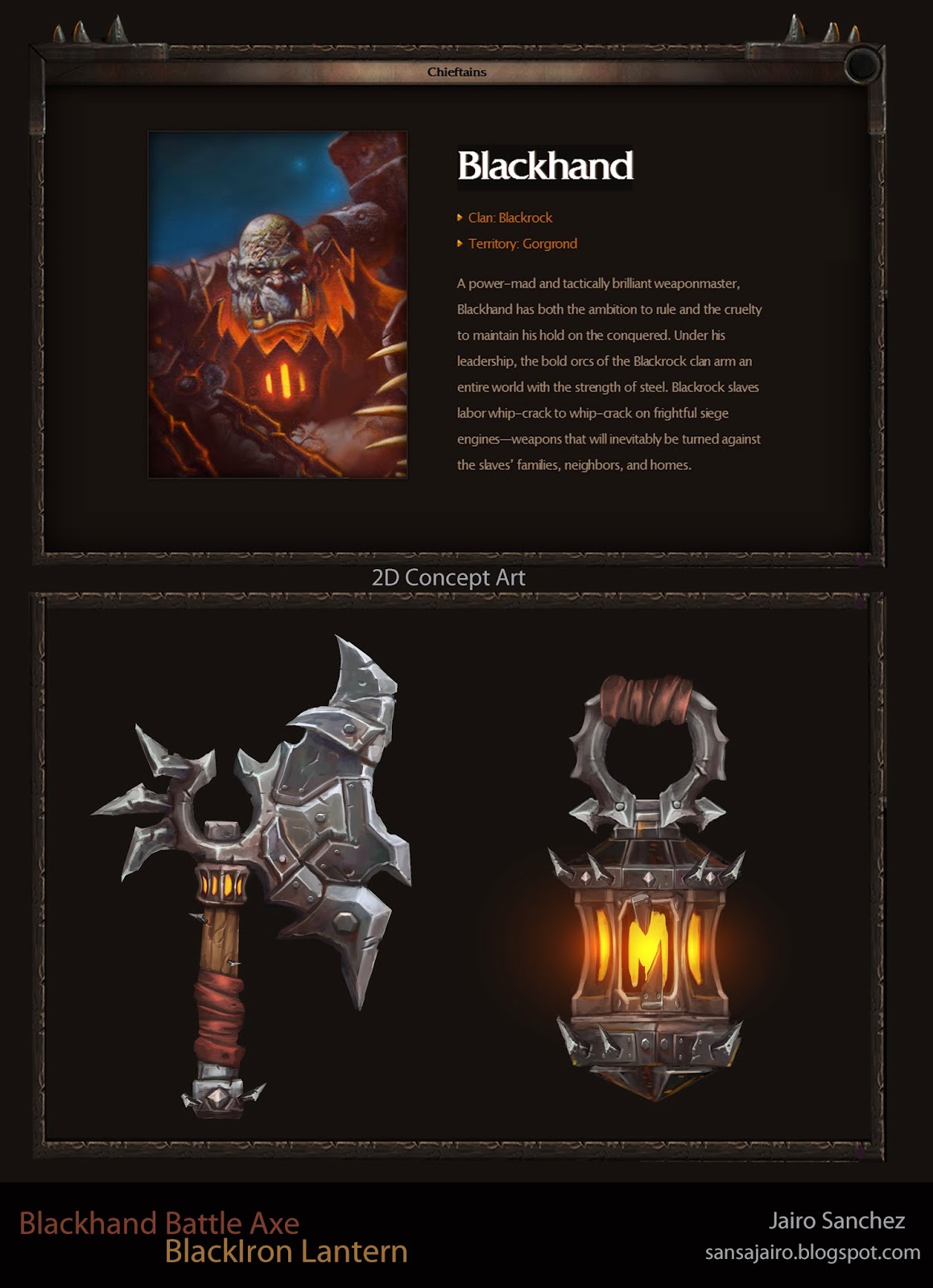
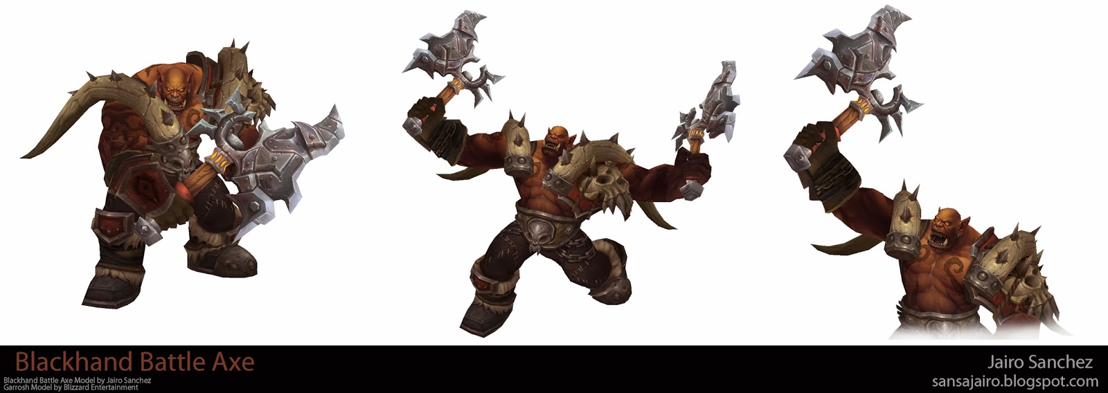
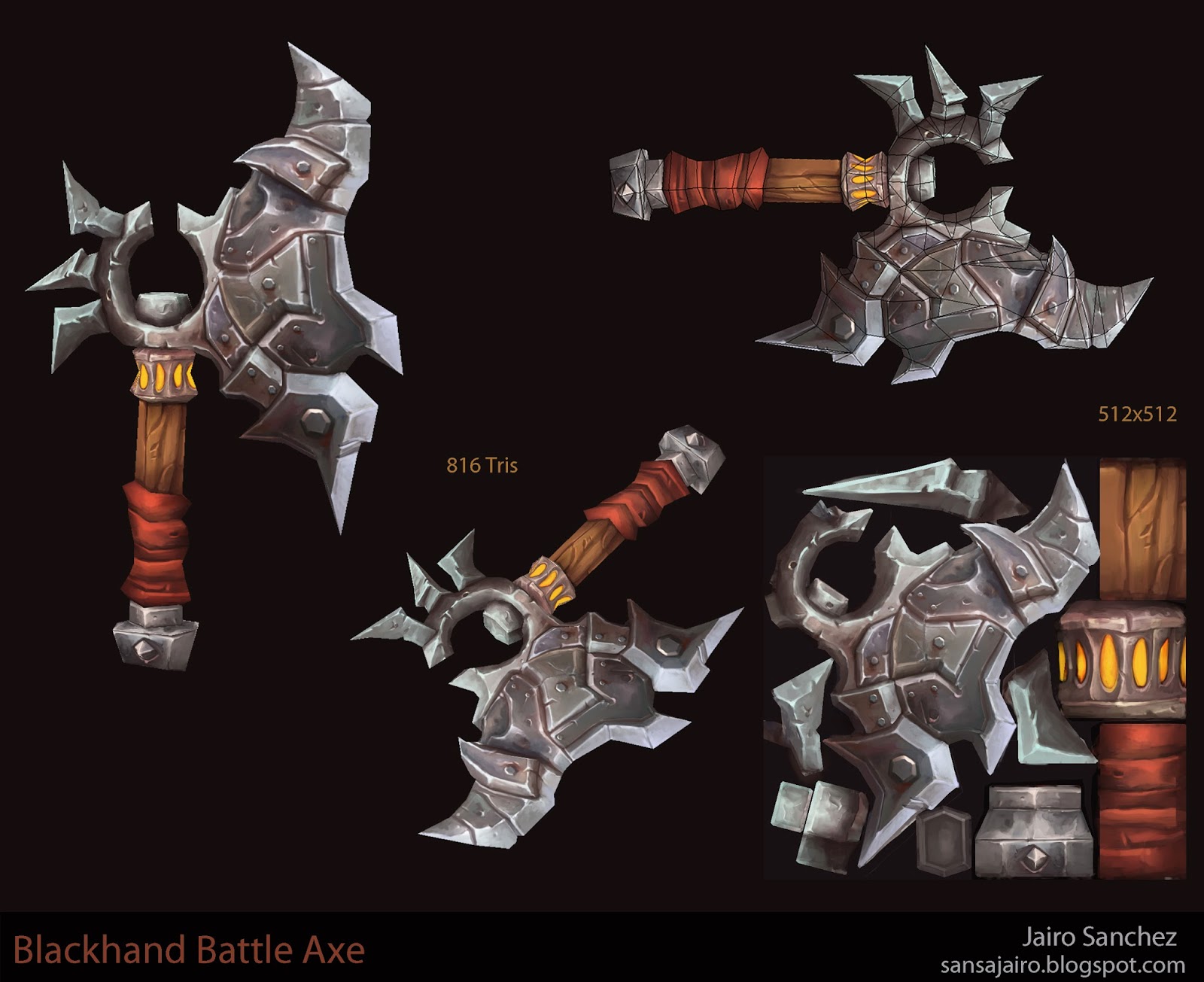
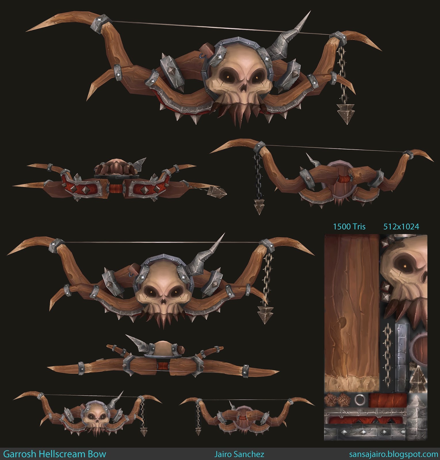

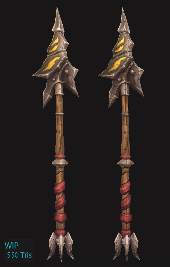
I have been concepting-modeling-texturing some weapons based on the amazing WOW.
Hope you like it


Replies
one crit from me, in the battle axe, i think around the orange bits at the top of the handle you could darken the area around that to inset those bits in more like the concept.
really nice work
EDIT: Did you use a standard painting from scratch method or did you ZBrush > bake an AO for it?