Camaro 1969 HIGHOLY render
Hiya guys! I'm new to these forums, have been wandereing around for a while but never had the guts to post something up here.
I have been introduced into the art of 3D about 1,5 years ago when I first entered high school and went started the Digital arts and entertainment course. and ever since I really enjoy Modeling/painting and such!
But hell here we go!
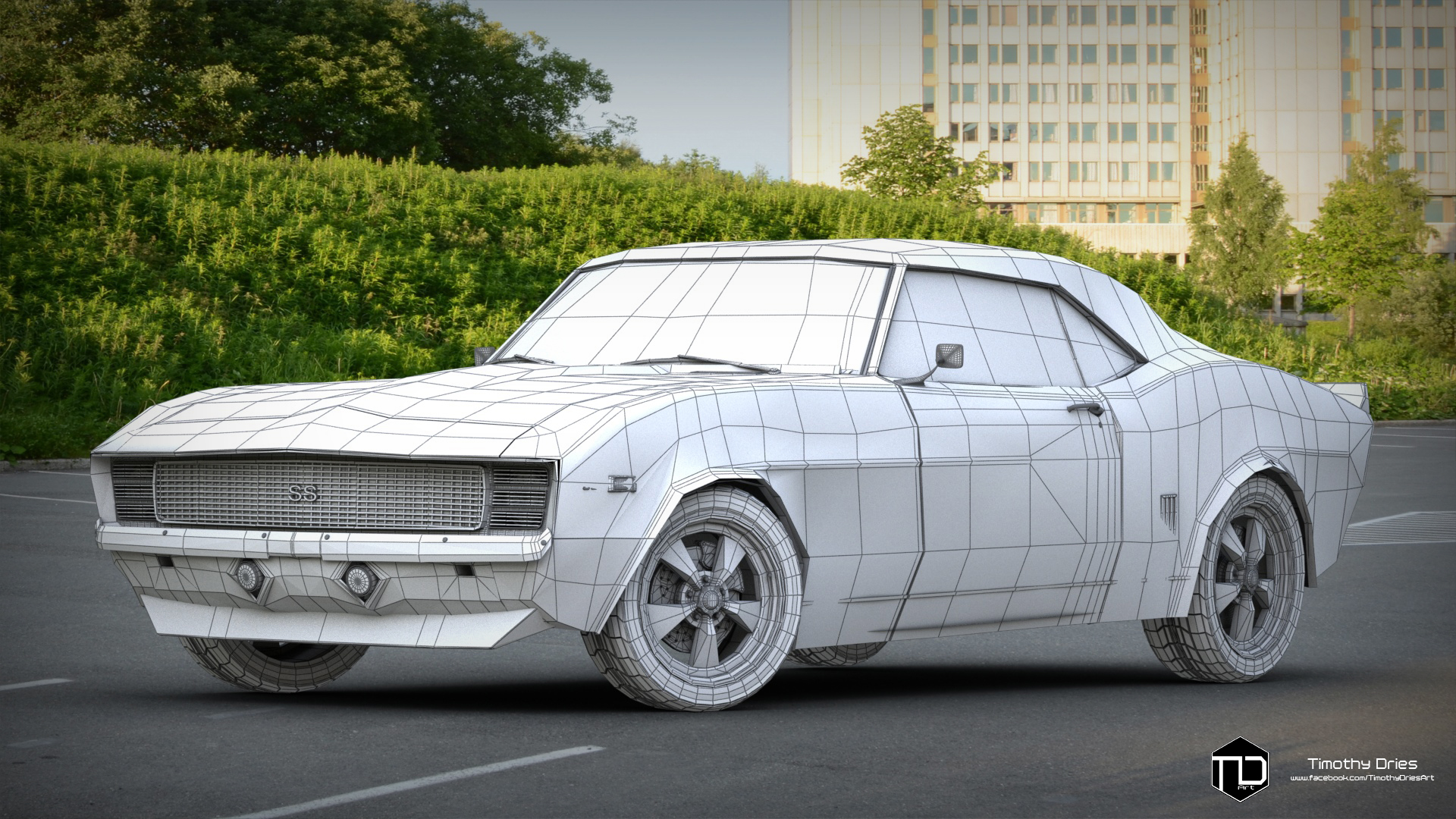
First some wireframes
LowPoly!
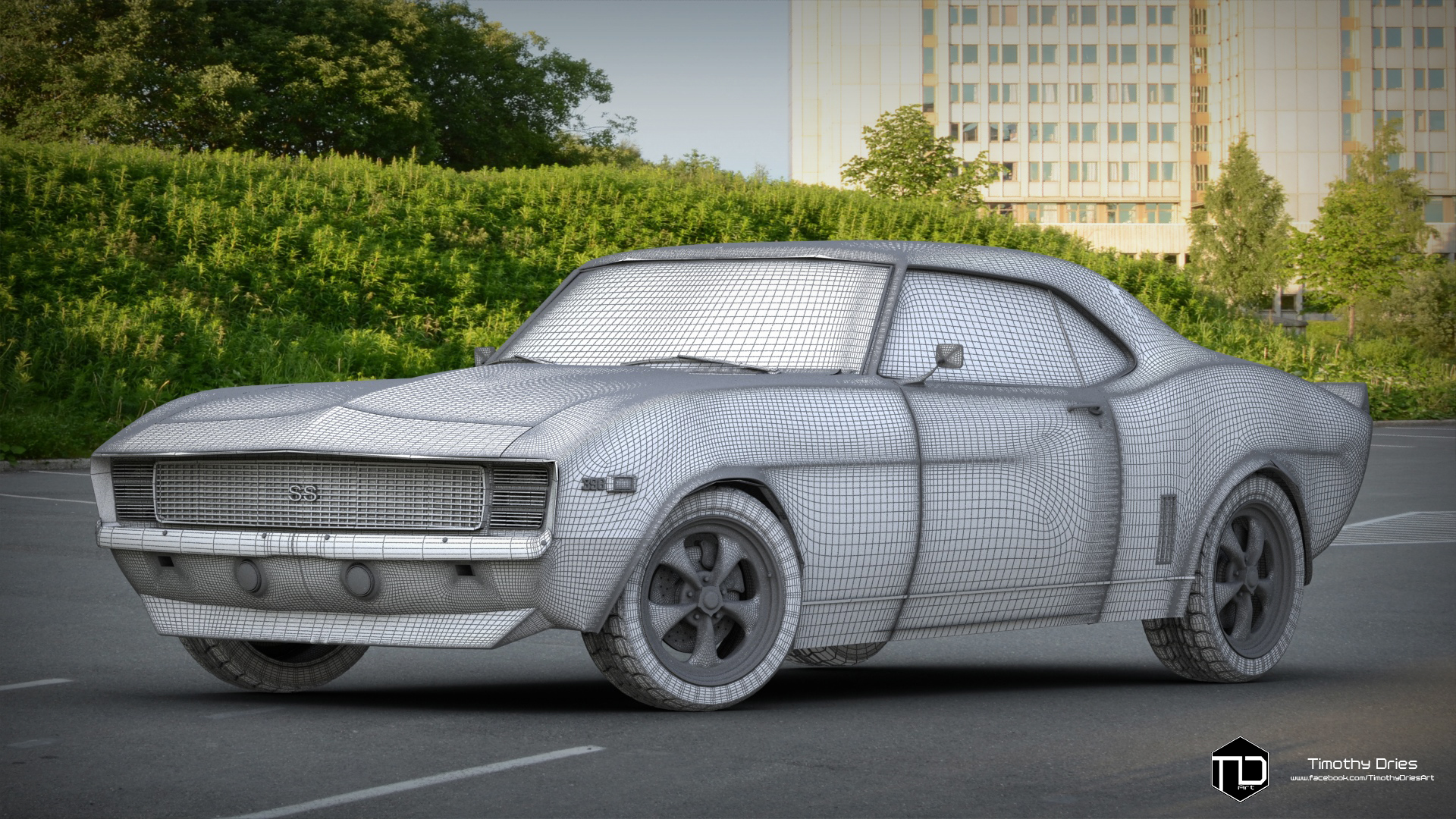
The HighPoly
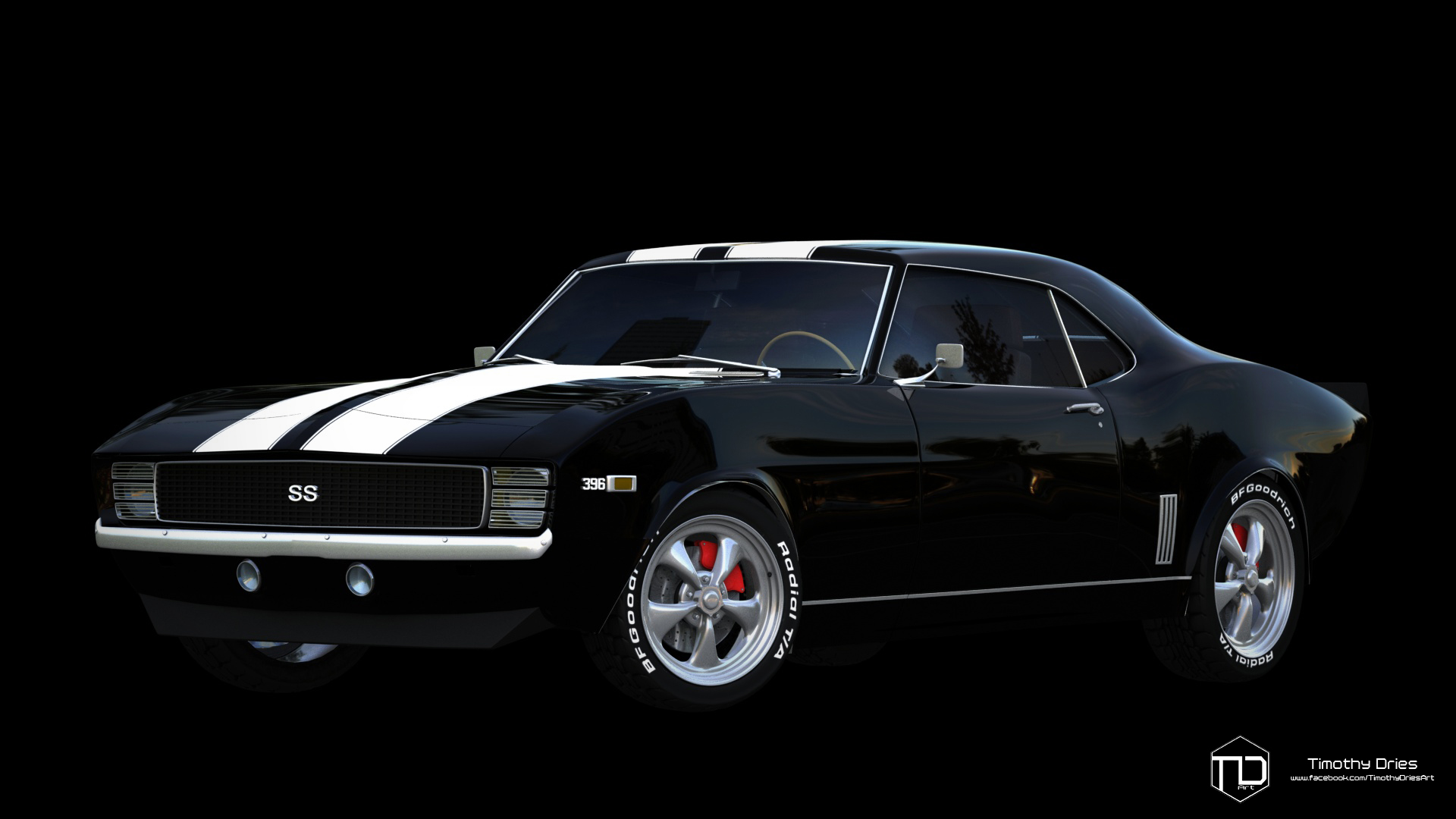
A Black background render
And last with environment
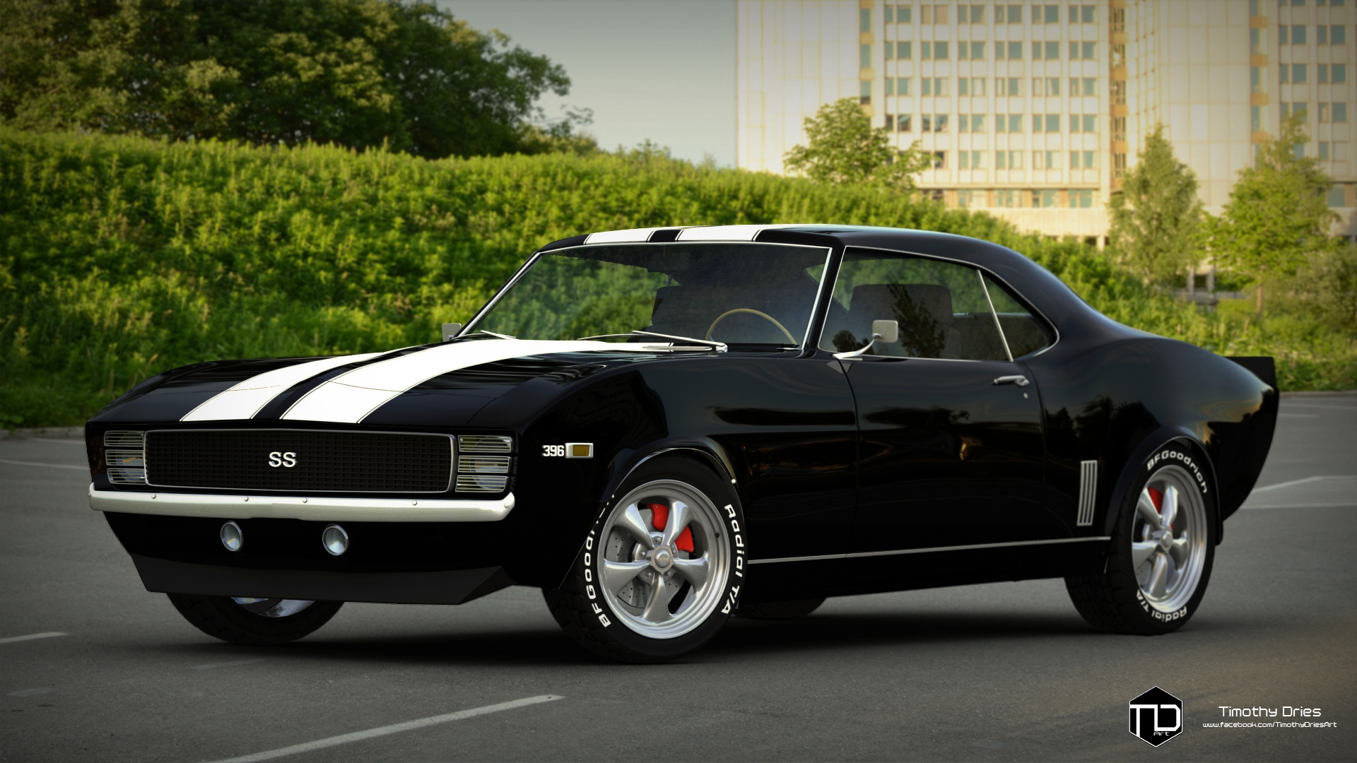
All of these we're made in 3DsMax and in the Mental ray renderer.
If you have any comments critiques or such leave them below!
Thanks for stopping by!
I have been introduced into the art of 3D about 1,5 years ago when I first entered high school and went started the Digital arts and entertainment course. and ever since I really enjoy Modeling/painting and such!
But hell here we go!
First some wireframes
LowPoly!

The HighPoly

A Black background render

And last with environment

All of these we're made in 3DsMax and in the Mental ray renderer.
If you have any comments critiques or such leave them below!
Thanks for stopping by!

Replies
I highly reccomend Hostr, it has a drag and drop desktop client which helps me so much
Contrast seems to high, all your shadows are devoured basically, its very black all in all
Also im not sure how they are in RL, but how you terminate your edges looks strange, very sharp and topo looks a little odd, but im no hardsurface guy , but overall impression is good
Higher resolution shots would be nice to have a better look on the silhouette and topo
I really hope This helps, like i said i think this is a great start and i cant wait to see you refine this and make it better
There are quite a few inaccuracies with you model : it's a sixties car, the sides and rocker panels are not like modern cars, they much rounder. These cars were designed a bit like women, and often compared to the shape of Coke bottles. It makes the rear wheel arch wrong and the sides "vents" wrong as well. The wheels arches should be parallel on all angles (more or less).
There's no wheel arch lip on the 69 Camaros and Firebird. The lip is replaced by this trail that runs along the fender and the quarter panel. The chrome trim on the arches is just a stainless piece screwed to the inner parts of the panel, it sticks out a bit off course but not that much.
The rear quarter panel should be much more edgy and flat, there is a slight curve to the top edge but it doesn't collapse like that at the back.
The roof looks too curvy as well, the top edge of the windows is nearly parallel to the top line of the roof. The rear window look too small.
Do you have some more pictures on different angles ?
As you said Shrike, the shadows cast are indeed to harsh, I just did'nt notice it until now.
Uploaded some higher res shots so I could get better feedback on the wireframe and edgeflow.
Onto the next one!
Thanks for the extensive feedback Cglewis I really aprecciate it (allthough through the feedback I see all the flaws myself and realise I made so much mistakes ) but hell we got to learn from them. And in every aspect of your feedback you are right so really thank you for that! And I0m going to do the best I can to adjust all the features.
Another thanks for some great feedback SuperDuty455, and sadly I have no pictures on different angles yet, I'm gonna do that when I have some spare time.
Really appreciate the great feedback guys.
I'm gonna update this as soon as possible!
But! I'm back, and I redid major parts of the chasis and parts of my 1969 Camaro RS not SS.
Still a work in progress, but the frame now fits better to the reference.
Redid the glass, rims, tires, hood and parts of the back end of the car.
Loads of minor tweeks and another environment to not bore people to death!
First some wires
And this is the preview
Comments and critique is more than welcome, and thanks for all the previous feedback and comments!