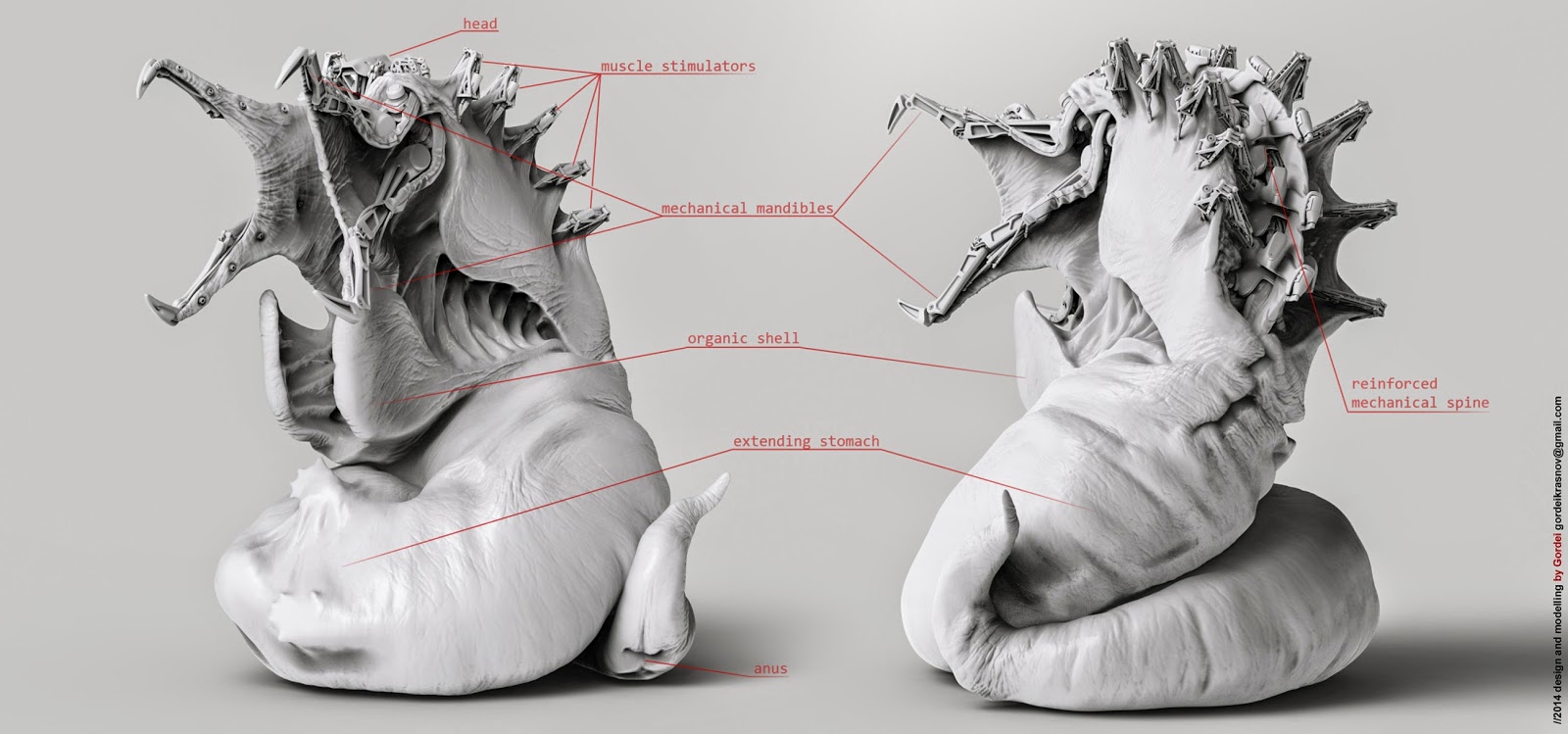
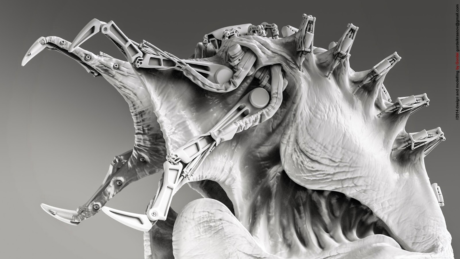
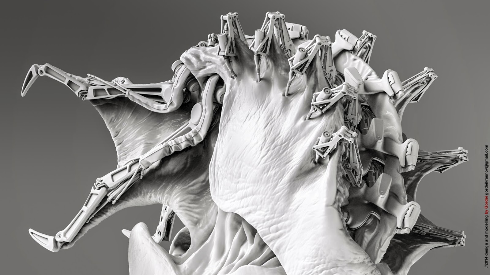
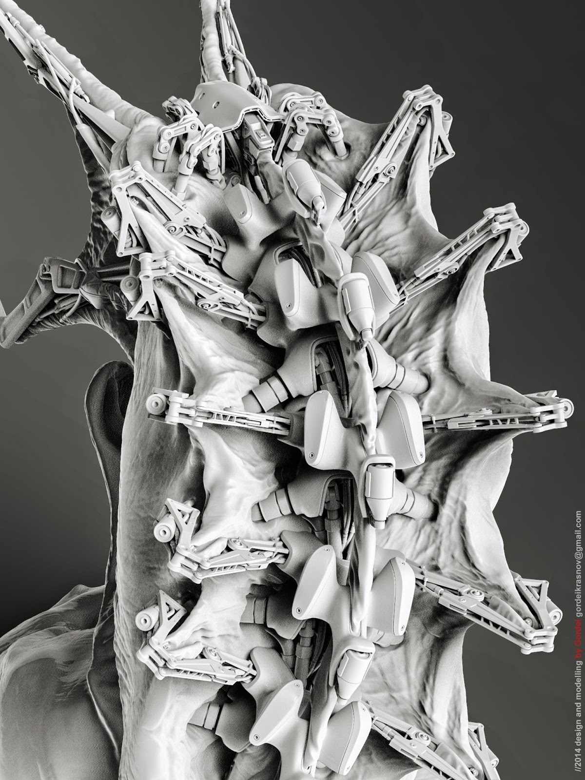
Hi everyone! Sorry for my bad english, my name is Gordey and i'am russian student learning on architect and drink a lot of vodka in my spare time. But I would like to work in game industry, this is my first work in zbrush and sub-d modelling practice in 3dsmax and modo. Hope to see some critique!
I've found that replies are like gold. I can go through four or five updates before I get a single reply. so don't worry: its not major. your crazy biomech in the OP is awesome, by the way. I think it takes a lot of skill to mix man-made and natural surfaces together.
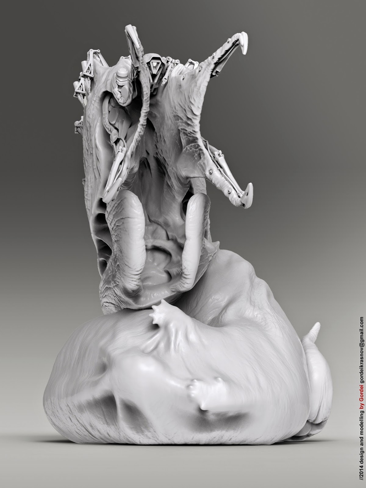
Hmmm... to be honest I don't like the second one (the tattooed guy), it lacks structure, or maybe it's just my personal taste. The first one is awesome though! First of all it's an awesome design! I love how there is a guy being digested in it's stomach, and he is obviously still alive and trying to escape... it gives a lot of story to it. The mechanical parts are clean and look very functional, and I think you really put effort in making the look like they can actually move (Most mechs I have seen don't look very functional). I would love to see it colored, with some materials and textures.
This is damn amazing, great job. I think the on black renders need to go though, this would look great in an out of focus environment like your first render
Replies
full size http://fc09.deviantart.net/fs70/f/2014/328/4/6/control_panel_layout_by_gordeikrasnov-d87keax.jpg