GOLF - Kid's Playground
Finally done with a contract work yesterday, free for few days so directly jumping to the this contest. Been eager to participate from the beginning. 15 days left, Hope I can finish this one.
WIP#1:
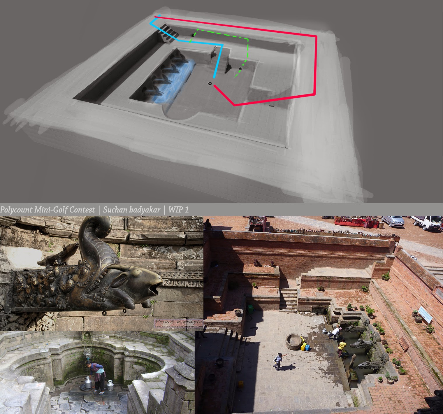
Here is the rough concept (LOL, Cannot draw ). Basically its a simple Stone Tap area where people come to collect water, but for here some kids play golf here with their homemade ball.

Let me know what you think design wise(?)
WIP#1:
Here is the rough concept (LOL, Cannot draw

Let me know what you think design wise(?)
Replies
Time running so fast, need to work faster.. Anyways, Here is a quick block out in Maya and abit modified concept for interesting gameplay.
Next Step:
-Start Texturing
-Export and test the basic Map in Engine
Will be soon start testing the game.
Next:
-Make some adjustment in the textures[Make it look more vibrant ?]
-define holes and add some power ramps
Do, let know what you think abt the look and feel.
Here is the test game play video
[ame="
Since the deadline is extending, I'll still be changing lots of things(hopefully good
Looks like you should select your static mesh and you should change its weldign type to anti clockwise in the properties.
Phew,Had been hell lot of Busy and almost no update here, I still have 24hrs, so I again changed the design(LOL, I didnt like how it was looking previously,boring gameplay), so changed into something else, added more way,so more interesting and more element of surprises..
(Funny but somehow I'm still in blocking phase
Update here:
[ame="
20 Strokes, lol Hope I dont get disqualified for not being MINI-Golf
Is it too green ? Maybe use blue fogs ?
Next task:
-Need to replace the cube floor and wall with lil more defined mesh
-Add small props here and there
and I'll call it done, dont have much time now(weekend over
[ame="
http://www.youtube.com/watch?v=c8i8WeDY0AY
Uploading video to youtube, meanwhile here are the snapshots.
After lots of modification, finally I like what I'm seeing
At that time, was very much in dilemma whether to use blue and orange or green and orange as the main color palette. so, just picked one, I guess I might make it abit better later when I get time.
Thanks for the feedback