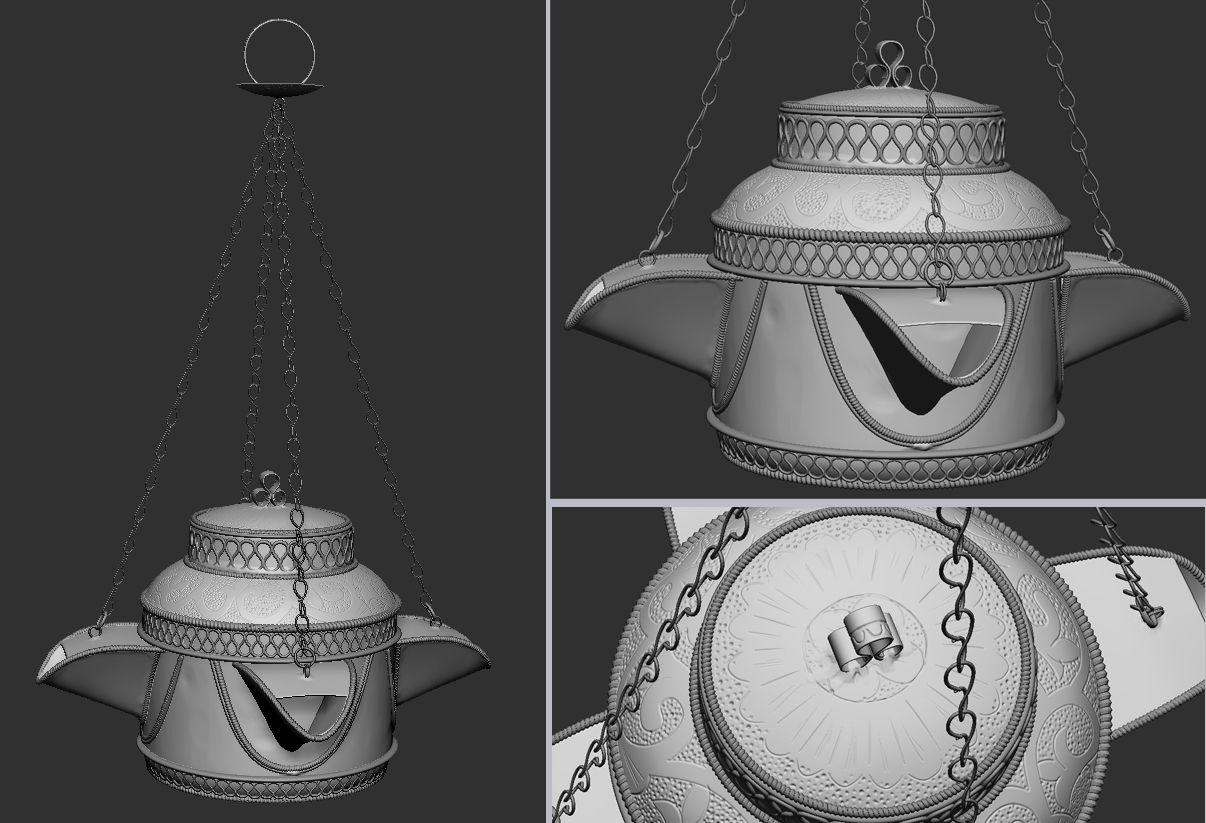
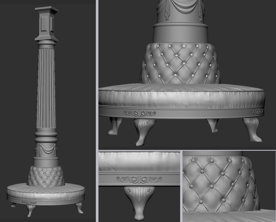
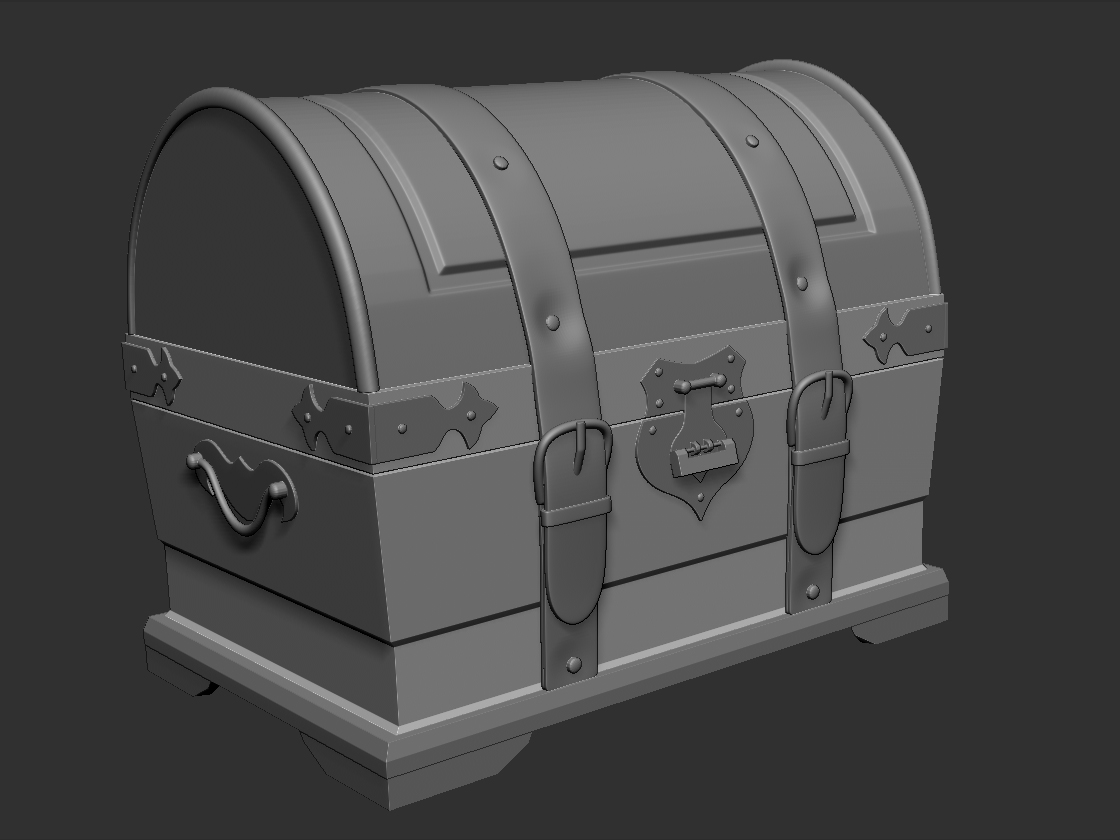
Revamping my portfolio with more relevant work for 2014. Working a lot more with zbrush along with some new techniques and software to play around with.
Job hunting is slow so is it bad to just confine myself to props?
Anyways these are mostly works in progress; the market stall is baked so will post some pics soon and looking forward to mixing up materials on the chest
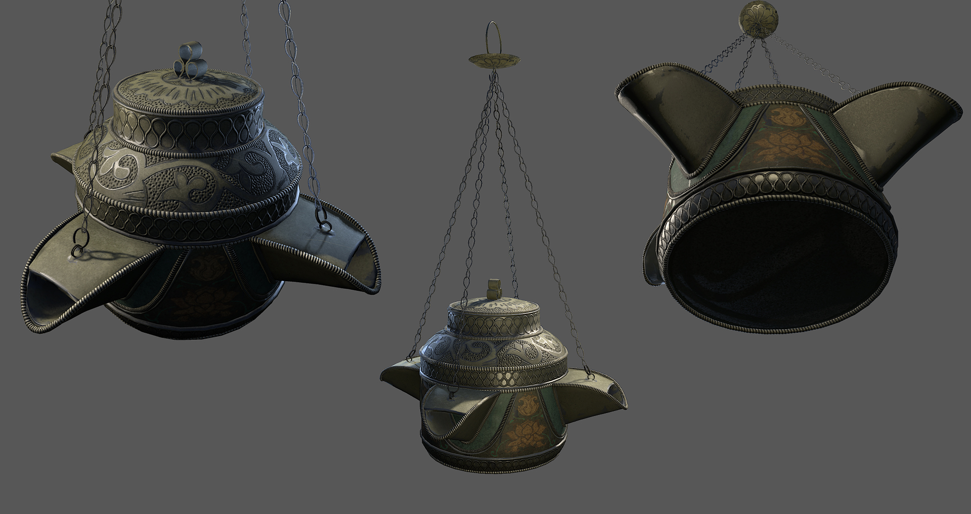
Your sculpting looks great. as well as the Burner's textures
I find with most Environment Artists Props are Secondary and generally as a backup on there main Environment pieces.
You don't see many people only making Props. Yes its true most people when they get a job work on props anyway but they end up moving into Environments. So I'd say work on an Environment as well.
If your building skills then I find Props are the best course of action. there quick and you can move on to something else very quickly.
Still some work to do on the texturing but looking ok so far, hopefully the metal looks somewhat like brass?
Figured out how to use Sketchfab, pretty cool might have to wait a few seconds for the textures to load in.
Wow pretty nice stuff, Just that u need work more on render+Lighning ( if u rendered it ) and materials , What programs u work in? And pls Quote me
Thanks. I agree, lighting and rendering aren't my strongest areas. The shot was in Marmoset; I've been tweaking the material a lot so still a bit further to go then
Latest prop - a stone lantern. I'm going to be expanding into a full Japanese environment in UE4 for a fresh portfolio piece and to learn the engine better
Layout for the area - I'll put up a few reference images too. So, at the end of the 'pier' over the pond there will be a circular view-port to a mountainous backdrop basically framing the scenery which I really like the idea of
In terms of the rock wall that you painted, I think it is a bit too uniform. Try maybe throwing in some more color variation I think. You've got some very nice high poly sculpts of your props. I'm not a huge fan of the style of the chest, I would love to see you make it as detailed as the burner.
thanks, yeah it does need more variation plus I agree about the chest - that's from a couple of years ago, yikes! I'm concentrating on this level so I think I'll just leave that one in the past for now lol
little update; currently working on a roof for a temple type building so figuring out all the different tile styles that are used. These are the end tiles - I modelled the details in 3ds max to keep it crisp but will add a bit of wear in Zbrush:
Another update on the building - most of the structure is in but still need to build a foundation so its not floating! Quite like to work on the sky and overall lighting soon, think a dusk setup would be nice so I can have lanterns lit up about the place
You're making some great progress here, agreed that the props up top are lovely and detailed. One crit about the bamboo because I'm an absolute nerd about plants/trees/etc. is that it could use some more color variation. Areas where it's yellowed/drying out, some leaves that are ripped or missing, etc. Those little details really sell it and make it believable. It also looks like it may be a bit thick around the middle, and I would add some smaller shoots sprouting up from the ground around the larger groupings to help blend it out. Like this: http://science-all.com/images/bamboo/bamboo-02.jpg But really, good stuff, keep it up!
@EM. Thank you so much for the plant nerd feedback! They are looking pretty uniform atm so I'll get on that and make some variations on all the things you mentioned - thanks for taking the time to crit my stuff
Dude, it looks awesome. I really like the building roof details. Just curious, are you creating this with game resolution in mind or more towards pure eye candy? I see you are using UE4 and so far it looks amazing.
Thanks! I guess a little bit of both because it's for my portfolio but generally the assets are in game resolution apart from perhaps the roof tiles which have a relatively higher poly count because of their unique shape. If it were confined to a small level though then I'm sure they would be fine.
These are my final wip images as I need to start something new and different soon! Open to critiques and advice on finishing touches or anything that doesn't look quite right. In the final images I'll have a day shot and a night time shot since I have some fireflies in there and the lanterns:
It still feels like you've got great models that are being let down by mediocre textures. Once you finish your current project, I'd recommend choosing some object that's super, super, simple from a modeling perspective, and take a ton of time on the textures.
For now I have tried to harmonize the textures eg. the rocks were a bit brown with mismatching values, added more details within roughness and colour maps and also swapped out the tiles on the walkway for the same ones on the tea room:
I've been working on a night time scene recently from concept art by Pablo Carpio; more of an exercise in creating a certain atmosphere and mood and this image seems quite mysterious in an enchanting way:
There are only a few assets to create with the large rock being the focal point; I referenced the Lycoris radiata, known as red spider lily to add interest amongst the field:
Development of the large rock in Zbrush; after receiving feedback, chunks were masked and extracted from the mesh to create more visual impact and finally I used Dynamesh to kick out a low poly that retains some of the crevices from the sculpt:
So for my next project I wanted to create some fan art of my favourite game The Elder Scrolls: Oblivion. I'm going to recreate the Arch-Mages Quarters:
Looking at the interior I think it would be good to also redesign it slightly, for example, the floor tiles seem out of place and also a couple of arched windows would create more lighting interest. I need to get some more ref for the ceiling though so some 'research' time is required I've started learning Substance Designer and I'm hoping to use the Allegorithmic software for a good chunk of production. My aim is to pull a scene together more efficiently rather than focusing on small stuff too much.
Here is my dark oak texture which I plan to mask in unreal with an 'exposed' wood grain texture for damage and wear. This will be applied to all wooden assets which I'll model with edited normals.
There's some really nice stuff there, I'm impressed with the amount you seem to produce in such short periods. Once you have you Oblivion scene nailed, you should be in pretty good standing to find a job =]
Replies
I find with most Environment Artists Props are Secondary and generally as a backup on there main Environment pieces.
You don't see many people only making Props. Yes its true most people when they get a job work on props anyway but they end up moving into Environments. So I'd say work on an Environment as well.
If your building skills then I find Props are the best course of action. there quick and you can move on to something else very quickly.
Figured out how to use Sketchfab, pretty cool might have to wait a few seconds for the textures to load in.
chest_texture_wip by Flumpinator.
[SKETCHFAB]c46567b02b7f4bbd884b513962ebc9c2[/SKETCHFAB]
I'm in the same situation at the moment.
Job hunting and working on a new portfolio piece
Best of luck!!!
Thanks. I agree, lighting and rendering aren't my strongest areas. The shot was in Marmoset; I've been tweaking the material a lot so still a bit further to go then
Quite like to work on the sky and overall lighting soon, think a dusk setup would be nice so I can have lanterns lit up about the place
One crit about the bamboo because I'm an absolute nerd about plants/trees/etc. is that it could use some more color variation. Areas where it's yellowed/drying out, some leaves that are ripped or missing, etc. Those little details really sell it and make it believable. It also looks like it may be a bit thick around the middle, and I would add some smaller shoots sprouting up from the ground around the larger groupings to help blend it out. Like this: http://science-all.com/images/bamboo/bamboo-02.jpg
But really, good stuff, keep it up!
@EM.
Thank you so much for the plant nerd feedback! They are looking pretty uniform atm so I'll get on that and make some variations on all the things you mentioned - thanks for taking the time to crit my stuff
In the final images I'll have a day shot and a night time shot since I have some fireflies in there and the lanterns:
There are only a few assets to create with the large rock being the focal point; I referenced the Lycoris radiata, known as red spider lily to add interest amongst the field:
Development of the large rock in Zbrush; after receiving feedback, chunks were masked and extracted from the mesh to create more visual impact and finally I used Dynamesh to kick out a low poly that retains some of the crevices from the sculpt:
Looking at the interior I think it would be good to also redesign it slightly, for example, the floor tiles seem out of place and also a couple of arched windows would create more lighting interest. I need to get some more ref for the ceiling though so some 'research' time is required I've started learning Substance Designer and I'm hoping to use the Allegorithmic software for a good chunk of production. My aim is to pull a scene together more efficiently rather than focusing on small stuff too much.
Any thoughts welcome
@Joopson no pressure
This will be applied to all wooden assets which I'll model with edited normals.