Fighting Room (UDK)
Update 2/23/14


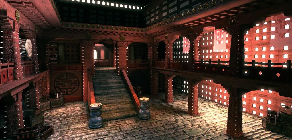
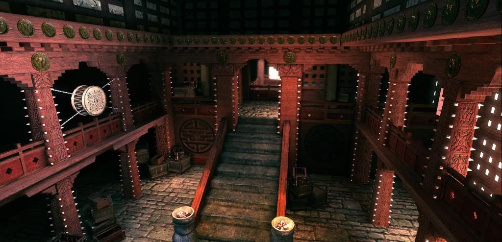
Part of my new years resolution is to get back into doing props/environments because ive been slacking for many many months, Found this sweet concept for a fantasy style fighting room(Dojo) and thought it would be a good first project to get me back into the swing of things.
Very WIP right now, first pass textures, building modular, got it all built in engine now. I have a good idea of where to go with it from here, (Filler props,braziers,drum) all to come, im gunna be constantly tweaking textures and will eventually throw the spikes in, not final on the back wall carving, just a placeholder, not sure I like it right now, Anyways, comments and critiques encouraged! :thumbup:


Part of my new years resolution is to get back into doing props/environments because ive been slacking for many many months, Found this sweet concept for a fantasy style fighting room(Dojo) and thought it would be a good first project to get me back into the swing of things.
Very WIP right now, first pass textures, building modular, got it all built in engine now. I have a good idea of where to go with it from here, (Filler props,braziers,drum) all to come, im gunna be constantly tweaking textures and will eventually throw the spikes in, not final on the back wall carving, just a placeholder, not sure I like it right now, Anyways, comments and critiques encouraged!


Replies
Another thing is you really need something on the walls, like the spikes in the concept (i would add them tbqh), to help break up the red thats simply everywhere atm.
and about the spike, they aren't just brake up the red, but they'll make your enviroment look like a place to "fight" ( so was the bronze badge ), not a boring temple.
its from age of conan, an instance called warmonks monestary
outside part-
good luck
Thanks a bunch for those images!
I knew it was from age of conan, just hadnt seen an in game shot, and that first one is great! I had no idea what the back wall was going to look like, so that helps alot.
@Jaber
Yea theres definitely some scale issues, I feel like if when I finalize it a bit more so im not importing more meshes, im just going to scale the whole thing up more, its coming across to compact and not so open/grand when im in a players perspective.
Next on the to do list is The Drum and a few more filler props!
As always feedback and Critiques wanted...
@Higuys, Thanks man! I completely agree about breaking up the transition from floor to stairs/pillars, maybe some gold/Steel bases or trim to break it up, would you also agree that there should be something to break up the transition of the side pillars?
I did quite of bit of changes here, started up a little more of an advanced shader for the gold relief, and pretty happy with the current effect, looks "Goldish" to me. Tweaked the color and specularity of the Braziers to better match the reference. I scaled up the whole scene and I feel like its getting closer to the reference, The flag stones appear more to scale I believe as well because of it, took Higuys advice and made some Stair/Braziers to floor trim pieces to, not happy with the brazier bases, ill propably make em more detailed later on. More finalized on the lighting, toned back the everywhere grunge a bit on the Wood tileable.
And The Drum has a first pass!
C&C encouraged!
I like most of it so far, but the texture on the stairs is really throwing it off. It needs some variation, try turning the grain of the concrete 90 degrees on the flat part of the stairs/maybe give the stairs a lip/etc. There's lots you can do. It's just really not up to the standard of the rest of the scene atm.
Thanks for the tip on the Coal texture, thats kinda what I had in mind, forgot about panners!
Even if those steps are mare from multiple blocks, each one have been eroded, in this case by water but also by thousands of feet.
Also the wood texture needs some large cracks I think, a bit like this:
Just make them big enough to be sure that the cracks will be seen from a distance.
Keep up !
Im thinking im to the point where its just polishing and adding a couple more assets now, feeling like its time to stray away from the concept a bit now as well. Ill work on getting some wood cracks eventually as Abrvt mentioned.
As always, comments and critiques encouraged!
Without Post process.
Hi Polycounters! Been a while since my last post, ive decided im going to make this a playable level, and big enough to where i can render out a flythrough when i finish it.
Ive done some basic post process in UDK and am pretty happy with the result, as well as some texture tweaks, particularly in the tileable textures.
Sadly, im getting a bit bored of this room so ill be moving on to an outside portion, im going to be doing something along the lines of a sand garden (Asian) with a bonsai and some foliage.
Will be finding reference soon for that.
Anyways, C&C encouraged!
And as I said before, im moving on to starting up a sort of sand garden with some foliage and walls, Running into a complication with the corner of this side right now, which I really need to sort out, because it looks pretty bad currently, also im aware of the light map issue on that right lower wall and I will be correcting that further down the road. All just first pass, I intend on doing a different style wall for the other side of the garden and the back end.
Also some of the Reference im thinking as far as layout.
As always, C&C welcome please!