The BRAWL² Tournament Challenge has been announced!
It starts May 12, and ends Oct 17. Let's see what you got!
https://polycount.com/discussion/237047/the-brawl²-tournament
It starts May 12, and ends Oct 17. Let's see what you got!
https://polycount.com/discussion/237047/the-brawl²-tournament
Pony Plop's Workshop.
My workshop submission:

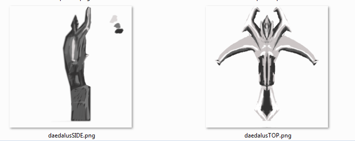
Ok, first up is a WIP for a Daedalus crossbow for Sniper, these are the greyscale side/top views that I wanted to work on, which I set as image planes in maya to help me model.
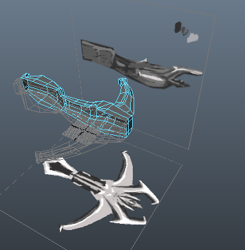
My initial pass on a 3D model, notice the triangle count is way too high.
Dota 2 Daedalus v.01 (click to view in 3D)

and with paint chucked at it-
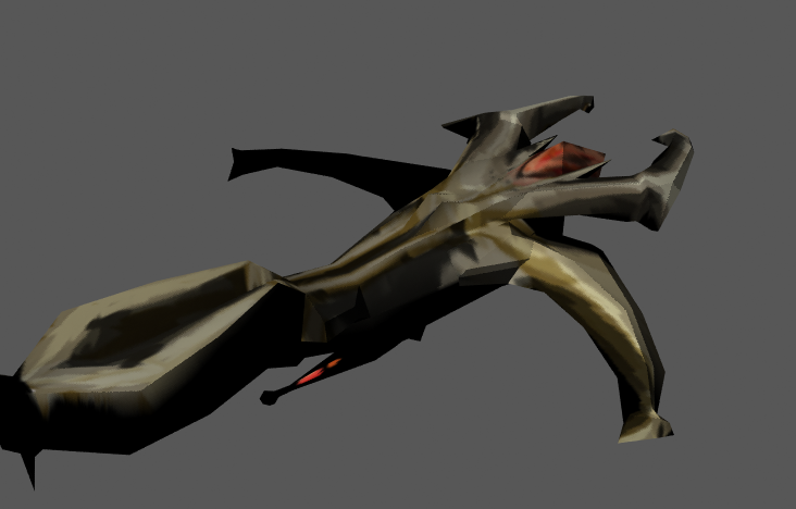
And magically, less tri's, but more features! oh joy!
daedalus LOD1 WIP (click to view in 3D)

and some ingame (rough WIP) gifs!
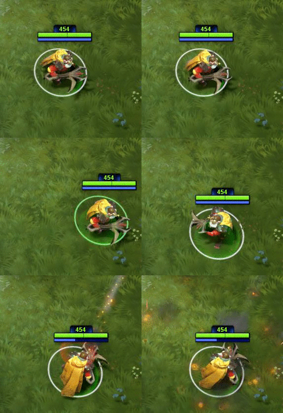
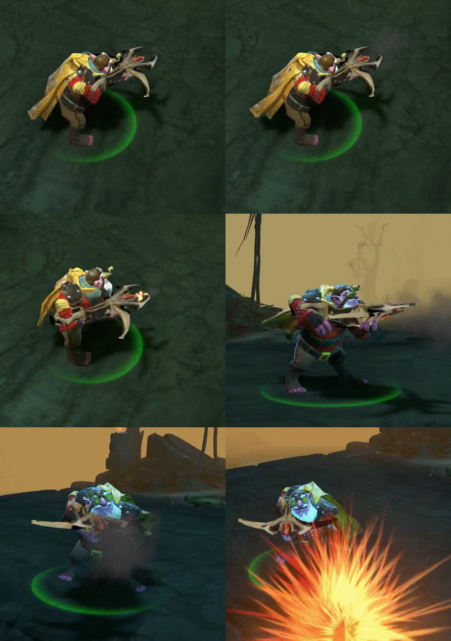
and an updated version with base colours and a little AO baking. I need to work out how to make the gem glow, and perhaps give the arms and horns a faint pale glow also. I'll also be making the shadows more pronounced.
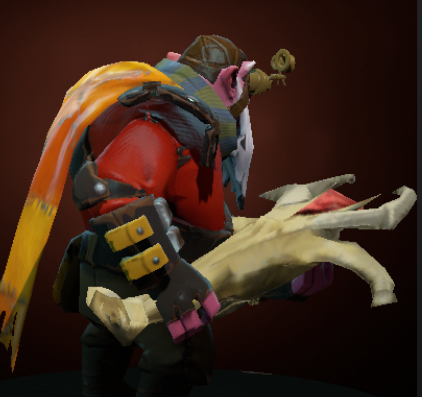

Ok, first up is a WIP for a Daedalus crossbow for Sniper, these are the greyscale side/top views that I wanted to work on, which I set as image planes in maya to help me model.


My initial pass on a 3D model, notice the triangle count is way too high.
Dota 2 Daedalus v.01 (click to view in 3D)

and with paint chucked at it-

And magically, less tri's, but more features! oh joy!
daedalus LOD1 WIP (click to view in 3D)

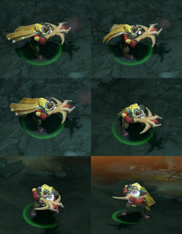
and some ingame (rough WIP) gifs!


and an updated version with base colours and a little AO baking. I need to work out how to make the gem glow, and perhaps give the arms and horns a faint pale glow also. I'll also be making the shadows more pronounced.


Replies
updated my model and UVs
[SKETCHFAB]4d7315e161e04efdbd57ba22c9badb27[/SKETCHFAB]
[SKETCHFAB]376c12b85f7c4a19a239721d69a06019[/SKETCHFAB]
I'm not trying to sound harsh, but there is just too many flaws on that, both on the design itself and on the technical aspect of it.
Beat me to it, I agree on all these points. What you should really do is take the daedalus item, and work it into a sniper rifle, as opposed to just making the item
This model is in a extreme state of infancy all the way across the board. There are several technical problems you are having, and a handful of aesthetic choices that are really hindering the model. In addition to this it seems like the conceptual direction isn't driven by the Dota2 lore guidelines.
If this is your first submission, I would really recommend delving head first into Snipers aesthetic, reading the dota guides, and taking your time while posting millions and millions of WIP shots until you have a very tight first submission. Polycount is great at being extra eyes, but it's hard to help when "definitive milestones" are posted.
I did post a bunch of WIP shots, but nobody ever commented on them
I get what you mean about the progress so far though, needs a lot of tweaking, which is what this thread is here for right?
Thanks for the feedback!
I'd really aprpeciate it
It would be better to see some wireframe shots of the model to really determine where tris are being wasted
Pack it as tight as you can. Any space wasted is wasted space, its just about how efficient you can make your UVs.
Super cool Double post, but with nondeformable meshes, you just pretty much want to keep edges and verts where there is a silhouette definition, or modeled in details. Since it isn't deforming, there is no reason to load your mesh with loops, so typically you can axe out a ton of edges and verts that you would usually need for deformation.
Also, what heboltz said is very true. You don't need to keep loops and stuff like that if you're not going to subdivide or deform it.
That paintover is really helpful too! I wish they showed us more stuff like this at uni, but i suppose its down to us to follow up what they teach us!
I did another quick paintover on some places where you can remove edges and where you can add them:
Try not to focus on small details, since they won't be seen ingame. Always think about the silhouette!
Also, I checked out your workshop thread, there are some really lovely hats on there! and your colour schemes/maps are really great!
(also, totally didn't realise it was you who was making the NP items on the hangout, keep it up!)
I'll have a go at working through the item now
EDIT: Here's where I've got to today:
[SKETCHFAB]a460f9a9eef8438e901f4ee774a64e2a[/SKETCHFAB]
And finally managed to UV it all, and map it so that No space was Left untouched, hopefully this will translate into some lovely textures, but we'll have to see!
And some massively improved UV's thanks to some help and guidance from Clinton on the Hangout- cheers!
Anywho, this is how I start out:
Very initial addition of polys, using the flat view to line up verts with silhouette key points:
Then eventually I add more divisions to add to the general form, using the split selected edge ring tool-
I like having a custom shelf in Maya so I can access 95% of the tools I need all within view, as shown here- I believe you just ctrl+shift click them from their menus to add them :
And a quick update with the lowpoly mesh, I reckon I'll follow the advice with the creasing etc to get a nice output to mudbox
And here's my first try at Creasing:
And a before/after of it with some lightening and repainting:
And a 3D model of the latest iteration- I think the color scheme needs some tweaking, particularly the metal, gem and wooden parts- elso maybe add some painterly touches/texture to the arms and claws of the bow.
[SKETCHFAB]f75177536f154c71bf1c5c3bd34289df[/SKETCHFAB]
Next up, I'll be looking at making a set for Naix, the Lifestealer.
I'm about to post it in this forum to get advice from everyone since this is my first item for Dota2
Here is some images:
few days ago
I added some more detail on this one, rebalance the color, mask....
a badass version in marmoset few days ago. Will do another one for promotion picture when i'm done with the in game model.
I'm waiting for your C&C guys.
btw, does anyone know when will I be able to create my own thread???
The ingame screenshots indicate that perhaps the textures need a bit of TLC- mind sharing your UV maps?
I like the topology too- it seems pretty efficient! Keep it up buddy
heboltz3: will do soon man. My first post on a forum after years so.... I need sometime to get used to it haha. Sorry if it bothers you