Trine 2 inspired environment
polycounter lvl 7
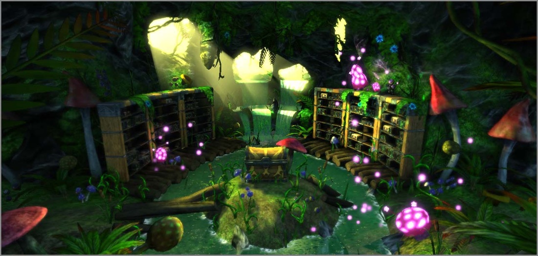
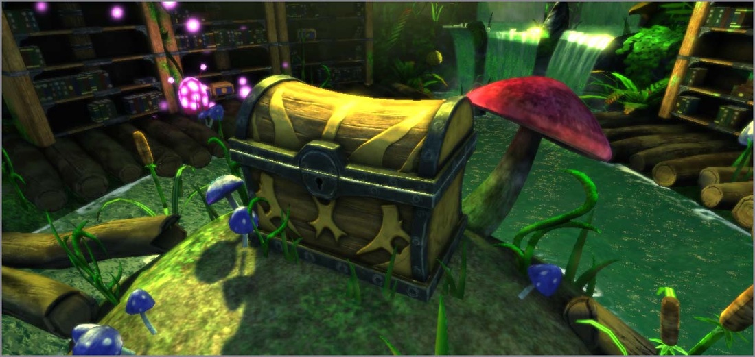
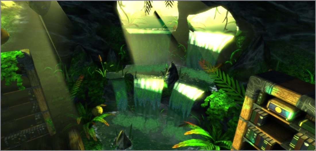
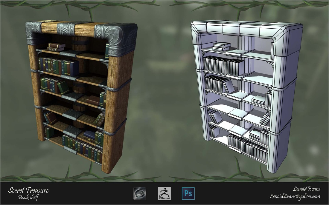
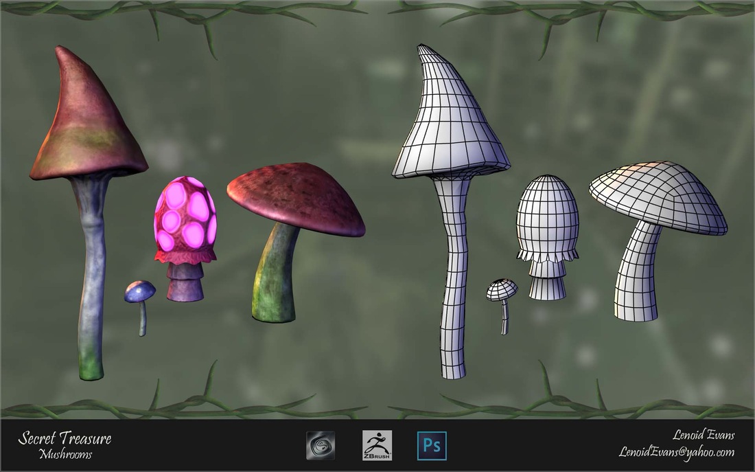
This is an environment i made in UDK based on Trine 2. The art of that game is so beautiful that i just had to do this.
by the way, this is pretty much my first post here, so hello people of Polycount.
[vv]83010567[/vv]


by the way, this is pretty much my first post here, so hello people of Polycount.
[vv]83010567[/vv]
Replies
The books on the bookshelves seem very uniform - they almost all have the same height & thickness.
Consider increasing the partially transparent portion of the particles to give them more of a glow and less like a solid ball.
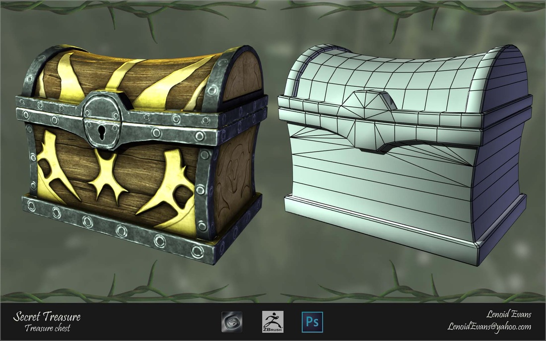
The side of the chest looks like a solid piece, rather than planks of wood like the top & front.
Consider having the glowing mushrooms serve as lights.
The particles are just sort of there. Try giving them a purpose - rising from the mushrooms, dancing around the chest - some personality.
The gold particles at the end seem somewhat awkward. A simple glow (ala Pulp Fiction) might be more effective.
DWalker's feedback is spot on, especially the part about using glowing mushrooms as lightsources. That's what they're there for. For a Trine look you might want to tone down the overall ambient, add some bounce from the bright background light, and use small lightsources (mushrooms, candles) to light up the dark areas.
Another tip to achieving the style in those games: Try to keep the surfaces realistic and shapes cartoony. You could pay a bit more attention on the materials, maybe add some fine detail to the normalmaps and tweak the specular settings to make those metals shine properly. I do like your texturing, though, the style's just a bit different.
Keep up the good work!
Regards,
Ilkka Kuusela, Lead Artist at Frozenbyte