I am trying to make a realistic Nordic Axe It is a Zbrush sculpt at the moment I will be re-topoing it soon. Its part of a UDK cinematic short for a viking character. I am trying to get a realistic but not boring feel to it...
Please be harsh in your critique..
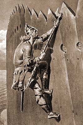
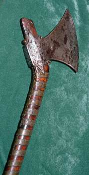
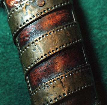
Some references that I used:
As I am self learning.. at home.. alone.. Your critiques are always welcome!! :poly142:
The Model itself looks good. Modelling looks clean and accurate. However you should include some wireframes, Tris Count & Textre sizes so we get a full idea.
Things to you could improve on:
- Firstly the Wood Texture looks good at the base where its been cut, plenty of detail there but the rest seems rather boring. for an Axe of this type I'd expect it to have seen lots of battle so there could be scratches and cuts from swords, wear and splitting from age & Stained mud & Blood from use (For the Wood I wouldn't expect them to clean them to often)
- The Axe Head looks like you've used some kind of filter and its has no real design to it. Have a look at these Images and I'd recommend creating a design from these Image 1 Image 2
You could create your own template design in Photoshop and Normal map that on or Project it on in Zbrush/ Mudbox or you could sculpt your own design on and bake it down.
- The Axe head has very little metal definition and could use some work. It would be alot better to work with once it has a proper design inplace. You could brighten the spec around the edges of the axe head design and darken the inner.
Details are way too small. They turn quickly into noise when viewing the whole thing. I'd make everything at least twice as big and half the amount of stitches. You need to view your work from a distance always and judge if everything reads properly. It'll keep you from overworking it.
Show your reference. Will make it easier for people to give feedback.
There's very little difference in materials - spec and gloss will define your metal/wood etc. If you understand how these things react with light in the real world, your work will shine through as physically accurate. Otherwise i think the small detail stuff looks great.
Model looks great, but I don't dig the design on the blade part personally (mentioned already). Like the Celts, the vikings used knotted patterns that represented plant forms and such.
Could you post some pictures of the wireframe?
Looks great but I think it needs a little more wear where the axe head meets the wood.
Sorry I didn't mention this before but this is a ZBrush sculpt.(I will add this to the main post) That said I will be re-topo-ing it for UDK. The project is actually a short cinematic of the viking age. I am trying to be as realistic as possible while maintaining a little stylistic appeal.
Cool! Will add more wear.
The Model itself looks good. Modelling looks clean and accurate. However you should include some wireframes, Tris Count & Textre sizes so we get a full idea.
Things to you could improve on:
- Firstly the Wood Texture looks good at the base where its been cut, plenty of detail there but the rest seems rather boring. for an Axe of this type I'd expect it to have seen lots of battle so there could be scratches and cuts from swords, wear and splitting from age & Stained mud & Blood from use (For the Wood I wouldn't expect them to clean them to often)
- The Axe Head looks like you've used some kind of filter and its has no real design to it. Have a look at these Images and I'd recommend creating a design from these Image 1 Image 2
You could create your own template design in Photoshop and Normal map that on or Project it on in Zbrush/ Mudbox or you could sculpt your own design on and bake it down.
- The Axe head has very little metal definition and could use some work. It would be alot better to work with once it has a proper design inplace. You could brighten the spec around the edges of the axe head design and darken the inner.
Hope this helps. Its looking good so far!
Thanks Carl! Its not a low poly object yet as it is a Zbrush sculpt. I will be retopo-ing it soon though. The texture resolution is going to be around 2k. Thanks for the links! Yes the axe head does have a surface noise effect and on hindsight it doesnt seem the best approach. Engraving it does seem like the best thing to do so thats where i'll go..
Looks like Damascus steel which wasn't used by Vikings. Vikings used very poor quality steel so it would have pits and impurities.
Thanks for the heads up on the metal! On further reading I found that vikings did use pattern welding on their swords like this
But Viking axes are made from more solid steel like
And this image however appealing doesn't look good from afar or accurate...
Details are way too small. They turn quickly into noise when viewing the whole thing. I'd make everything at least twice as big and half the amount of stitches. You need to view your work from a distance always and judge if everything reads properly. It'll keep you from overworking it.
Show your reference. Will make it easier for people to give feedback.
This piece of advice is going to be very useful! Thank you so much! I am learning by myself at home so there isn't anyone to give me these gems. As a result I can get carried away by the nitty gritties of things... I will update the main post with the references.
There's very little difference in materials - spec and gloss will define your metal/wood etc. If you understand how these things react with light in the real world, your work will shine through as physically accurate. Otherwise i think the small detail stuff looks great.
Thanks! I think thats very true. Because this is in ZBrush the material system is quite sad at least for game related exporting. I will be taking this into mudbox to paint the spec maps I guess otherwise it seems quite dull.
Model looks great, but I don't dig the design on the blade part personally (mentioned already). Like the Celts, the vikings used knotted patterns that represented plant forms and such.
Thank you! Yeah the engraving bit has me on for a toss. I cant seem to come up with a good looking engraving. :poly122: The shape of the blade is a bit different so I cant seem to think of a good design for it. I guess I will just have to go with it and start making one...
So Nordic guy has a satchel too! This is also a sculpt soon to become an in-game object.
Do you like it? Does make you go googly inside or burn with rage at the inconsistencies? Do tell!
Finished model looks nice, but some things I do notice that you can keep in mind with your next model.
the top leather of the axe is a little too shiny and looks more like coiled metal to me, I also take it that the large circles on the top leather are some type of rivets or nails, if they are then it needs to be its own material.
I really like the detail of the ax head itself and it reads from afar to me which is great.
And last but not least did you use anti-aliasing in the final renders it just looks really jagged in the pictures.
Glad you liked it James!
You are right the top coil is actually Bronze! I agree it would be better to have the rivets be of another material.
Thank you for the tip on the antialiasing the images have been updated.
Vikings used wootz and damascus steel.They would bring it back from their travels in the far east. Wootz steall comes from india if I remember correctly and is even better then damascus steel. Only the welthiest of vikings could afford weapons smithen with them, like the famous Ulfberht swords.
Replies
Looks great but I think it needs a little more wear where the axe head meets the wood.
Things to you could improve on:
- Firstly the Wood Texture looks good at the base where its been cut, plenty of detail there but the rest seems rather boring. for an Axe of this type I'd expect it to have seen lots of battle so there could be scratches and cuts from swords, wear and splitting from age & Stained mud & Blood from use (For the Wood I wouldn't expect them to clean them to often)
- The Axe Head looks like you've used some kind of filter and its has no real design to it. Have a look at these Images and I'd recommend creating a design from these
Image 1
Image 2
You could create your own template design in Photoshop and Normal map that on or Project it on in Zbrush/ Mudbox or you could sculpt your own design on and bake it down.
- The Axe head has very little metal definition and could use some work. It would be alot better to work with once it has a proper design inplace. You could brighten the spec around the edges of the axe head design and darken the inner.
Hope this helps. Its looking good so far!
Show your reference. Will make it easier for people to give feedback.
Thank You guys sooo much for your critiques! I work in isolation so your critiques are very very important to me!
Sorry I didn't mention this before but this is a ZBrush sculpt.(I will add this to the main post) That said I will be re-topo-ing it for UDK. The project is actually a short cinematic of the viking age. I am trying to be as realistic as possible while maintaining a little stylistic appeal.
Cool! Will add more wear.
Thanks Carl! Its not a low poly object yet as it is a Zbrush sculpt. I will be retopo-ing it soon though. The texture resolution is going to be around 2k. Thanks for the links! Yes the axe head does have a surface noise effect and on hindsight it doesnt seem the best approach. Engraving it does seem like the best thing to do so thats where i'll go..
Thanks for the heads up on the metal! On further reading I found that vikings did use pattern welding on their swords like this
But Viking axes are made from more solid steel like
And this image however appealing doesn't look good from afar or accurate...
This piece of advice is going to be very useful! Thank you so much! I am learning by myself at home so there isn't anyone to give me these gems. As a result I can get carried away by the nitty gritties of things... I will update the main post with the references.
Thanks! I think thats very true. Because this is in ZBrush the material system is quite sad at least for game related exporting. I will be taking this into mudbox to paint the spec maps I guess otherwise it seems quite dull.
Thank you! Yeah the engraving bit has me on for a toss. I cant seem to come up with a good looking engraving. :poly122: The shape of the blade is a bit different so I cant seem to think of a good design for it. I guess I will just have to go with it and start making one...
Do you like it? Does make you go googly inside or burn with rage at the inconsistencies? Do tell!
Viking Axe
the top leather of the axe is a little too shiny and looks more like coiled metal to me, I also take it that the large circles on the top leather are some type of rivets or nails, if they are then it needs to be its own material.
I really like the detail of the ax head itself and it reads from afar to me which is great.
And last but not least did you use anti-aliasing in the final renders it just looks really jagged in the pictures.
Overall though pretty nice I like it!
You are right the top coil is actually Bronze! I agree it would be better to have the rivets be of another material.
Thank you for the tip on the antialiasing the images have been updated.